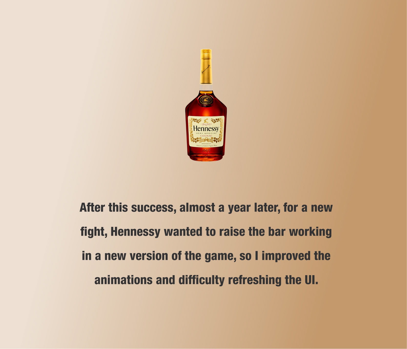
- 2018 -
MOBILE GAME FOR HENNESSY
MOBILE GAME FOR HENNESSY
How I crossover boxing with the best brandy
Moët Hennessy, the French Brandy,
is the main sponsor of Canelo Alvarez,
he owns the International Boxing Federation World Middleweight Title.
They asked to create a mobile boxing game...
is the main sponsor of Canelo Alvarez,
he owns the International Boxing Federation World Middleweight Title.
They asked to create a mobile boxing game...
ROLE:
Art Director
UI/UX
Game Designer
Art Director
UI/UX
Game Designer
SCOPE:
Two months project
Two months project
PLATFORM:
Web App
Web App
TOOLS:
Adobe Photoshop
Adobe Illustrator
Animate
Adobe Photoshop
Adobe Illustrator
Animate
TEAM:
Five person
Five person
MARKET-SPACE:
B2C - Gaming, Beverage
B2C - Gaming, Beverage
The Process
THE JOB
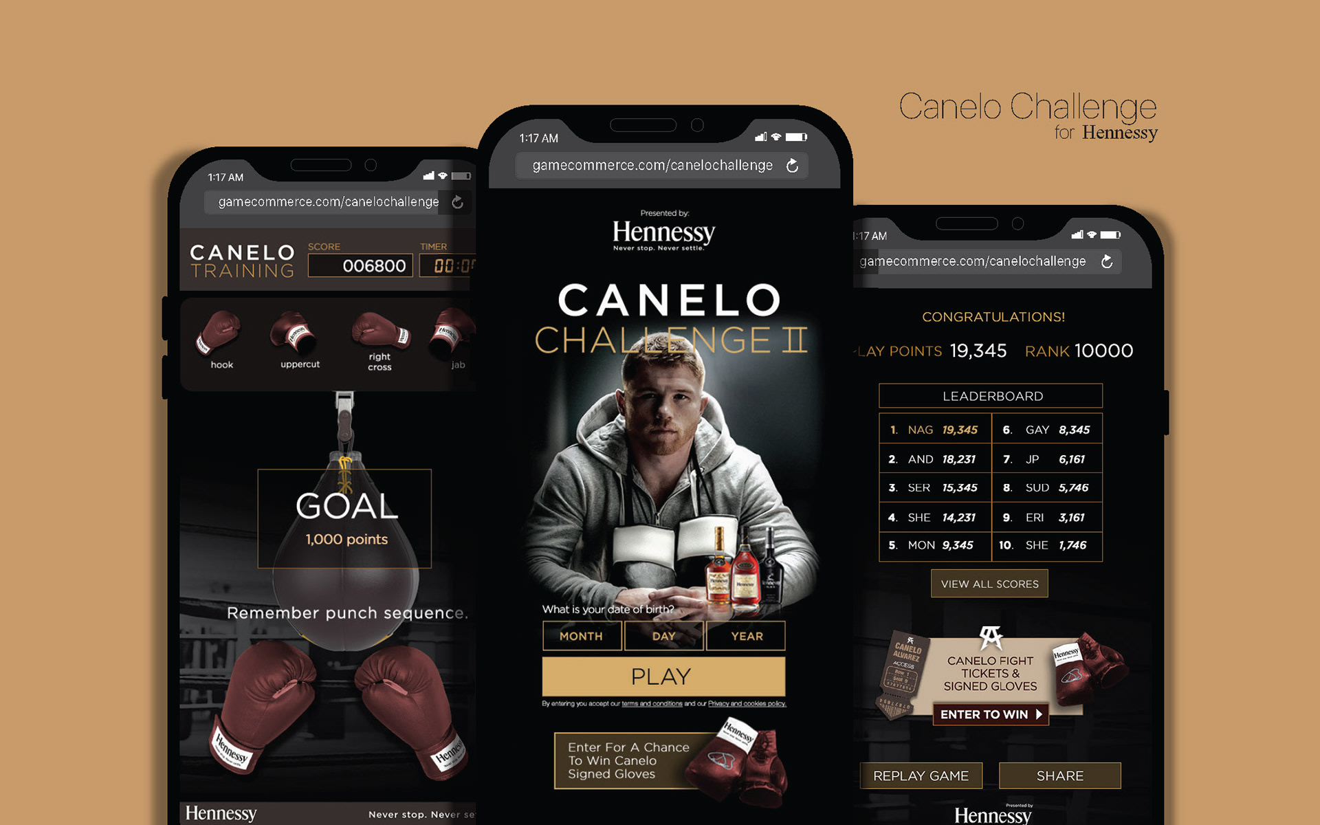
For Canelo's 2018 fight at Las Vegas, Hennessy wanted to deliver an interactive boxing experience. The idea was to explore how a boxer trains, designing a game that can capture the movements these kinds of athletes need to execute later during a fight.
Besides Apple, Hennessy is one of the brands I worked for, that has the highest standards. They have meticulous branding guidelines, style, and aesthetics, and they wanted the game to be a pure reflection of the brand at a boxing space.
SOME RESEARCH
To understand the real flavor of this born 1765 brand, we recurred to its website to understand the real meaning of its heritage and historical tradition.
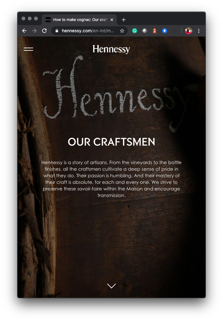
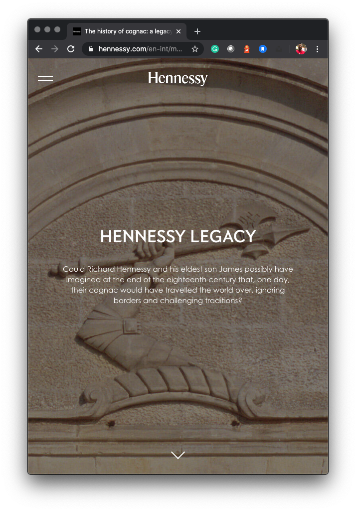
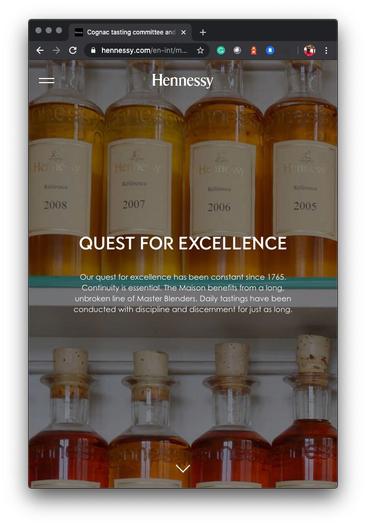
Figure 1. Hennessy's website screenshots. The brand uses specific color palettes and clean typographic compositions to create a high-quality image with a 300 years tradition.
Figure 2. We did in-depth research on the color palette Hennessy usually uses at its campaigns, labels, and advertising. The colors are mostly warm, with many shades of ochre, browns, and black. Based on those, we guaranteed the necessary "atmosphere" of the final product.
THE FLAVOR
We received many pictures and branding guidelines provided by them to create the experience. These assets reflect the graphic style the brand uses to showcase the relationship with the boxer.
Hennessy showcases "stories" at its website to align with different characters from sport, art, and other spaces.
Hennessy showcases "stories" at its website to align with different characters from sport, art, and other spaces.
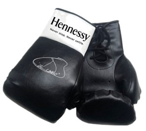
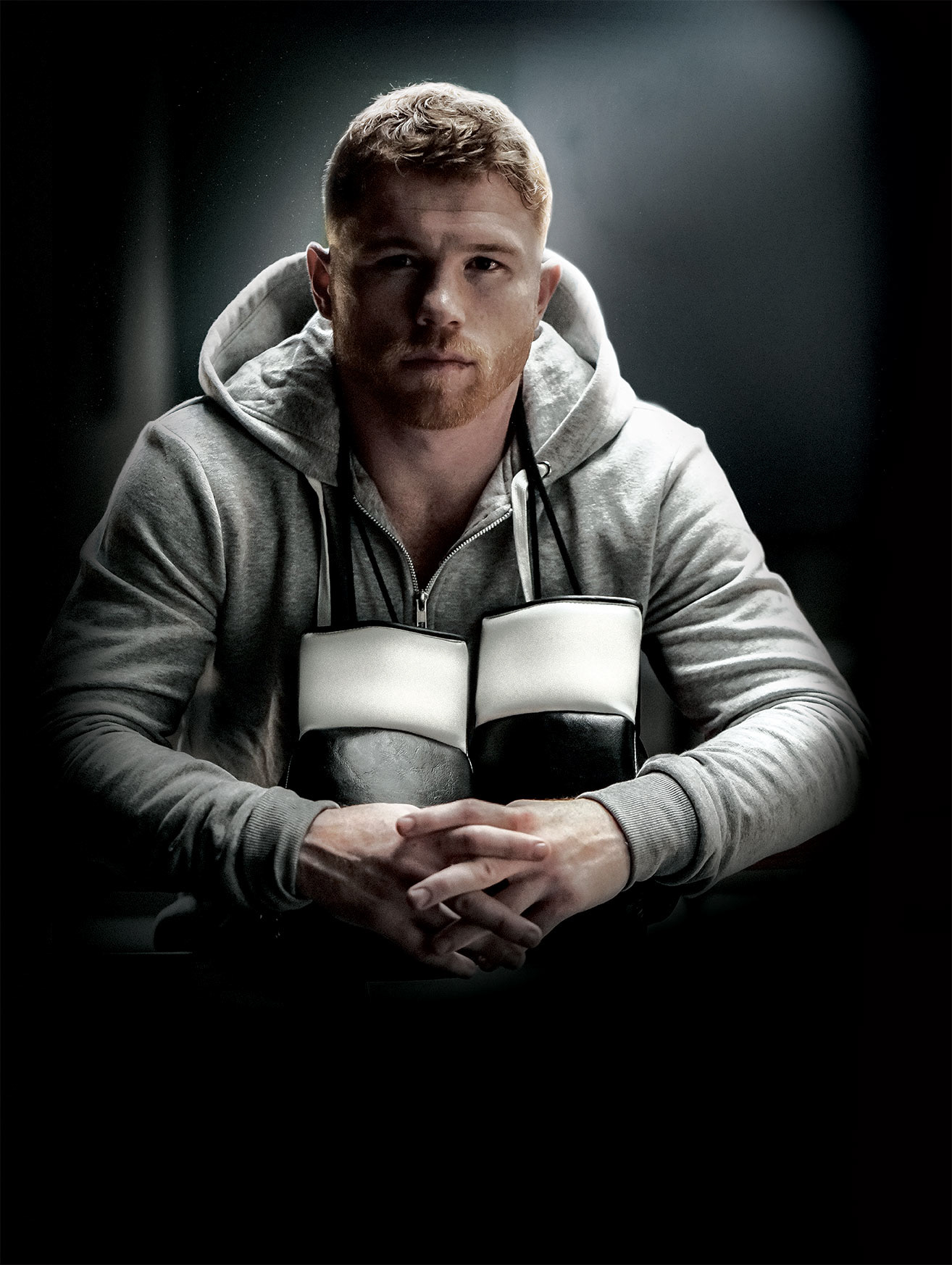
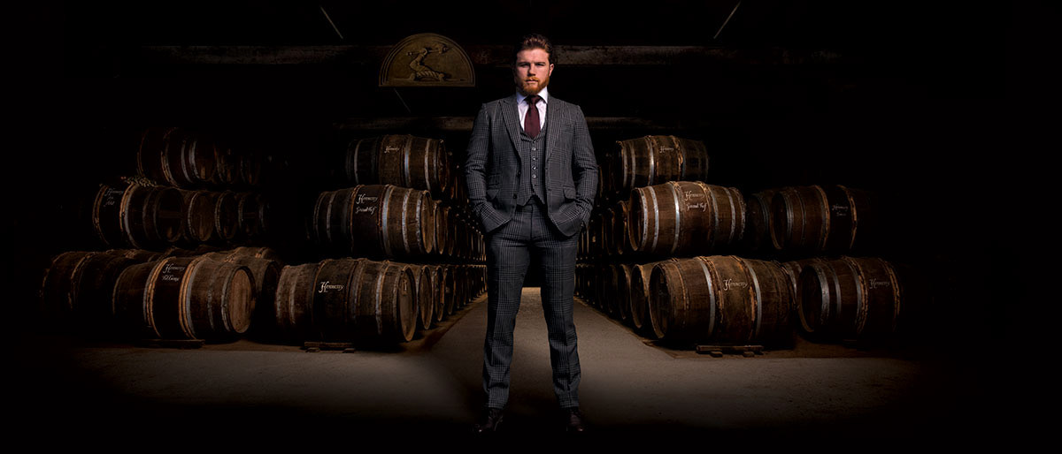
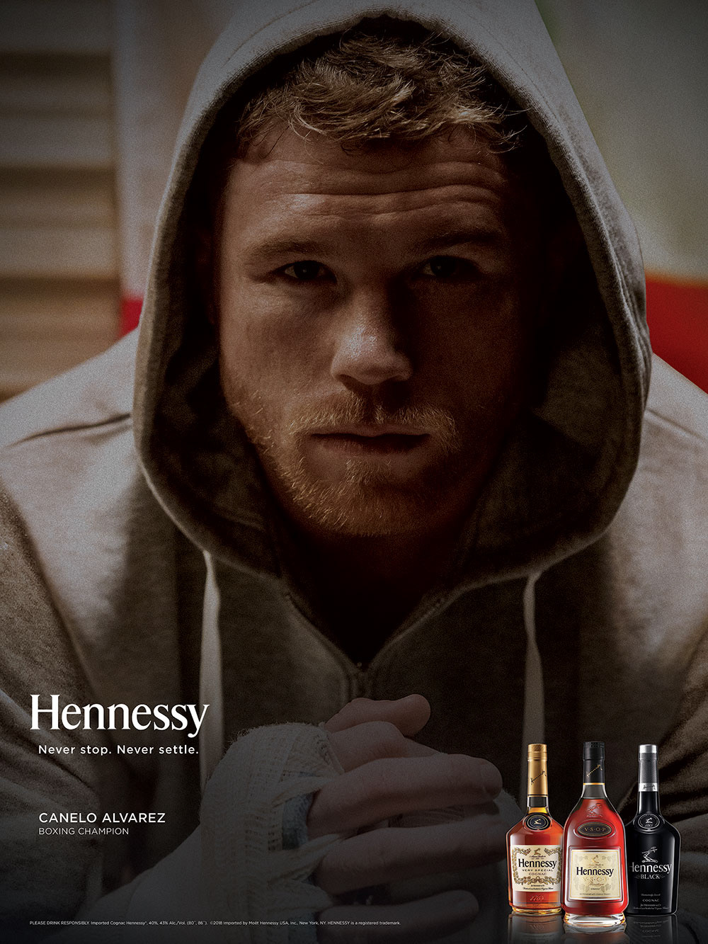
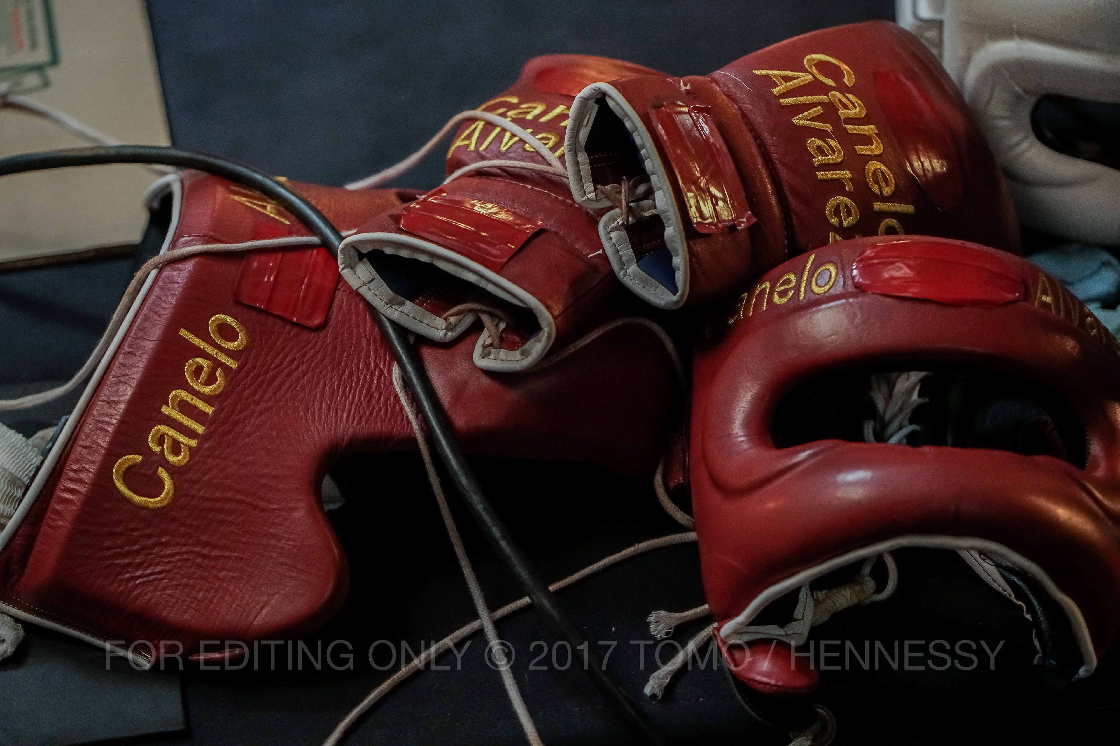
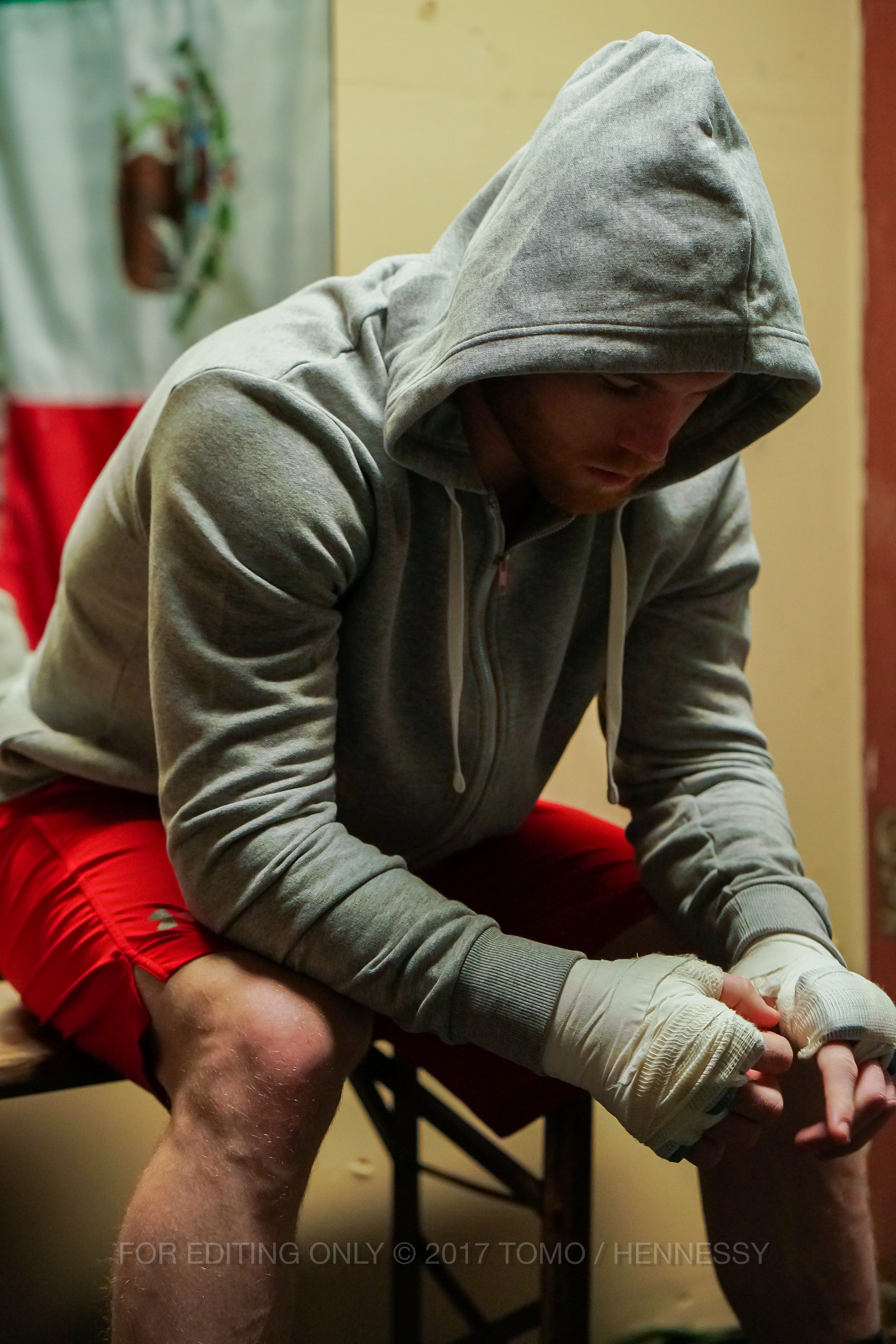
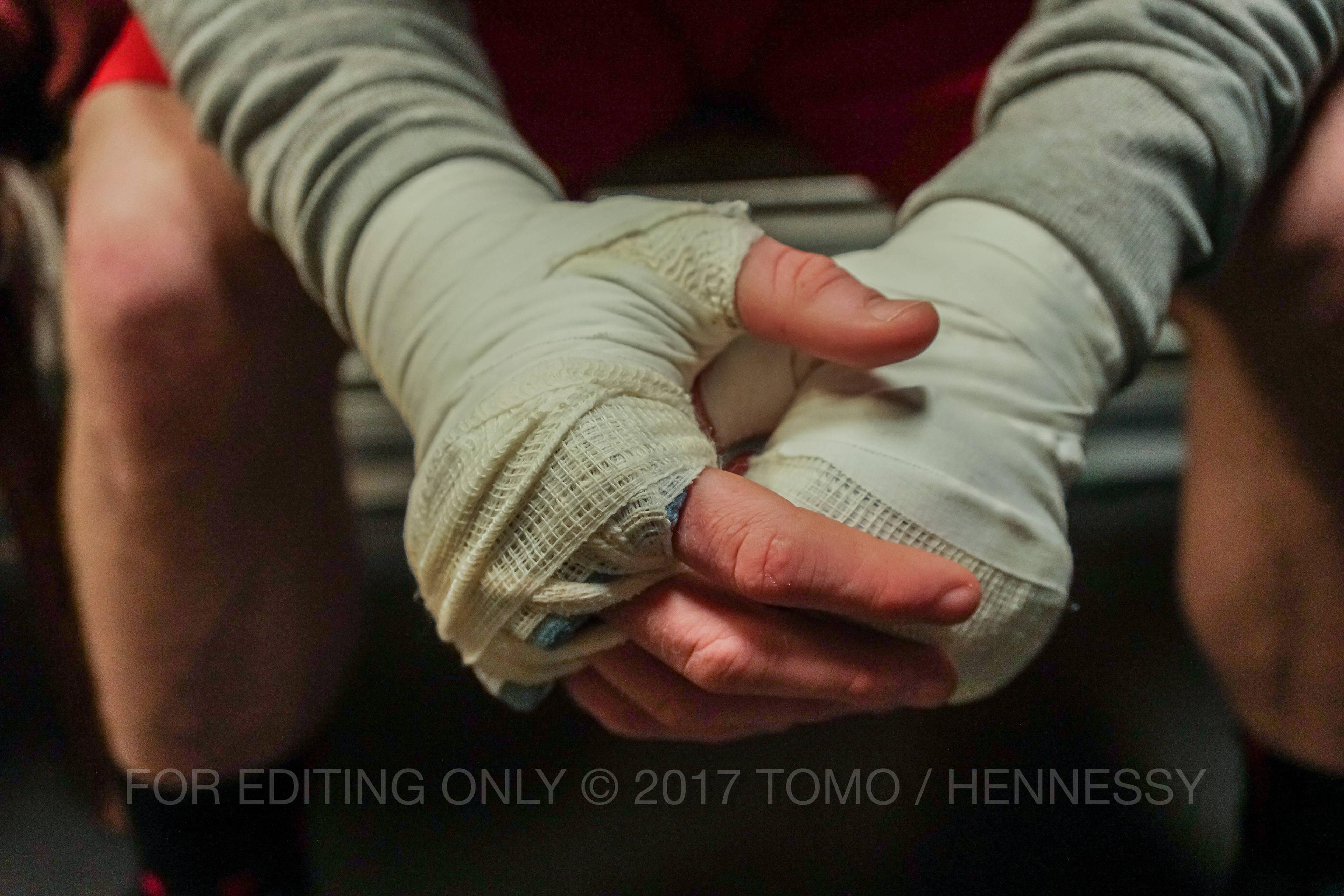
Figure 2. Some images we received to use at the game.
DEFINING GOALS
The game was a great challenge as it had to be fun, dynamic, sport-accurate, and marketing aligned with the company's objectives. From an aesthetic point of view, working on Hennessy's branding is one of the highest standards I have ever.
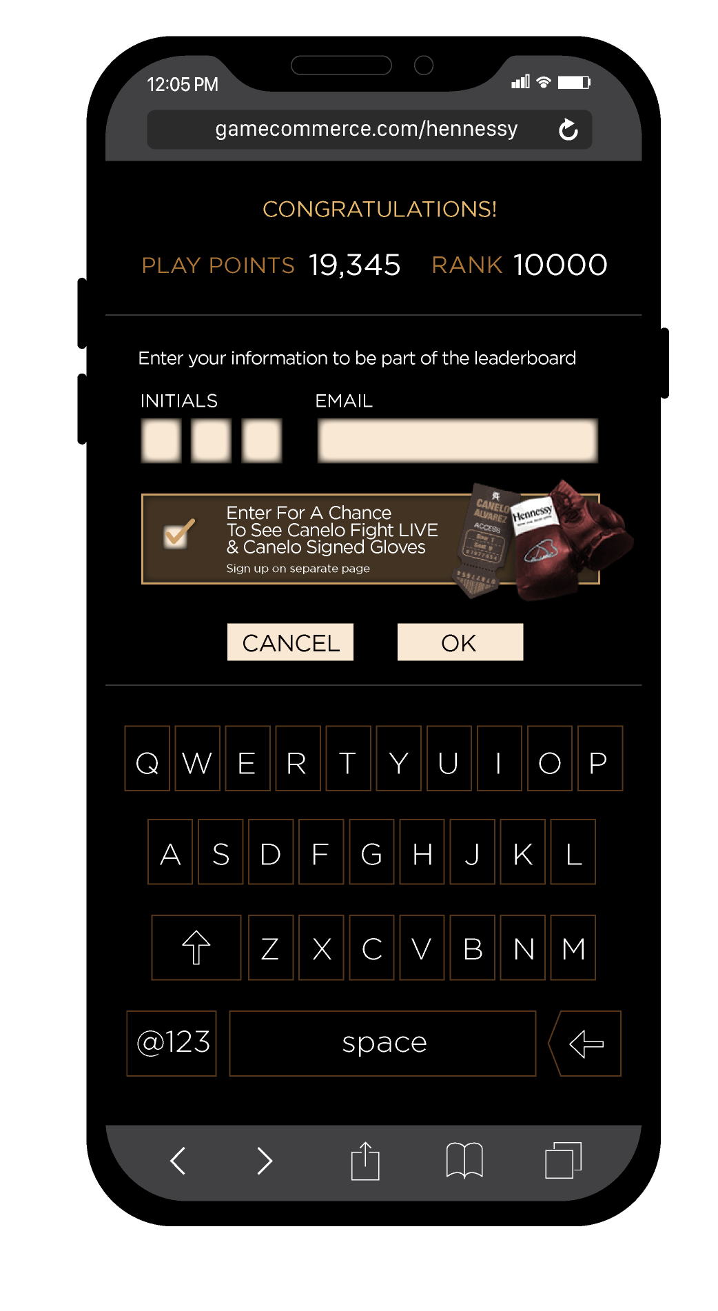
The main goal was to increase the Hennessy's database by collecting emails from users-players. So since the inception of the game, we knew that eventually, it had to involve prices to motivate people to play.
The main goal was to increase the Hennessy's database by collecting emails from users-players. So since the inception of the game, we knew that eventually, it had to involve prices to motivate people to play.
HANDS ON, I MEAN GLOVES ON!
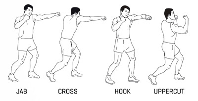
My first job was to research the different types of boxing training and then the type of punches. Once I understood the dynamics, I translated those movements into 2D space to create a boxing sensation. I found and worked around different images of gloves that combined them with those movements to integrate them as the most important elements of the user interface.
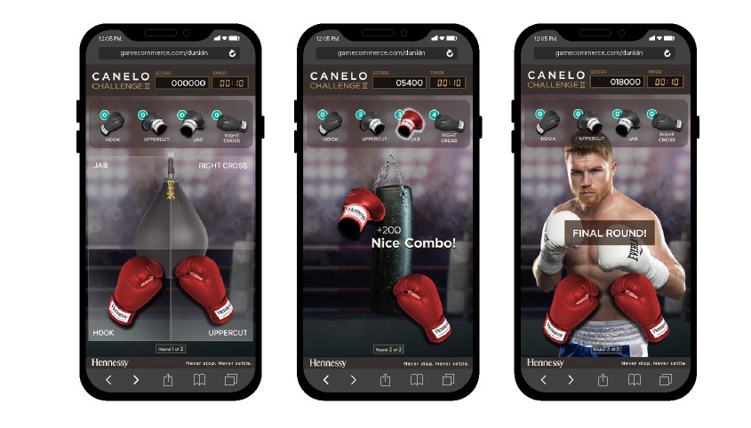
At that point, we needed to decide which kind of experience the game was going to be. After some tests, and receiving the commandment that we needed to showcase the boxer's image at a certain point of the experience, we present a first-person game divided into three rounds based in a small punching bag, a big bag and the final round facing Canelo himself.
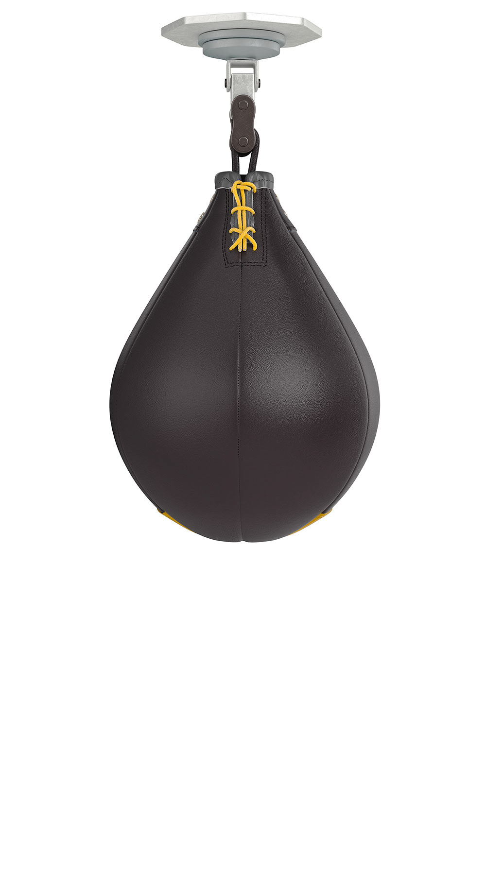
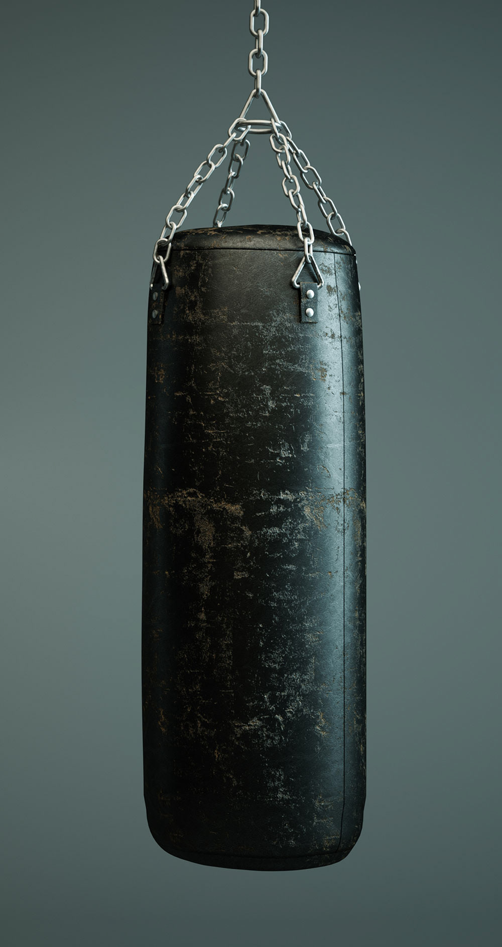
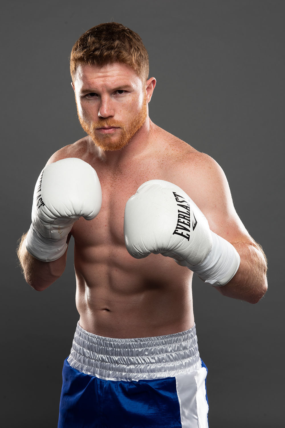
Figure 3. The original images I used for the game.
My job was defining the User Experience along the way, setting times for every level, and the interface for the different “hit-zones.” The interaction with the user is fundamental during the entire experience to help them understand not only what they have done but also when and where. For that, I worked hard on the copy to communicate effectively with fewer words/resources. There are many different levels of signs and communication assets to show information hierarchies as the score, timer, type and amount of punches, pop-ups, points, penalties, and comments.
I created the background with photo composing techniques and bag animations needed when receiving the four types of punches by generating visual 3D effects from 2D images giving a sense of depth and space.
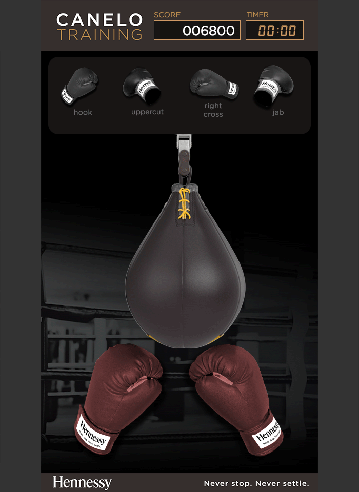
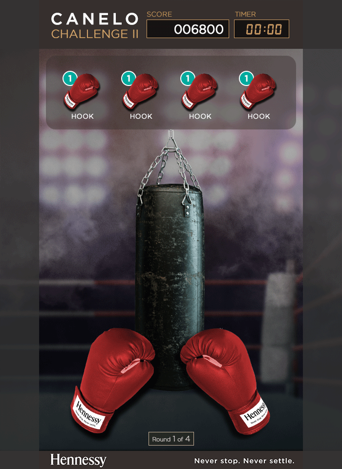
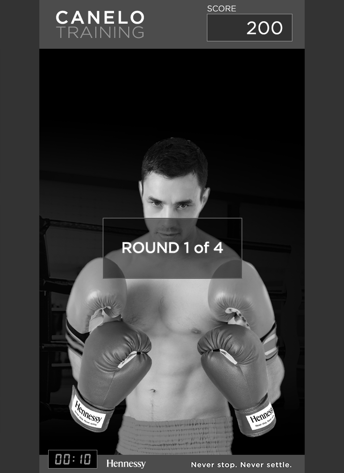
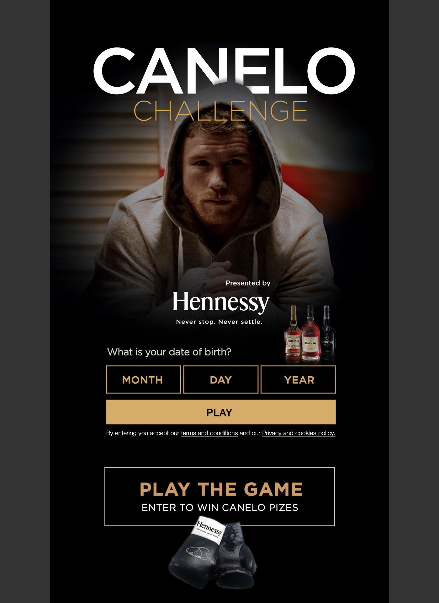
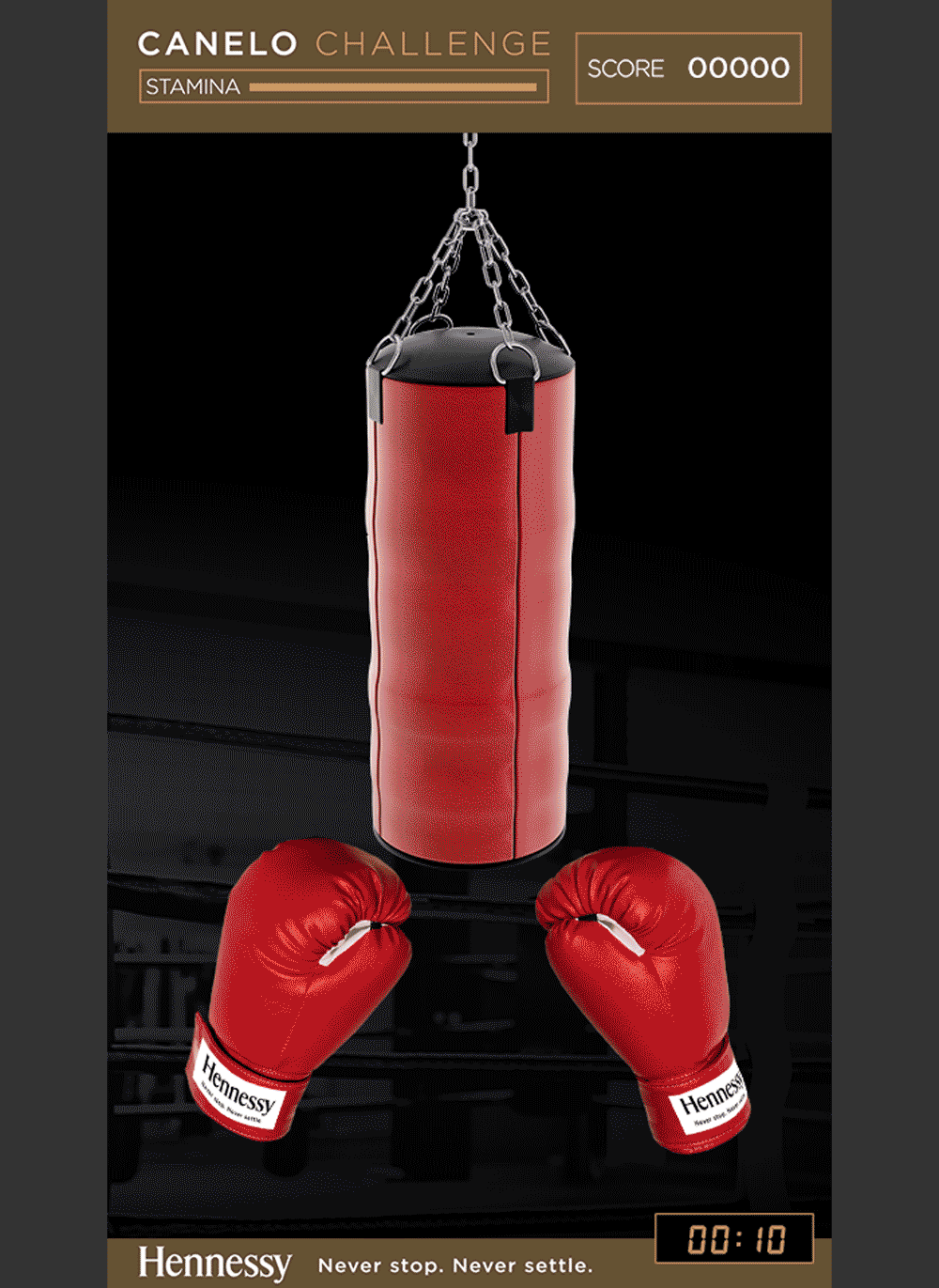
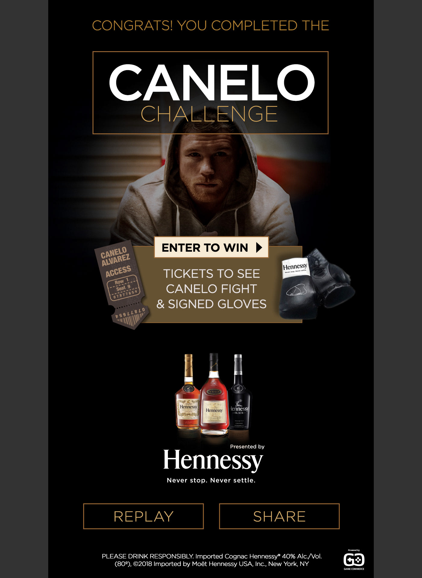
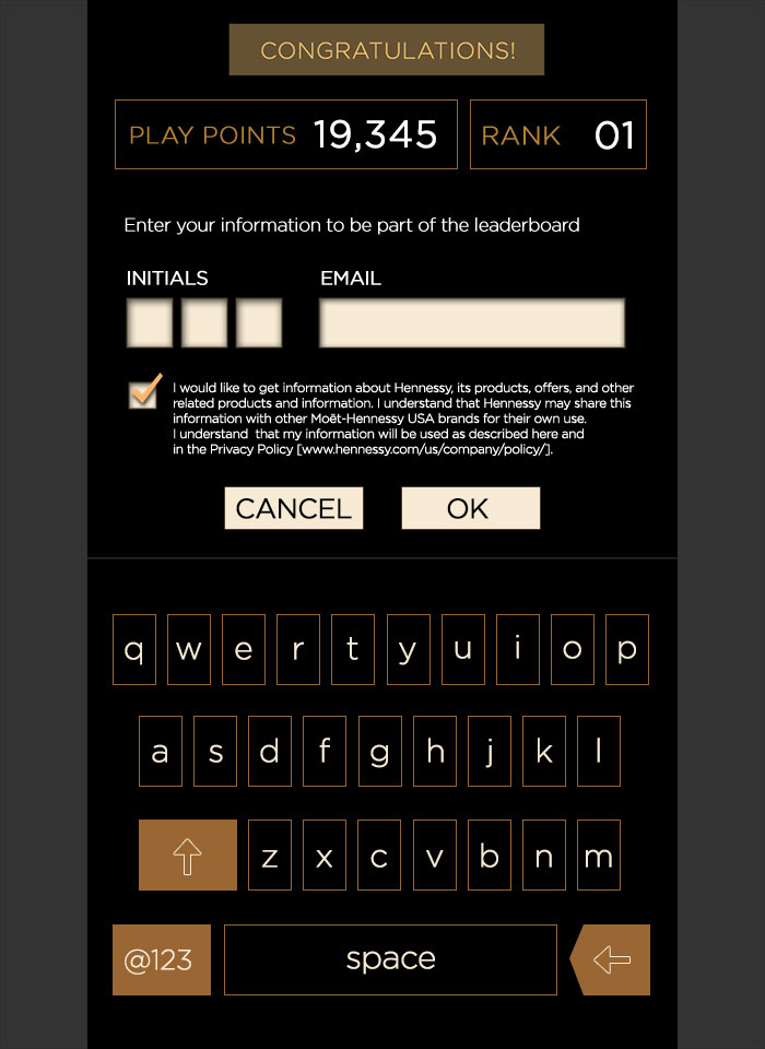
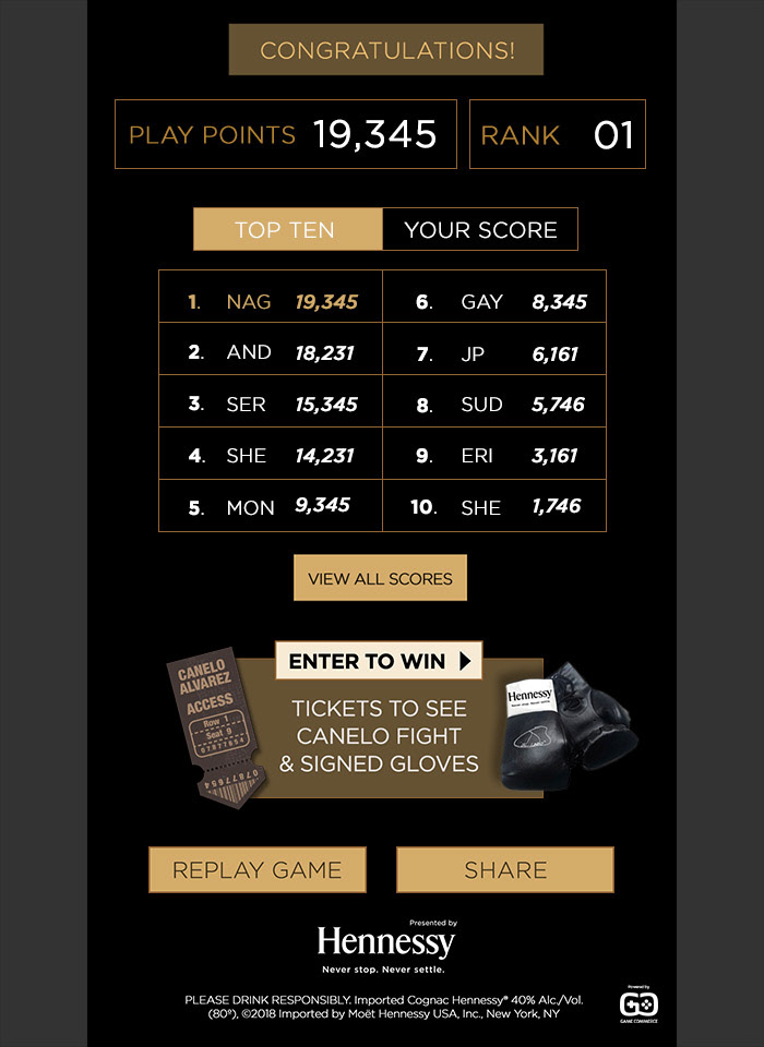
Figure 4. After a some experimentation and iterations we arrived to the desired outcome.
Because of the uniqueness of the aesthetics defined by Hennessy’s branding, I embraced the challenge of designing a mobile keyboard from scratch. It was a very high-end task to fit the overall interface from a visual point of view and a functional perspective.
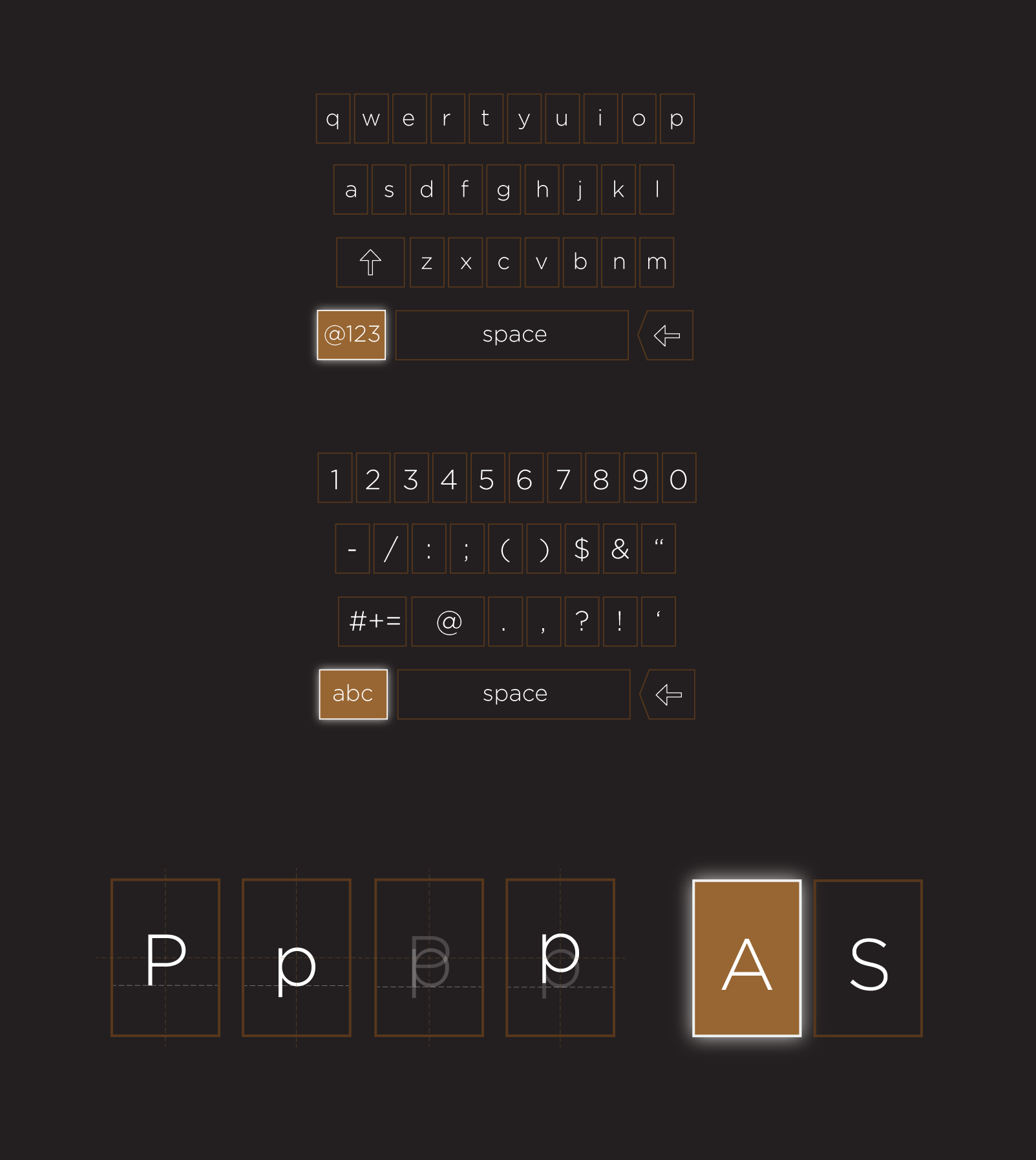
I worked on small visual adjustments on every key to balance each character inside its frame as Upper Case characters and Lower don’t fit the same way.
I defined a key pressed instance with a glow to highlight it.
I defined a key pressed instance with a glow to highlight it.
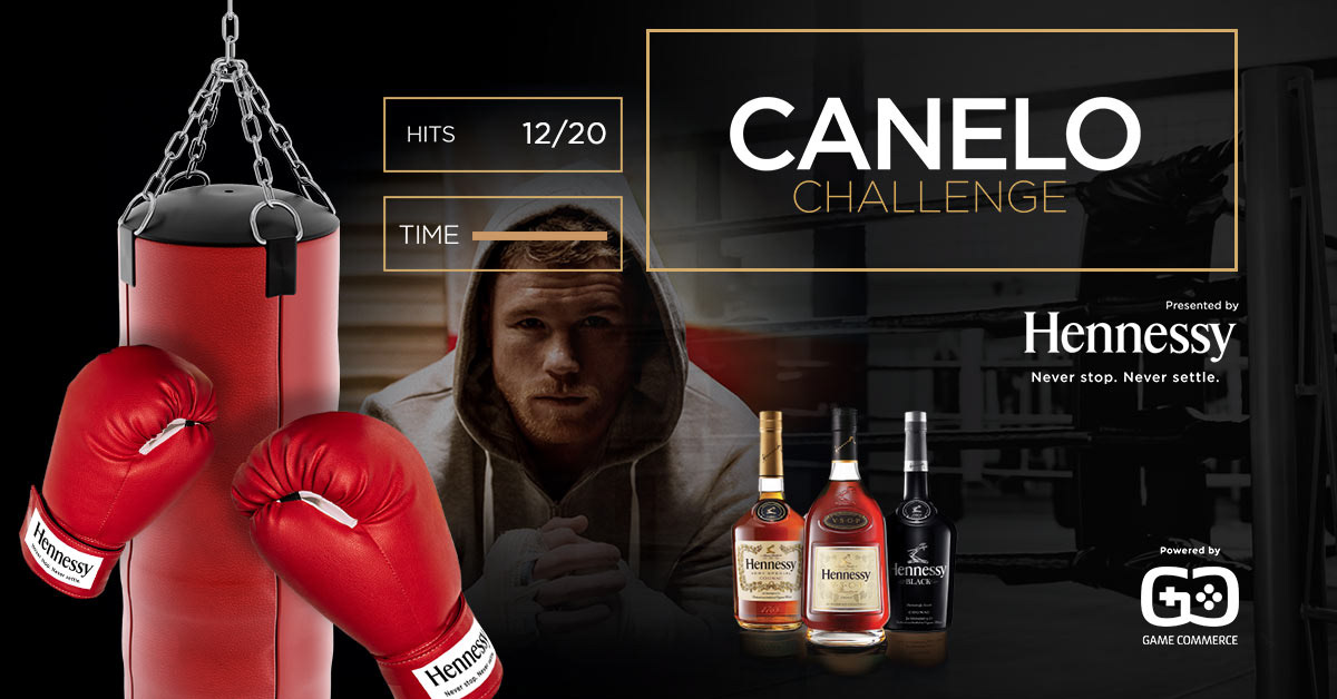
The result is a very engaging game with realistic images with a high-polished User Interface inspired in Moët Hennessy’s brand with a delightful way to amuse people leading them to a “Call to Action” instance.
2.7 minutes User Engagement
163 sec avg. time
Time spent 5x longer than TV spot
163 sec avg. time
Time spent 5x longer than TV spot
Played across 106 countries
14% click thru rate
Client received 10K sweepstakes entries!
14% click thru rate
Client received 10K sweepstakes entries!
Team members
Andrew Jasper
Creative Director at GameCommerce
Creative Director at GameCommerce
Sudhir Subramanian
Software Engineer at GameCommerce
Software Engineer at GameCommerce