(3:10 min read)
NEW LANGUAGE APPLICATION FOR US BANK
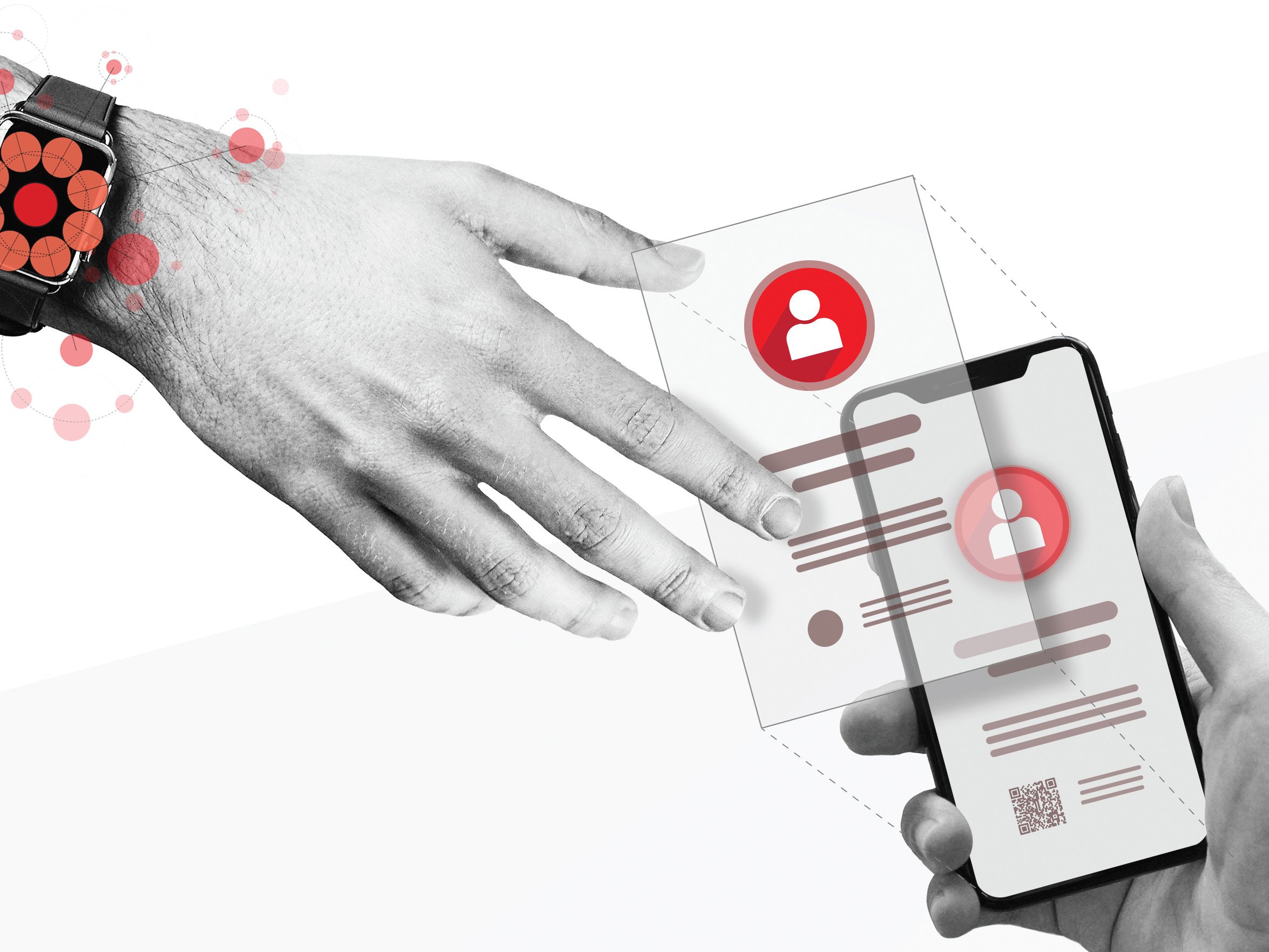
How I used my Latin heritage to impact 52 million US users
The financial institution wants
to take over the US Hispanic population,
by creating a brand-new experience.
to take over the US Hispanic population,
by creating a brand-new experience.
ROLE:
UI/UX,
Interaction Designer
SCOPE:
45 days project
UI/UX,
Interaction Designer
SCOPE:
45 days project
PLATFORM:
Mobile and Desktop Web
Mobile and Desktop Web
TOOLS:
Sketch
InVision
Jira
TEAM:
Seven person
Sketch
InVision
Jira
TEAM:
Seven person
SPACE-MARKET:
B2C - Finance
B2C - Finance

The Scope
THE PROBLEM
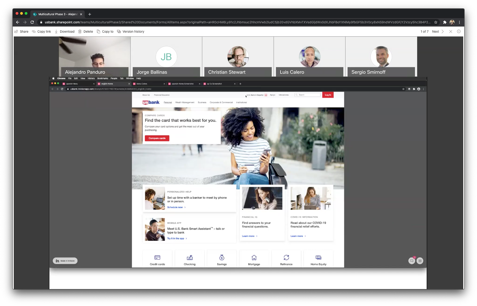
To translate the .COM experience to Spanish. For it, we’ll need a language indicator to inform customers which sections are in English while under construction.
THE VALUE THIS EXPERIENCE PROVIDES
Created a new user experience for the U.S. Bank in Spanish website that will help new and returning users understand and navigate the new available pages in Spanish. We also defined a UX that will help users understand that not all pages are available in Spanish, but are currently under construction. Finally, we wanted to create a new UX that can be implemented across the site in the future when new versions of the U.S. Bank website in other languages emerge.
DEPENDENCIES AND CONSIDERATIONS
The language indicator experience was built following SHIELD (U.S. BANK DESIGN SYSTEM) guidelines and with consultation from the .COM (English) Team, A11Y partners, and CAT/Legal teams.
WHO WE WERE SOLVING FOR:
For current and new U.S. Bank customers that are bilingual and/or prefer to access the website content in Spanish (and eventually other languages) due to language or cultural-based preferences.
COMPETITIVE ANALYSIS
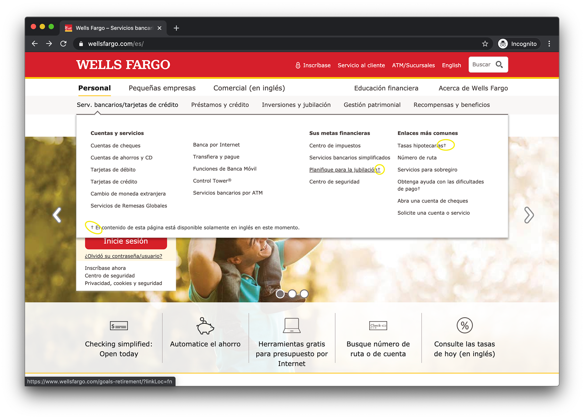
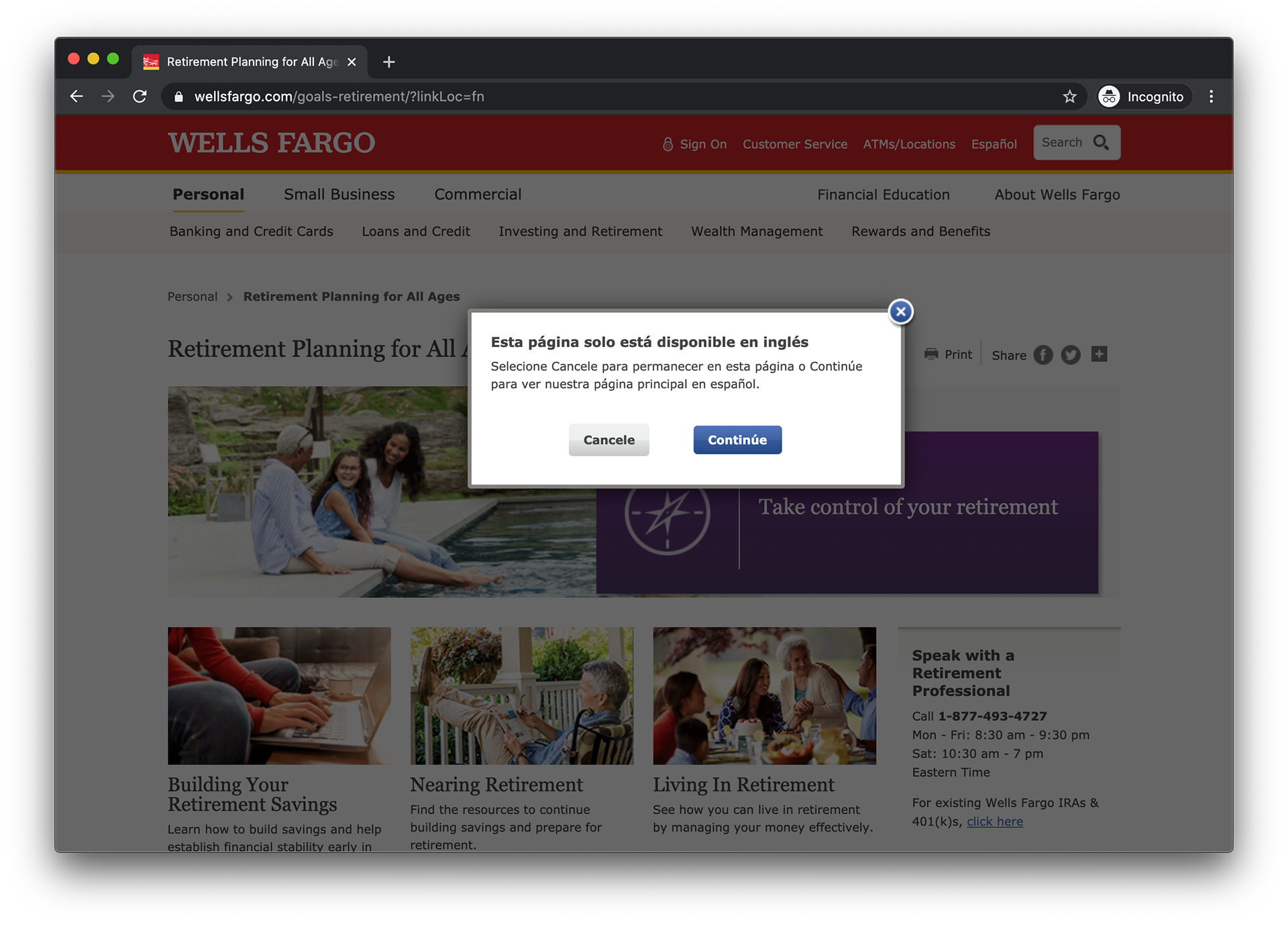
After comparing the user experience from two competitors: Chase and Wells Fargo, we realized that this experience does not currently exist. Based on our research, we analyzed the UX and features from our competitors as points of reference to develop this experience that existed on neither of the Banks' sites and created the Spanish Language Indicator for U.S. Bank in Spanish bank sites. Thus, we created the Language Indicator for U.S. Bank in Spanish website.
WELLS FARGO
• There is no indication when switching to Spanish addressing that not every page is available in that language.
• Once in Spanish, there are small † symbols indicating the pages that are only available in English.
• On click, the Modal appears (every time) communicating that fact.
• Once in Spanish, there are small † symbols indicating the pages that are only available in English.
• On click, the Modal appears (every time) communicating that fact.
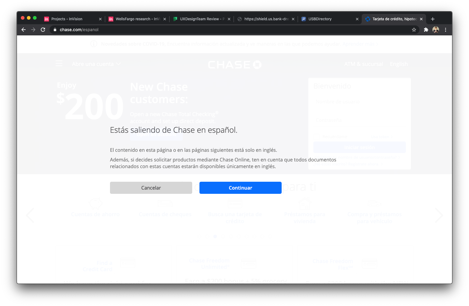
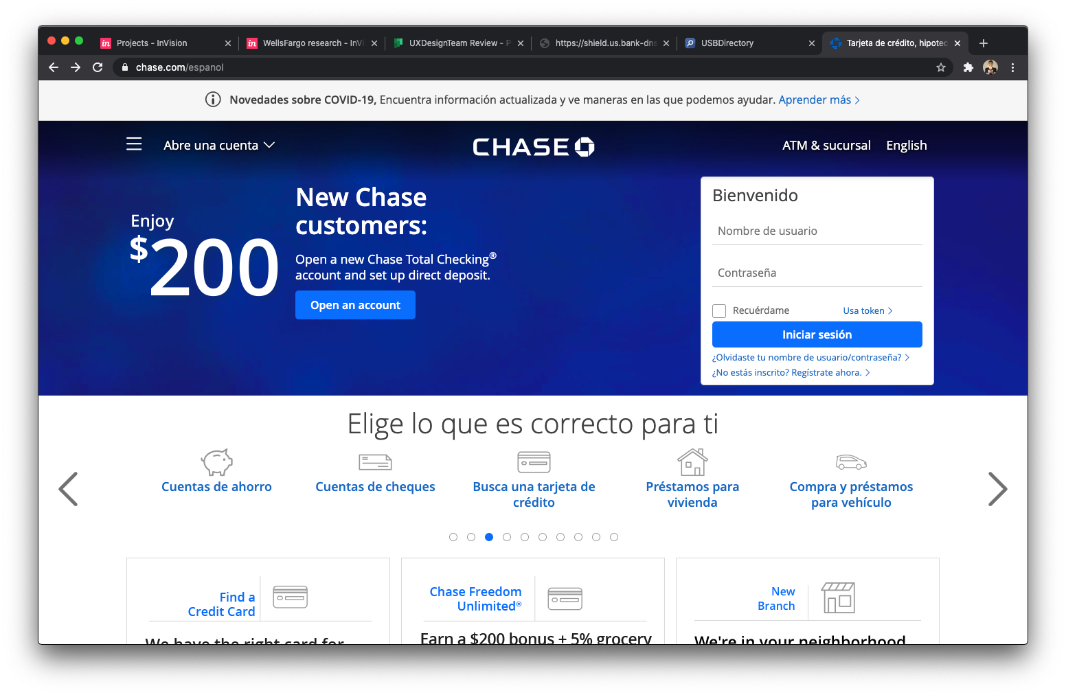
CHASE
• There is no indication when switching to Spanish addressing that not every page is available in that language.
• Once in Spanish there are NO indicators of pages that are only available in English.
• There are banners, cards, and links in both languages, together. There is no relation between clicking on a Spanish or English link/text and the Modal that appears.
• Once in Spanish there are NO indicators of pages that are only available in English.
• There are banners, cards, and links in both languages, together. There is no relation between clicking on a Spanish or English link/text and the Modal that appears.
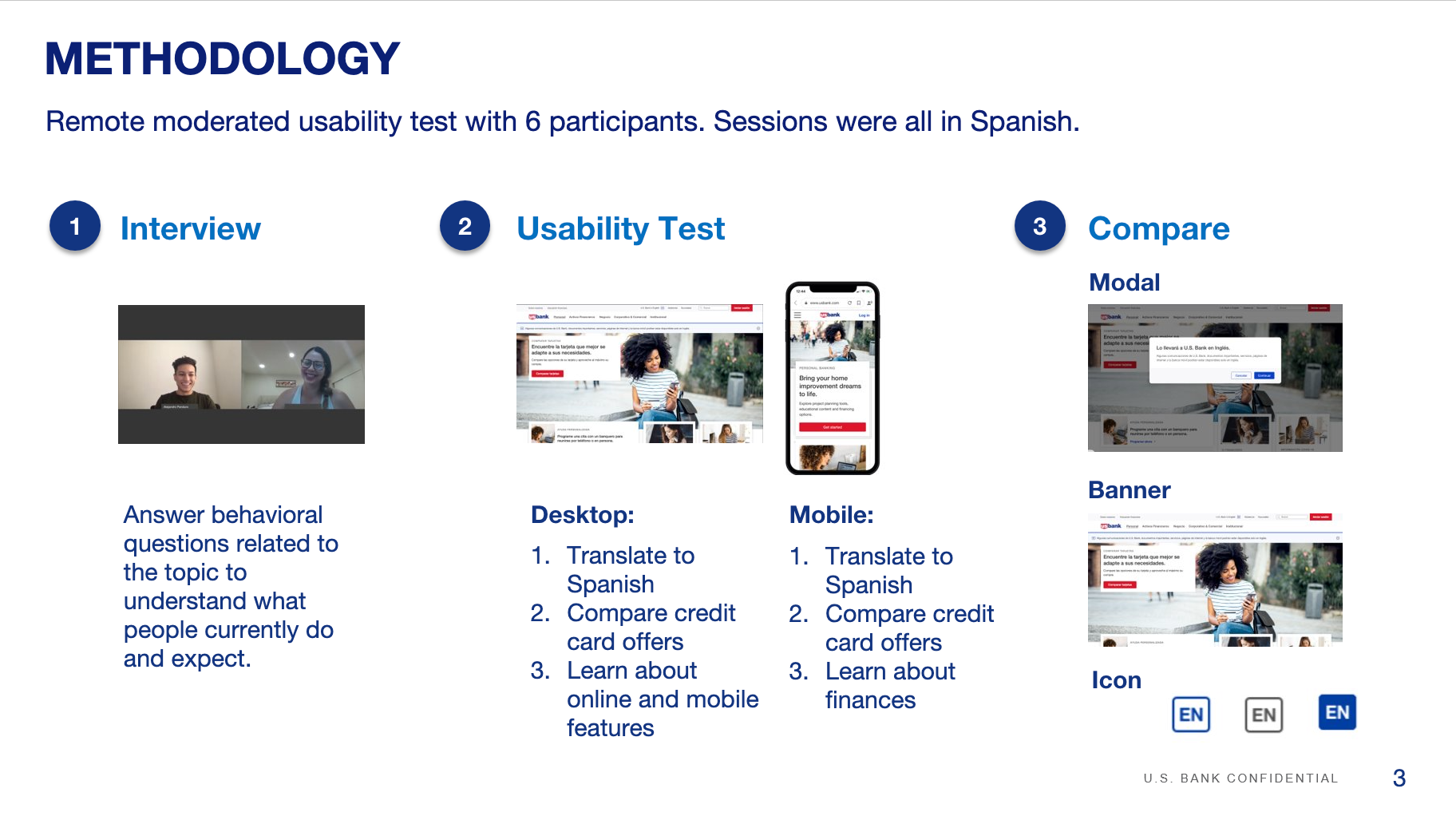
QUALITATIVE RESEARCH
The remote unmoderated usability test conducted in UserZoom tests indicated that:
1. Most participants did not see the banner in the desktop version.
2. Most participants misinterpreted the [EN icon] when presented with various icon options.
3. All participants said the modal would ensure they saw the message.
4. An explanation of the icon would further help clarify their understanding and expectations.
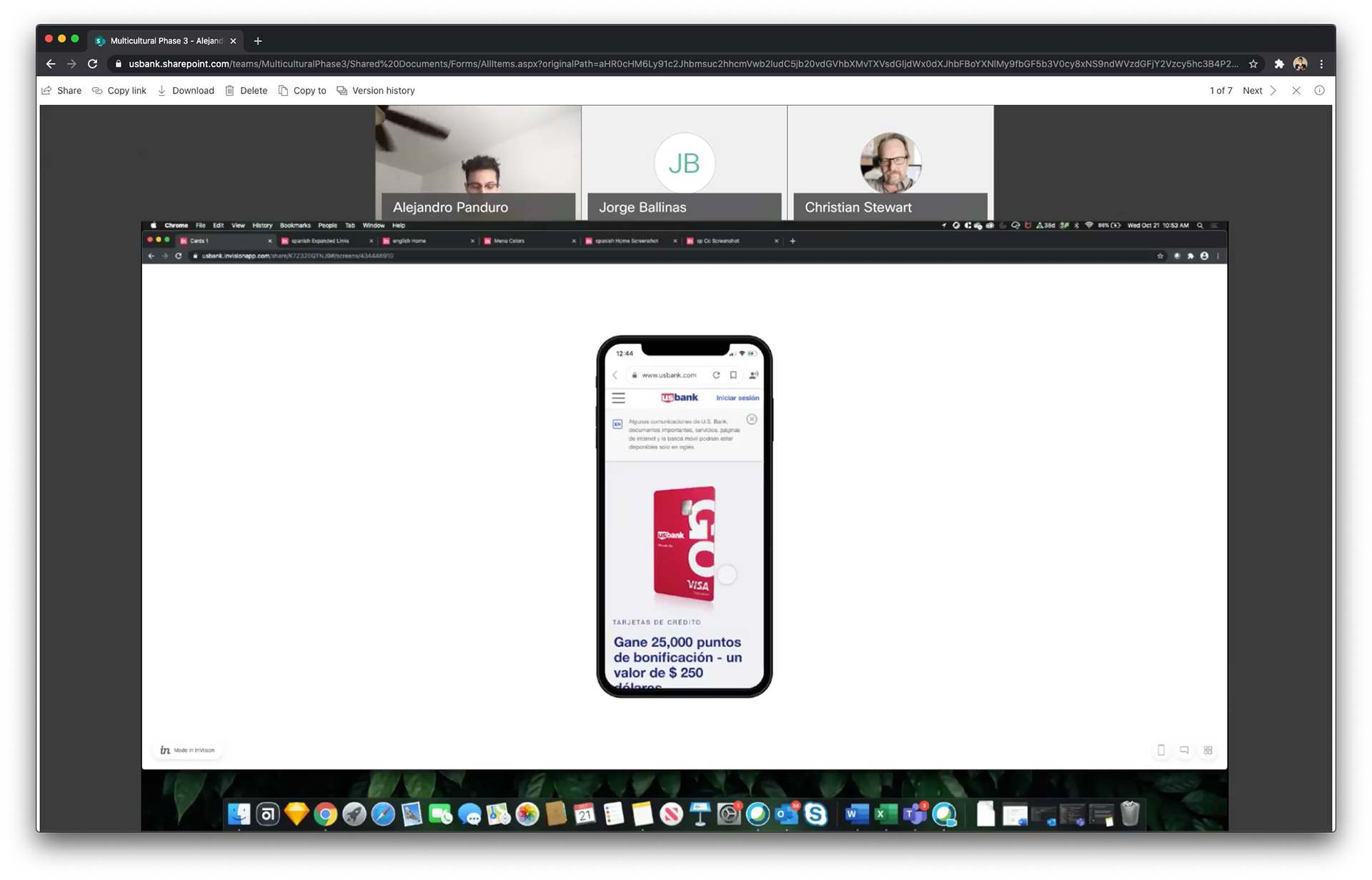
We realized that most participants in the research study did not see the banner for U.S. Bank in Spanish, or clearly understood what the [EN icon] represented. We learned that by creating the Language Modal Indicator, we would provide clarity and enhance the UX by setting up clear expectations and information for new and returning U.S. Bank in Spanish customers.
We also learned that the Language Modal Indicator ensured that customers clearly understood not all pages were available in Spanish, and what the [EN icon] represented.
A11Y ALIGNED
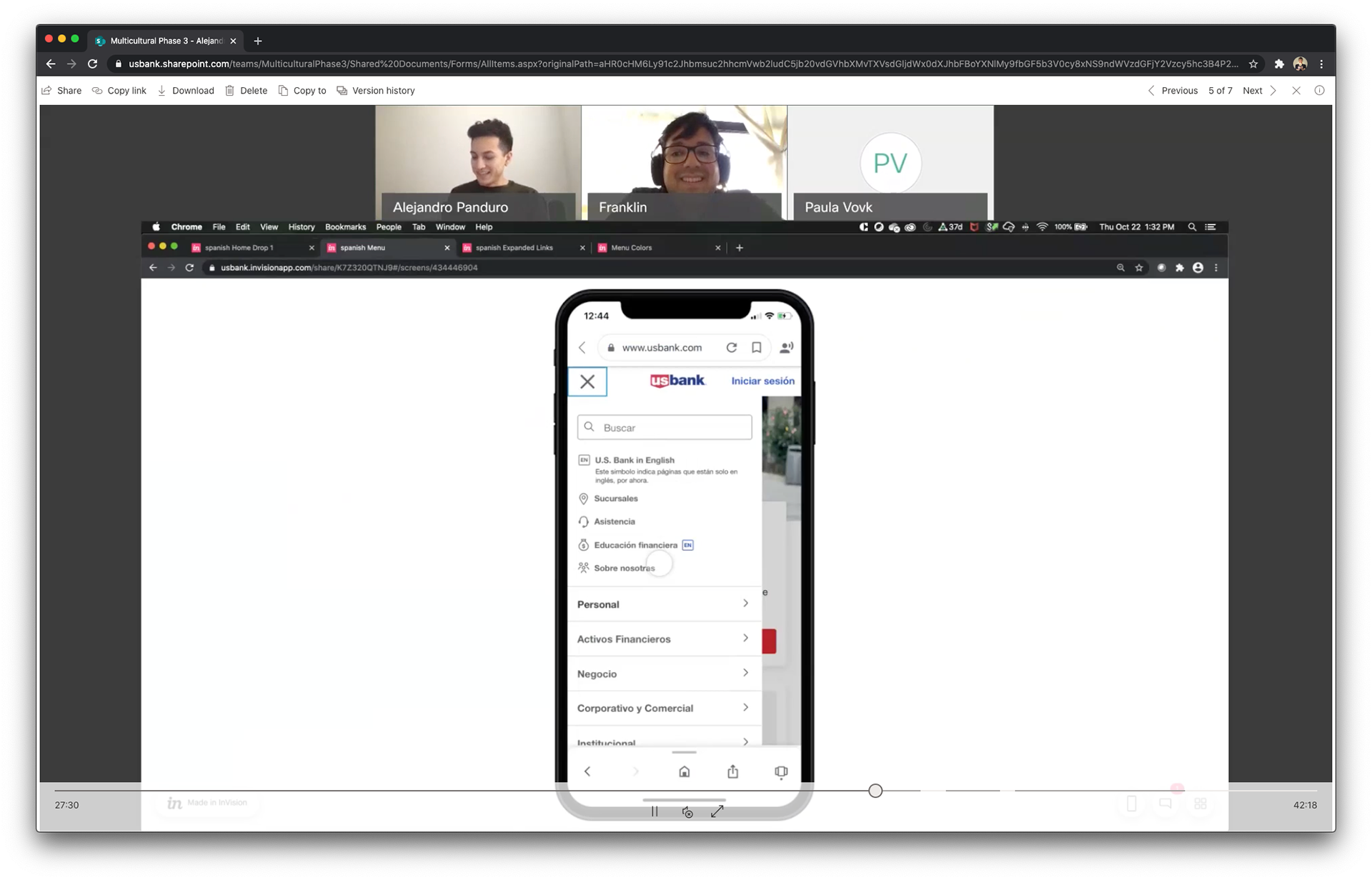
Based on the learnings after the research sessions, the team agreed that even the EN icon would be integrated into the copy, however for accessibility purposes and to be compatible with screen readers, the EN is part of the text, and the blue square is a background image.
The Icon
I created different options for Desktop and Mobile experiences. Besides size, color was an important part of the project, as it should work with dark and light backgrounds as well. So the full blue version works on top of white /light backgrounds and the white-stroke over color backgrounds. The gray version was needed for web mobile as it should match other existing icons at the main nav menu.
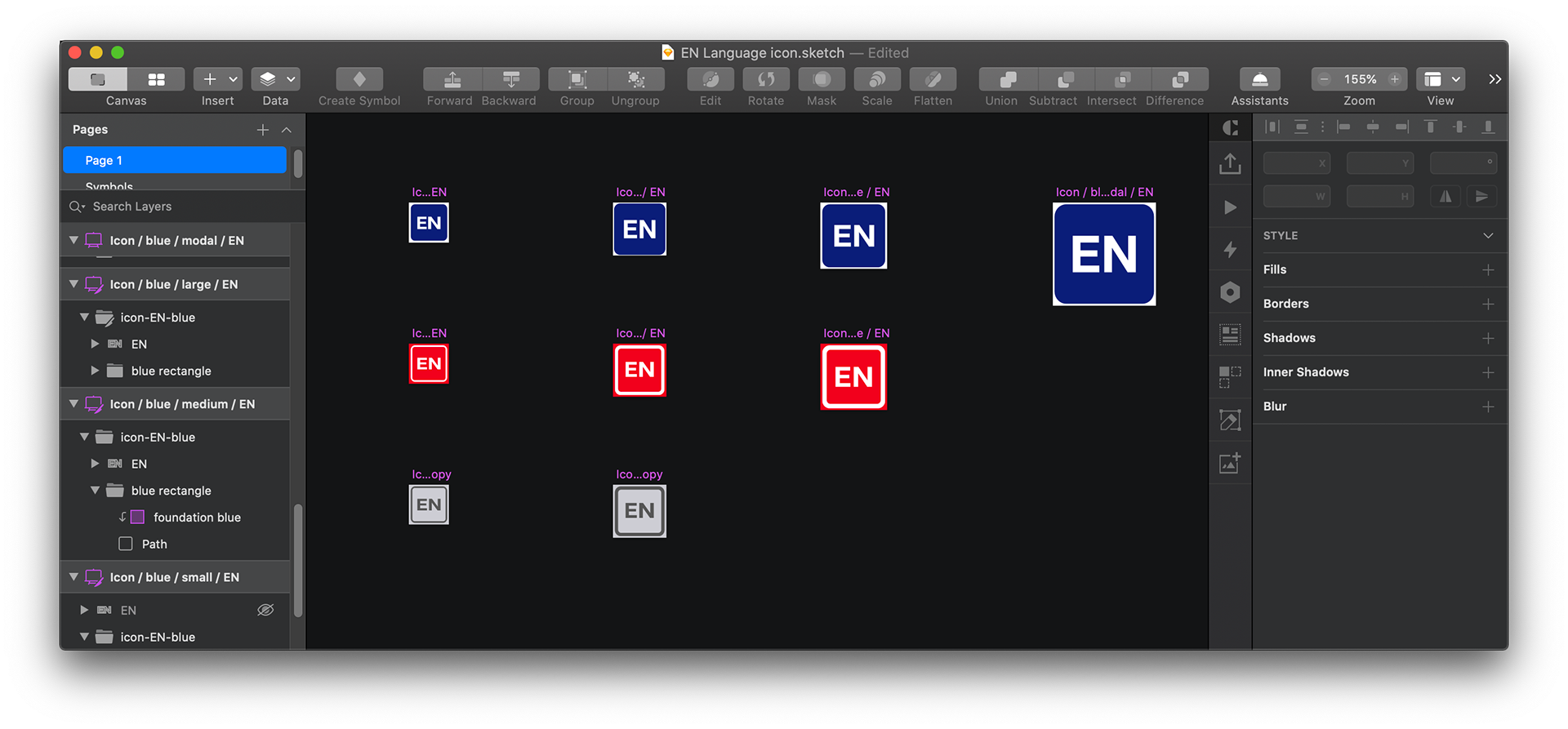
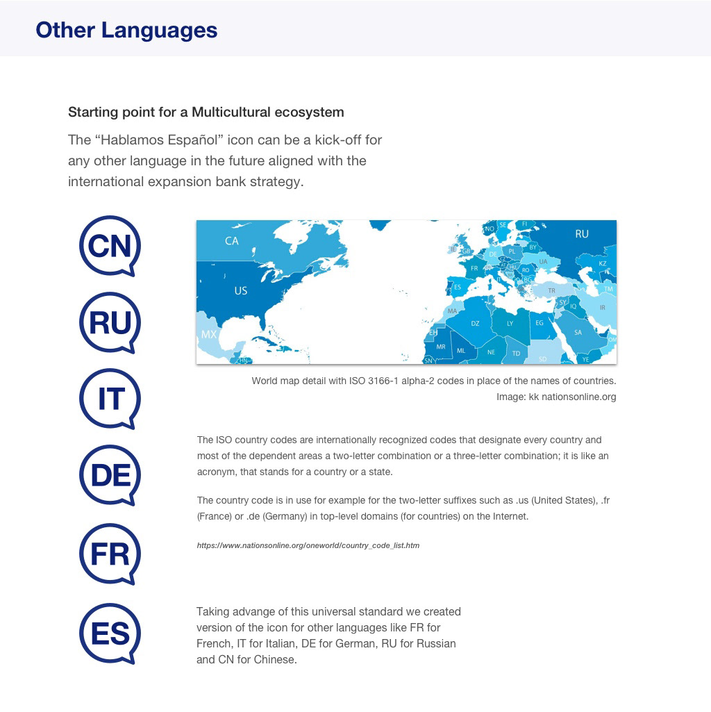
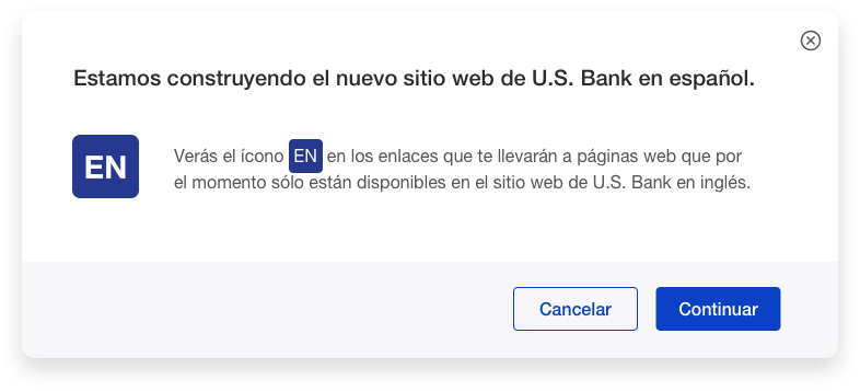
Figure 1. Final modal used for the experience.
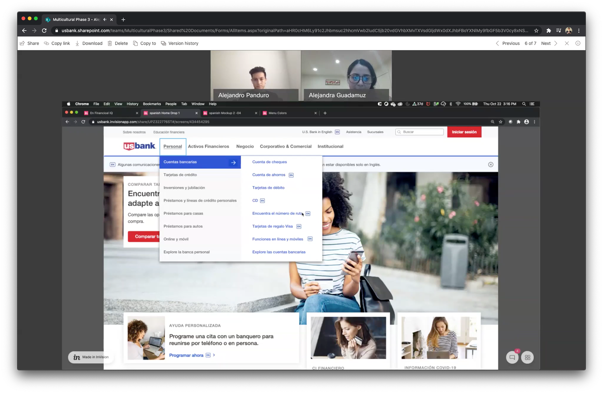
Mobile and Desktop
Both experiences allow fluid navigation to help the user access with one click/tap the desired content. However, Desktop and Mobile experiences are slightly different based on research discoveries and related to each platform's needs and behaviors.
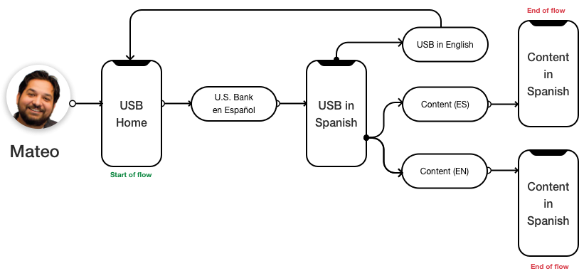
Figure 2. Mobile User's workflow.
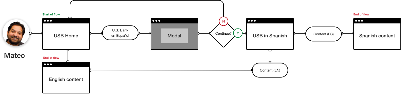
Figure 3. Desktop User's workflow
Screen flow - Desktop
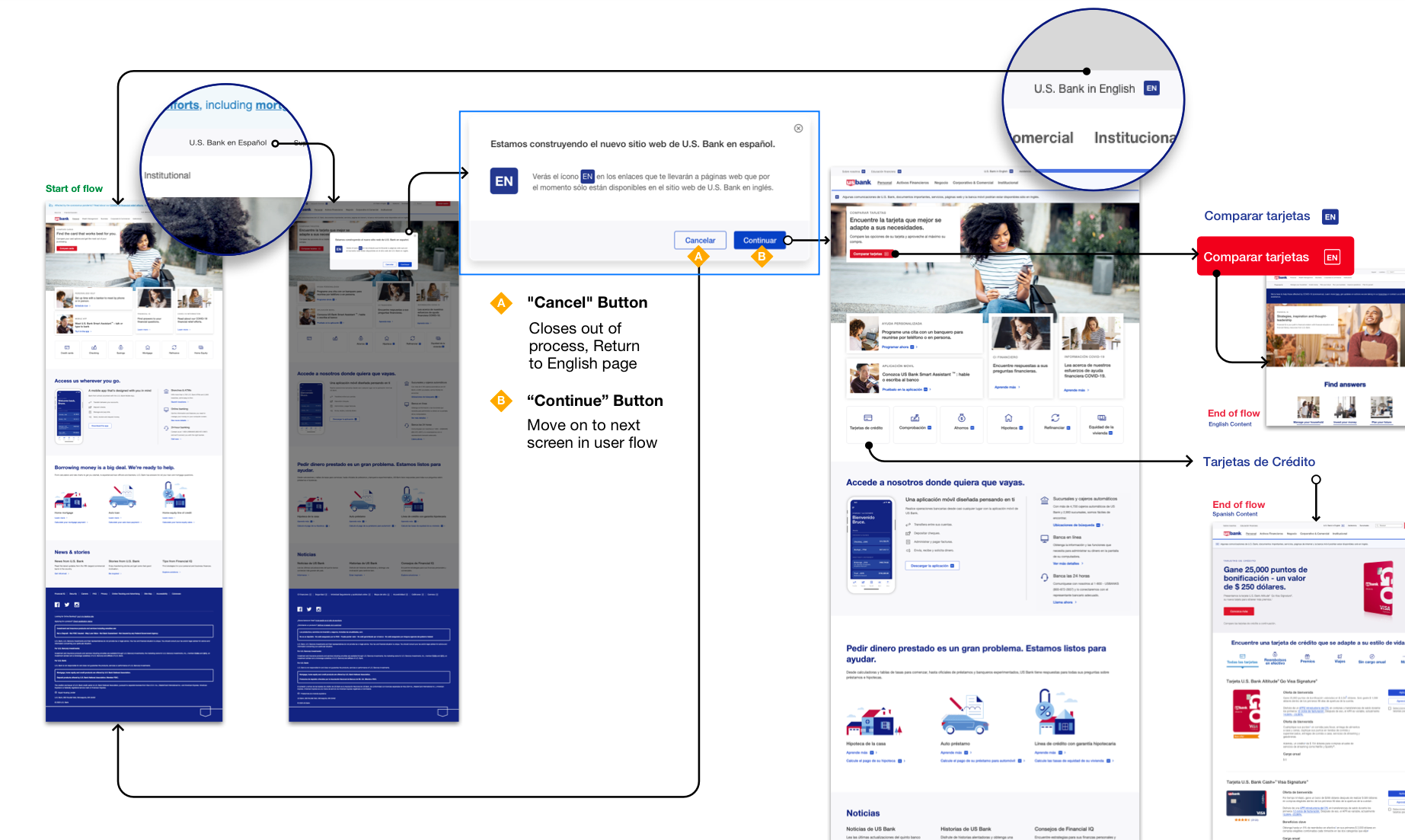
Screen flow - Mobile
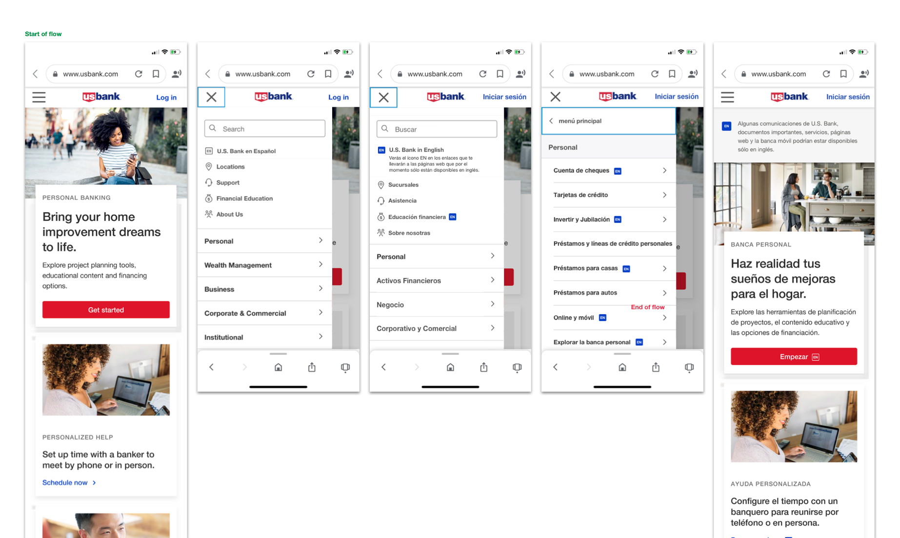
Figure 4. Interactive mockup for usability test purposes.
The result is a whole
new experience,
compared with the market standard,
which was looking to reach
52 million people, a 16.6%
of the United States' total population.
new experience,
compared with the market standard,
which was looking to reach
52 million people, a 16.6%
of the United States' total population.
Team members
Juan Carlos Castillo
Journey Owner
Journey Owner
Gustavo Sebran
UX Lead
UX Lead
Luis Calero
Content Strategist
Content Strategist
Mariyama Scott
A11Y
A11Y
Alejandro Panduro
Researcher
Researcher
Tiraporn Olson
TOS
TOS
Jenna Leskela
DotCom Partner
DotCom Partner