(3:00 min read)
MOBILE GAME FOR AMAZON
How I increased Amazon's sales with a game
The e-commerce giant asked my team to design a fun experience highlighting certain products for Christmas to increase sales.
ROLE:
Art Director, UI/UX,
Game Designer
SCOPE:
45 days project
Art Director, UI/UX,
Game Designer
SCOPE:
45 days project
PLATFORM:
Mobile Web App
Mobile Web App
TOOLS:
Adobe Photoshop
Adobe Illustrator
TEAM:
Five person
Adobe Photoshop
Adobe Illustrator
TEAM:
Five person
SPACE-MARKET:
B2B2C - Gaming, eCommerce
B2B2C - Gaming, eCommerce
The Process
INTERVIEWS AND RESEARCH
To have a better understanding of the client and their business goals for the experience, we scheduled a couple of interviews with Amazon executives. Through these meetings, we were able to clarify our understanding of what they were looking for with a clear idea of the milestones to achieve related to increasing certain products sale for the next Holiday Season.
BUSINESS GOALS
The experience's whole point was to land people at Amazon's website at specific product pages to increase its sales. The experience would be a bridge between Snapchat users and Amazon.
We received the products Amazon wanted to use, the company's branding guidelines, and a unique package of miscellaneous illustrations they developed specifically for that season.
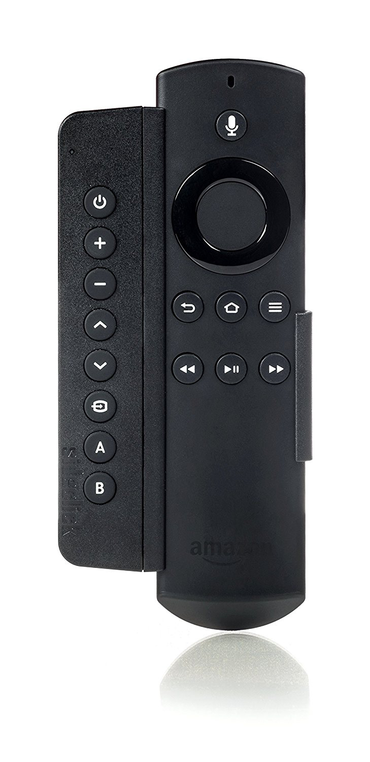
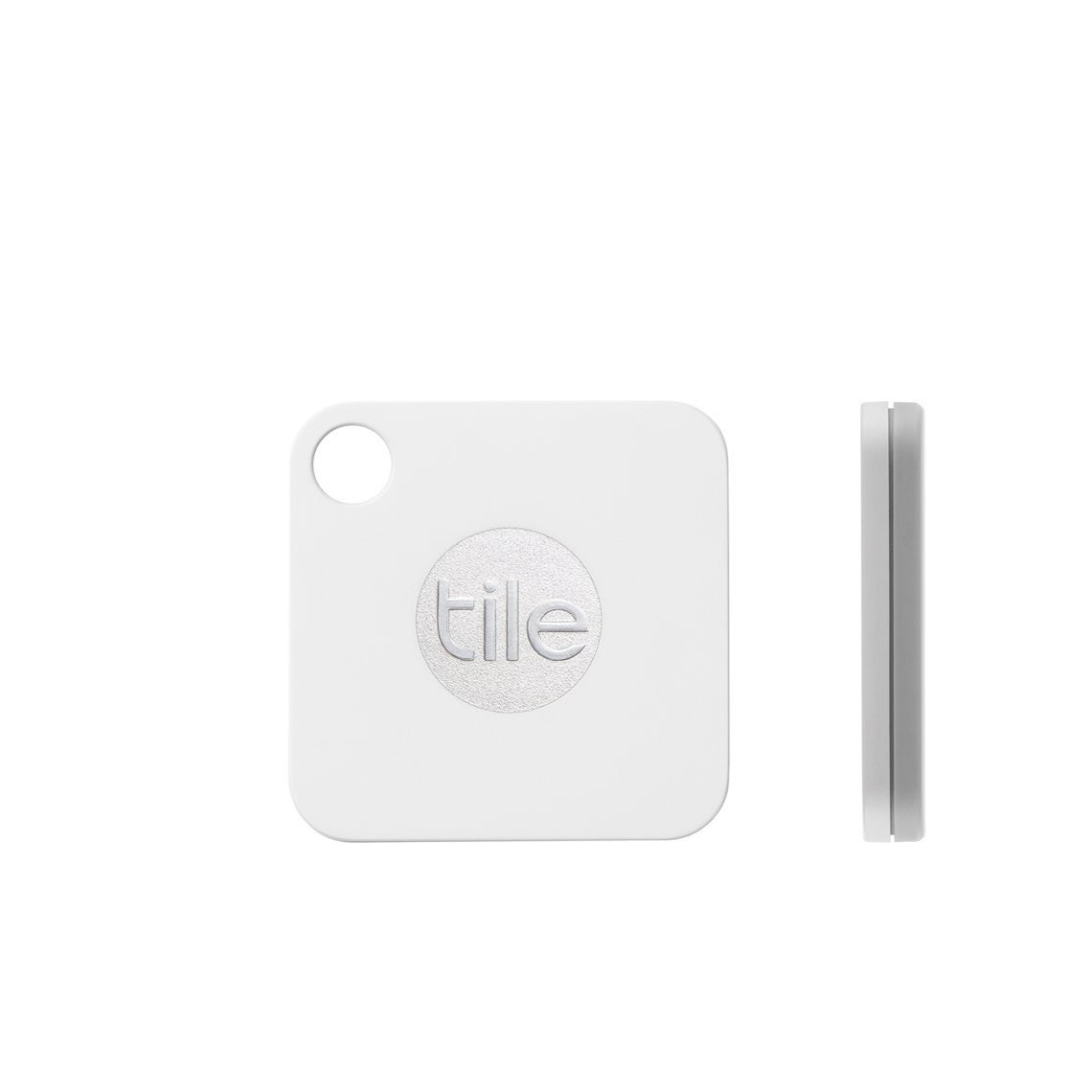
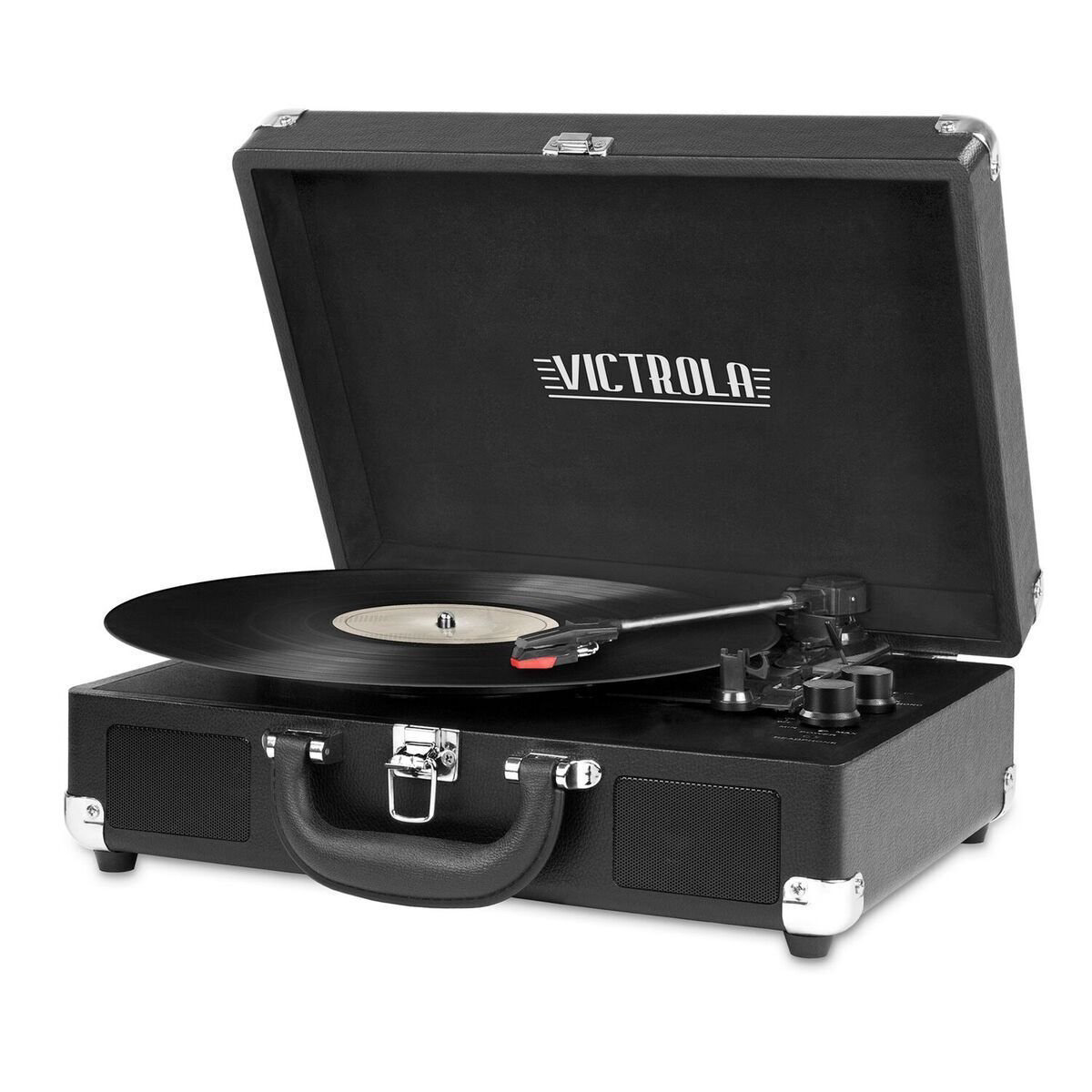
Figure 1. Package of received products to use into the game















Figure 2. Package of illustrations provided by Amazon.

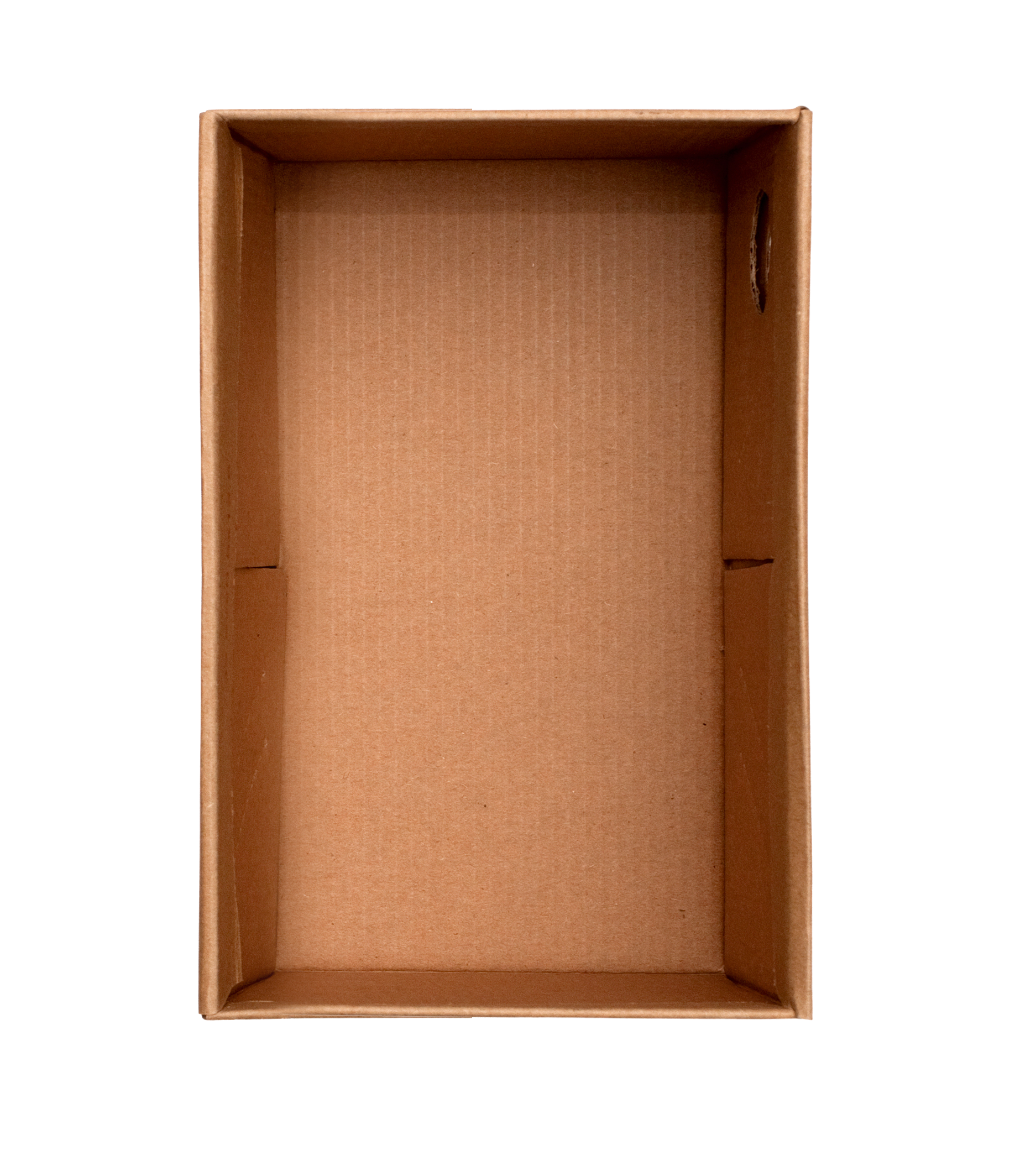

Figure 3. Amazon sent some box templates to integrate into the game.
BRAINSTORMING AND PROPOSAL
After gathering enough information from stakeholders and our users, we got together to evaluate options for the game. As the main goal was to sell those products, the game should be related to "uncover and highlight" them.
After some brainstorming sessions, we agreed to present a matching game where products come from different boxes, and the player has to memorize the place and find its pair.
After some brainstorming sessions, we agreed to present a matching game where products come from different boxes, and the player has to memorize the place and find its pair.
The challenge was to create an interface that allowed us to integrate the boxes with the products through a consistent and fun game experience.
I realized we couldn't use the boxes they sent as the products needed to come out of them as the different shapes and products proportions. That is why I started working on building a "wall" made of 3D boxes using and axonometric perspective. By doing that, we could increment the number of boxes stacking them without overlapping.
Figure 4. The sketch I draw to understand the logic of the needed structure to create a scalable grid of boxes and how the products will come out of them.
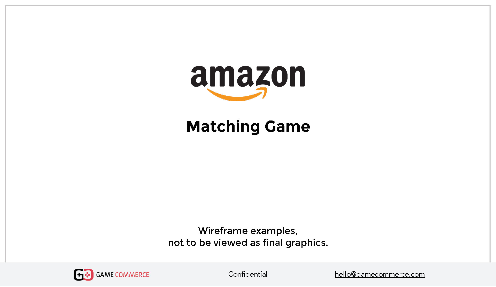
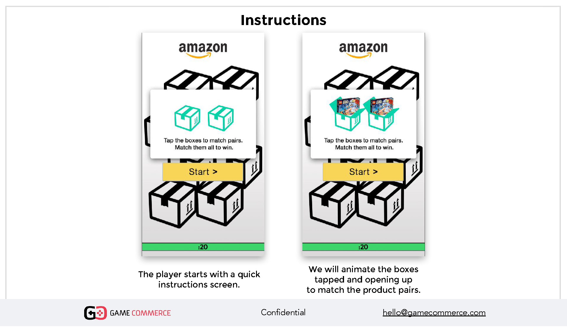
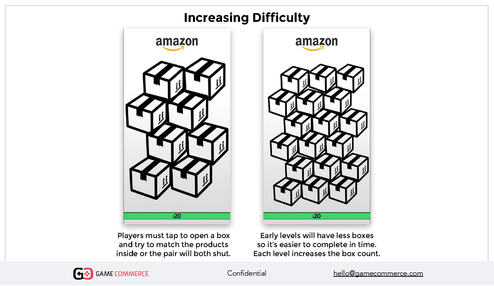
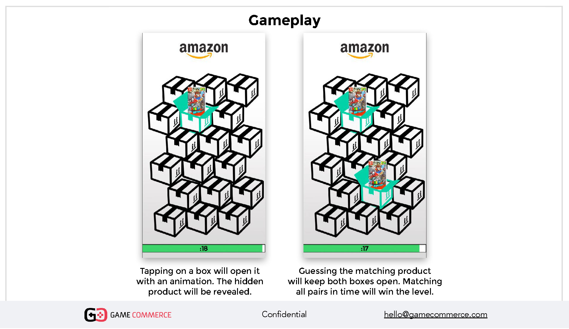
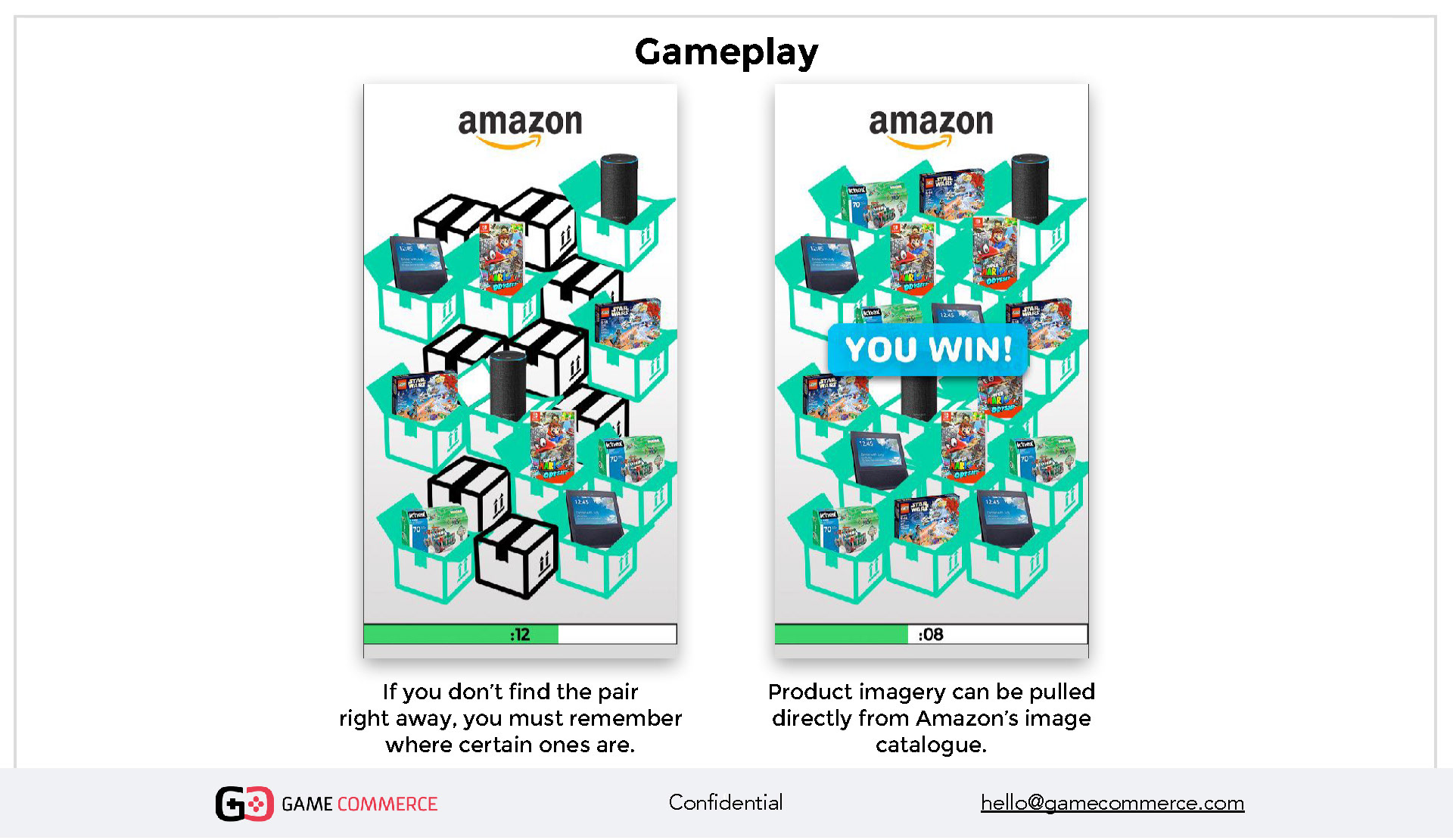
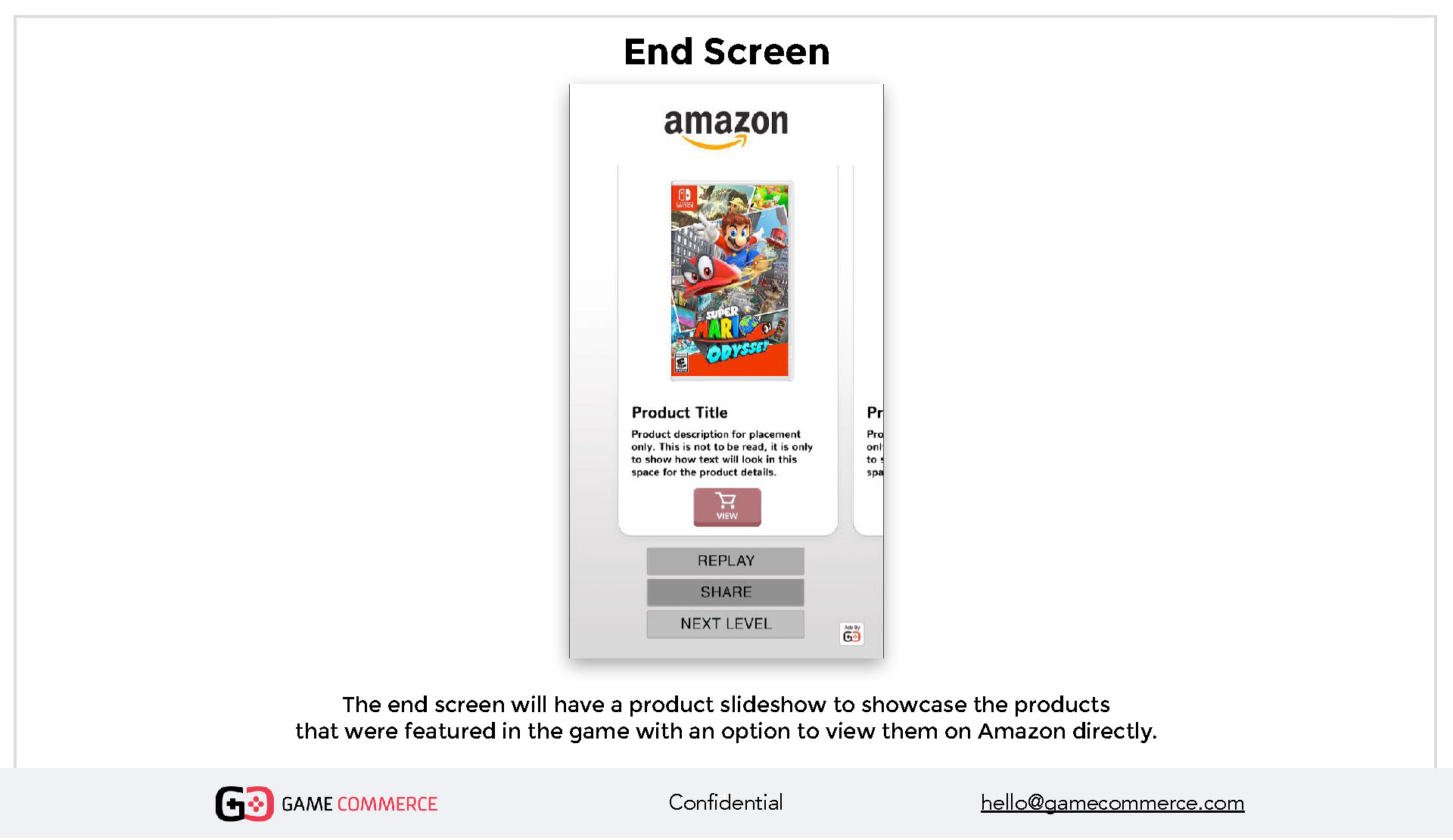
Figure 4. The original proposal for the Matching Game
DEFINING THE EXPERIENCE
It was vital for the project to understand the external and internal flows. Understanding the users' journey helped me create low-fidelity artifacts and an experience map to evaluate it holistically.
Once the idea was approved, and the flow set, I needed to define the interaction based on the sizes of the boxes related to a mobile screen. They needed to be big enough for an average finger to tap on them, even in the hardest levels where more boxes are added to contain more products.
I designed and animated the boxes from 2D illustrations and cardboard textures. Then came to my mind the idea to add Amazon emblematic smile at boxes sides as a way to reinforce its branding presence, it was a no brainer concept!
I designed and animated the boxes from 2D illustrations and cardboard textures. Then came to my mind the idea to add Amazon emblematic smile at boxes sides as a way to reinforce its branding presence, it was a no brainer concept!
Figure 5. From one template box, I created the stacks of boxes for all levels.
Figure 6. To create the opening-box visual effect, I built a frame-by-frame animation for the right and left flap to match the 3D box.
It’s important to understand that the experience needed to be a web-mobile game that always runs in a browser. This limitation defined the available space assuming many different proportions of smartphones.
I integrated Amazon branding guidelines, typefaces, and holiday assets to create a new experience integrating the company's flavor with a Christmas twist. Small interactions and animations as the snowflakes appearance help the users to understand achievement during the game.
Figure 7. To generate the Timer needed for the UI, I put together some of the icons received from Amazon.
DESIGNED TO SELL
If the player uncovers every pair on time, those products appear between levels to generate traffic to Amazon's website.
I defined a swipe left-right interaction to access the next product the player just unlocked by finishing the level on time. Users can access straight to the product page to buy it from the traditional and well-known style Amazon button.
I defined a swipe left-right interaction to access the next product the player just unlocked by finishing the level on time. Users can access straight to the product page to buy it from the traditional and well-known style Amazon button.
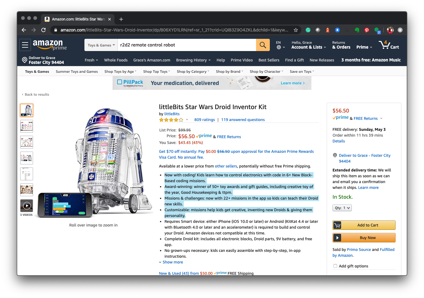
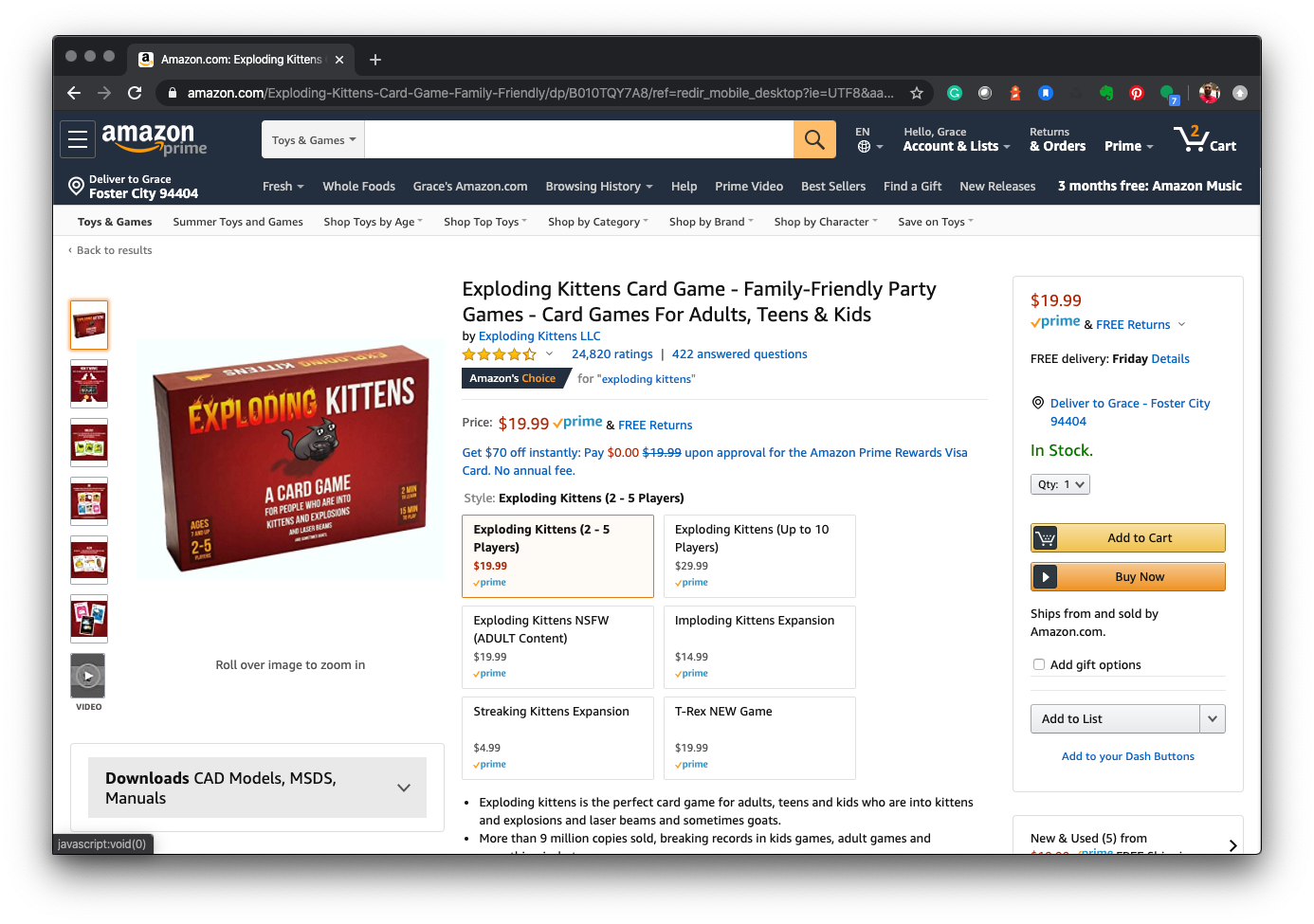
From the classic Amazon buttons, I created adapted versions to integrate with the game. The main goal is to make people feel familiar with Amazon's buying experience.
The result is a remarkably fun game
that amused both young and adults,
with a classic "Memory" flavor.
that amused both young and adults,
with a classic "Memory" flavor.
Team members
Andrew Jasper
Creative Director at GameCommerce
Creative Director at GameCommerce
Sudhir Subramanian
Software Engineer Lead at GameCommerce
Software Engineer Lead at GameCommerce


