Non-code software to run Machine Learning experiments
Samba Suite
for Sambanova Systems
(6:30 min read)
Picture yourself as one of the best-funded companies in Silicon Valley realizing that the cycle of selling enterprise hardware is too long and burns too much cash.
Then you realize that the way to create cash flow is to enter the SaaS market adding software on top of your hardware stack.
The problem is that even you have been around for some years and have a ton of money you lack of Product Design and no track record of building enterprise software.
ROLE:
Team Lead -
Sr. Principal Product Designer
UI/UX
Product Strategy
User Research
Team Lead -
Sr. Principal Product Designer
UI/UX
Product Strategy
User Research
SCOPE:
14 Months
14 Months
PLATFORM:
Desktop
Desktop
TOOLS:
Figma
Adobe Creative Suite
Figma
Adobe Creative Suite
TEAM:
Six person
Six person
MARKET :
B2B SaaS
B2B SaaS
INDUSTRY:
AI/ML
AI/ML
INTRODUCTION
SambaNova is working to create an AI platform for businesses. The company targets companies that want to integrate sophisticated AI systems into their business yet lack the resources to develop and maintain in-house Data Science teams.
It was April 2021, and after raising $676M at a $5.1B valuation and four years of uninterrupted growth, SambaNova Systems decided it was time to expand its offer beyond hardware, creating their first software to run Machine Learning experiments, as even with this funding round, their runaway has an expiration date.
It was April 2021, and after raising $676M at a $5.1B valuation and four years of uninterrupted growth, SambaNova Systems decided it was time to expand its offer beyond hardware, creating their first software to run Machine Learning experiments, as even with this funding round, their runaway has an expiration date.
SambaNova's original offer was based on hardware deployment for Machine Learning.
THE TOUGH STARTING POINT
The company had a foundational hardware focus from its inception, and its teams didn't have software development experience. At that point, they decided to bring the first product designer to lead the effort to create DaaS (Data-flow-as-a-Service) software from scratch.
I was recruited in Q3 of 2021 and joined the company in October based on my previous experiences solving high-end complex problems and creating big-impact solutions.
I was recruited in Q3 of 2021 and joined the company in October based on my previous experiences solving high-end complex problems and creating big-impact solutions.
From the beginning, it was clear that to satisfy the company's potential users, I needed to understand first who they were, their needs, and their goals to create solutions specifically for them. I was introduced to some preliminary drafts of the concept for building a platform that can run ML projects on the fly with a no-code approach. It's important to say that the standard of the market is to do these experiments through CLI (command line interface) commands, so the users are not only Machine Learning and Data Scientist experts but also professionals who have advanced coding skills to develop their daily tasks using languages like Pytorch or R.
The goal was to create a platform that could replicate traditional ML flows and processes without a single line of code, expanding the number of potential users from thousands to millions.
The platform's must-have feature is the capability to run Machine Learning Computer Vision and Natural Language Process (NLP) jobs without having deep experience in the space.
The challenge from a UX perspective was replicating extremely complex code-based tasks more efficiently by an intuitive GUI.
The challenge from a UX perspective was replicating extremely complex code-based tasks more efficiently by an intuitive GUI.
RESEARCH
Right out of the gate, I faced multiple obstacles, like no process for building software, at a company with a very hard-core engineering culture. Even though I had the green light to utilize any available resource, I didn't even know who I needed to talk to. It's fair to say that I started from square zero in terms of any kind of knowledge of Artificial Intelligence or Machine Learning.
"I must admit that in the beginning, it was very messy, with no processes in place and no design culture to refer to. But slowly, and listening a lot to everybody around me, I was able to start moving one step at a time, even if that next step would take me two steps back for course correction."
Sergio Smirnoff
After finding the right people to go after, I started a series of qualitative research studies with internal stakeholders to understand the market and users' needs. The ultimate goal was to identify User Personas, their goals, and pain points to define the must-have features for an initial release building a specific product for them.
To understand the different layers of information and how they are interconnected, I created a Product Design Strategy Map, where every voice and insight is located based on its relevance and relationships.
The research was divided into stages using different methods and targeting people in critical positions on these layers from a user-operational and business standpoint. I embarked on the task of validating and aligning every stakeholder under the same vision from the company and product go-to-market strategies, to the target market, and verticals to the final users, understanding how each layer of information should impact the product itself and at what level.
Interviews and research methodologies
• Card sorting for flow definition
• A/B testing for fonts and light-dark mode definition
• Usability tests for UI/UX validation
• Walkthroughs for intuitiveness validation and feedback gathering
• UX/UI competitive analysis
• Visual cultural references (gaming - sci-fi films)
• Interviews for:
- market/verticals requirements
- company go-to-market strategy
- product go-to-market strategy
- company's external messaging
- company's branding concept and visual definition
- external messaging
- persona definition
- insights detection
Some of the questions for the Usability Test Survey
1- What is your role?
2- What is your background and experience?
3- How many years of experience in Machine Learning do you have?
4- Is this the first time you are using the product? How much training do you have to use it?
5- Do you think the product follows specific branding guidelines?
6- Does the product look and feel align with the company style?
7- Do you think it should follow specific principles? Which ones?
8- Do you think it is hard to use? 1-5 rank
9- Do you think the interface is intuitive? 1-5 rank
10- Rank UI, UX, intuitiveness, flow, color use, information architecture
11- Choose the best words to describe the User Interface:
Clean - overloaded - intuitive - complex
12- Do you think a new customer/user would need a lot of training to use it?
13- Do you have any suggestions or missing elements?
Color low-fi A/B testing, Competitive analysis, and film GUI references
UNDERSTANDING THE USERS
I defined experience maps, low-fidelity artifacts, and the initial workflow, which data scientists in card-sorting research validated to confirm their working methods.
Whiteboarding session to define the workflow.
After gathering multiple stakeholder insights, different personas were identified, also enterprise readiness and requirements for different industries and verticals were identified.
I defined AI/ML alignment in terms of wording and best practices.
THE PROCESS
When I joined SambaNova Systems they had created some very early-stage flows, UI and UX. Even after the research, the findings validated some of the assumptions, the flows, and the Information Architecture required a full restructuration.
Early stage wireframes and flows I received when joining the company.
From the interviews with the C-Suite, I learned there were going to be other products and projects that would require UI. With that in mind, I decided to create a Design System with Master Components to standardize screen development to have cohesiveness between products and to speed up the process. The Company marketing GTM (go-to-market) strategy was to project a unique look and feel for every asset and my task was to balance that visual style at the product level incorporating the company's visual style into the products. The critical part was to define which elements from the Branding Guidelines were able to be applied and which ones required a product design approach, like fonts and color palette application.
I grew this Design System from basic elements to a complex library of components and rules for building software. From color applications to different hierarchies of buttons, inputs, dropdowns, and selectors, to responsive breakpoints and rules for creating screens and flows; I put together all kinds of scenarios and options for junior designers and front-end engineers.
I built seamless experiences almost without any supervision and just a final design QA review.
THE TYPEFACE SELECTION
The initial idea was to utilize the company fonts used for branding and marketing assets: Century Gothic and Avant-Garde. The alignment with Branding was to add "fresh air" to SambaNova's look and feel through the flagship product, and these fonts are very 80s and 90s-like style. Also, they are not the best option for screen-digital use as they were created many years ago, even before monitors even existed.
I began the search to find a unique font that could be used through Google fonts license, screen-first, and with a monospace variable as a way to bring a "technical-computing-style" flavor to display data.
To find the best options and present them to the Branding and Marketing team, I created a typeface report to evaluate and compare possible options for the Product.
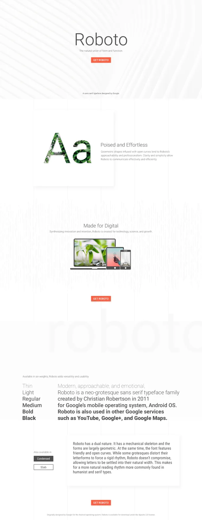

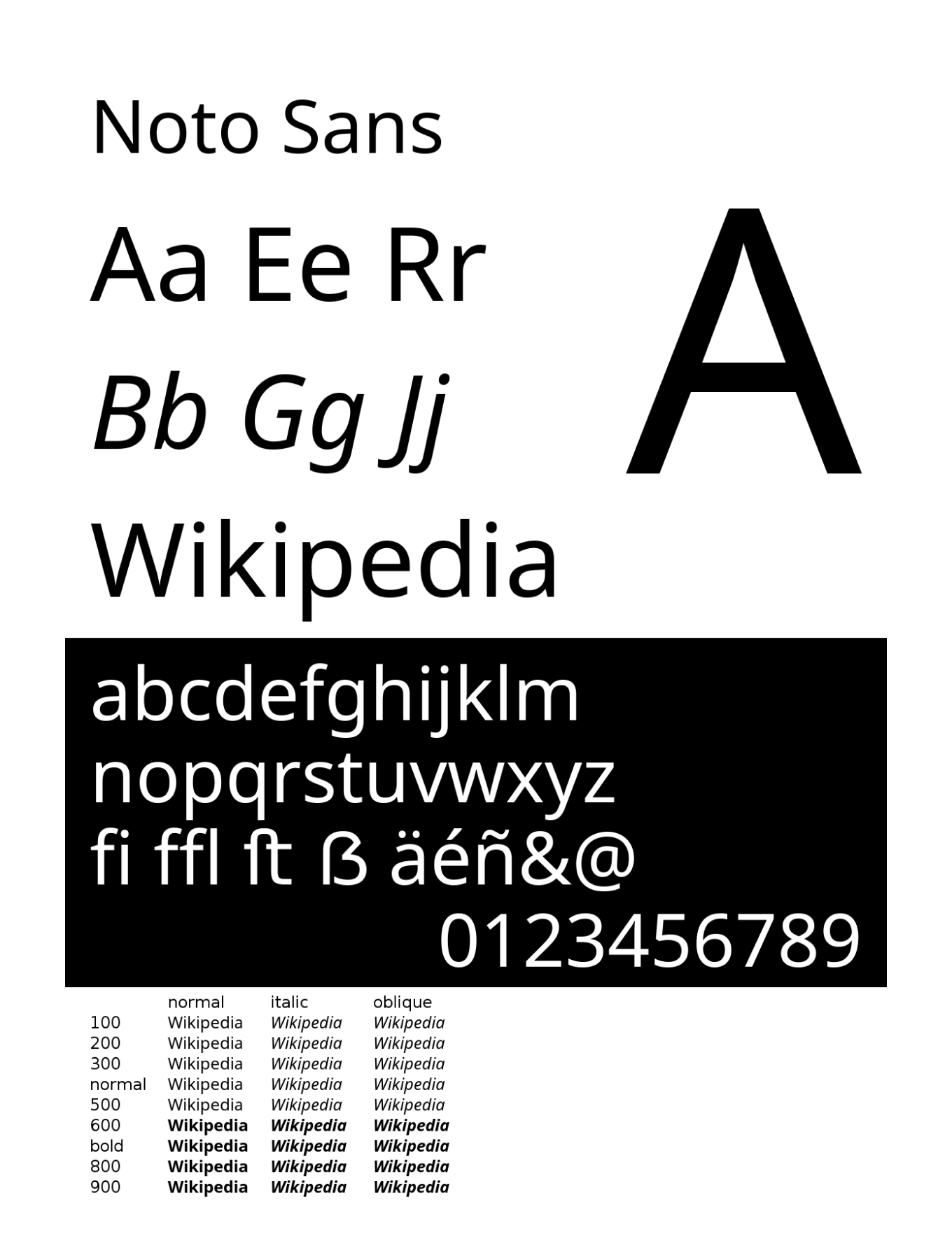


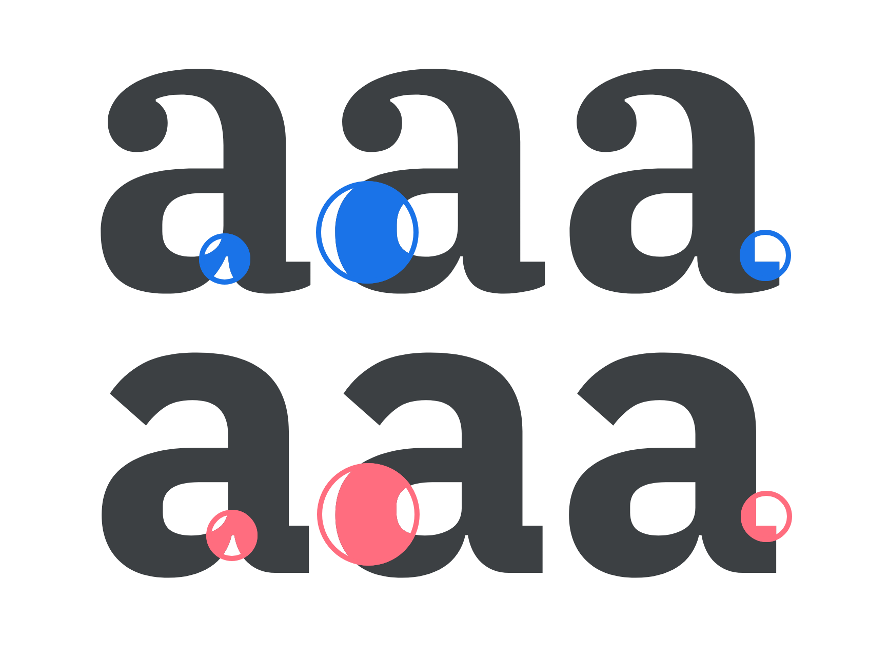
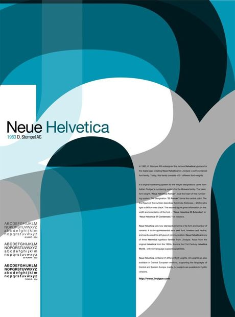
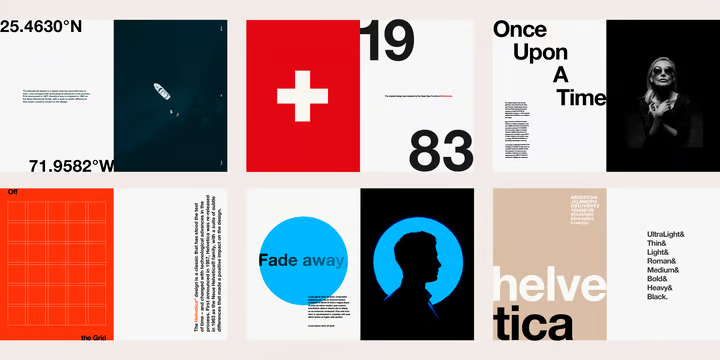
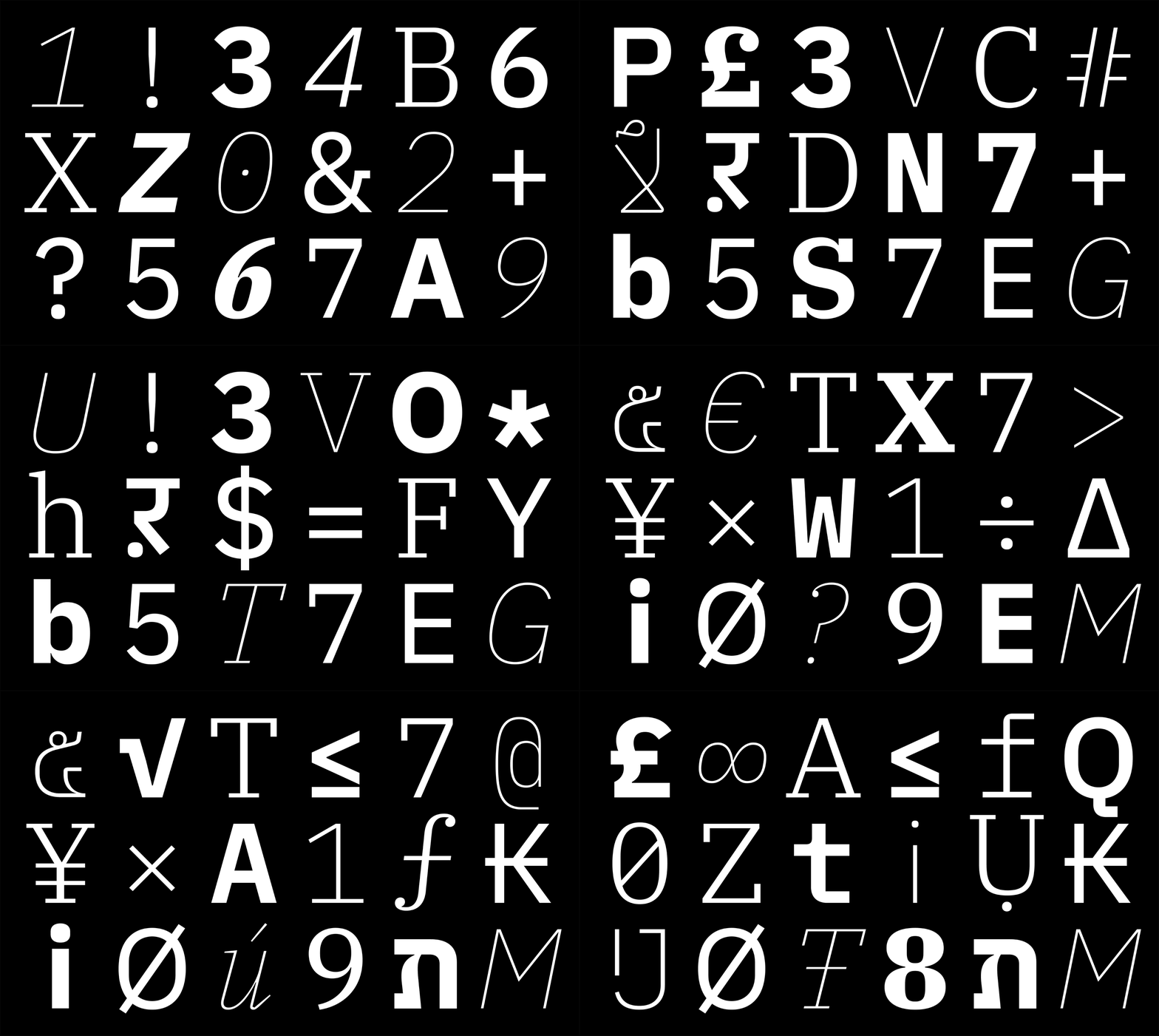


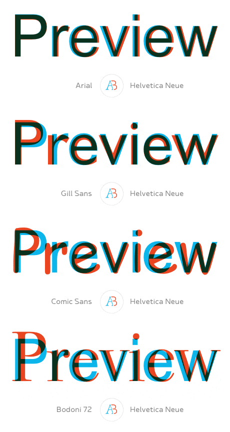
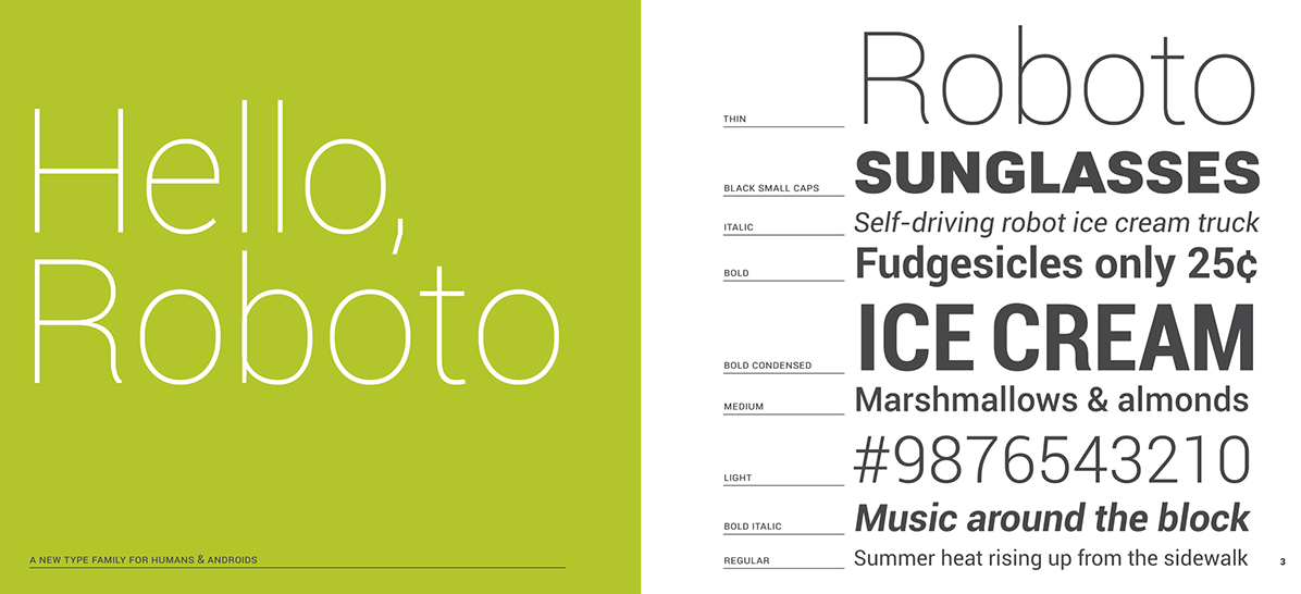
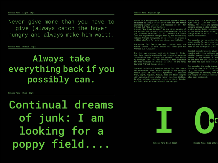
After carefully reviewing and evaluating the pros and cons, the decision was to move forward with Roboto for the number of available variables, performance, readability in small sizes, and the option to use Roboto Mono for data visualization.
THE DESIGN SYSTEM
To deliver complex enterprise-level software on a tight schedule I started from Material Design UI to speed up the interface definition. From there I created new components and tuned MUI elements to match the needs and style I defined for the company's software.
I created the first version of the SambaNova Design System in Figma with Master Components defining specifications and implementation resources.
A couple of pages from SambaNova's Design System. They are organized by categories like Color, Typefaces, Buttons, Interactive elements, Inputs, Menus, Selections, Tables, Cards, etc.
THE SOLUTION
Understanding the pain points and users' needs was the key step for creating a solution where not-very-skilled operators can run Machine Learning processes most intuitively.
After aligning Branding, Marketing, and Product behind a cohesive and unified experience across every channel I created an extremely clean seamless, delightful, and beautiful experience that was tested and validated by Data Scientists using interactive prototypes I created in Figma.
After just a 2-minute explanation about the Information Architecture of the platform, the participants of these tests were able to run ML jobs without any kind of supervision or previous training achieving an exponential reduction in their workload and time allocation for achieving the same tasks using CLI (command line interface).
The result is a very clean and intuitive no-code platform,
where users can execute the most complex ML work.
where users can execute the most complex ML work.
SambaStudio was released in February of 2023 after less than a year of development from 0-1.
Samba Suite release video
Team members
Azadeh Riahi
Product Manager
Product Manager
Shuya Zhan
Product Designer
Product Designer
Rajesh Ottikunta
Front End - Software Engineer
Front End - Software Engineer
Kenneth Huang
Front End - Software Engineer
Front End - Software Engineer
Bill Bain
Content Strategist
Content Strategist
