- 2019 -
APP DESIGN FOR RedLINES
APP DESIGN FOR RedLINES
How I went from Founder to Head of Product and back...everyday
My dream has always been to fund a startup in Silicon Valley. So, I did it as soon as I arrived in the Valley. I used to wear multiple hats coming for a very tough market in Argentina, where I even did business development, tackling all branding, product marketing, and, of course, product design didn't seem a big deal.
The real challenge was to take ownership of the rest of the leadership responsibilities, such as defining the product strategy, seeking investment, putting a team together, and dealing with vendors. But the hardest one was to realize that without a product that somebody is willing to pay for (or use), nothing else matters, even if you have the best-in-class design.
ROLE:
Product Strategy and Ideation
Product Management
Lead Designer, UI/UX,
Visual Designer
Product Strategy and Ideation
Product Management
Lead Designer, UI/UX,
Visual Designer
SCOPE:
Two years project
Two years project
PLATFORM:
Mobile App and Desktop
Mobile App and Desktop
TOOLS:
Invision - Sketch
Adobe Photoshop - Illustrator
Adobe Animate
Trello
Invision - Sketch
Adobe Photoshop - Illustrator
Adobe Animate
Trello
TEAM:
Ten person
Ten person
MARKET-SPACE:
B2B2C SaaS - Social, Networking
B2B2C SaaS - Social, Networking
The Process
BUILDING A PRODUCT FROM SCRATCH
RedLINES is an Artificial Intelligence networking platform to share contact information between smartphones and remotely, keeps everything updated, receives intros, and laser target suggestions from advertisers based on matched interests from multi-social media feed voice notes and keywords.
As one of RedLINES Co-Founders, my value for the team was to add all my experience as a Visual and Product Designer to create everything related to the Communication Strategies, Branding, and Product Development. From the idea to the final product, end-to-end.
My job as a Design Lead and Product Manager was to research and user interviews to define the architecture of the App, workflow, and User Experience. As I was also in charge of the company’s branding and communication strategy, I needed to dig deep into the startup concept to create a very related visual image that could apply to the UI as a system. I defined the color palette, font styles, and visual elements, used for both marketing assets and the User Interface.
"What would happen if everybody is
on everyone's network...?"
on everyone's network...?"
SUPPORTED BY A MILLENARY HISTORY
The Red Strings of Fate is a Far Eastern myth that tells everyone's finger is tied to this mythical red string that will lead him or her to another person with whom they will make history. The cord can stretch but never cut if you meant to connect with somebody.
The team felt this is what networking is all about.
Building on top of this strong foundation was inspiring as there was always a way to reference this concept creating a powerful but poetic message behind every asset we created. That's why the red was, for sure, the primary color aligned with an immaculate aesthetic visual image. Lines and round corners support this human and organic connection.
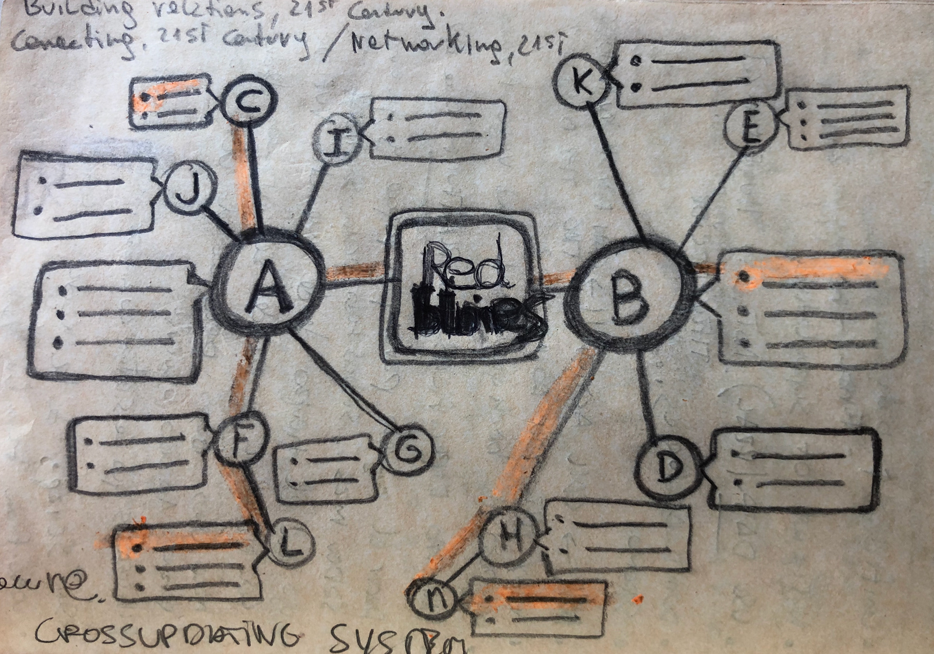
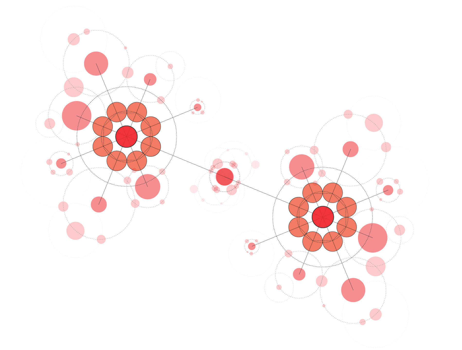
Figure 1. First draft working around the 1st, 2nd, and 3rd degree of Connections in a Network. User A connects with B, so then J can connect with B. Finally L can connect with B and eventually with D through the RedLINES' Artificial Intelligence engine.
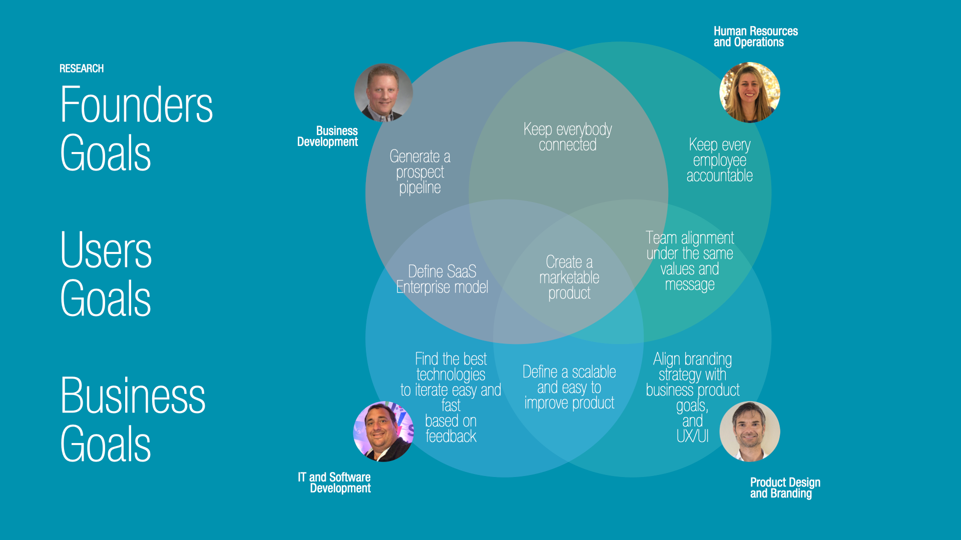
Research
BUSINESS GOALS
My first job was to gather together every team member's perspective, point of view, and experience to nourish the product. My business development experience helped me understand the best approach from a market perspective, not to get trapped on just fancy features, but real strategic oriented goals.
After several brainstorming sessions, the team agreed on the first goals: Spread the App's voice, generating more Sign-ups to achieve a certain critical mass of users. As a new product in the market, the Founders took an approach of testing and growth.
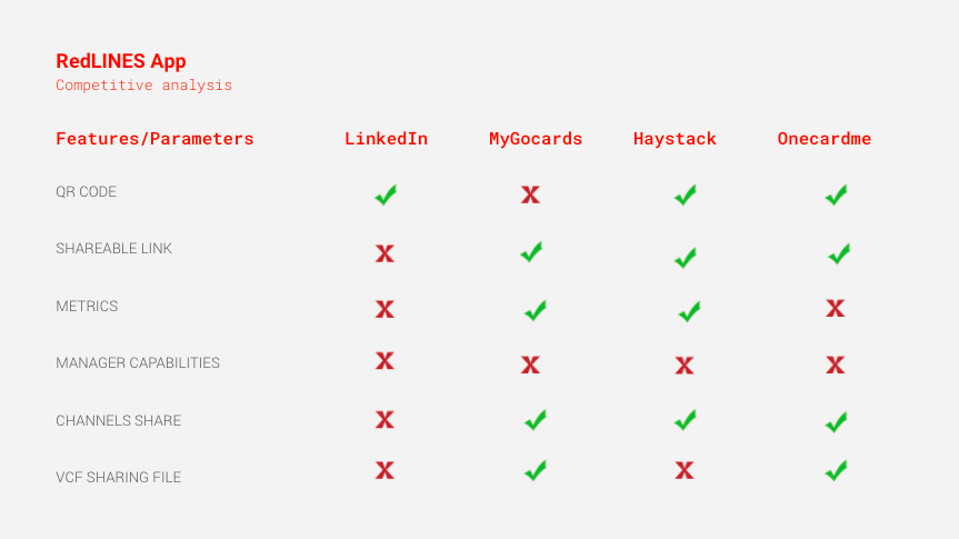
COMPETITIVE ANALYSIS
To better understand the landscape and identify the gaps in the market, I ran an evaluation of the potential competitors.
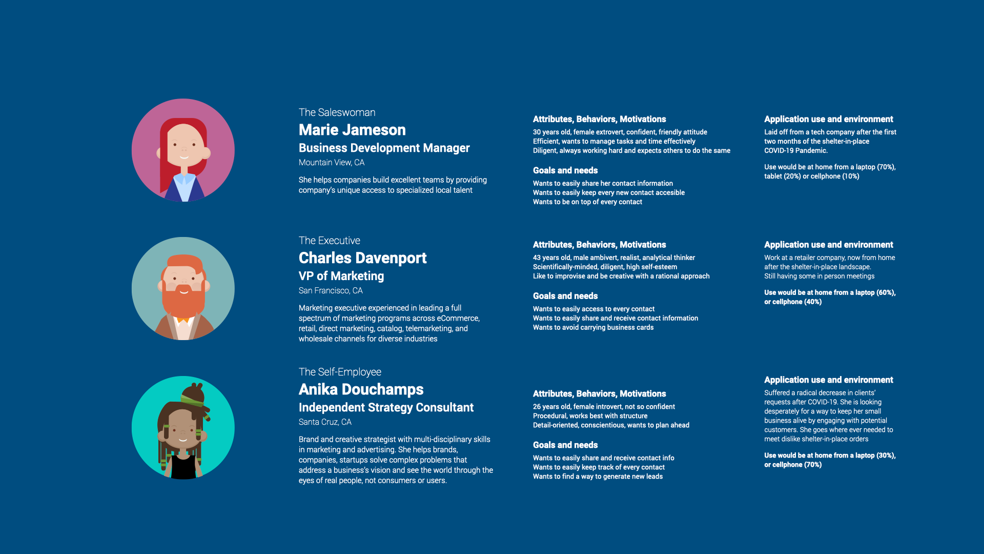
PERSONA CREATION
1. To create an easy-to-use flow to help people share contacts in the least amount of possible interactions.
2. Align the experience with a real exchange or sharing of contact information using physic printed business cards.
2. Align the experience with a real exchange or sharing of contact information using physic printed business cards.
DESIGN - INTERACTION GOALS
1. To create an easy-to-use flow to help people share contacts in the least amount of possible interactions.
2. Align the experience with a real exchange or sharing of contact information using physic printed business cards.
2. Align the experience with a real exchange or sharing of contact information using physic printed business cards.
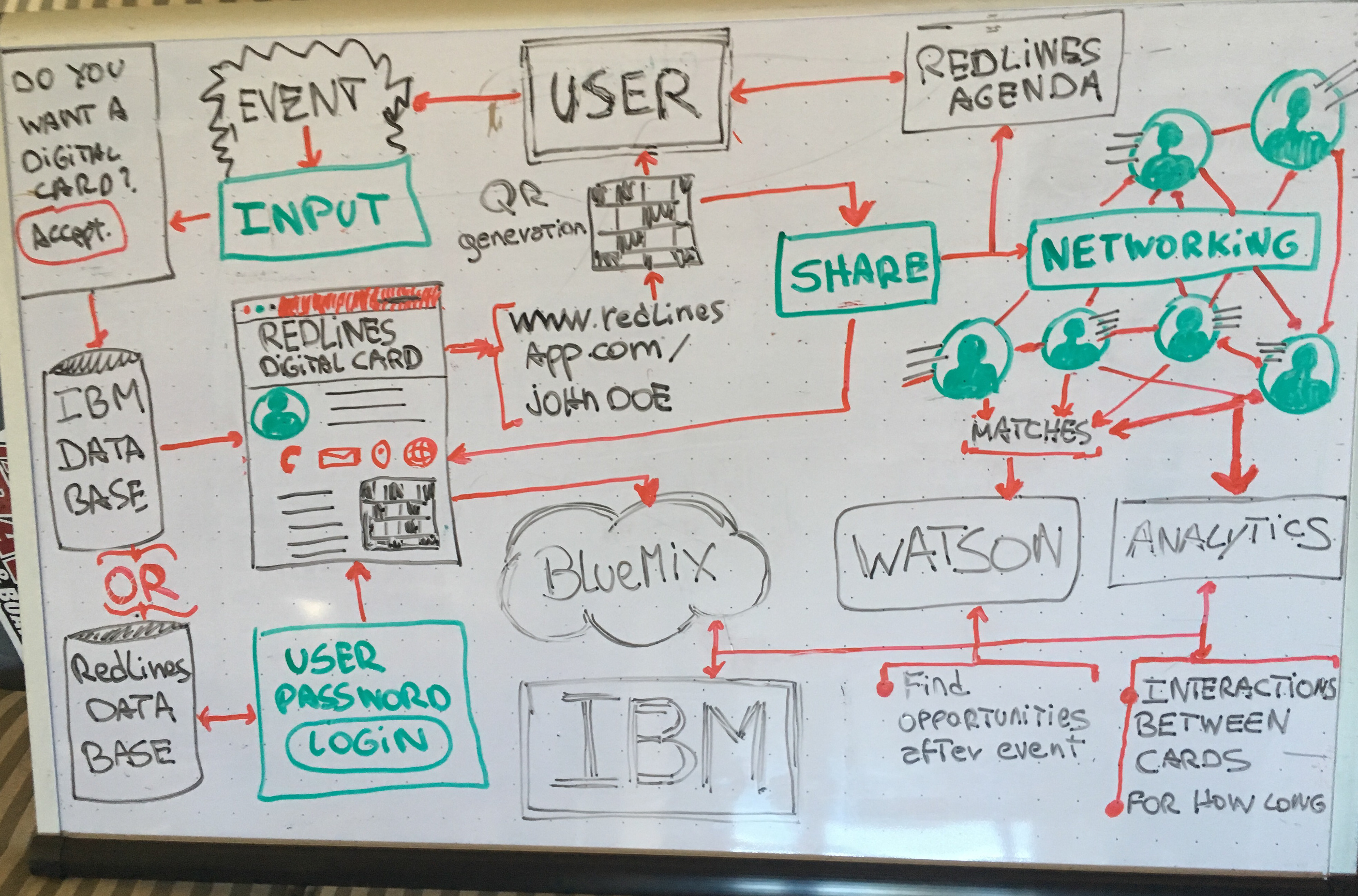
Figure 2. The Information Architecture and Infrastructure
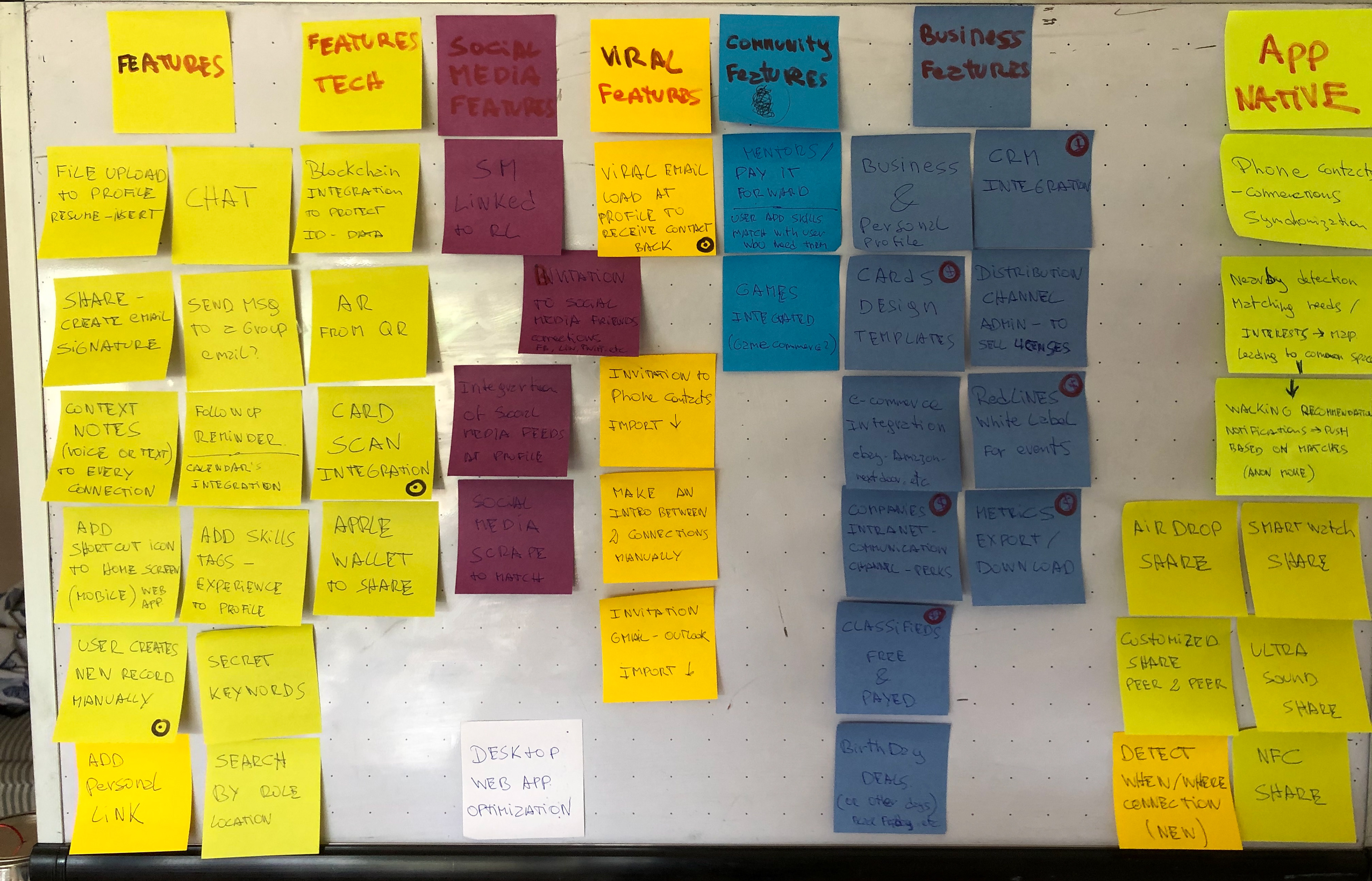
Figure 3. Once the team defined the business goals, I needed to clarify the features and integrations to deploy at different stages—whiteboard with features ideas.
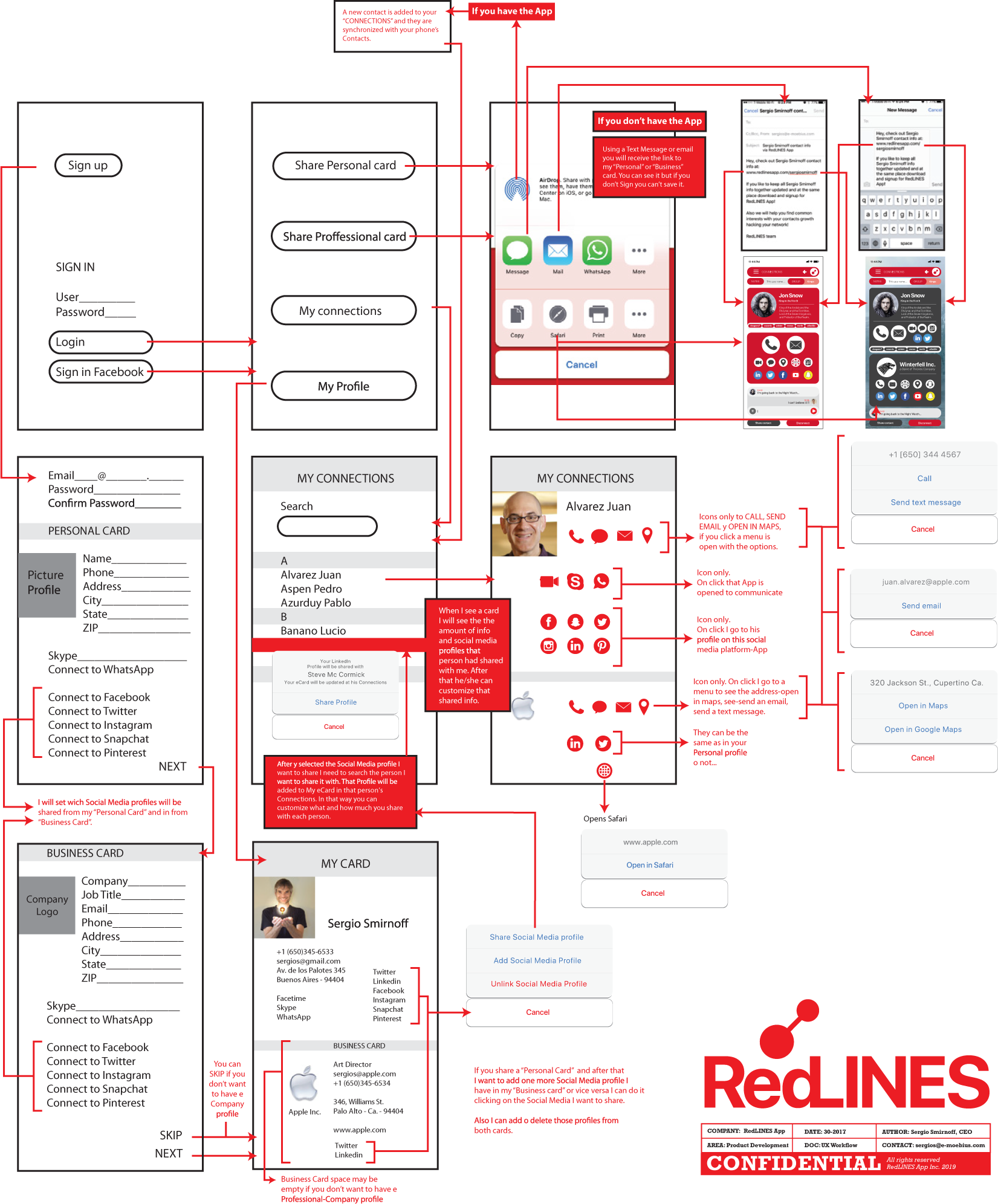
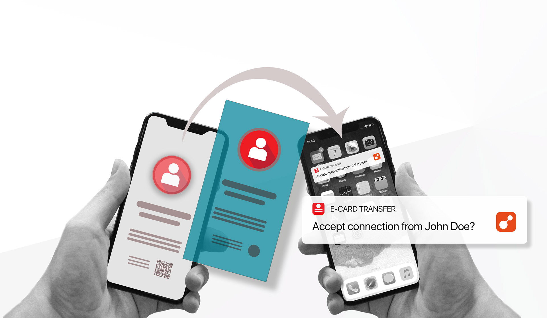
Figure 2. First wireframes, New User, Complete Profile, Share Personal, or Business eCard flow.
INDUCTING THE PHYSICAL WORLD INTO THE DIGITAL
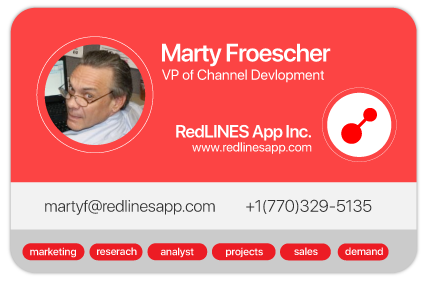
As a human behavior change, the main idea was to create a smooth shift from paper business cards to digital ones. As part of this transition, I worked towards a UI with a visual reference to a physic card. So I used specific proportions, levels of information, and shapes from real paper cards to create a “familiar” UI.
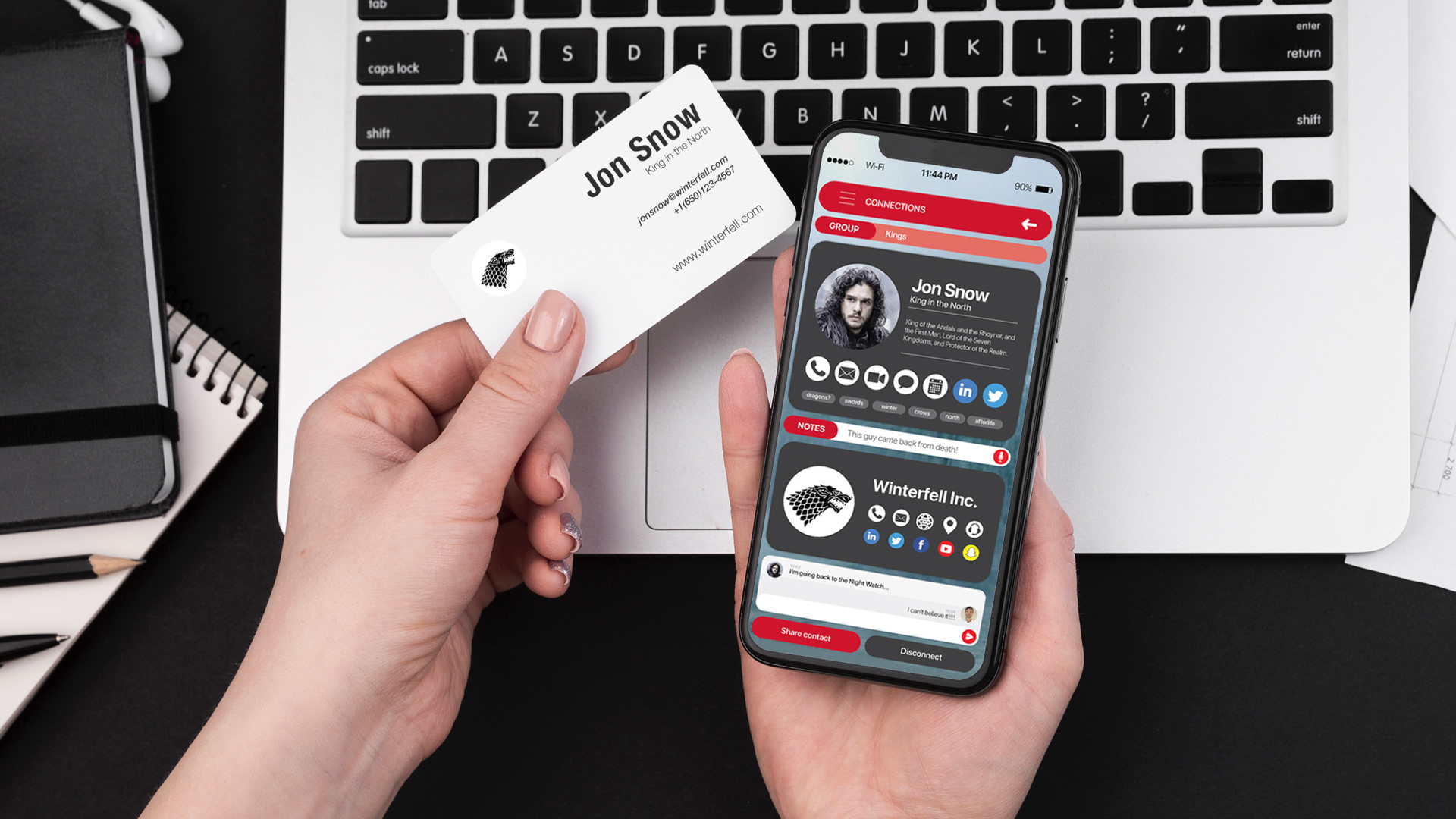
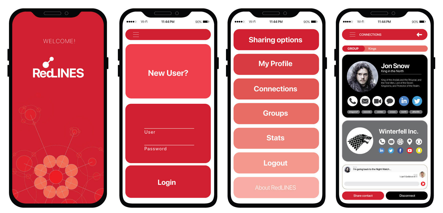
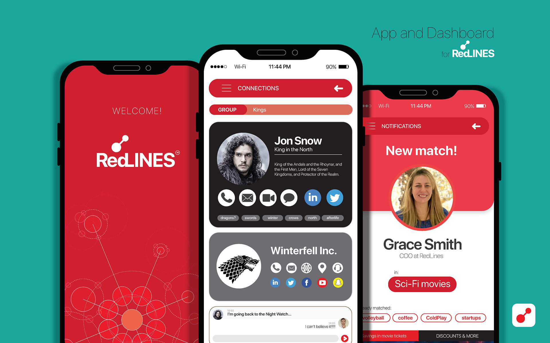
Figure 4. Welcome, Sign / Login, Menu, and Profile Screens.
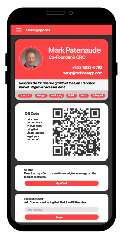
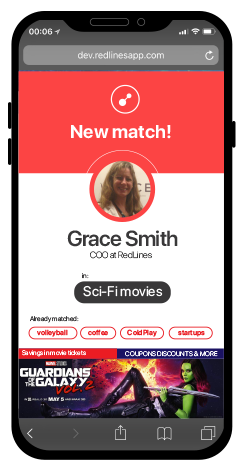

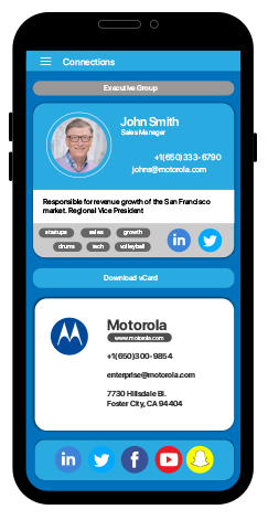
Figure 5. Sharing Contact Information, User Match, and Premium Profile.
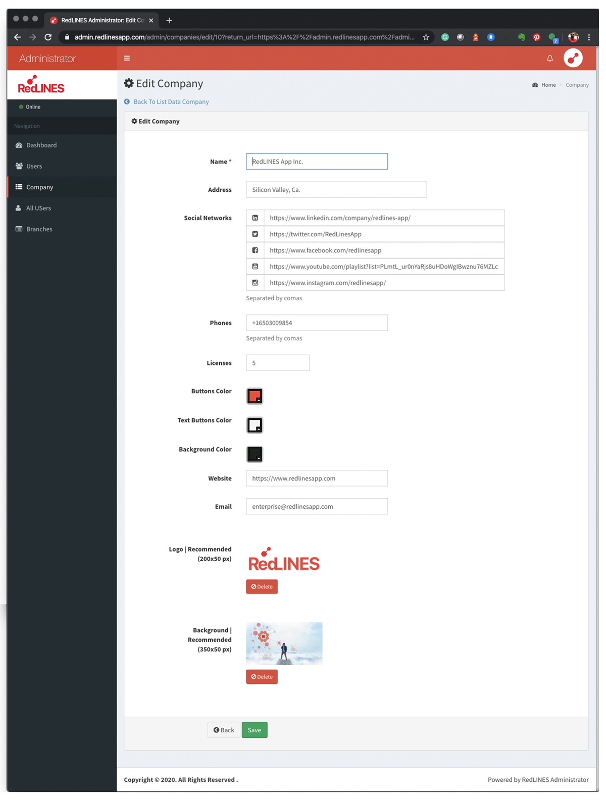
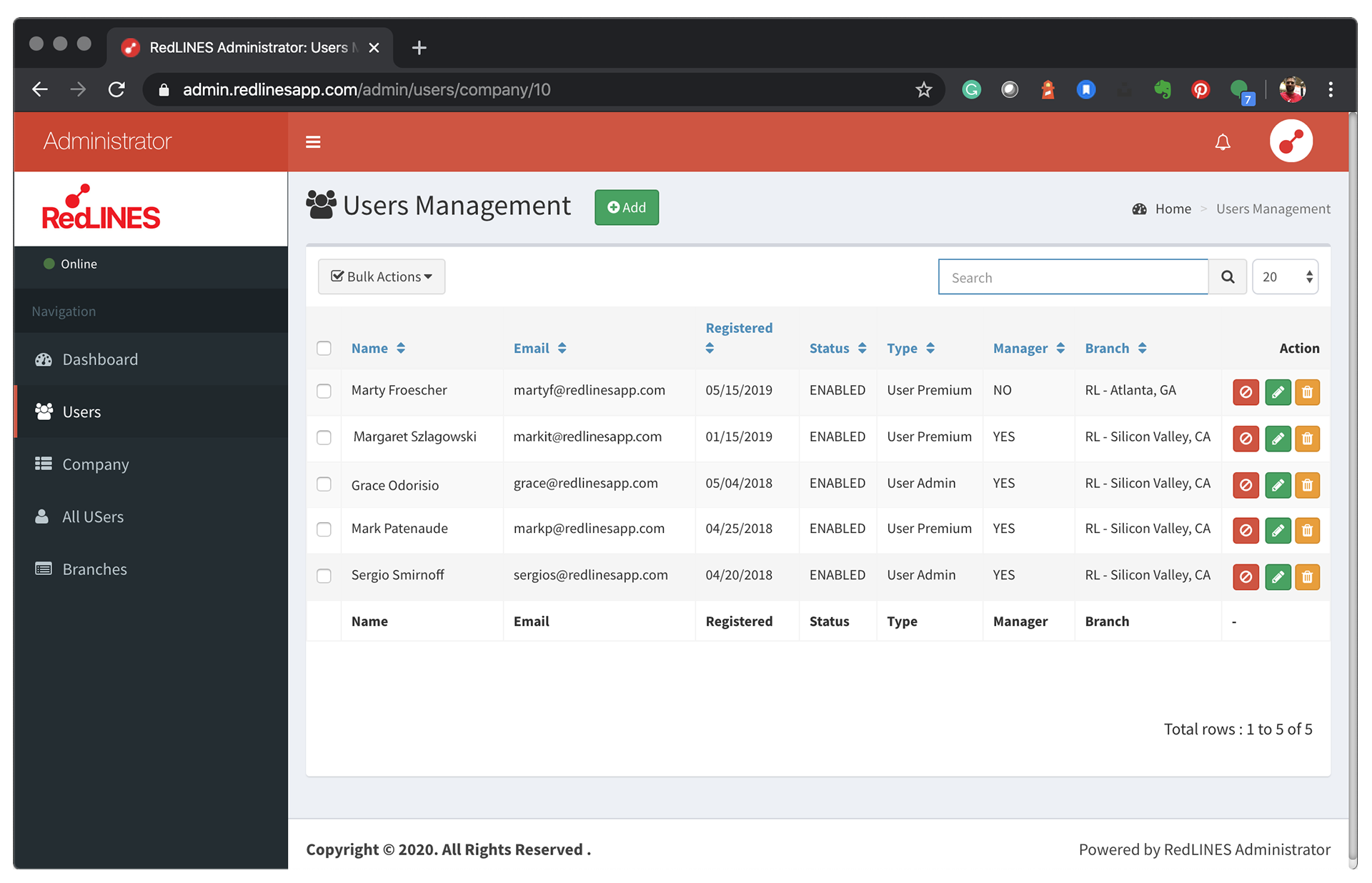
ADMINISTRATION DASHBOARD
We created an Administration Dashboard to let the Managers edit every aspect of their Company and employee profiles. Even the decision was starting from a framework to create it; my job was to visually relate to the rest of the application working in the white spaces, text hierarchies, and the Information Architecture.
An essential part of the application is the metrics section. It brings a whole new dimension of information and insights for the sales and marketing teams as never before. My job was to identify the critical markers between the personal and the company statistics and make them easy to highlight to differentiate one to each other.
I worked side by side with the dev team to make metrics easy to access and clear to navigate to bring transparency to those metrics on mobile.
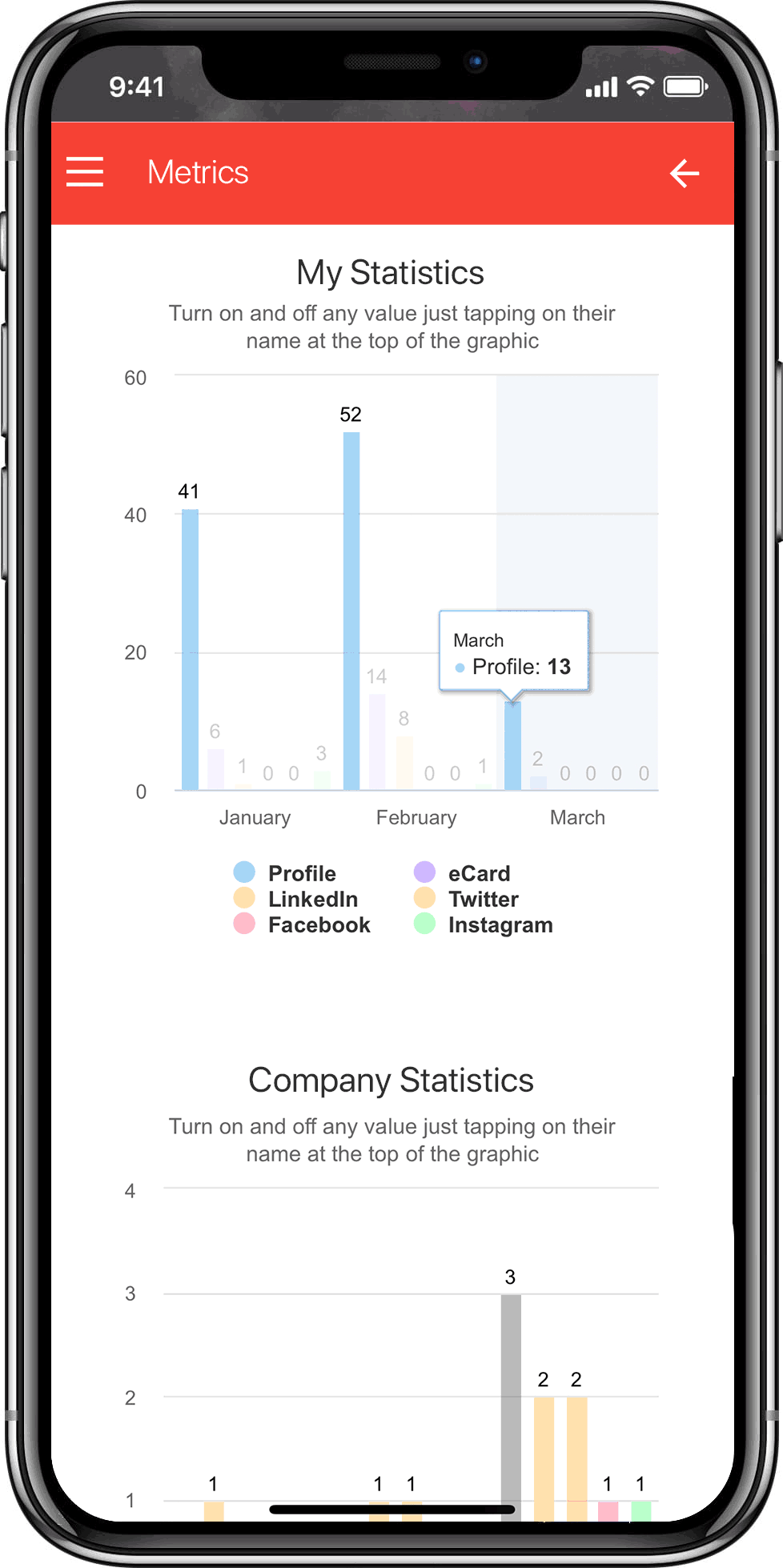
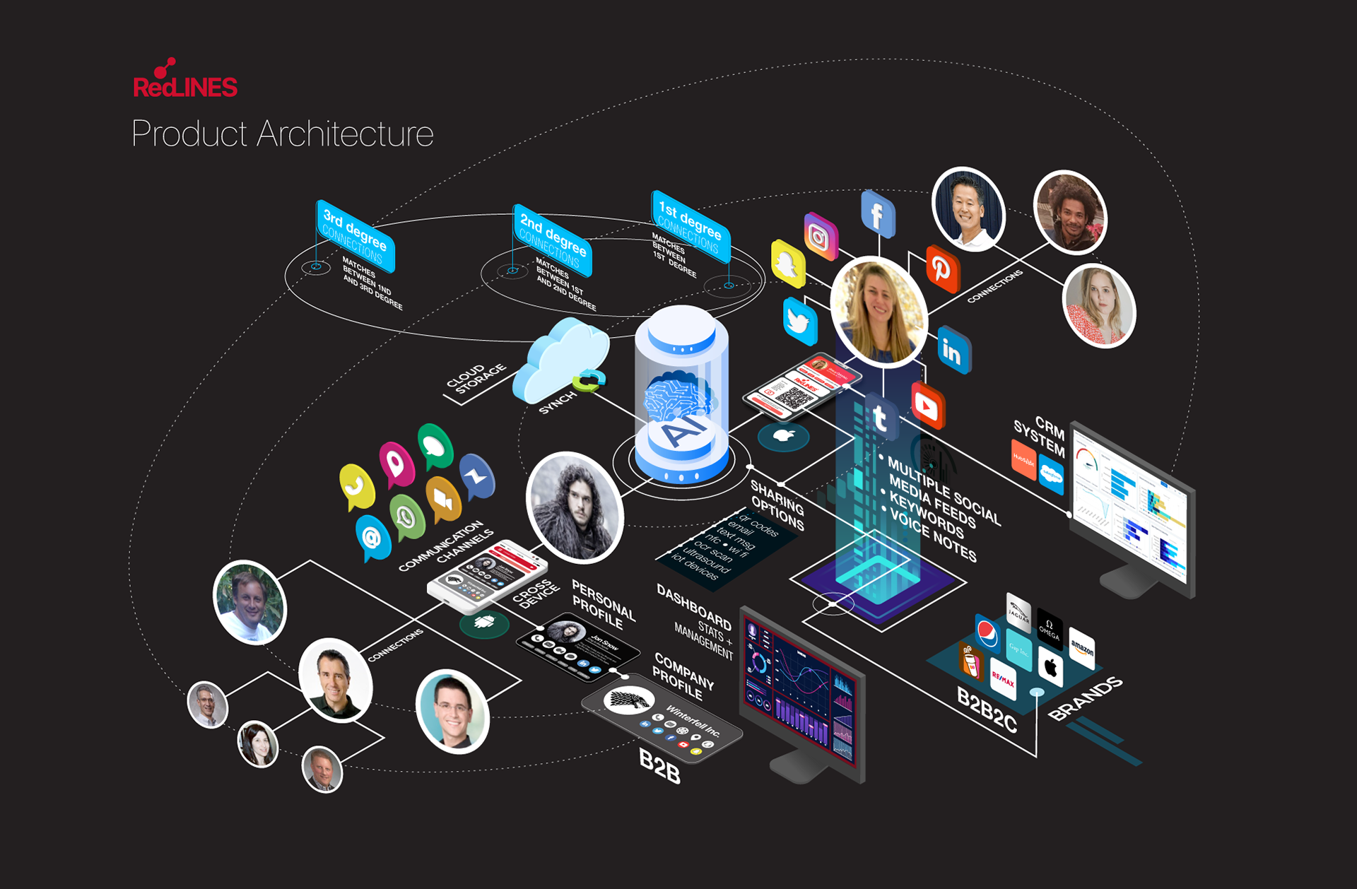
Figure 6. For a better understanding of the Product's architecture, I created infographics style flows, which I also used to generate animations.
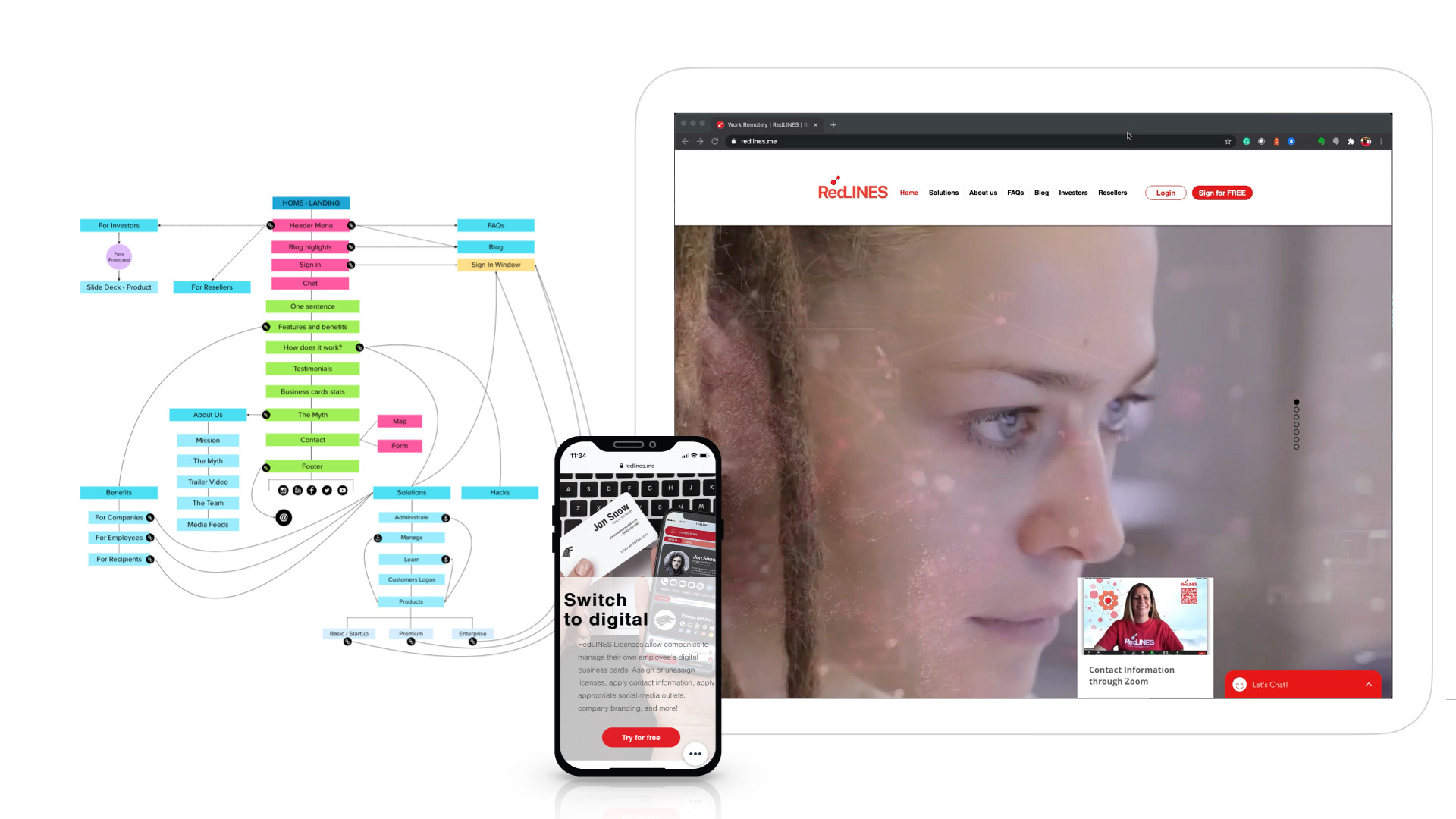
I designed the website that completed the whole system. It was a responsive landing page that followed the color palette and typography style. I used white spaces and plane color backgrounds to create impact.
I executed a holistic approach to help customers and prospects navigate all the available content to achieve RedLINES business goals.
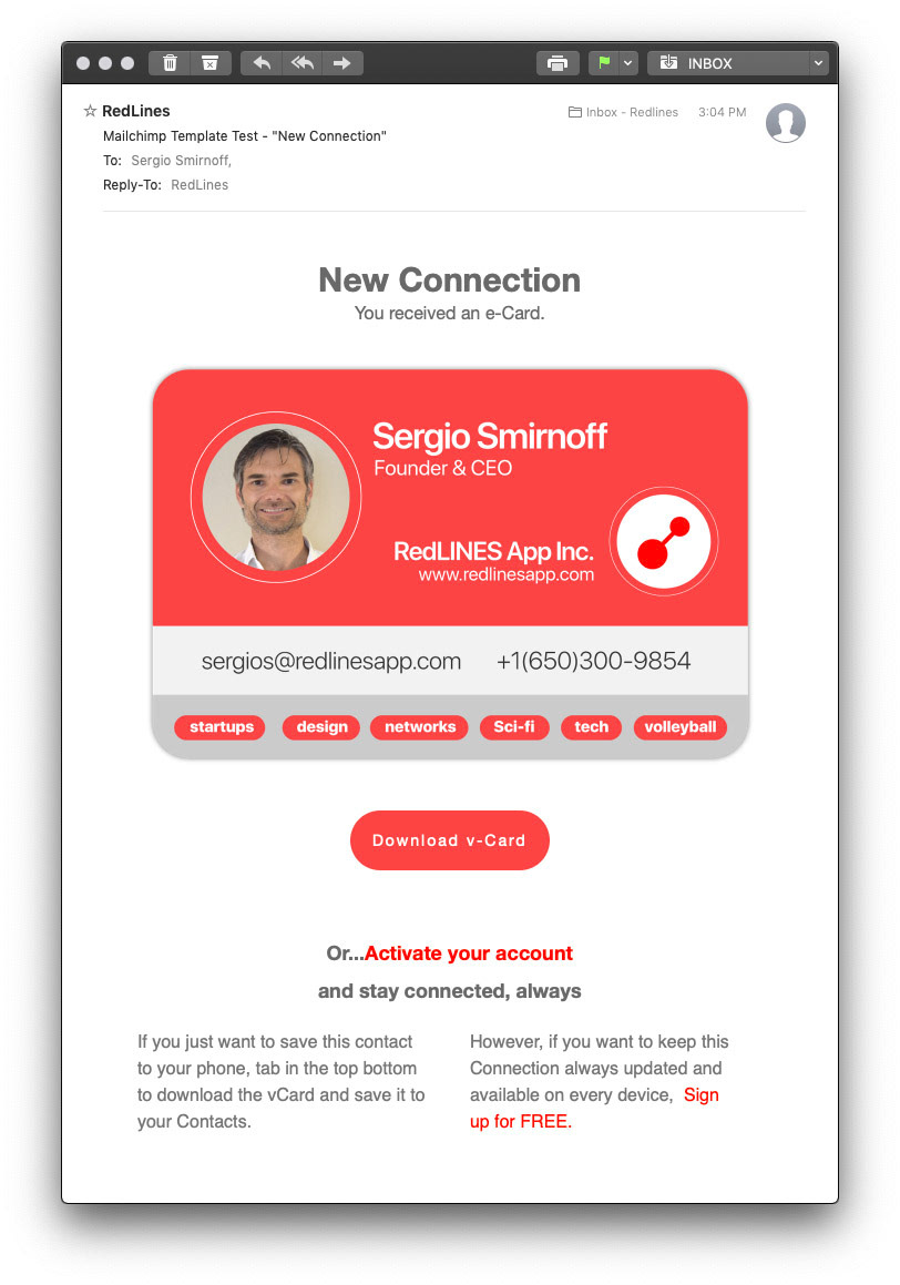
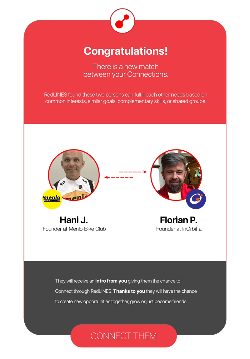
Figure 7. Integrated pieces of the UI used into other assets as emails and notifications.
Conclusion
When COVID hit, we couldn't raise money, and it was impossible to continue operations without external funding.
However, the experience of building a product from scratch, defining business goals and target market, and leading a team of Engineers, Operations, and Sales was one (if not) the most challenging but also rewarding in terms of "wisdom acquisition" I ever had in my career, understanding design wearing other areas shoes.
However, the experience of building a product from scratch, defining business goals and target market, and leading a team of Engineers, Operations, and Sales was one (if not) the most challenging but also rewarding in terms of "wisdom acquisition" I ever had in my career, understanding design wearing other areas shoes.
The most important lesson I learned is to assume that design needs to answer business goals to strive. Indeed, both go hand in hand, but design becomes an accessory without a product that can bring value to specific customers.
Team Key Members
Grace Odorisio
Co-Founder and COO at RedLINES
Co-Founder and COO at RedLINES
Mark Patenaude
Co-Founder and CRO at RedLINES
Co-Founder and CRO at RedLINES