- 2016 -
FULL PRODUCT AND BRANDING DEVELOPMENT
FULL PRODUCT AND BRANDING DEVELOPMENT
How I got an exit from learning about home renovation
A very experienced Bay Area home contractor asked me to shape his vision for a "Contractors on-demand platform".
I couldn't say no.
ROLE:
UI/UX
Product Designer
Interaction Design
SCOPE:
10 month project
UI/UX
Product Designer
Interaction Design
SCOPE:
10 month project
PLATFORM:
Desktop & Mobile
Desktop & Mobile
TOOLS:
Figma
Adobe Photoshop
Adobe Illustrator
TEAM:
5 person
Figma
Adobe Photoshop
Adobe Illustrator
TEAM:
5 person
MARKET - SPACE:
B2B2C - three-side market
B2B2C - three-side market
THE PROBLEM - THE VISION
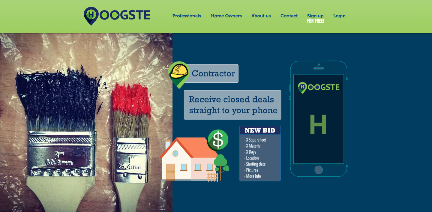
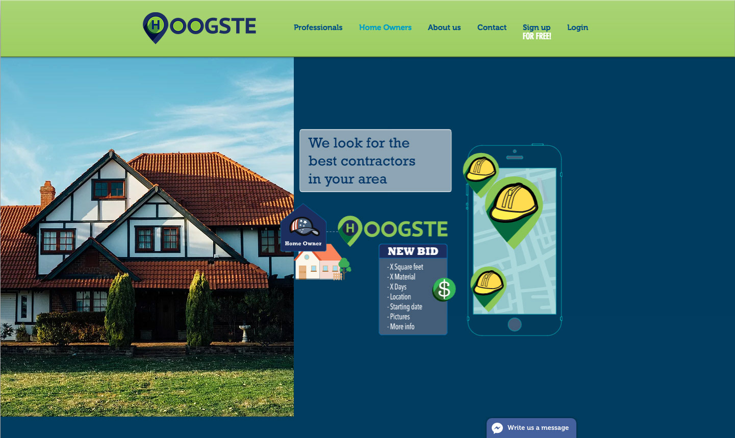
Hoogste is a tech company and its focus is generating connections from customers to any kind of service provider. They deliver to the best professionals closed deals in the area, so they don’t have to pay per lead. The platform finds crews of subcontractors to fulfill General Contractors' needs.
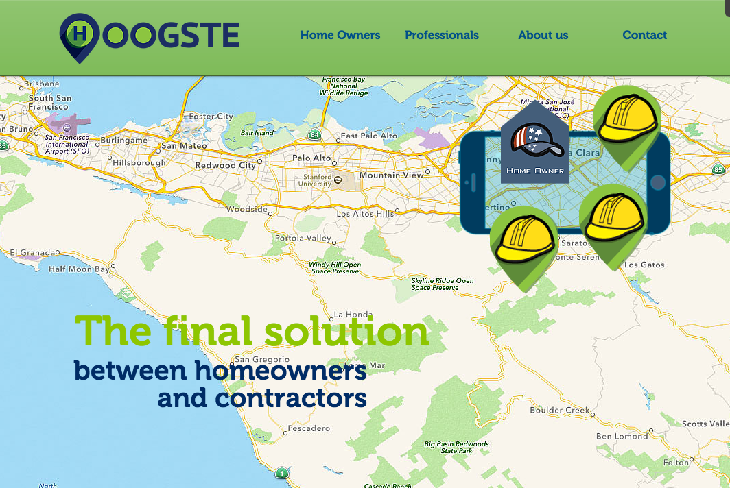
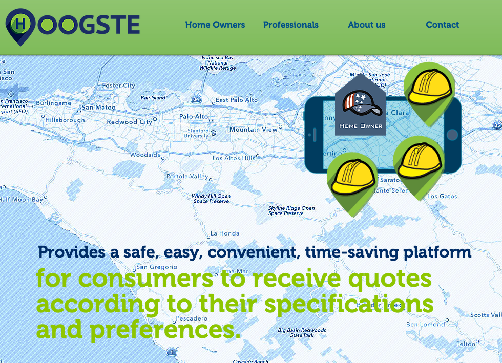
Hoogste is the solution between homeowners, general contractors, and subcontractors in the digital age. It provides a safe, easy and convenient time-saving platform for final consumers to receive quotes according to their specifications and preferences.
Hoogste is the solution between homeowners, general contractors, and subcontractors in the digital age. It provides a safe, easy and convenient time-saving platform for final consumers to receive quotes according to their specifications and preferences.
My job was to define the entire branding and marketing strategy of the company and the product design, UX-UI as well. For that I created Style Guides and a Design System to support both.

STRATEGIC COMMUNICATION
I designed the company's branding, which was the visual support for the User Interface of the platform. Many marketing and communication assets were required to fulfill the company's needs. To achieve that goal, I created a Visual Style Guide to keep every aspect aligned with Hoogste's branding.
The goal for the visual image was to be a referent in the space. Location is the essential aspect of every interaction between contractors and homeowners. It defines where the job has to happen and how far from the contractor territory, the job will be. Based on this premise, I created the Hoogste icon, from where many other visual elements took shape.
The goal for the visual image was to be a referent in the space. Location is the essential aspect of every interaction between contractors and homeowners. It defines where the job has to happen and how far from the contractor territory, the job will be. Based on this premise, I created the Hoogste icon, from where many other visual elements took shape.
The visual image should be highly recognizable and nothing-compared with other companies in the space. It has to be attractive for everybody; contractors, subcontractors, and homeowners in this three-sided market. The color palette was very important to accomplish that goal.

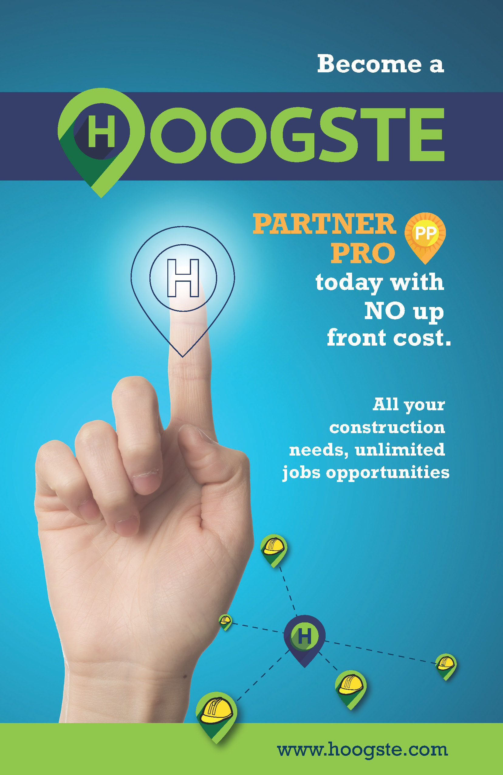
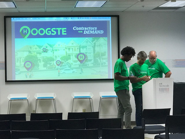

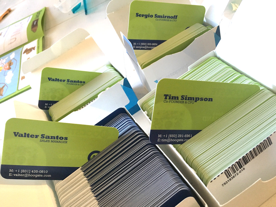
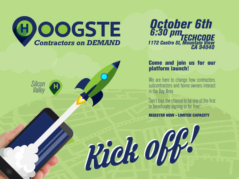
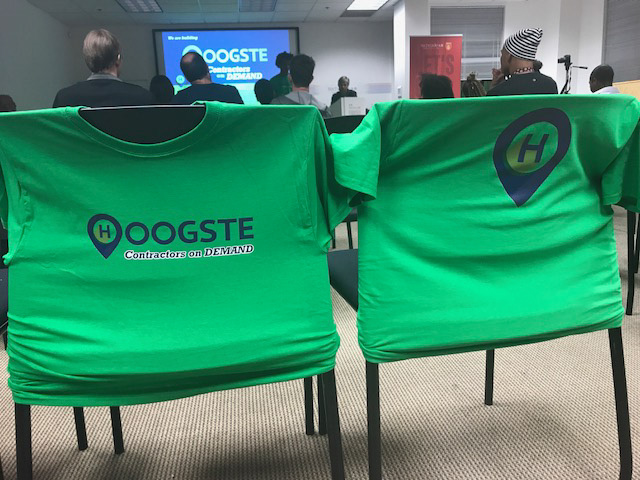
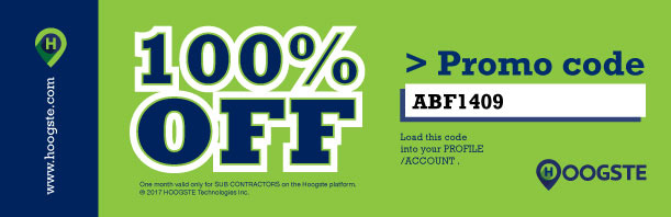
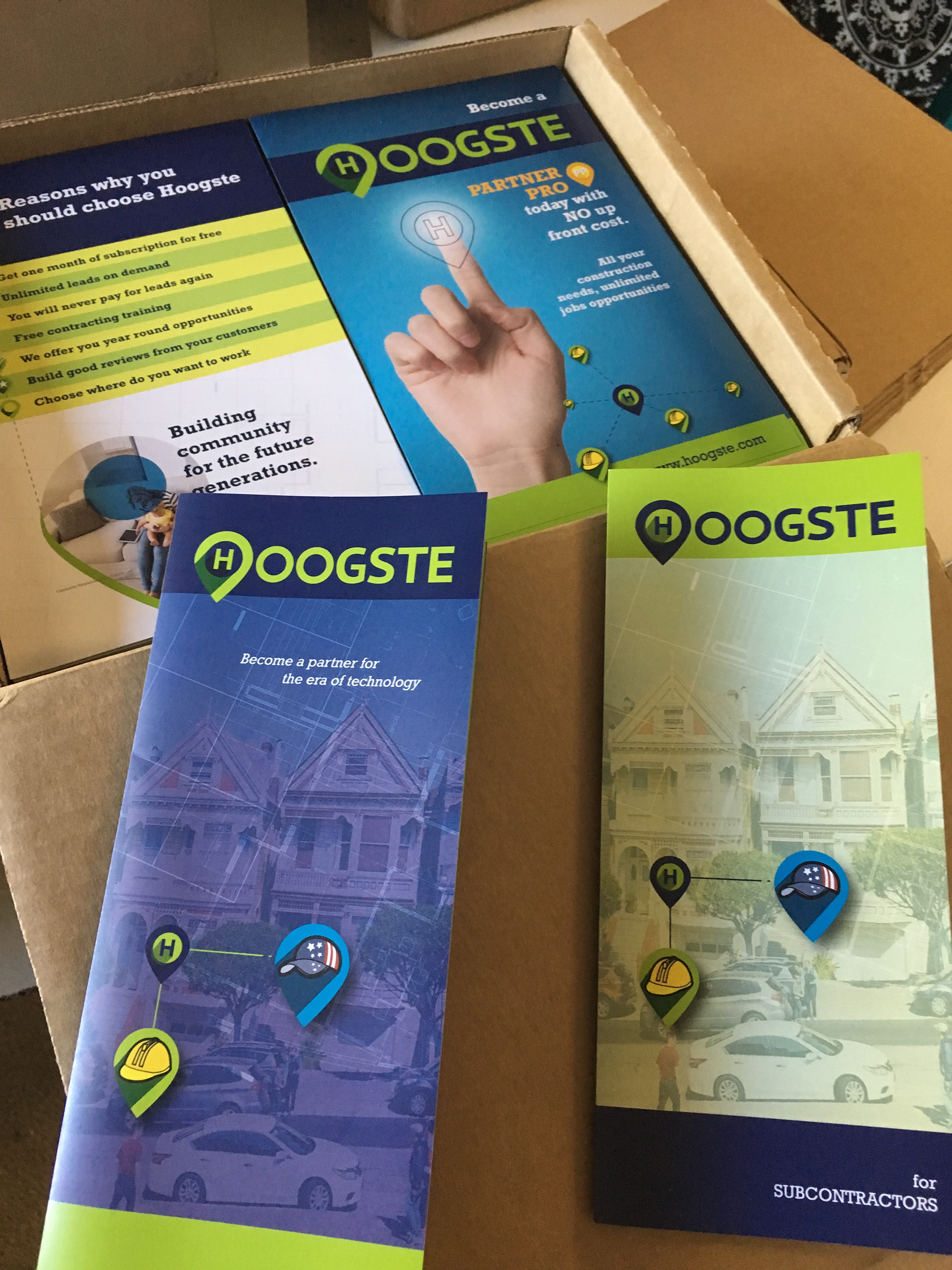
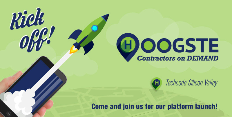
Some of the marketing assets I designed for different events.
I build Hoogste's website,
where I integrated motion graphic videos
I created to explain specific processes.
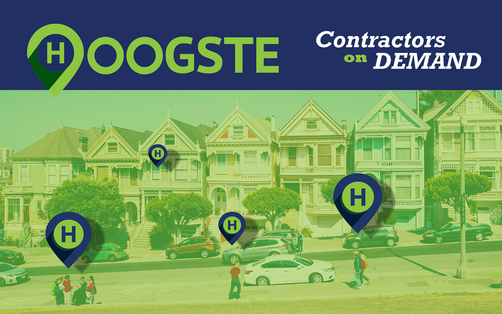
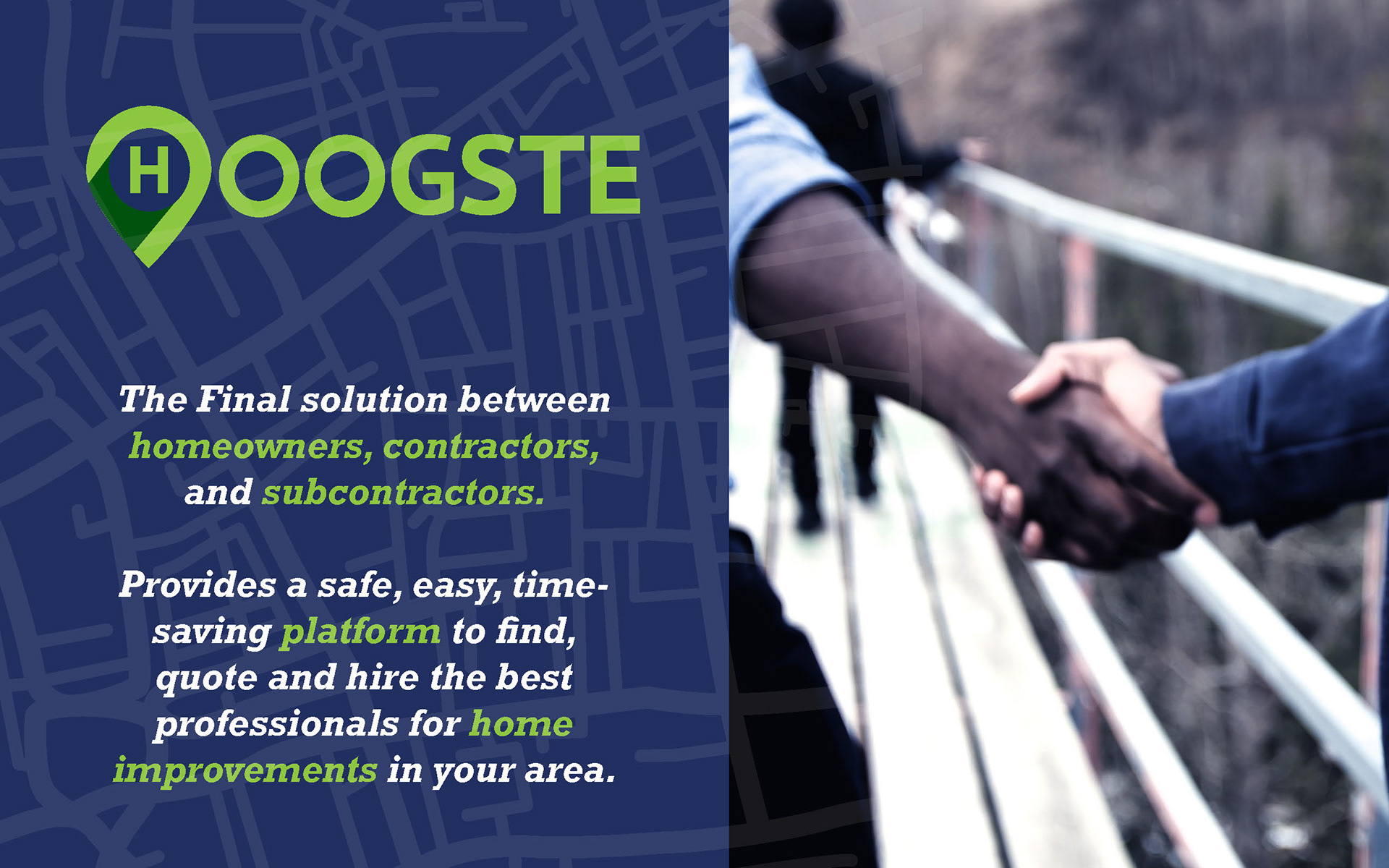
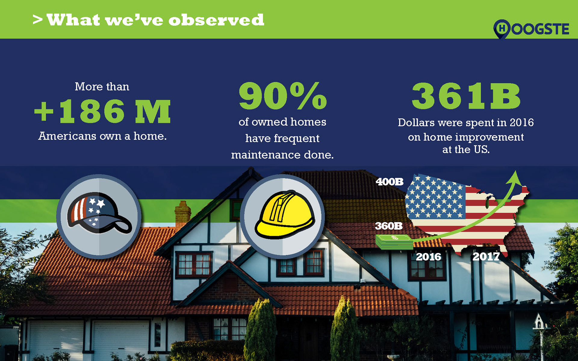
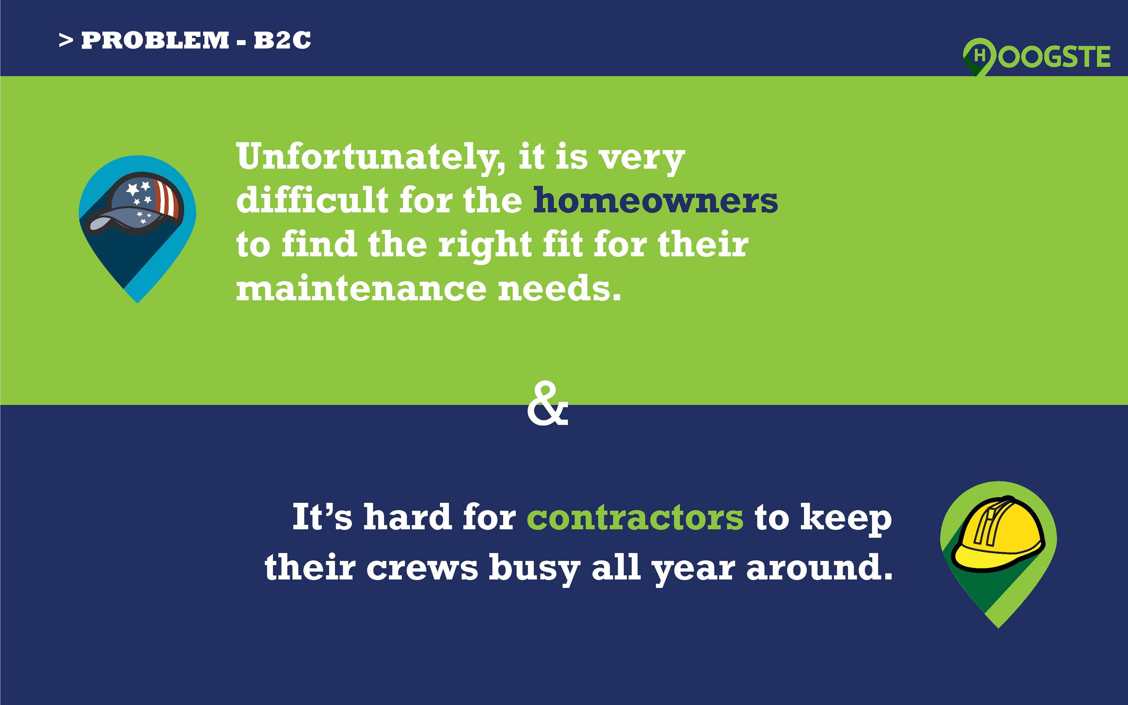
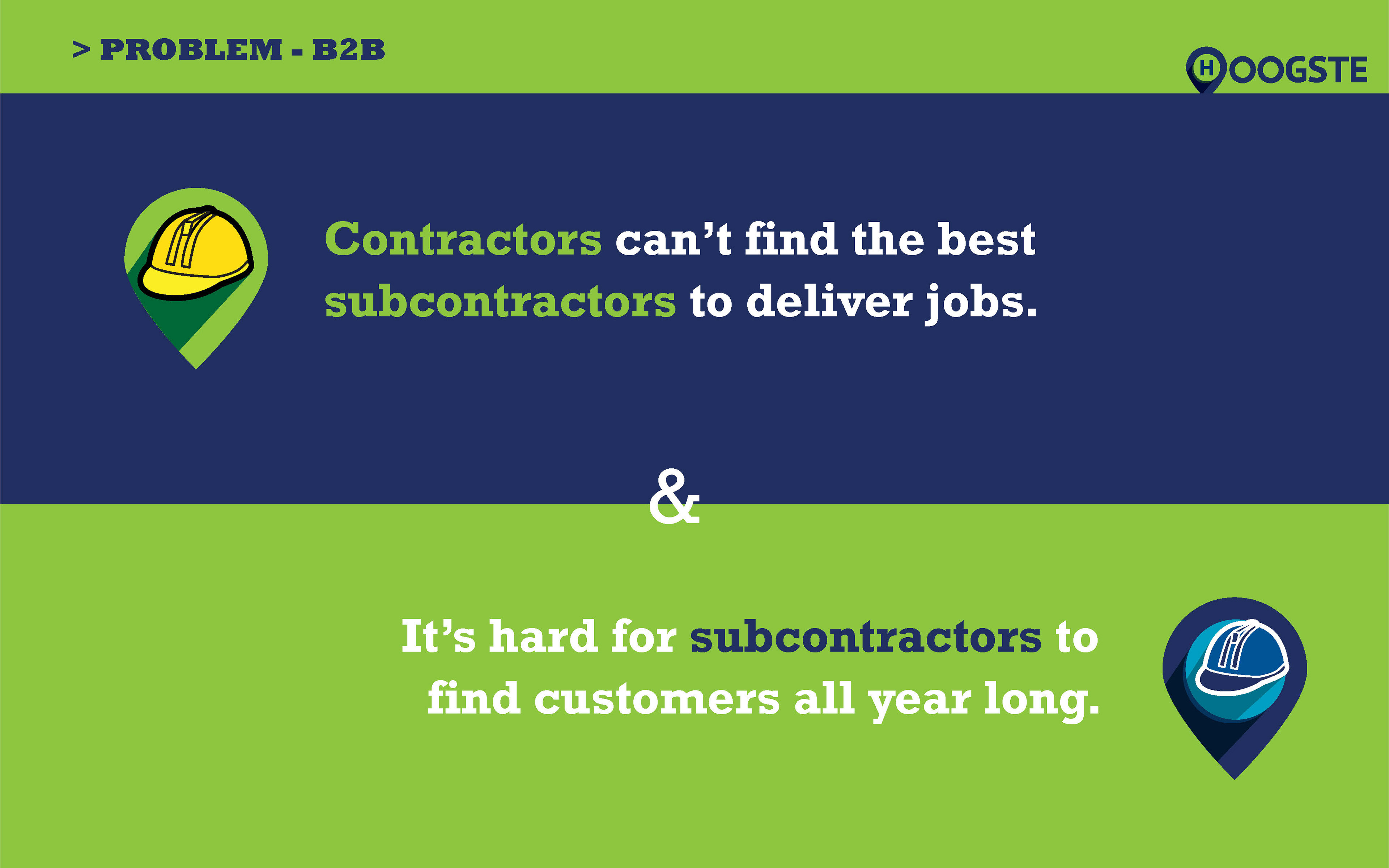
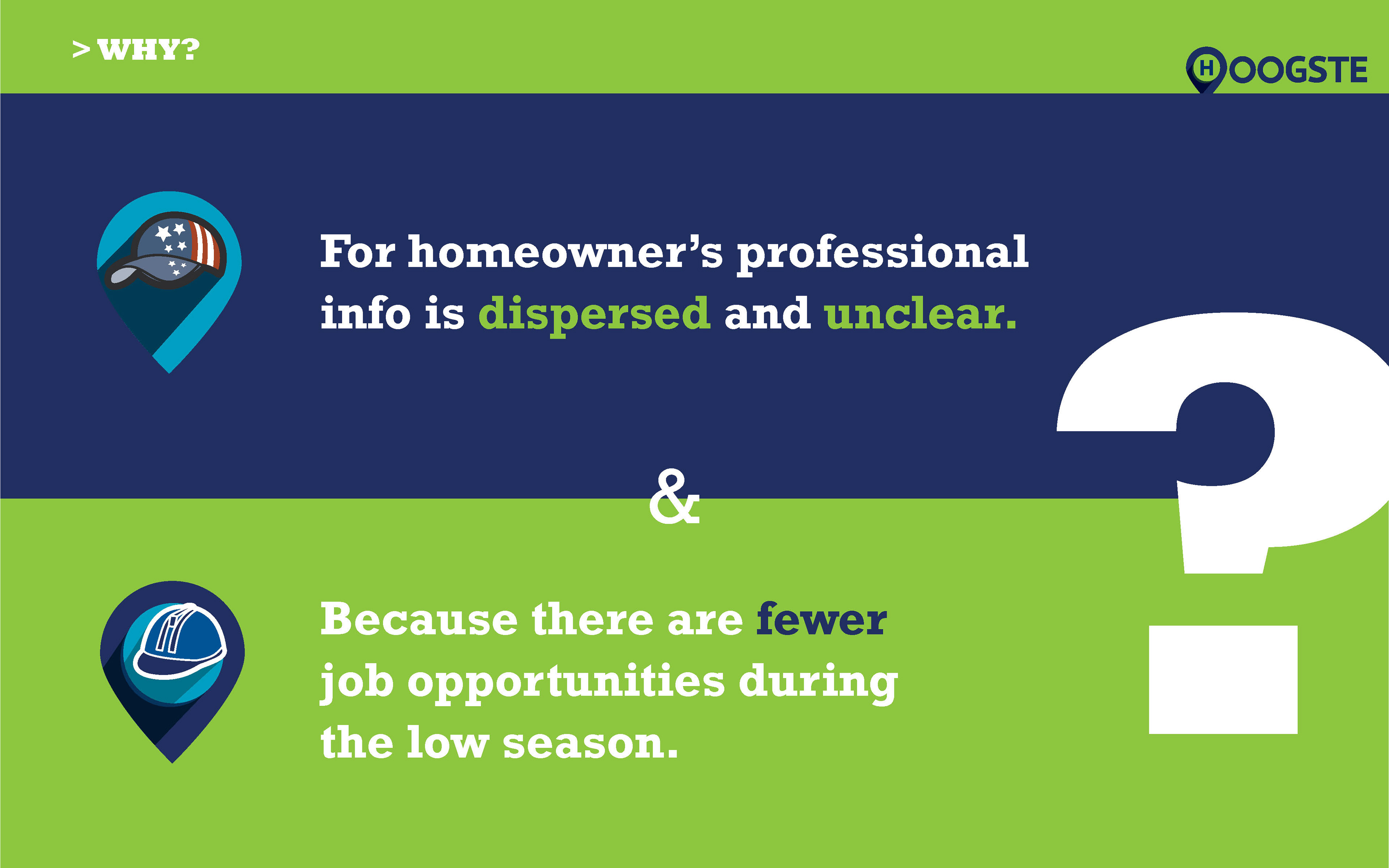
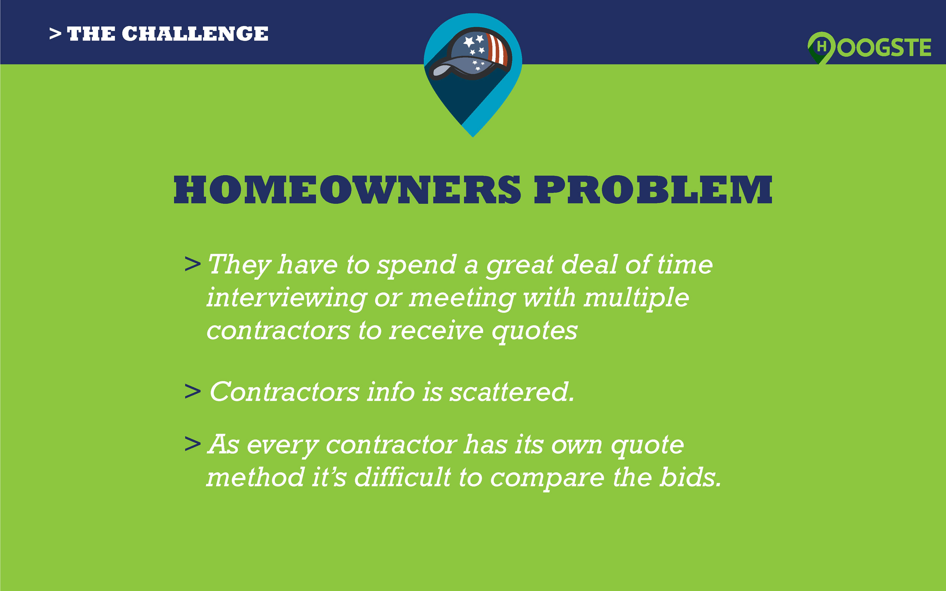
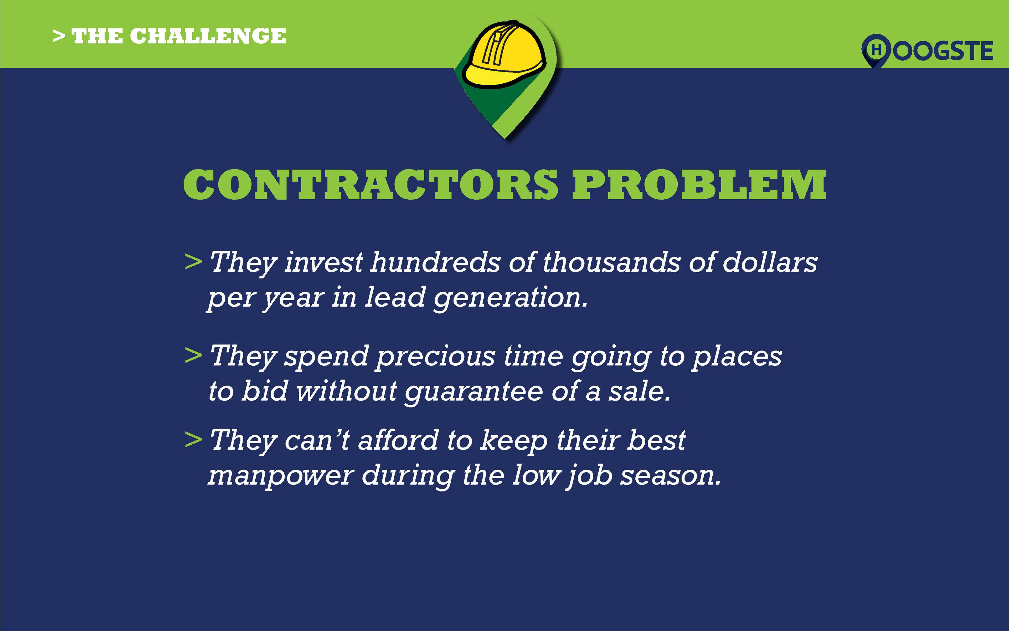
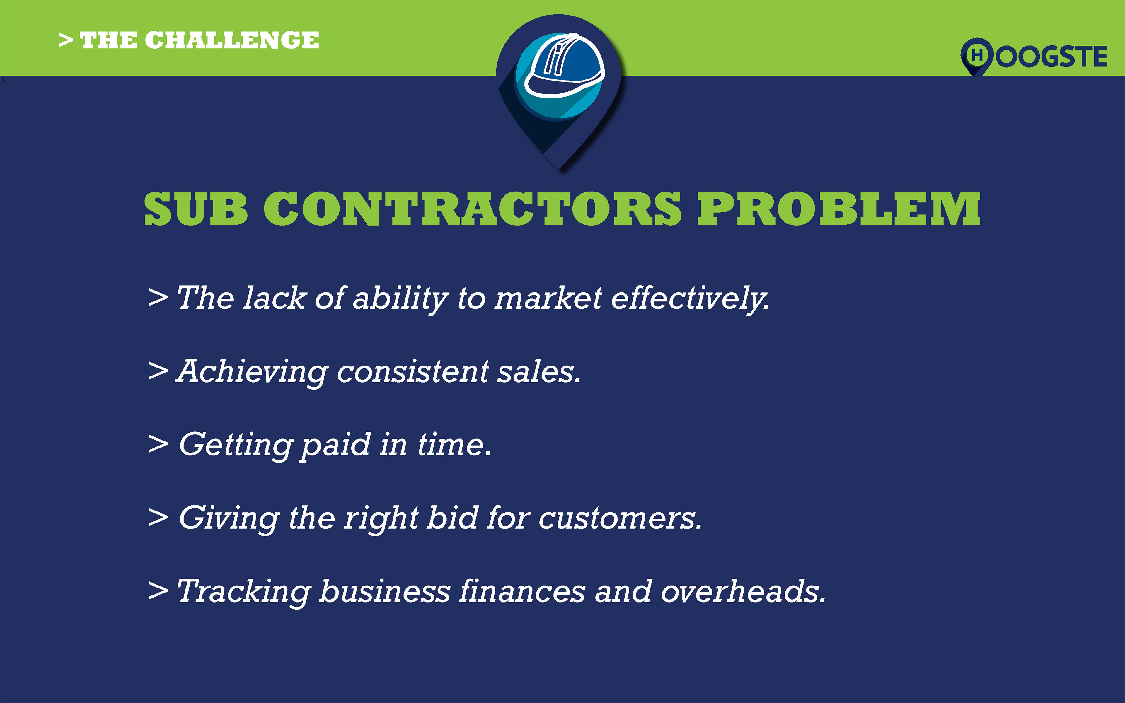
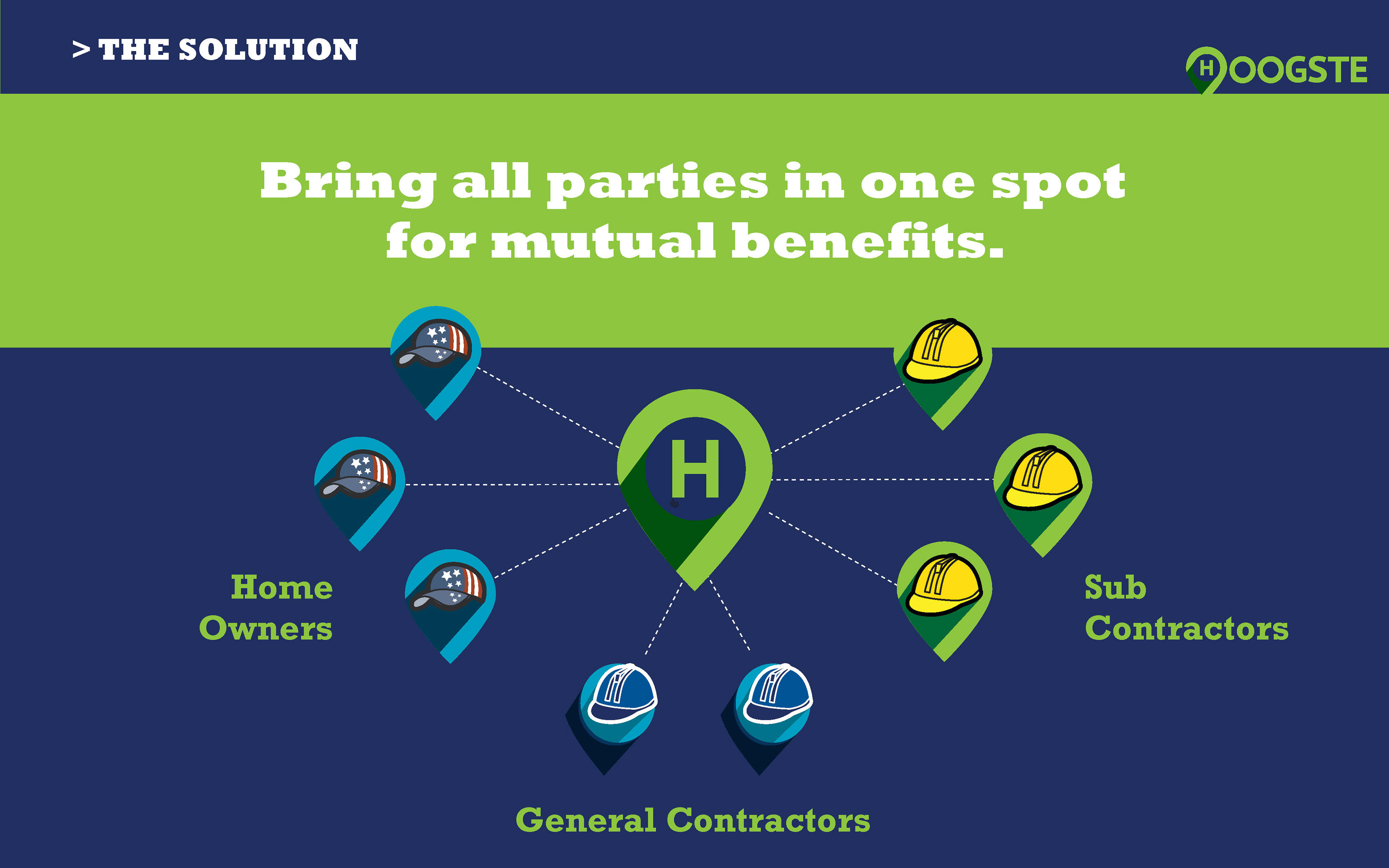
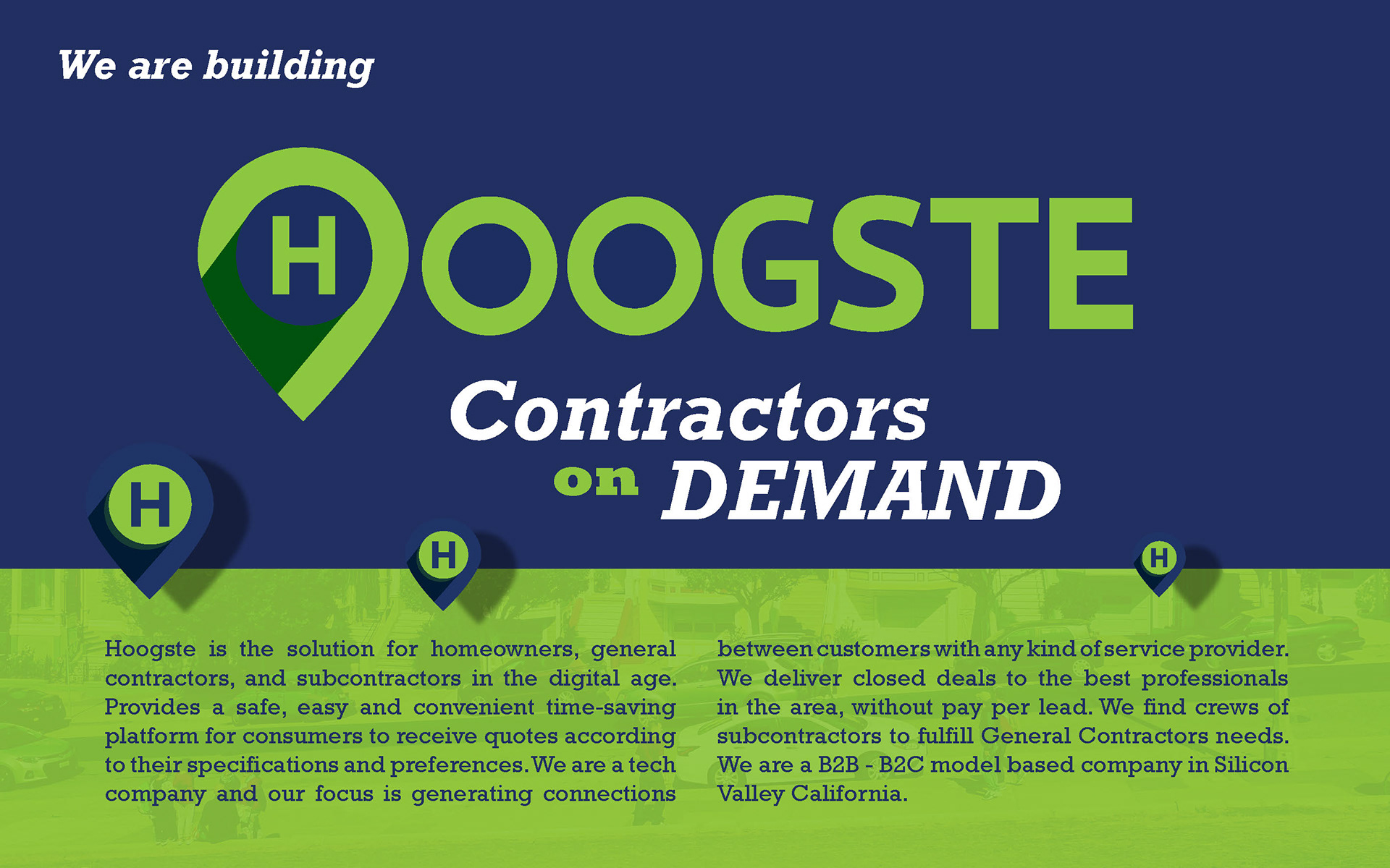
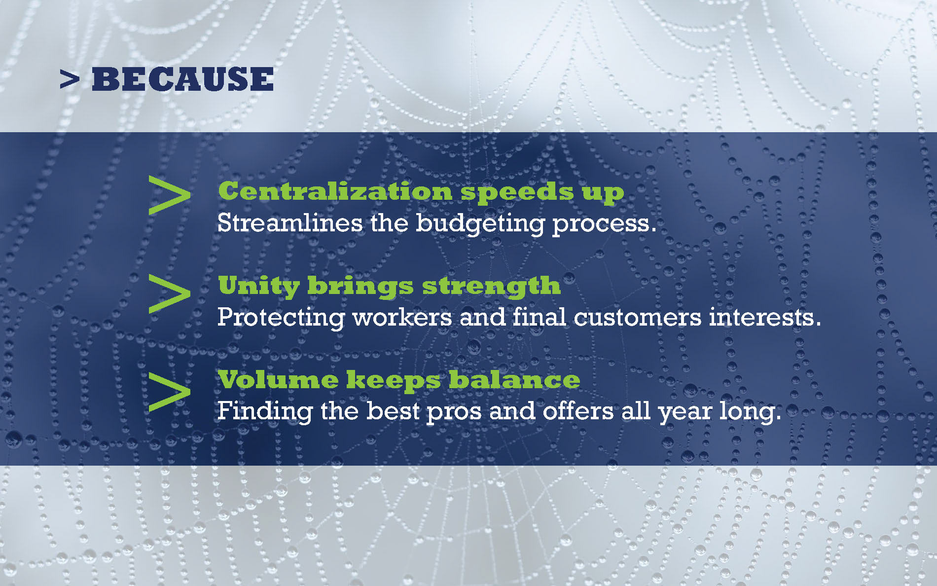
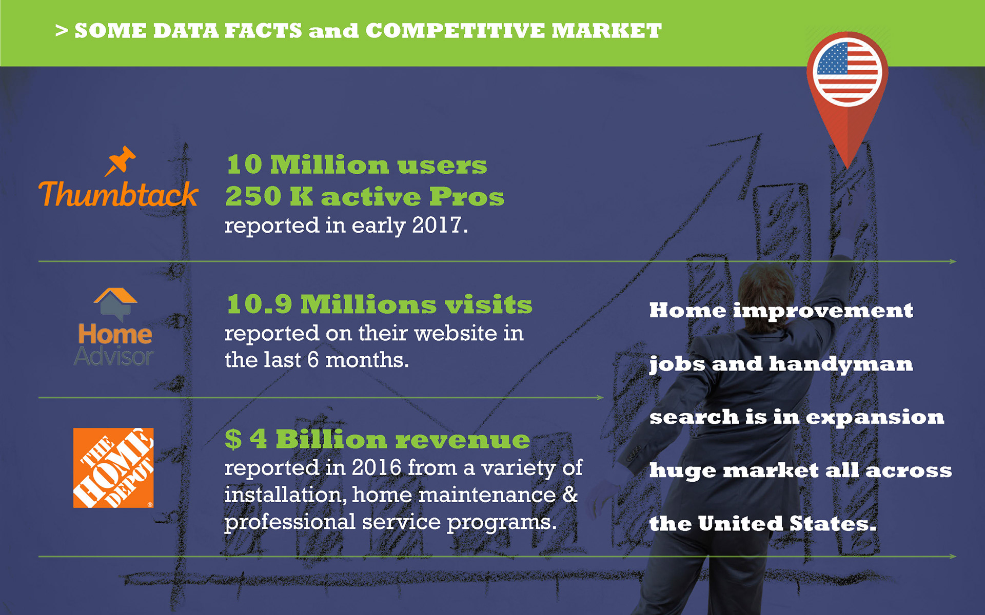
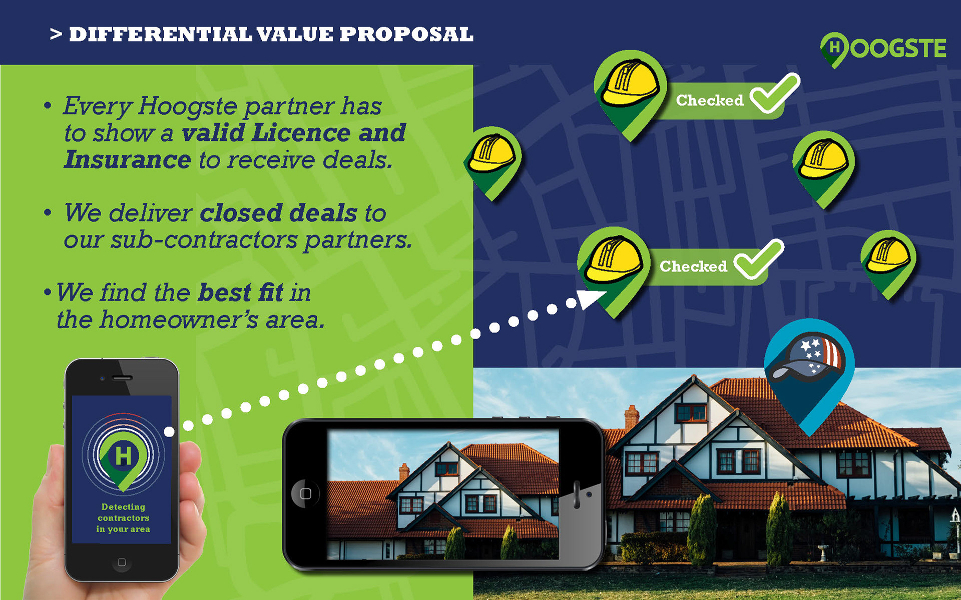
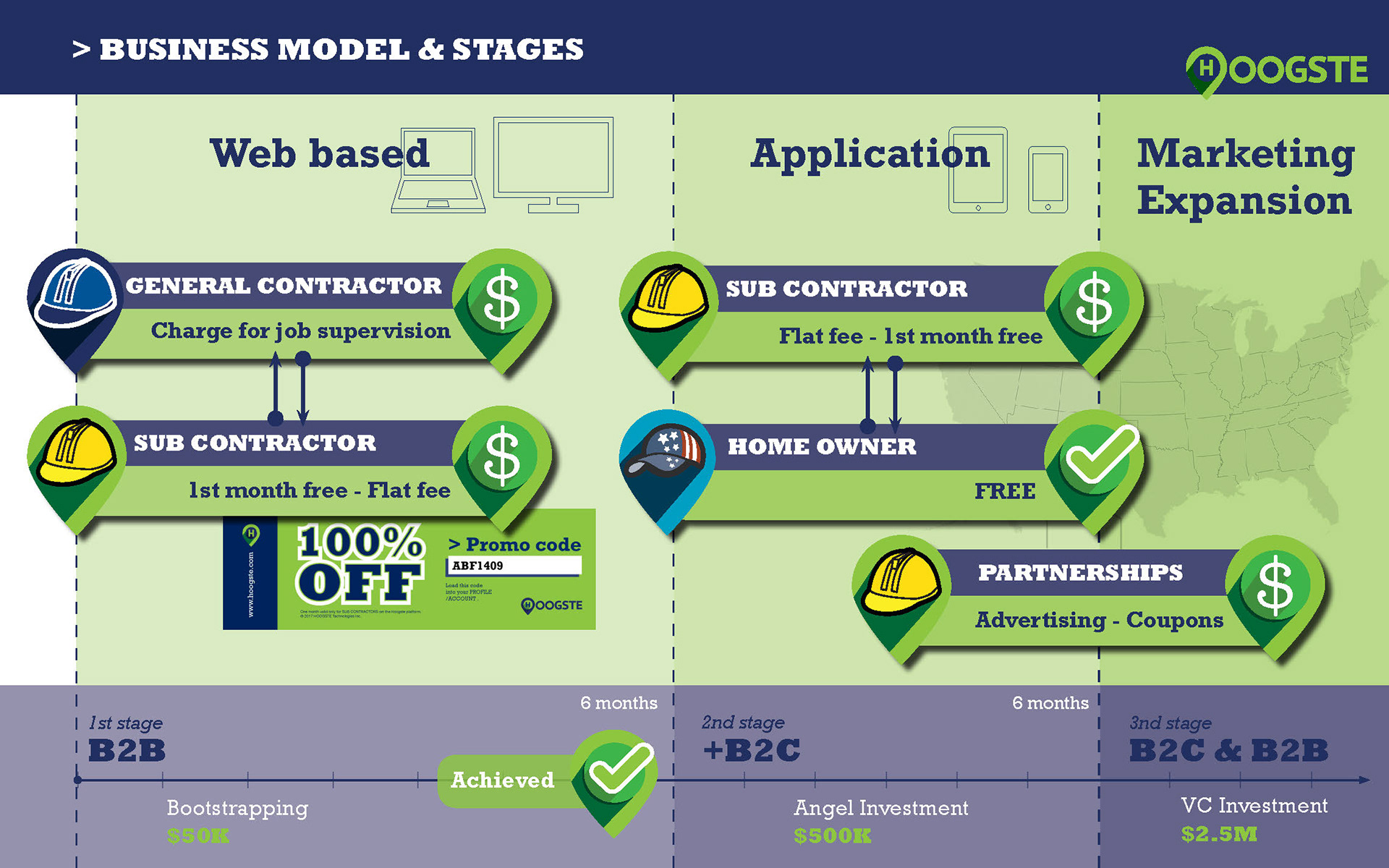
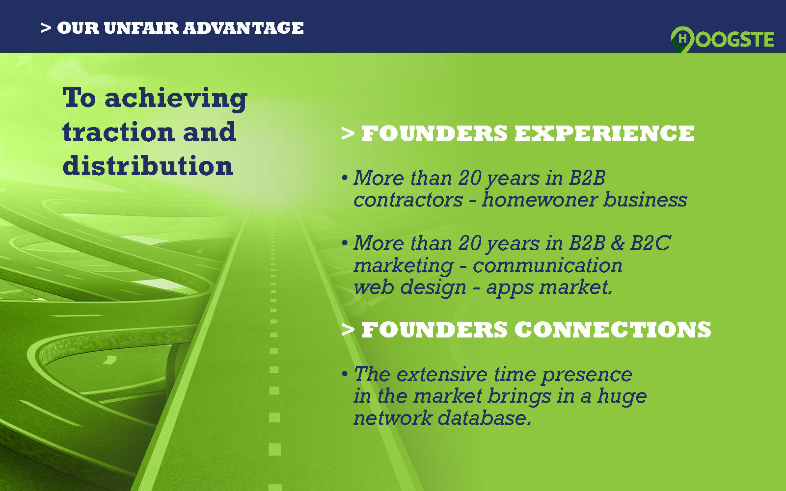
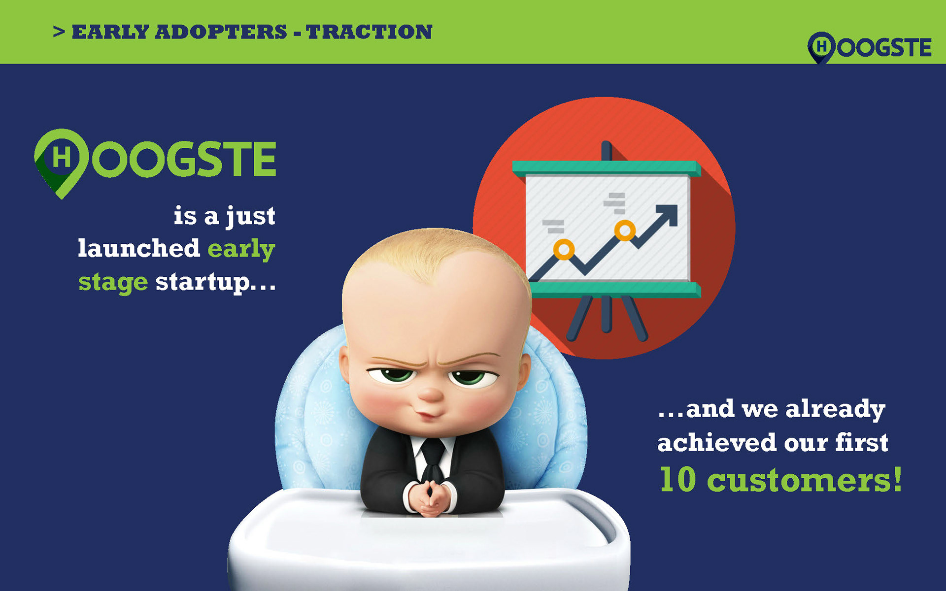
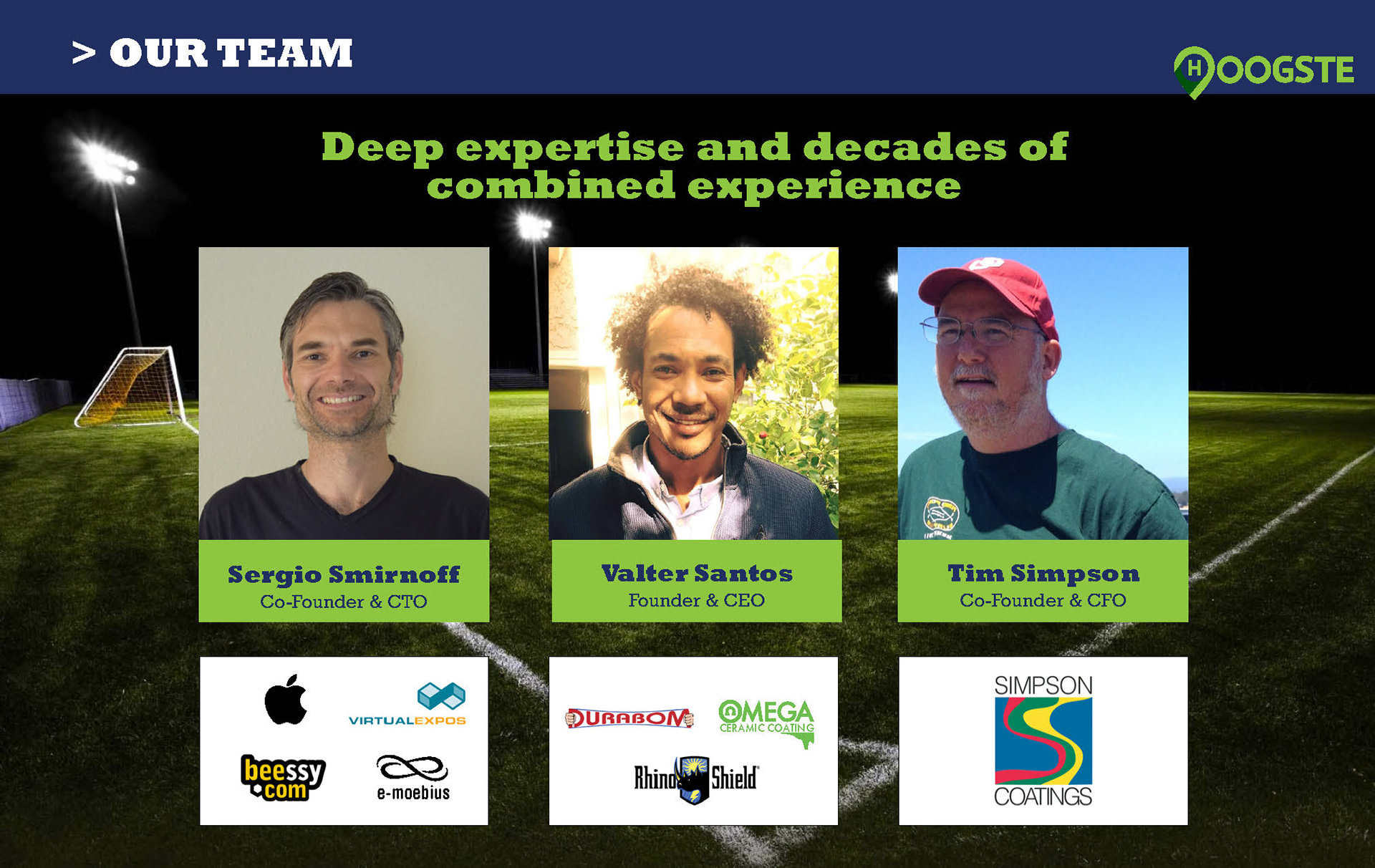
Fig3. Pitch decks and presentations were very important to share Hoogste's vision with multiple stake holders. They communicate the company style and vision based on a bold look&feel.
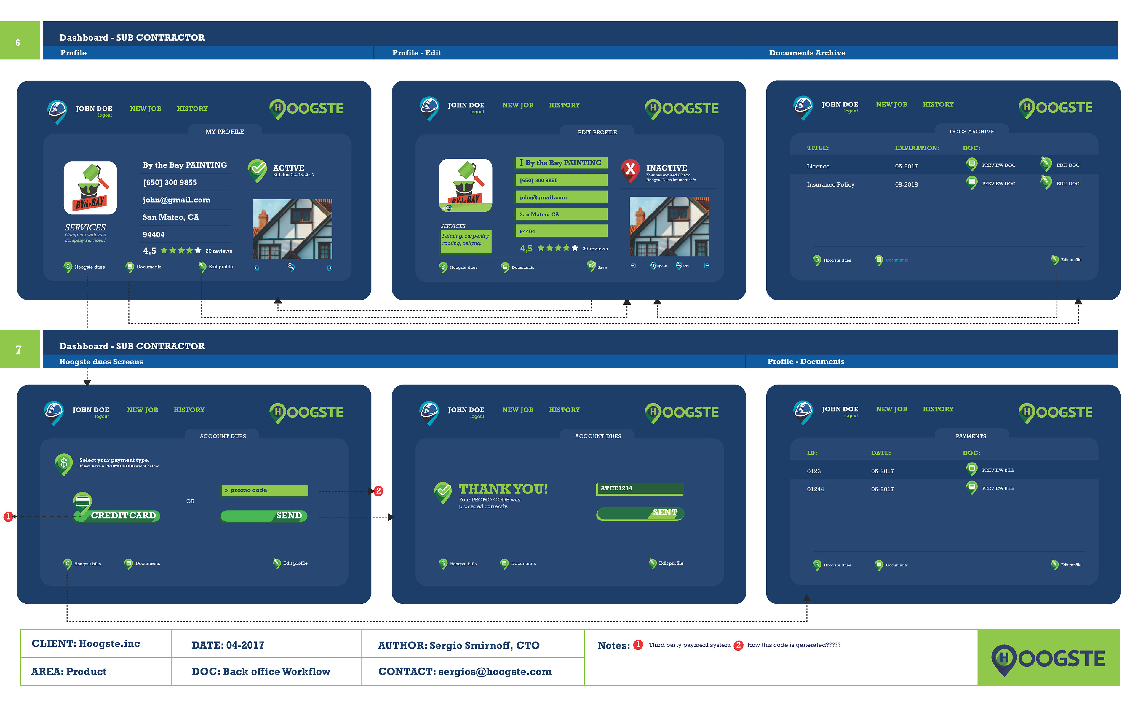
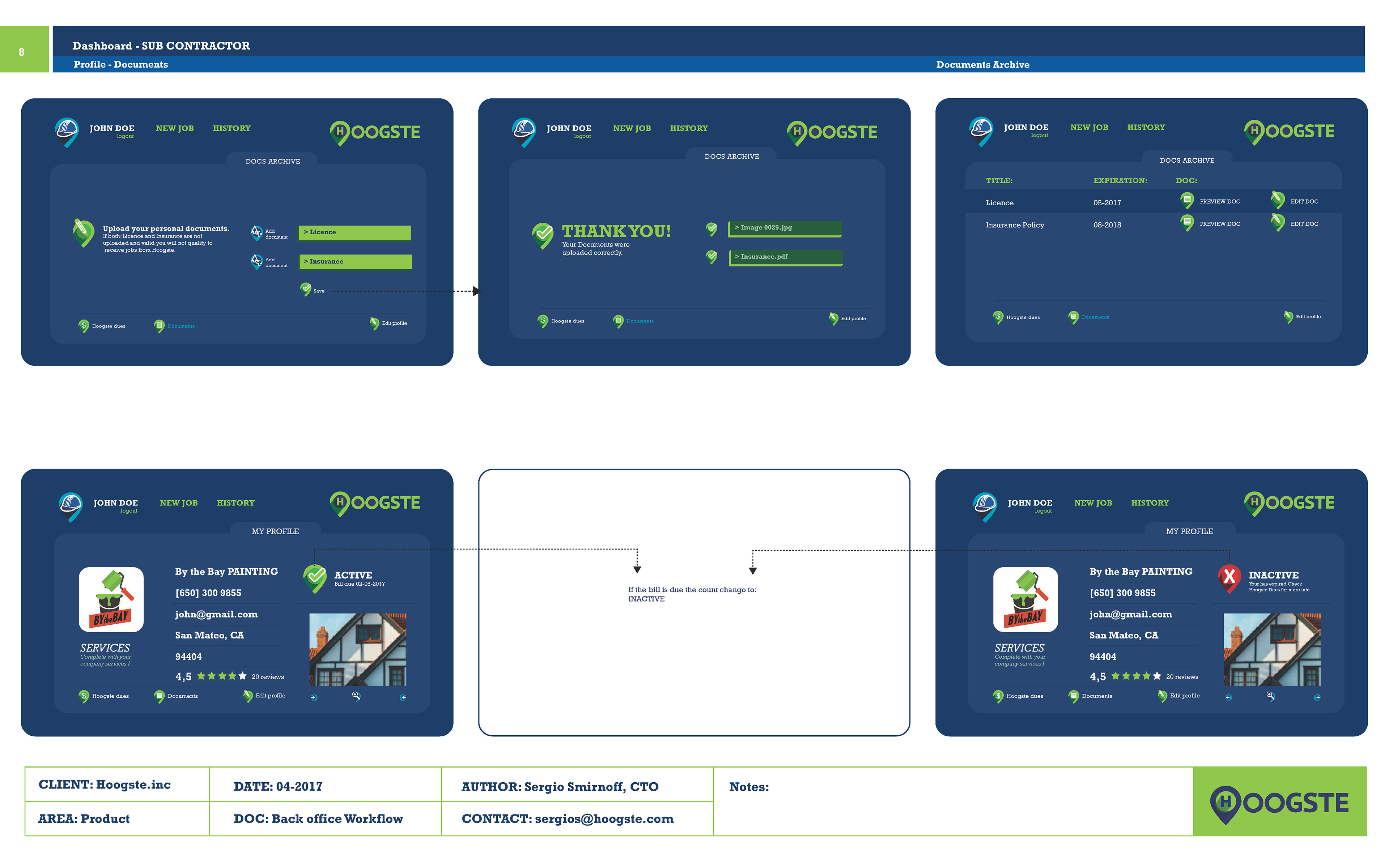
DEFINING THE PRODUCT
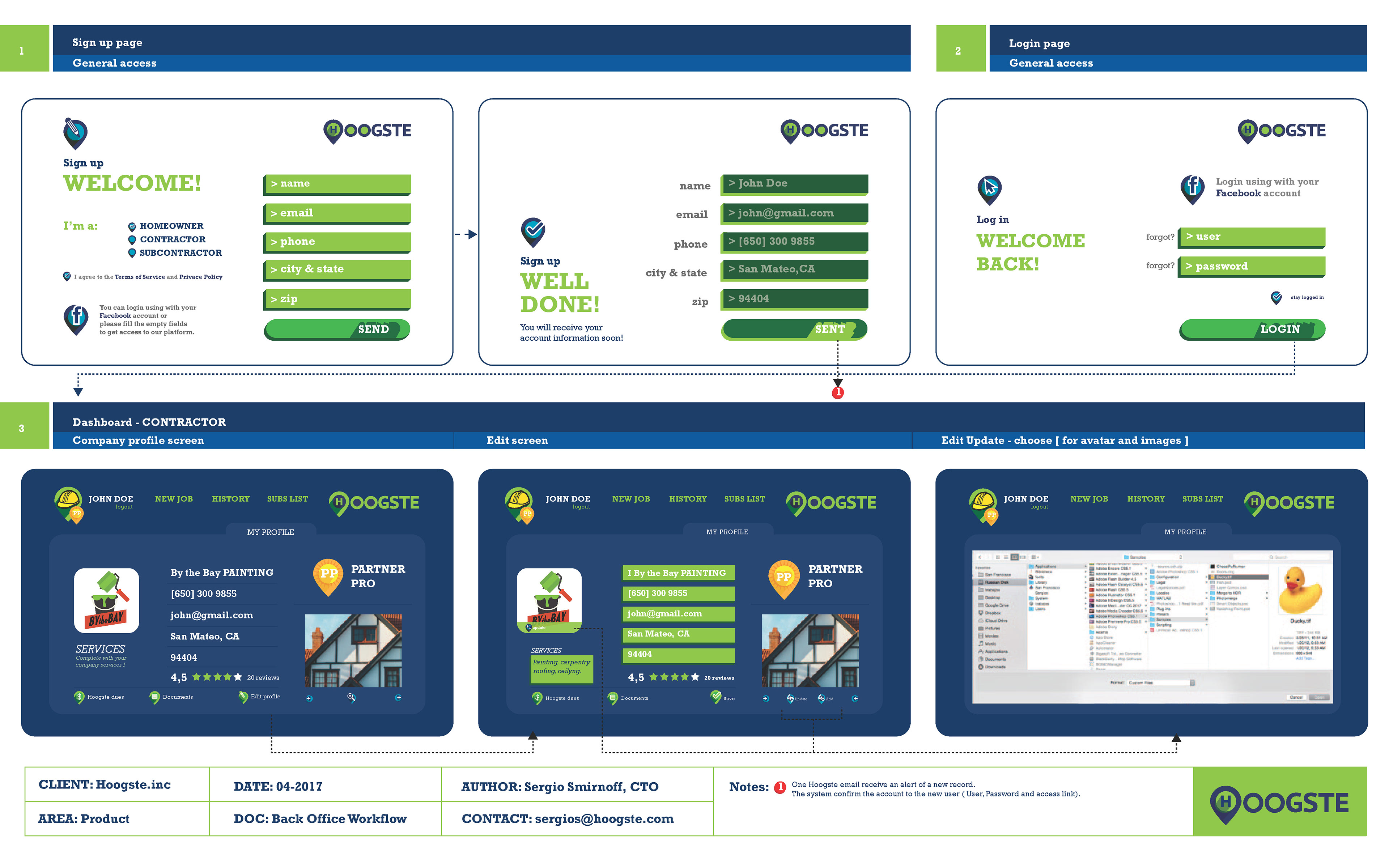
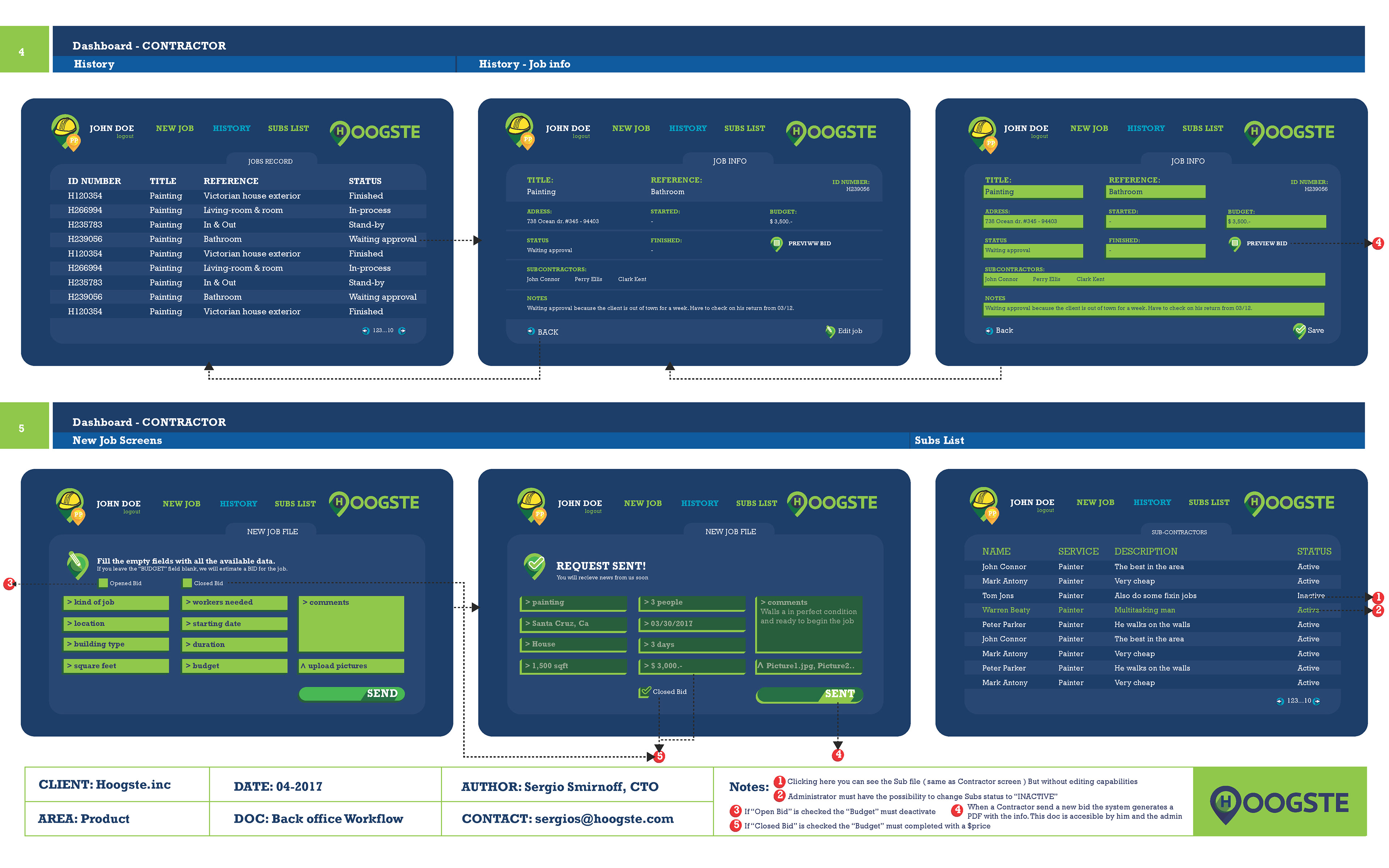
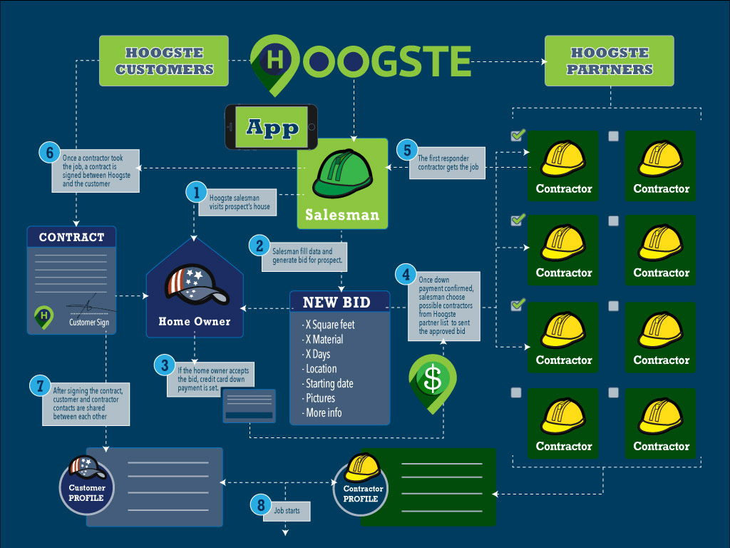
To achieve this task I needed to identify and design a complex process with multiple entry and exit points into the easiest possible way for the not-very-savvy-techie audience. The job included interviews with users to define the workflow and research to achieve the expected outcome.
My responsibilities included defining the Workflow, Information Architecture, User Experience of the entire platform. The Information Architecture and User Experience were the most parts of the job as needed to analyze and integrate multiple different kinds of users interacting with each other.
My responsibilities included defining the Workflow, Information Architecture, User Experience of the entire platform. The Information Architecture and User Experience were the most parts of the job as needed to analyze and integrate multiple different kinds of users interacting with each other.
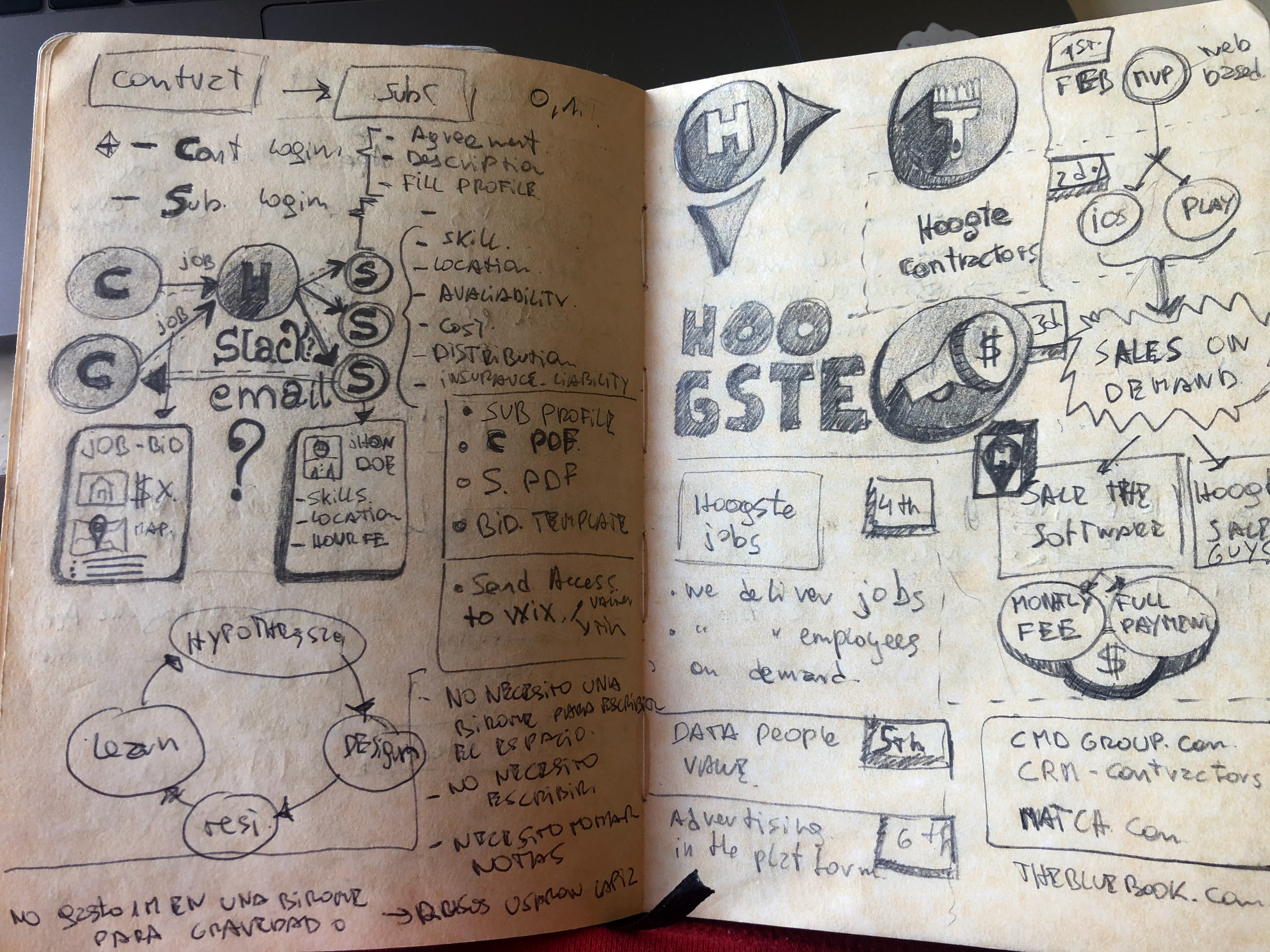
I took many notes from my interviews with the CEO and Founder of the company to understand his vision. Because he didn’t have a tech or design background, my job was to define how the entire platform works to fulfill that vision.
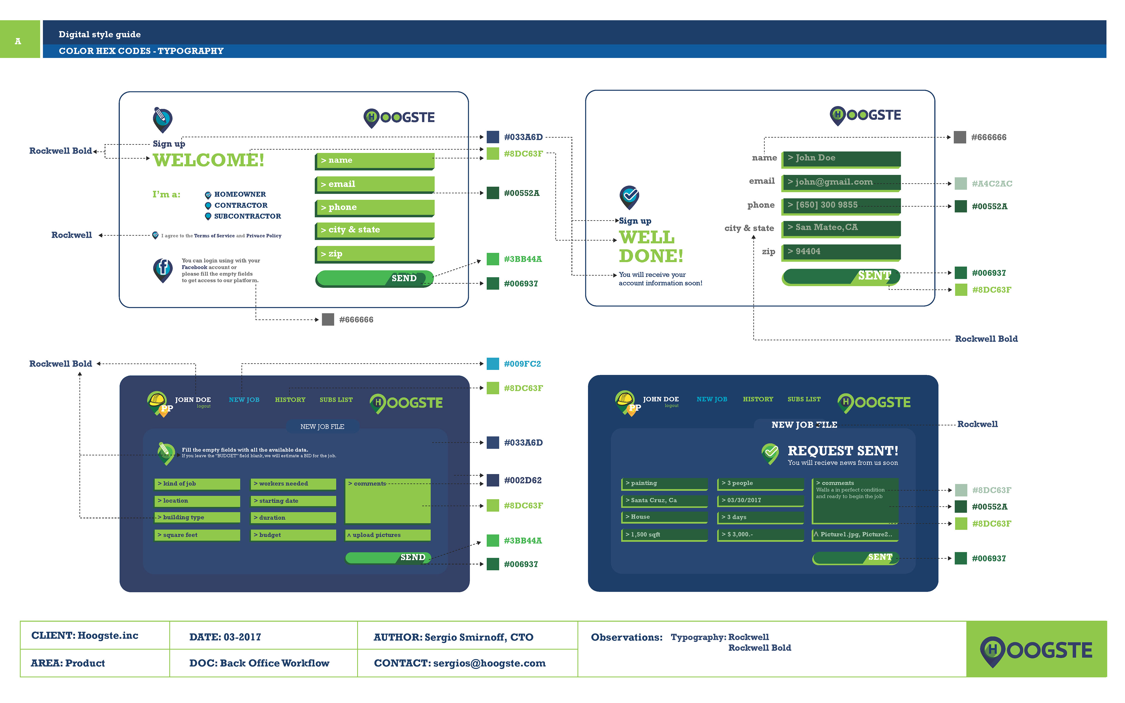
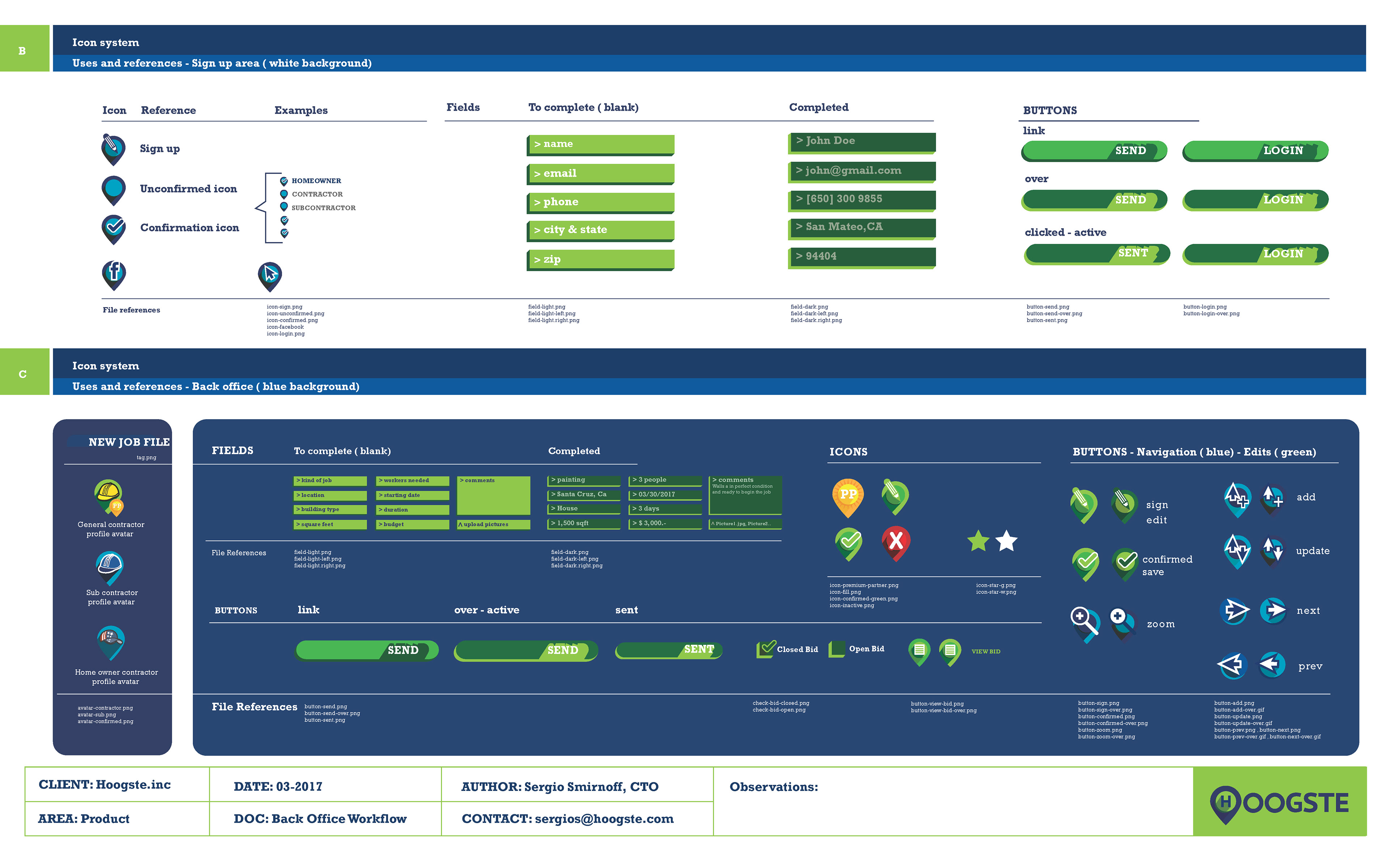
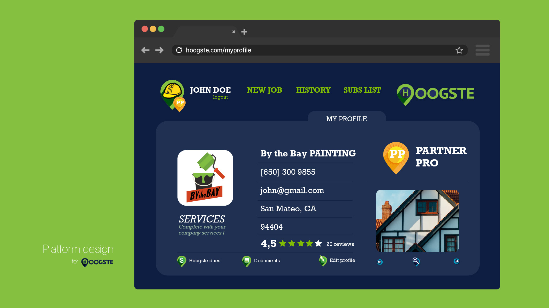
To make it easier to navigate for everyone I created a system of icons, color palettes, holding a navigation experience, maintaining a unique way along the entire platform to help users to feel confident using it always in the same way.
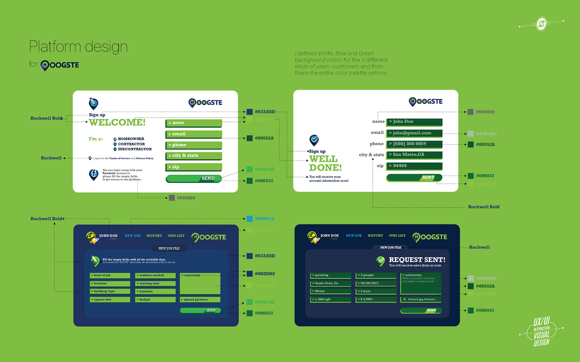
I created a Design System as a foundation of the platform.
I organized multiple components based on the different use cases and persona journeys along with different screens and stages.
I organized multiple components based on the different use cases and persona journeys along with different screens and stages.