How I designed a dashboard to go from 4 robots to 500
Dashboard Design
for InOrbit.ai
PROBLEM:
InOrbit's robot fleet management dashboard was built by founders without design involvement — limiting their ability to scale from managing 4–5 robots to hundreds, and blocking enterprise readiness for customers like Amazon. I needed to fix it in 6 months.
SOLUTION:
Redesigned the full platform UI and branding — introducing a scalable accordion system, three-tier information architecture, and a design system that could display 4 or 500 robots with equal clarity.
OUTCOME:
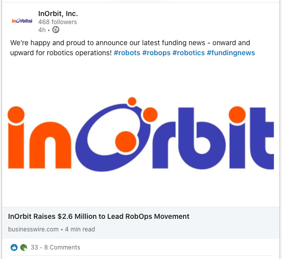
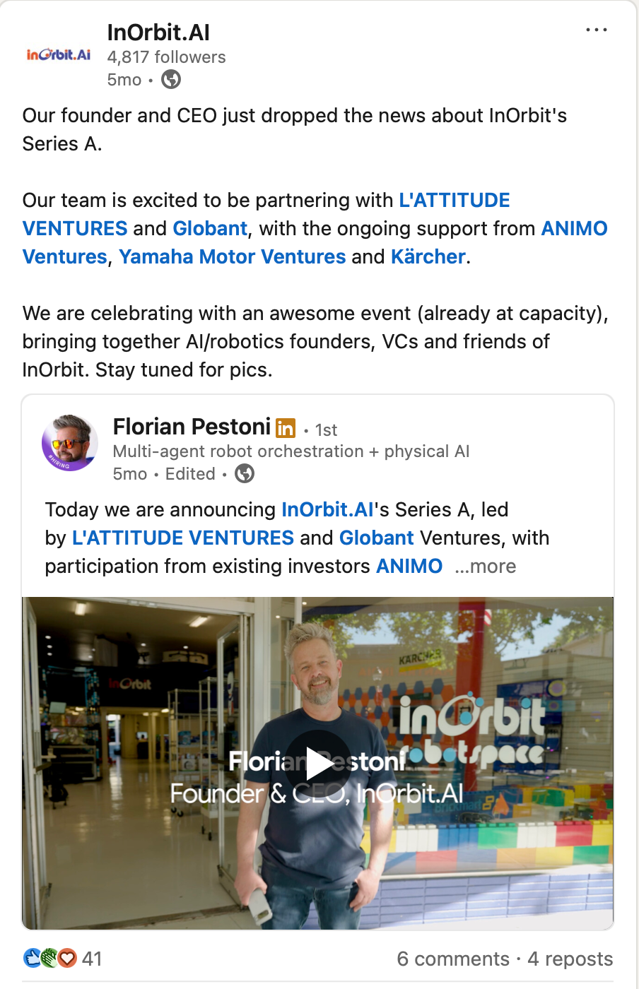
$2.6M Seed & $10M Series A raised after redesign · Enterprise-ready for warehouse-scale robotics operations
METADATA:
Lead Designer · 6 months · Desktop · 8-person team · Enterprise · RoboOps
In 2018, InOrbit had a real problem: a robot fleet management platform built entirely by engineers, for engineers — functional but visually inconsistent, information-dense without hierarchy, and nowhere near ready for the enterprise buyers they needed to close to survive. The founders knew their technology was strong. What they needed was a designer who could make it look and feel like it belonged in an Amazon warehouse, not a university lab. That's where I came in.
THE CHALLENGE
As InOrbit began targeting enterprise customers, the product needed to meet a higher bar — visually credible at a corporate level, technically scalable to hundreds of robots, and compelling enough to support a fundraising round.
BEFORE
AFTER
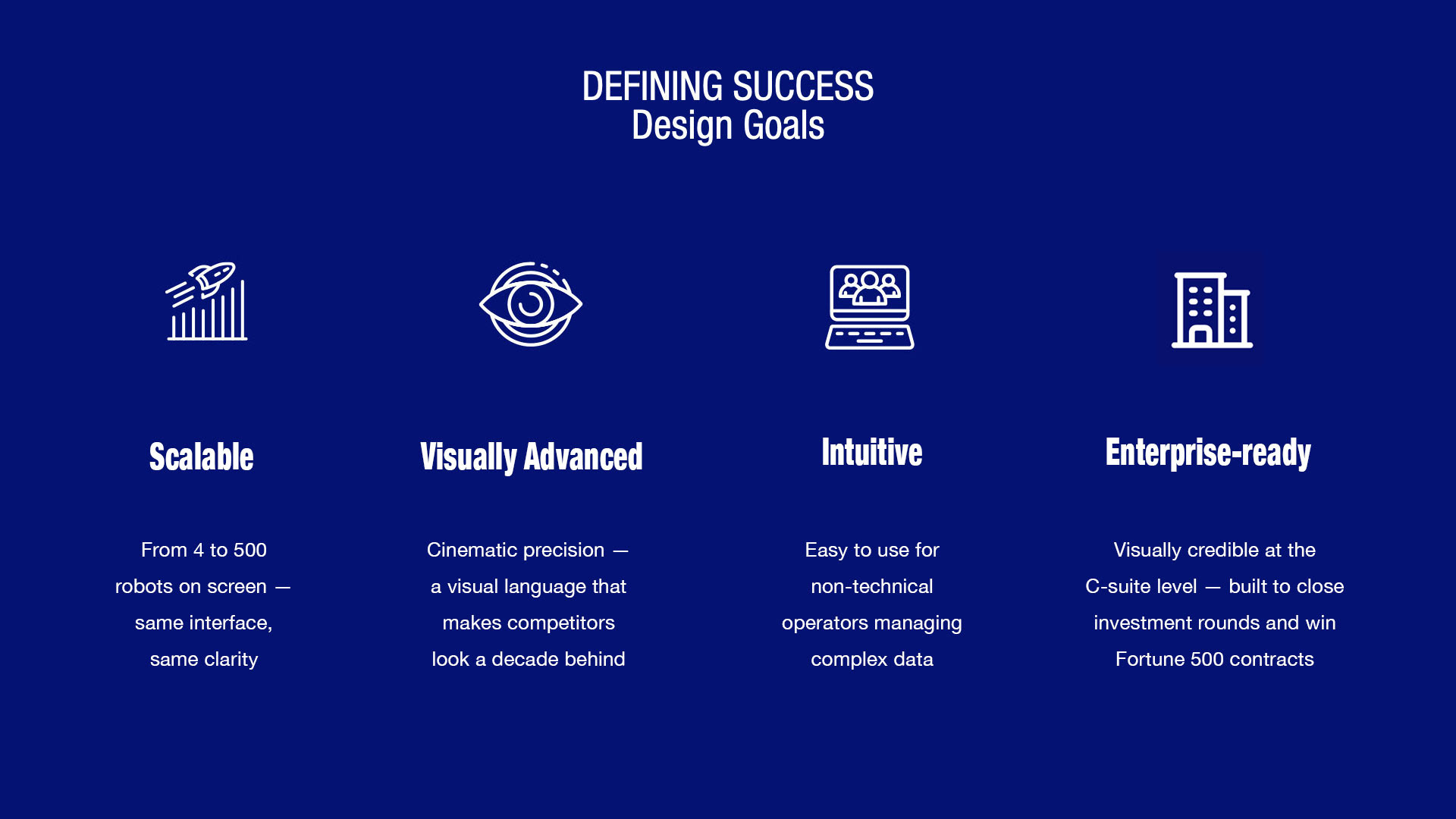
The platform's core challenge was scale — the same interface needed to display 5 robots and 500 robots with equal clarity. At low numbers, rich detail is possible. At high numbers, information hierarchy becomes critical or operators lose situational awareness entirely.
RESEARCH - COMPETITIVE ANALYSIS
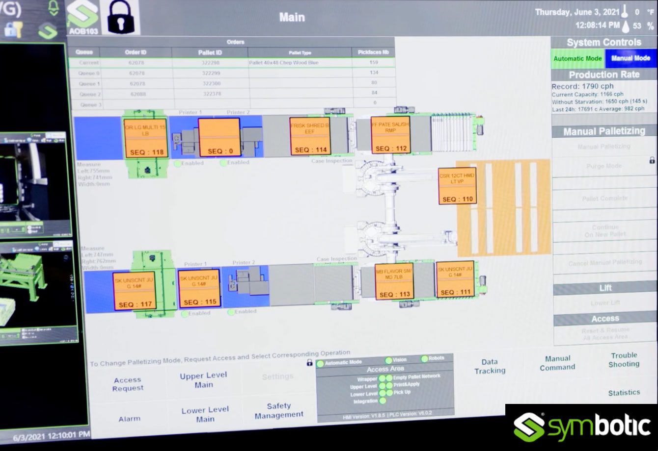
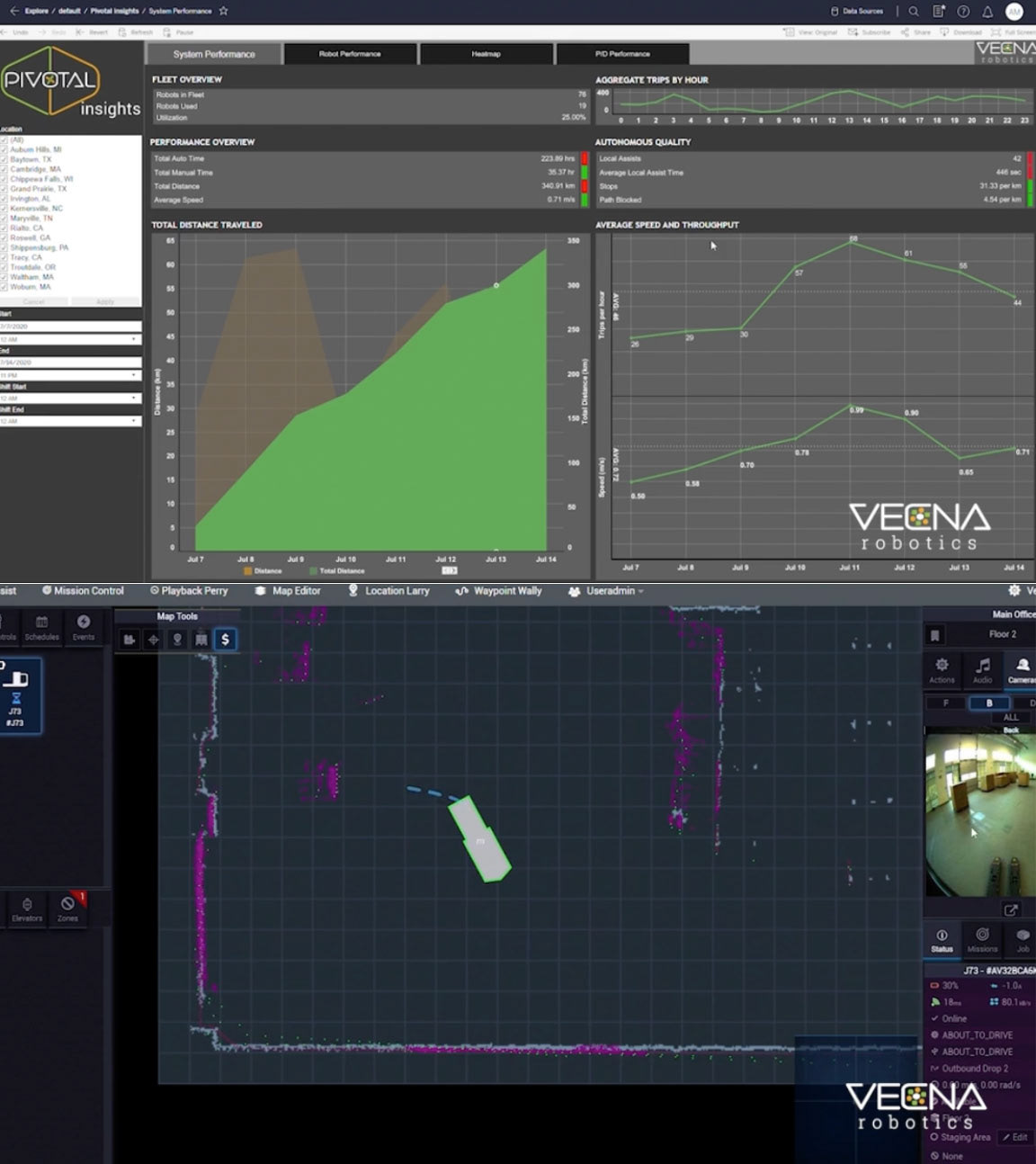
To establish a clear design direction, I conducted a competitive analysis of existing robot fleet management platforms. The market standard at the time — represented by interfaces from companies like Symbotic and Vecna Robotics — revealed a consistent pattern: interfaces designed by and for engineers, with no concession to cognitive load or operator efficiency.
Symbotic's HMI interface used dense warehouse floor maps overlaid with color-coded sequence blocks, competing control panels, and no visual hierarchy to guide operator attention. Every element carried equal visual weight, making critical error states nearly impossible to identify at a glance. Vecna Robotics' platform split fleet data across disconnected dashboard and map views — a generic analytics panel above and raw LiDAR data below — requiring operators to mentally merge two separate data streams to understand what was happening on the floor.
Neither platform had a coherent answer to scale: both assumed a small number of robots in a controlled environment. Neither could support hundreds of robots without the interface becoming an overwhelming wall of undifferentiated data.
This benchmarking confirmed two things: the competitive bar was low, and the opportunity to differentiate InOrbit through design clarity was significant.
In addition to understanding InOrbit's business goals and their perception of the robot management market, it was essential to hear their client feedback. I intended to identify overlaps between client and user needs in order to prioritize platform features and functions. I came up with research strategies to conduct with users, and validation from InOrbit team.
I ran two parallel research tracks — one with InOrbit's team to understand business goals, target customers, and 12-month priorities, and one with existing users to identify pain points, daily workflows, and trust gaps with the current UI.
Key findings: Operators needed situational awareness at a glance across the entire fleet, with the ability to drill into individual robot data in two interactions or fewer. The existing interface required too many clicks to surface critical error states — a significant problem when a robot malfunction in a warehouse has immediate operational and financial consequences.
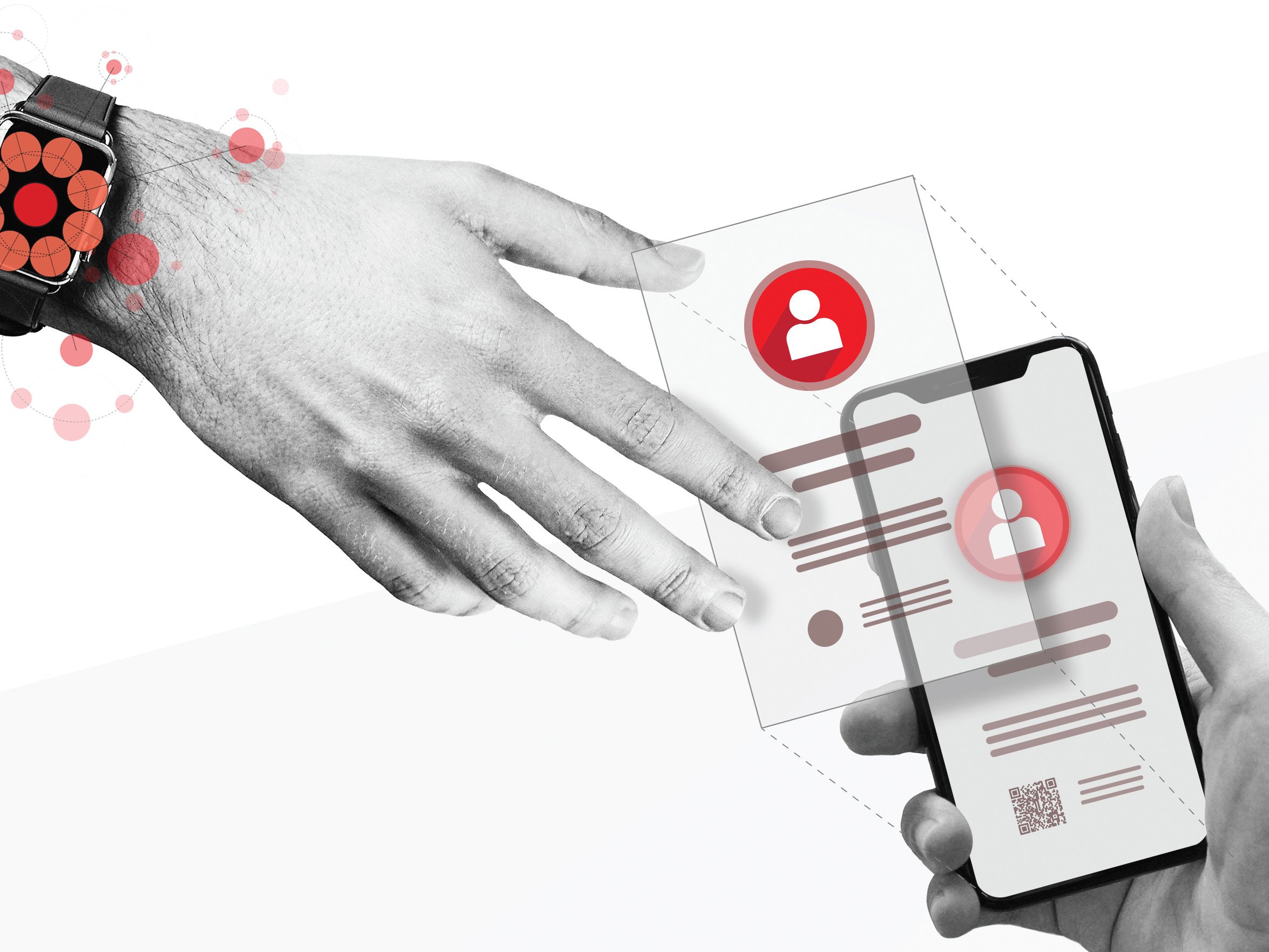
THE USE CASE
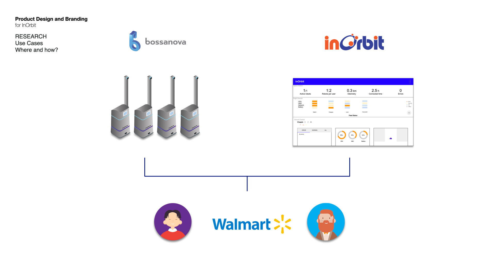
Where and How InOrbit Works in the Real World
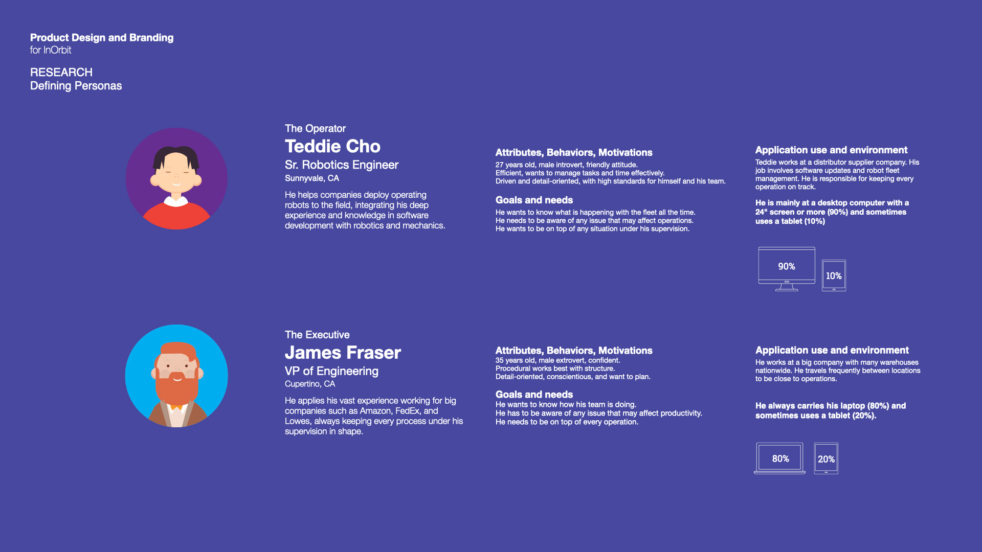
With personas defined, the next step was grounding the design in a concrete operational context. The diagram above maps a real-world deployment scenario: Bossanova Robotics' inventory management robots — operating across Walmart store locations nationwide — monitored and managed through InOrbit's platform.
This use case drove several critical design decisions. Teddie, the Operator, is on a 24" desktop screen monitoring the fleet in real time from a central location — he needs immediate situational awareness and fast access to error states. James, the VP of Engineering, is moving between Walmart locations on a laptop — he needs high-level fleet health at a glance, with enough detail to make operational decisions without being in the room.
Two personas. Same platform. Completely different contexts, screen sizes, and information needs — all served by a single responsive interface designed to scale from one robot to hundreds without changing the mental model for either user.
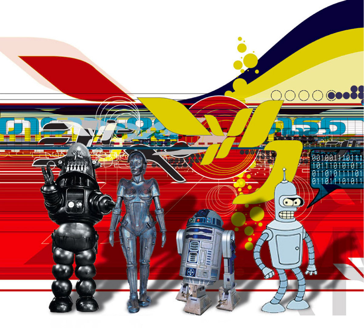
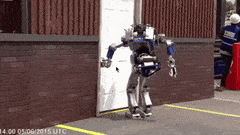
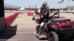
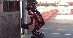
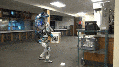
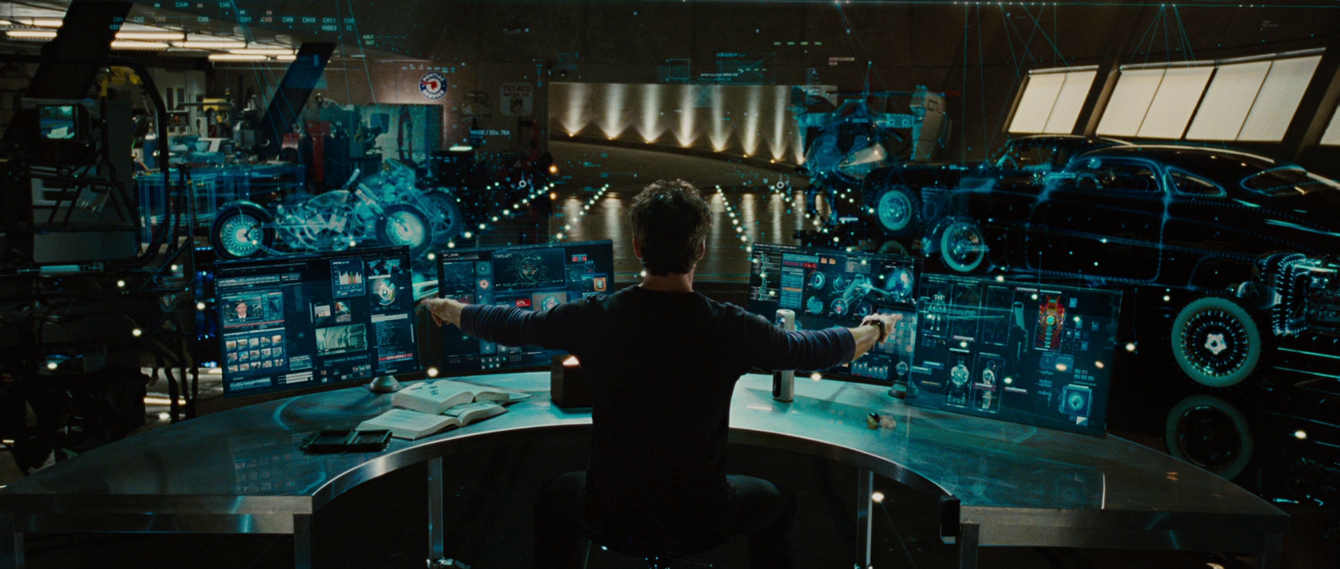
FICTION VS REALITY
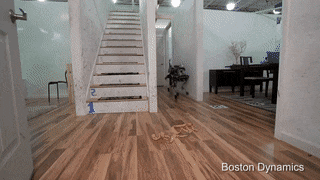
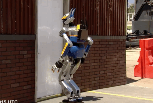
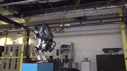
We are all used to fictional robots, but actually which is the real state of robots today? I needed to dig deep into the space to understand the reality of the problems and pain points, so I could work on this project and start thinking about solutions.
VS
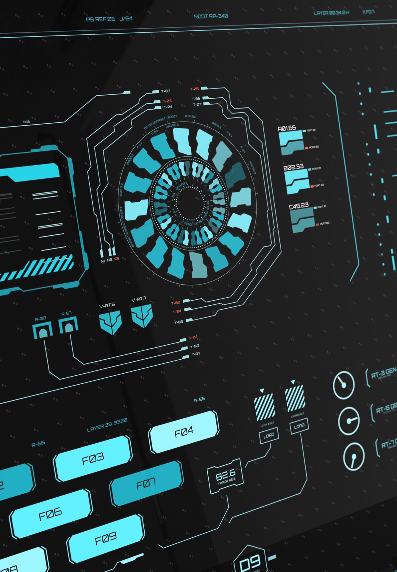
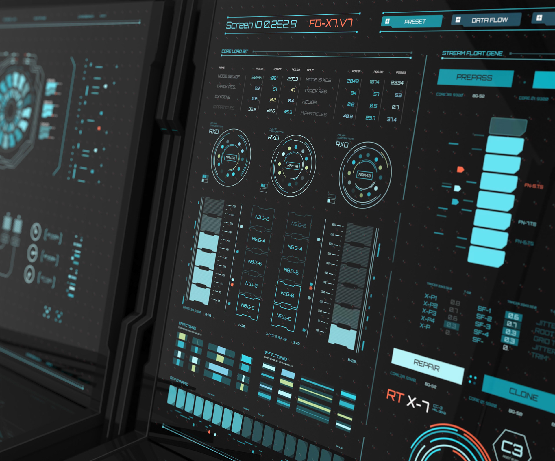
IS THIS SCI-FI?
Every time I shared insights about InOrbit with people, I got a "Uhhh, this is so cool!!" from everyone. The fact that they manage fleets of robots sounds like a starting point for a Steven Spielberg script. So I started asking myself, if we have been watching movies about robots for decades and complex systems like Skynet or The Matrix, and those kinds of technologies are available, why can't we design interfaces that look futuristic and cool? Can't they seem taken from the future?
The future is happening right now!
That was the starting point for running research on movie artists who design UI for films like Minority Report, Anon, Oblivion... I found astonishing examples that inspired me to introduce that concept to the team.
The future is happening right now!
That was the starting point for running research on movie artists who design UI for films like Minority Report, Anon, Oblivion... I found astonishing examples that inspired me to introduce that concept to the team.
We agreed to start a process where, through update after update, we would be able to approximate it toward the final goal of bringing the future of UI to the present.
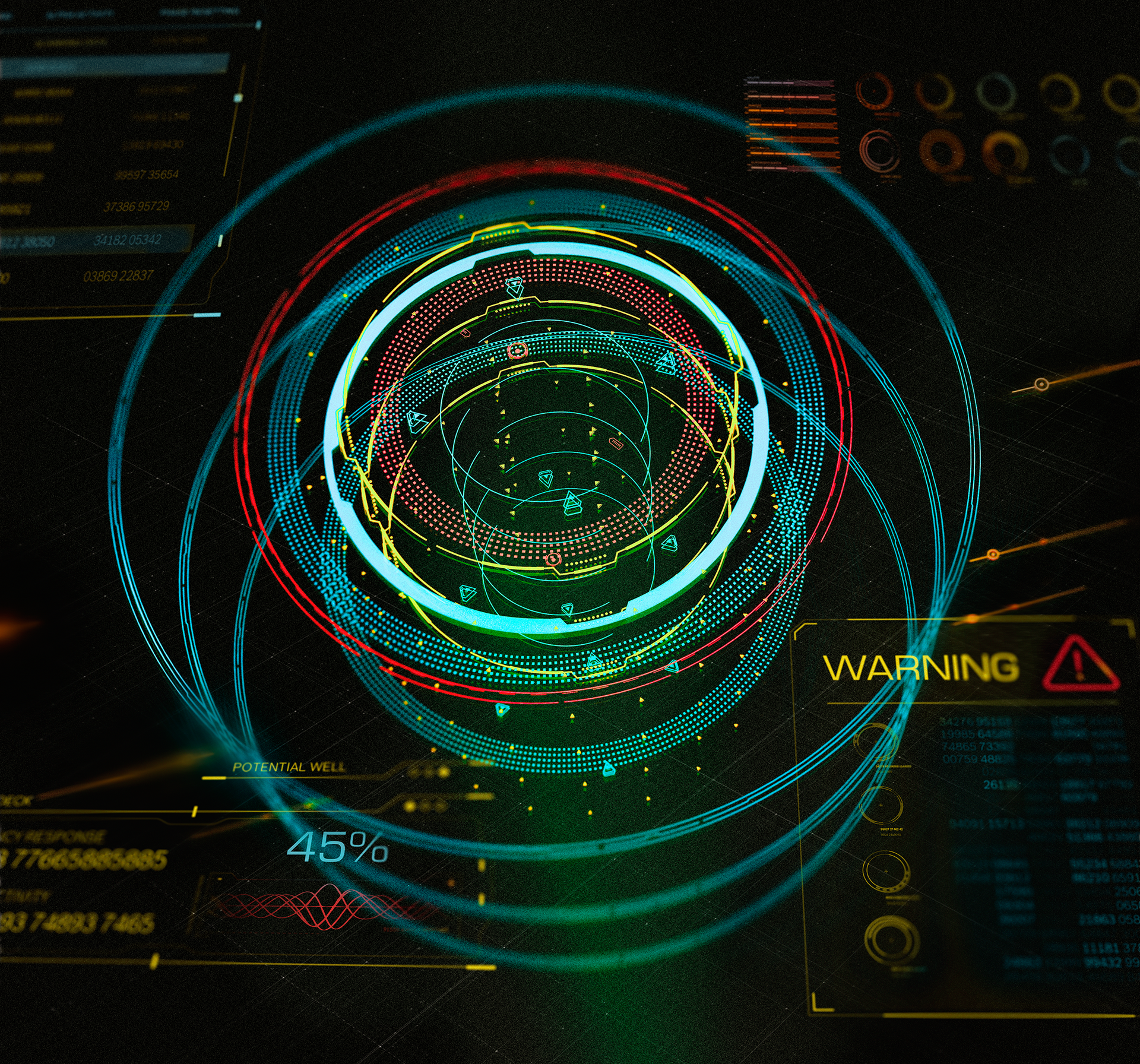
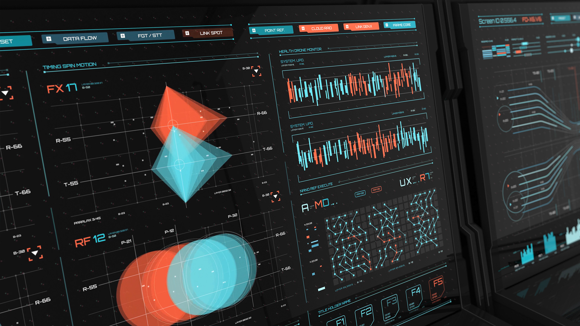
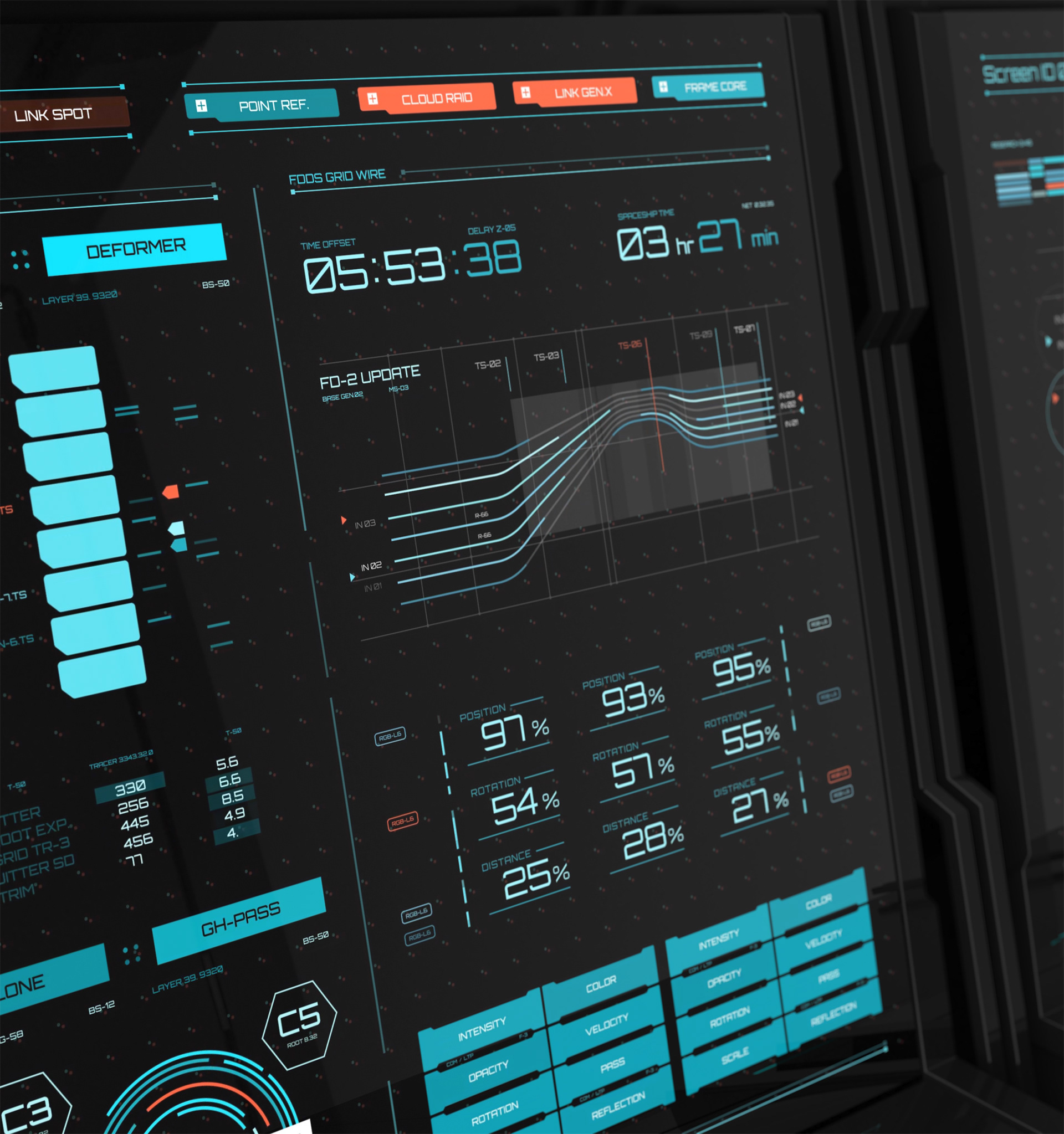
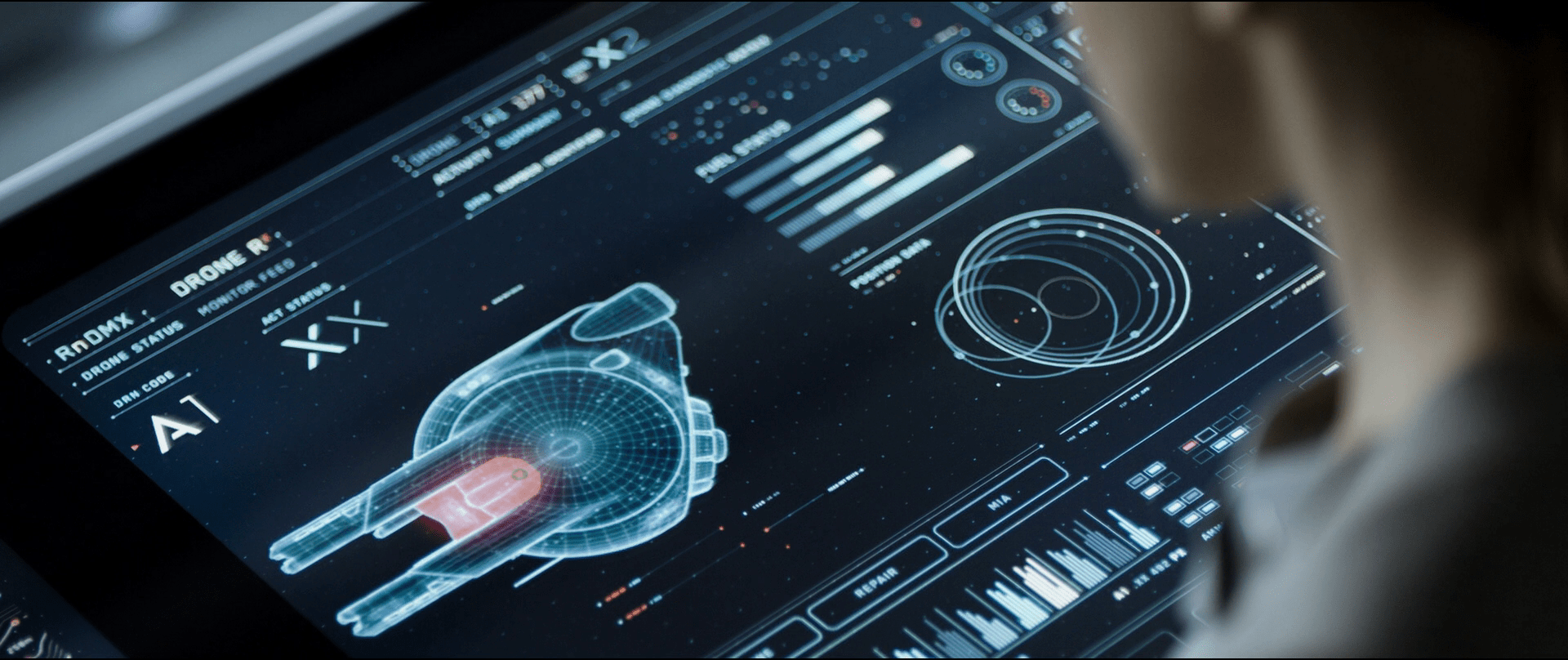
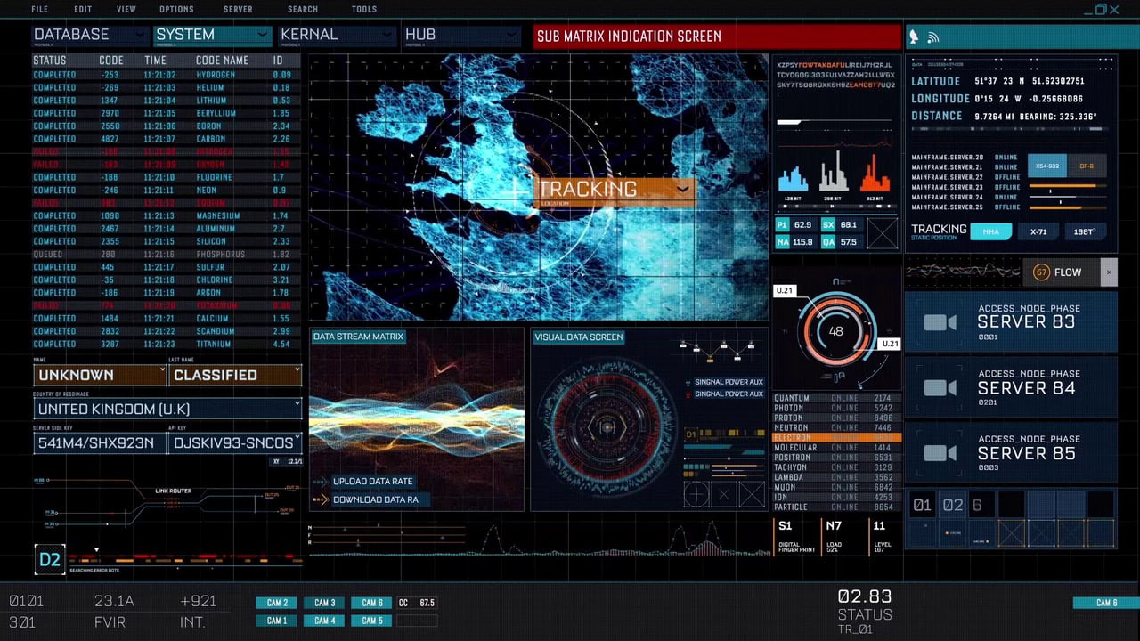
Some User Interfaces I used as a reference to pitch the Sci-Fi idea.
THE SOLUTION
With research findings validated, I restructured the platform around a single organizing principle: every piece of information should be reachable in two interactions or fewer, regardless of fleet size.
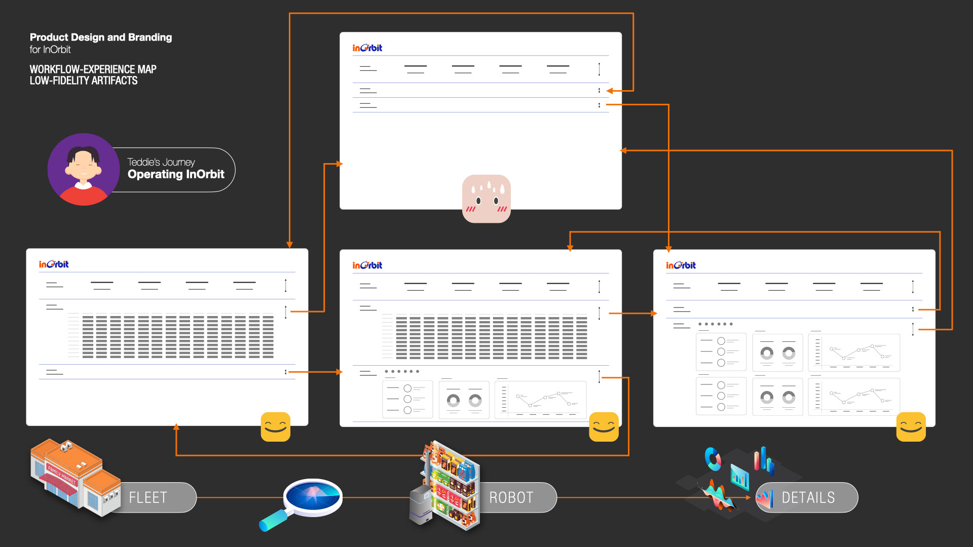
After defining users' pain points and their needs, I defined a workflow with low-fidelity artifacts
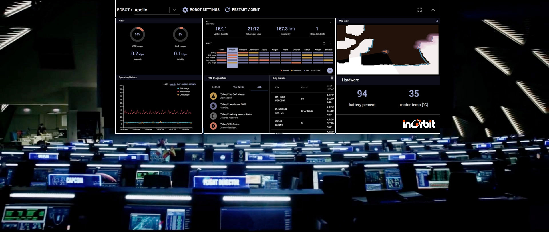
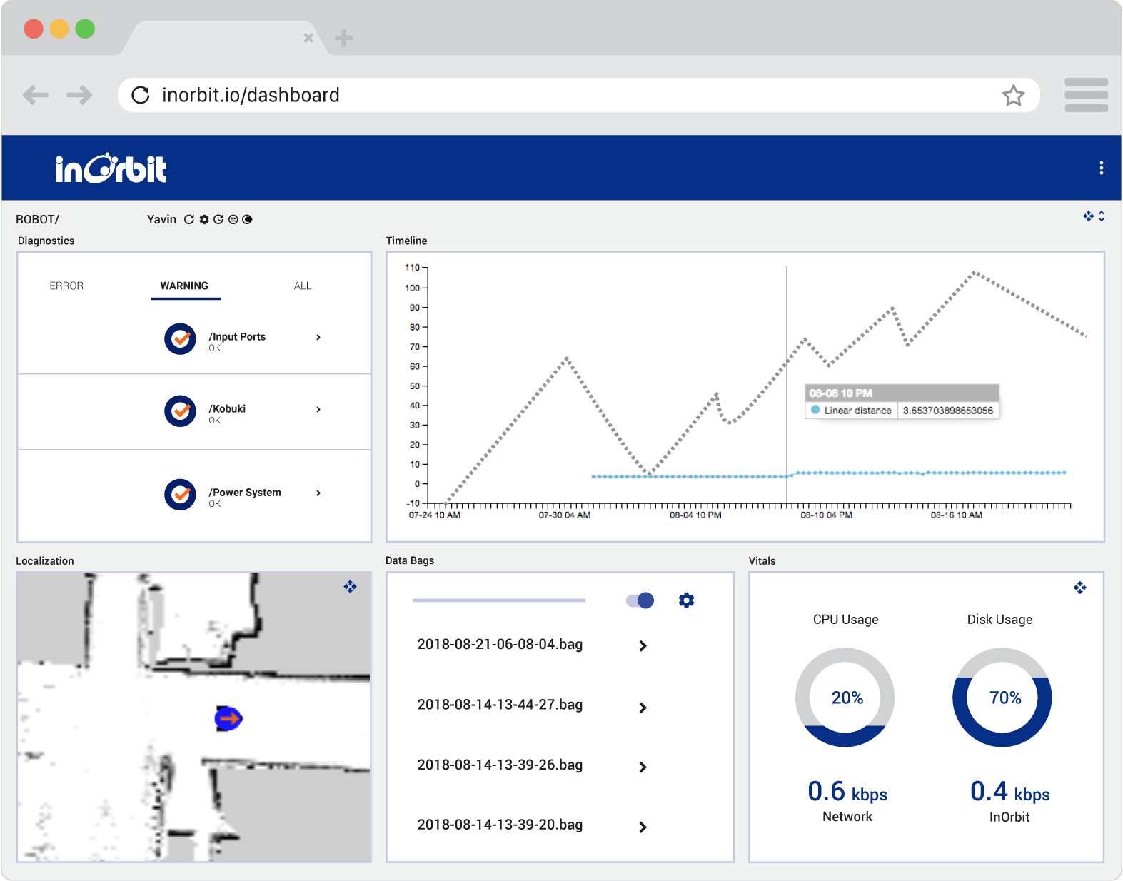
A very significant part of the job was to create a modular responsive structure to support any monitor size. The dashboard is a cloud web-based application, so users can access it from any device.
I rebuilt the dashboard around a modular grid system — standardized proportions, sizes, and color tokens that could scale from 5 robots to hundreds without breaking the layout or losing operator clarity. The dark mode wasn't just aesthetic — it served a functional purpose, reducing eye strain for operators monitoring screens for extended periods and giving critical error states higher visual contrast.
Part of InOrbit’s Dashboard guidelines. Proportions and Modules.
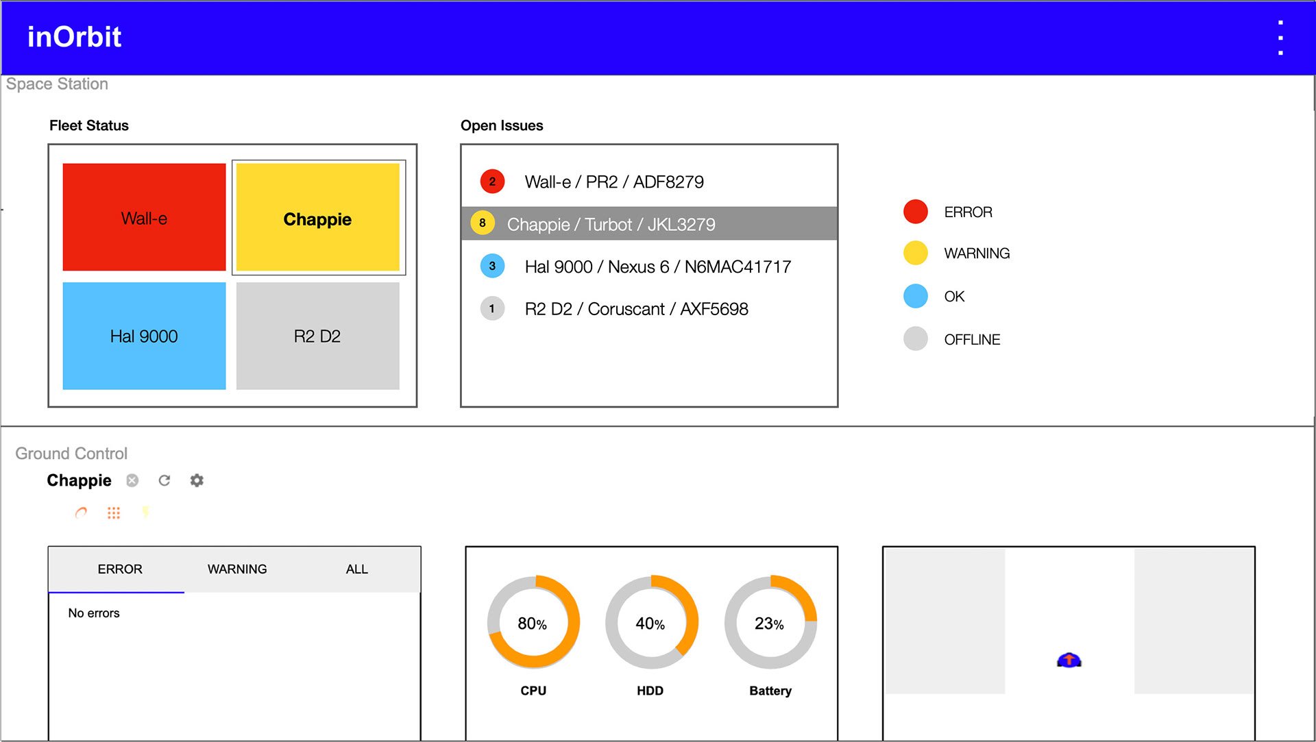
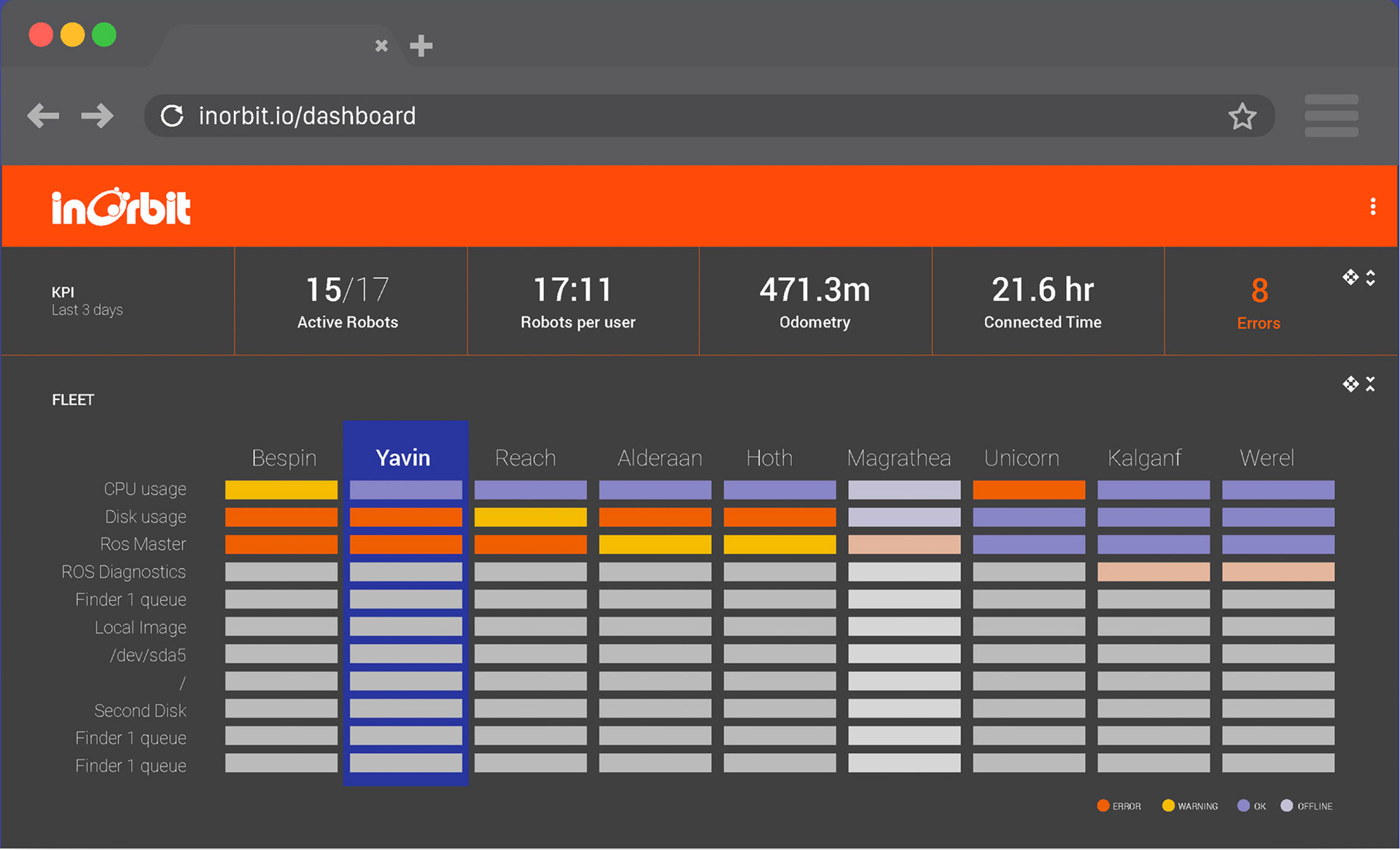
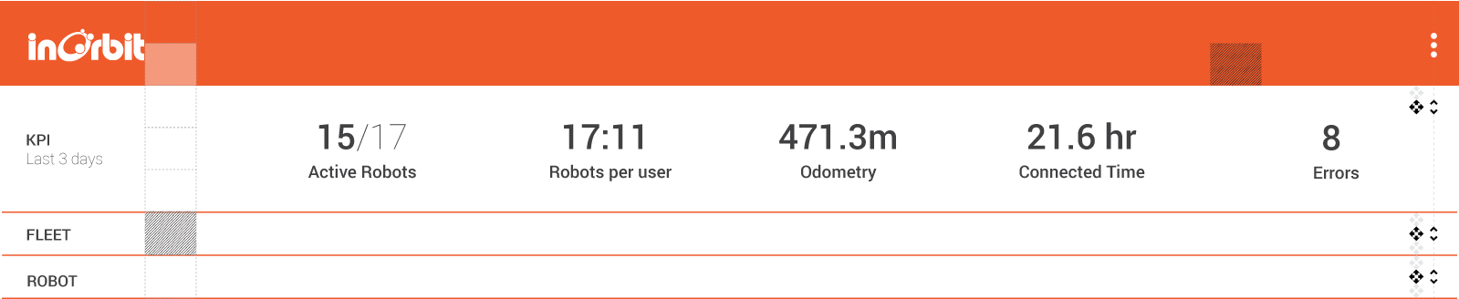
InOrbit's Dashboard has three levels of information:
• General Overview, where the user can have at a glance a broad understanding of the fleet and any problems that might be happening.
• Fleet Status, where you can see every robot and its different variables.
• Details — for closer inspection of individual robot variables, camera feeds, connection status, and map position.
I implemented an accordion system that allows the operator to jump from the fleet view to the minimum level of information in one taps. Everything can be collapsed and expanded to focus on different levels of information
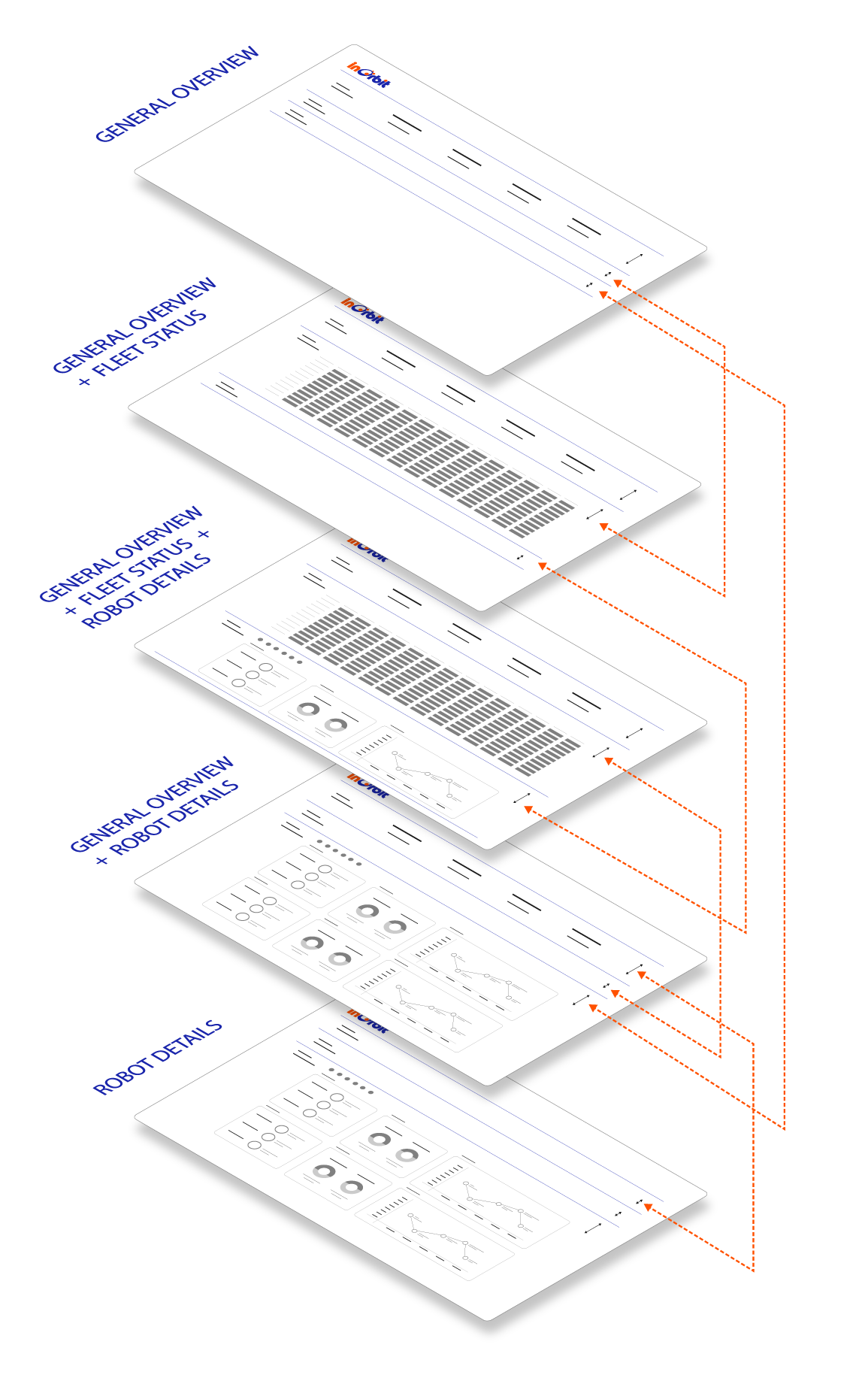
By collapsing and expanding the different levels, the operator can go from a general overview of the entire fleet to every data point in one click.
Watch: the priority-sorting algorithm in action — errors always visible, healthy robots off-screen
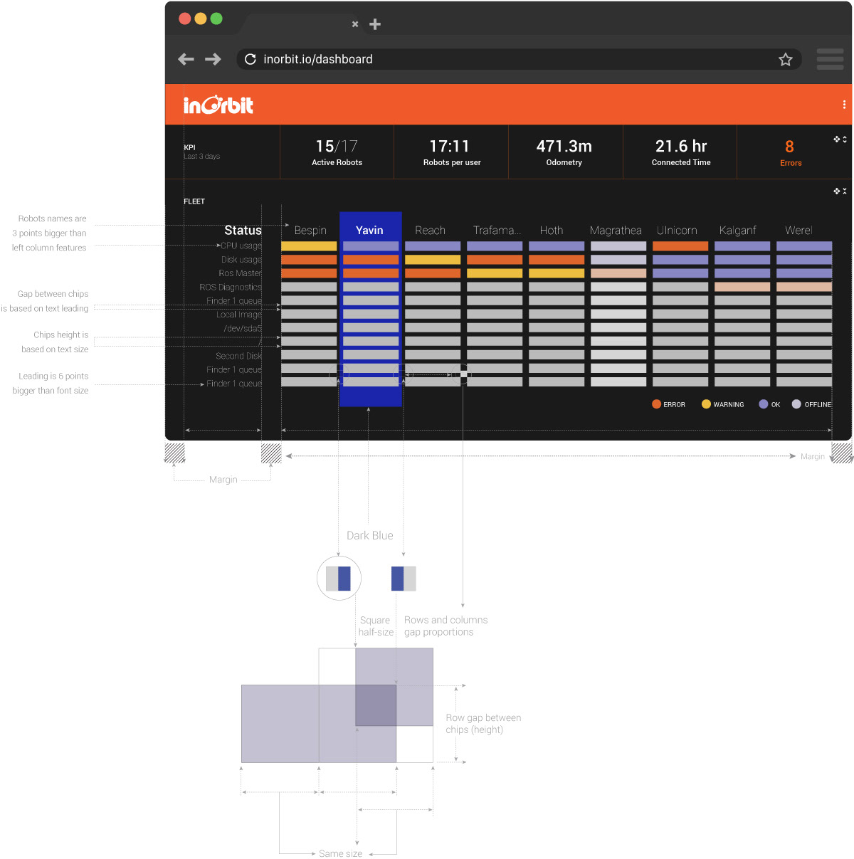
The most critical UX challenge in fleet management at scale isn't displaying hundreds of robots — it's making sure an operator can identify a problem robot in under three seconds, regardless of fleet size.
My solution: a priority-based horizontal sorting algorithm, built in collaboration with the engineering team at my direction. Robots are organized in columns, with dimensions as rows. The algorithm continuously sorts the fleet left to right by urgency — robots with active ERRORS anchor the far left of the screen, WARNINGS follow, and healthy robots are pushed progressively to the right, eventually off-screen entirely.
The result is a self-organizing interface: the most critical information is always visible without scrolling, while healthy robots — which require no operator attention — naturally disappear from view as the fleet grows. An operator managing 500 robots sees exactly what demands their attention, nothing more.
This was one of the most impactful UX decisions of the project — a pattern that turned an overwhelming data problem into an ambient, at-a-glance awareness system.
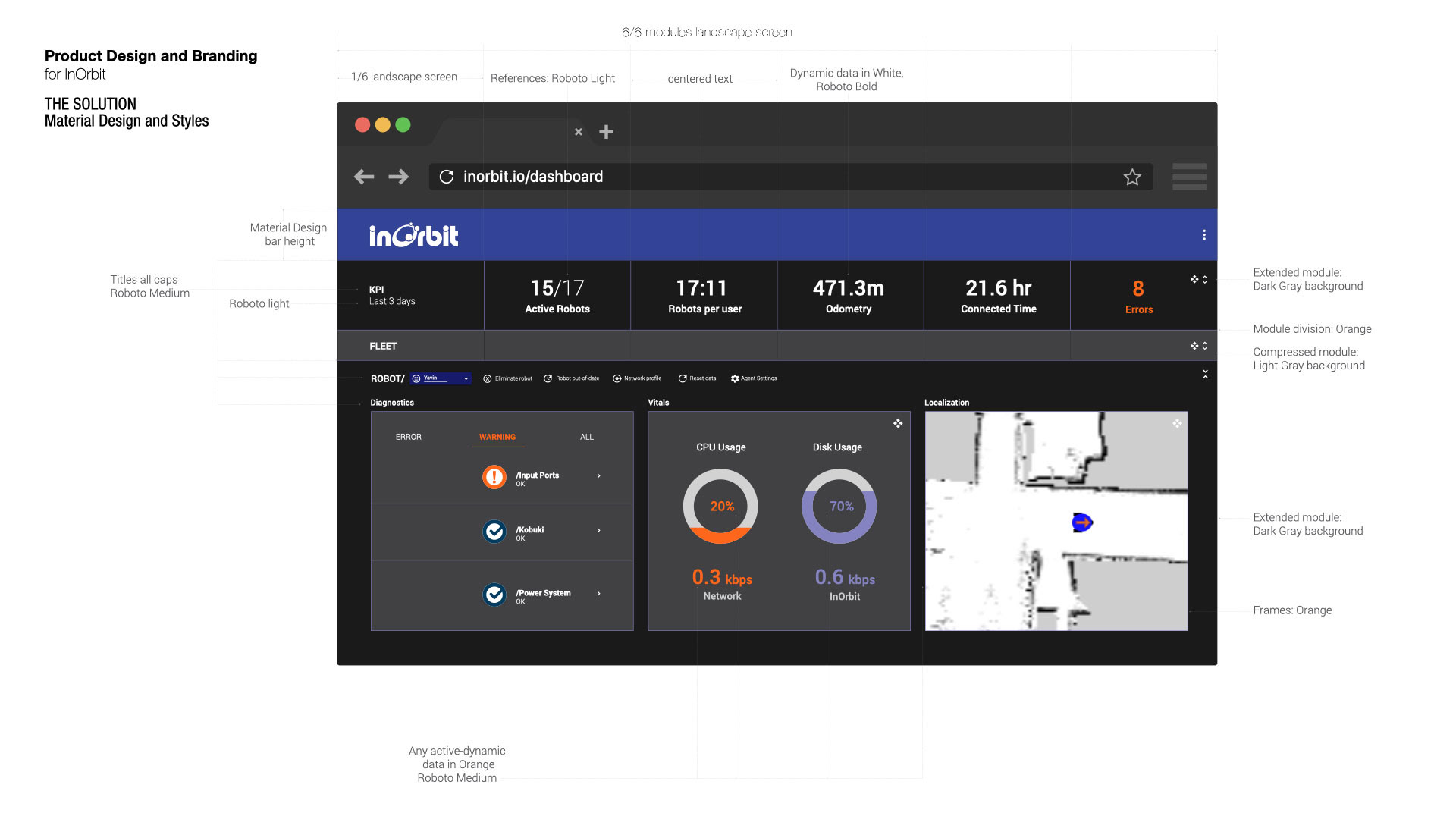
Material Design & Styles
With RoboBusiness Santa Clara on the calendar — six months away and non-negotiable — there was no time to build a UI component library from scratch. After aligning with the founders and engineering team, we agreed on a pragmatic foundation: Material Design. It would give us production-ready components immediately, letting the team focus development effort on InOrbit-specific functionality rather than rebuilding buttons and inputs.
Then came a small moment of fate: Material Design's recommended typeface is Roboto. InOrbit's branding called for Roboto. The decision made itself.
From that foundation, I built InOrbit's design system — extending Material Design's component library with InOrbit's brand colors, visual language, and dashboard-specific patterns. The system established clear rules for every UI layer:
— Titles in Roboto Medium, all caps, for section hierarchy — Static labels in Roboto Light, for information density without visual noise — Dynamic data — live metrics, active states, errors — always in Orange, Roboto Medium, so operators can distinguish what's changing from what's fixed at a glance — Dark Gray backgrounds for extended modules, Light Gray for compressed ones, Orange frames for active robot selections — The KPI bar anchored at the top: Active Robots, Robots per User, Odometry, Connected Time, and Errors — the five numbers an operator needs before anything else
The constraint that could have been a liability became an advantage: by building on Material Design rather than against it, the engineering team could implement screens significantly faster, and the final product had the visual consistency of a system that had been in development far longer than six months.
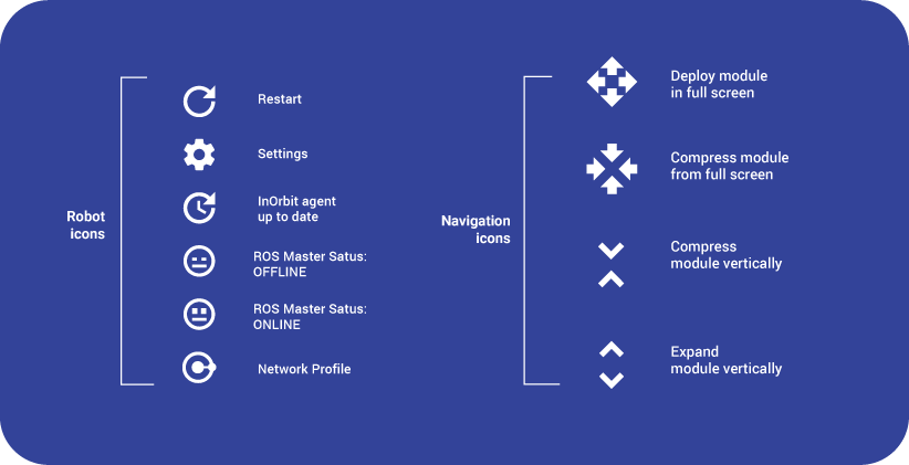
I updated some previous icon versions and created new ones to communicate different instances and situations.
The job included creating a light version.
As a color accent, I used InOrbit's Blue and a Light Blue for strokes and frames.
As a color accent, I used InOrbit's Blue and a Light Blue for strokes and frames.
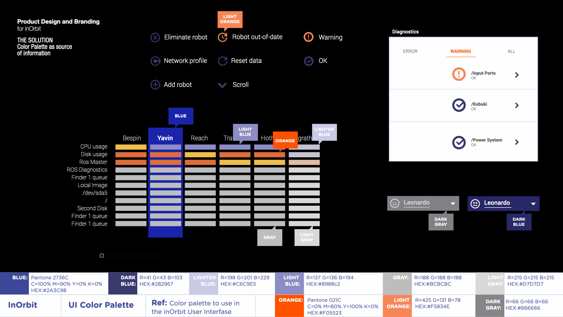
The new color palette was defined according to InOrbit's branding guidelines as part of its full rebranding, but at the same time, as a source of information supporting the UI.
BEYOND THE PRODUCT
Brand, Marketing & Motion
Simultaneously with the platform redesign, I led a full refresh of InOrbit's visual identity — ensuring the new product UI and the company's external presence told a cohesive story to the same enterprise buyers.
The work included:
— Logo refinement — evolving the existing mark to align with the new product's visual language while maintaining brand recognition — Marketing assets — pitch decks, event materials, and sales collateral for RoboBusiness Santa Clara — Website redesign — updating the public-facing site to reflect the new brand direction and enterprise positioning — Motion graphics — animations explaining InOrbit's core value proposition for sales and marketing contexts
The result: a unified experience where a prospect could move from the InOrbit website to a sales deck to the product demo without feeling a visual disconnect — a detail that matters significantly when selling to enterprise buyers evaluating multiple vendors.
Shortly after the redesign launched, InOrbit closed a $2.6M Seed round — followed by a $10M Series A.
The redesigned platform became the foundation for every subsequent product iteration, and the design system I established continued to guide the team's visual decisions well beyond my engagement.
TEAM MEMBERS
Florian Pestoni
Founder and CEO
Founder and CEO
Julian Cerruti
CO-Founder and CTO
CO-Founder and CTO