- 2014 / 2020 -
PRODUCT DESIGN
PRODUCT DESIGN
Experience is everything
During my career, I created many different experiences for well-known brands.
ROLE:
Visual Design
UI/UX
Game Design
Interaction Design
Visual Design
UI/UX
Game Design
Interaction Design
TOOLS:
Figma
Sketch,
InVision, XD
Creative Suite
Figma
Sketch,
InVision, XD
Creative Suite
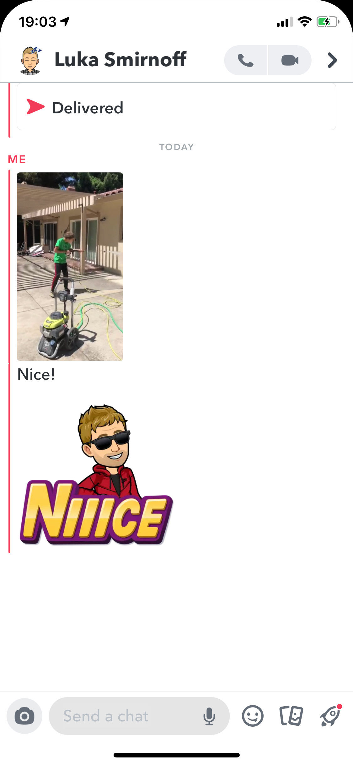
Interactive Point of Sale Kiosk for Rivian
The concept behind this prototype is to showcase the product in different environments, but keeping alive its benefits and style. Project for Point of sale for an Electric SUV. Photo-composed in Photoshop and rapid prototyping in XD.
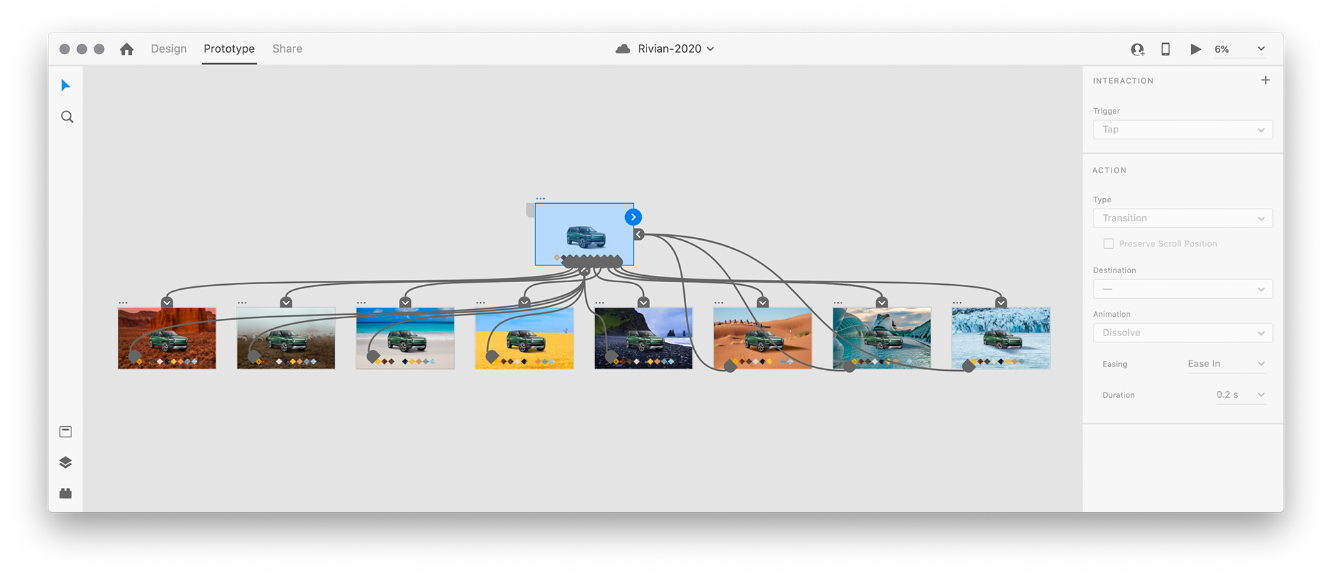
Tools: The photo composing was made in Photoshop and the Interaction in XD
Goal: Point of Sale demo Kiosk for Electric SUV
Role: Ideation, Visual Design, UX/UI, Interaction design, Motion Graphics #photoediting #prototyping #interactiondesign #photoshop #xd
Role: Ideation, Visual Design, UX/UI, Interaction design, Motion Graphics #photoediting #prototyping #interactiondesign #photoshop #xd
Social Media Feed Concept
1_The Challenge
Creating a Social Media Feed is one of the most challenging but rewarding design projects faced by a designer. Companies as Facebook, LinkedIn, or Twitter assign armies of designers to create these experiences that will be available for thousands, even millions of users, every day around the world.
That is why having a take on this subject can't be faced lightly. It should be the result of many hours of UX research, interviews, and an alignment between business goals, management, engineering, and of course, design.
That is why having a take on this subject can't be faced lightly. It should be the result of many hours of UX research, interviews, and an alignment between business goals, management, engineering, and of course, design.
To face this assignment, I defined assumptions and hypotheses based on personal preliminary research. The visual result should be evaluated based on this framework but eventually needed to be widely verified to eventual implementation.
02_Used Design Principles
To maximize impact and reach, I kept the following principles.
Aesthetic Integrity
Aesthetic integrity is required combining appearance and behavior with app features.
Consistency
The app incorporates new features and behaviors in ways people expect by implementing common standards and paradigms, keeping interface elements, well-known icons, standard text styles, and uniform terminology.
Direct Manipulation
By making maximum use of common gestures as scroll up-down, tap, and swipe right and left, Users can see the immediate, visible results of their actions.
Feedback
Showing results to keep people informed is a way of giving feedback after Users' actions. The new True Feed provides perceptible feedback in response to every user action.
Metaphors
Metaphors work well in apps because people physically interact with the screen executing actions, whether rooted in the real or digital world.
User Control
The best apps features find the correct balance between enabling users and avoiding unwanted outcomes, making people feel like they're in control by keeping interactive elements familiar and predictable.
These are well-known Design Principles pushed by referents of the market like Apple, and very helpful when creating any new app experience.
3_Research
After running a comparative preliminar analysis from the most well known Social Media platforms and Messaging Apps screens, I conclude that the overall style is kind of messy and overloaded with information, icons, lines, backgrounds, and even changing styles on the same screen.
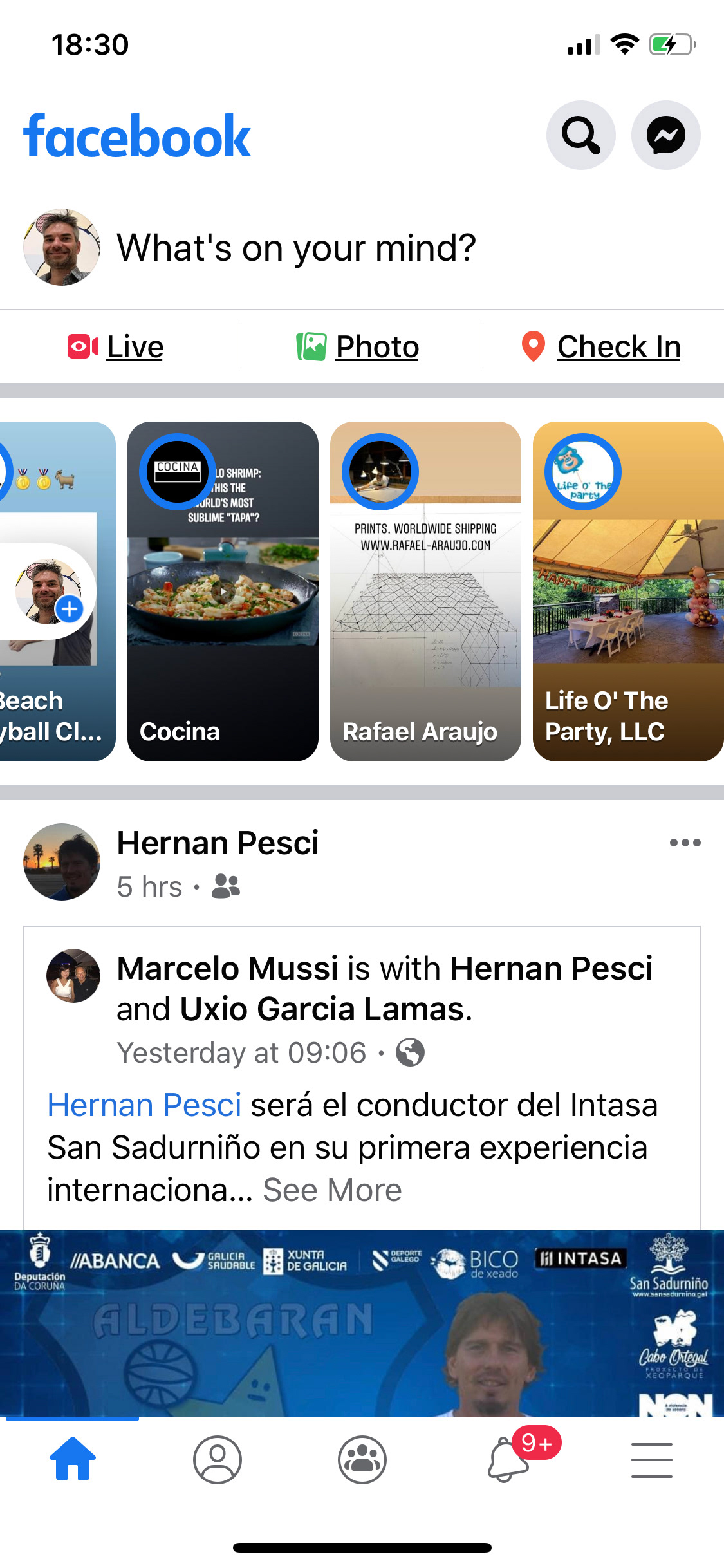
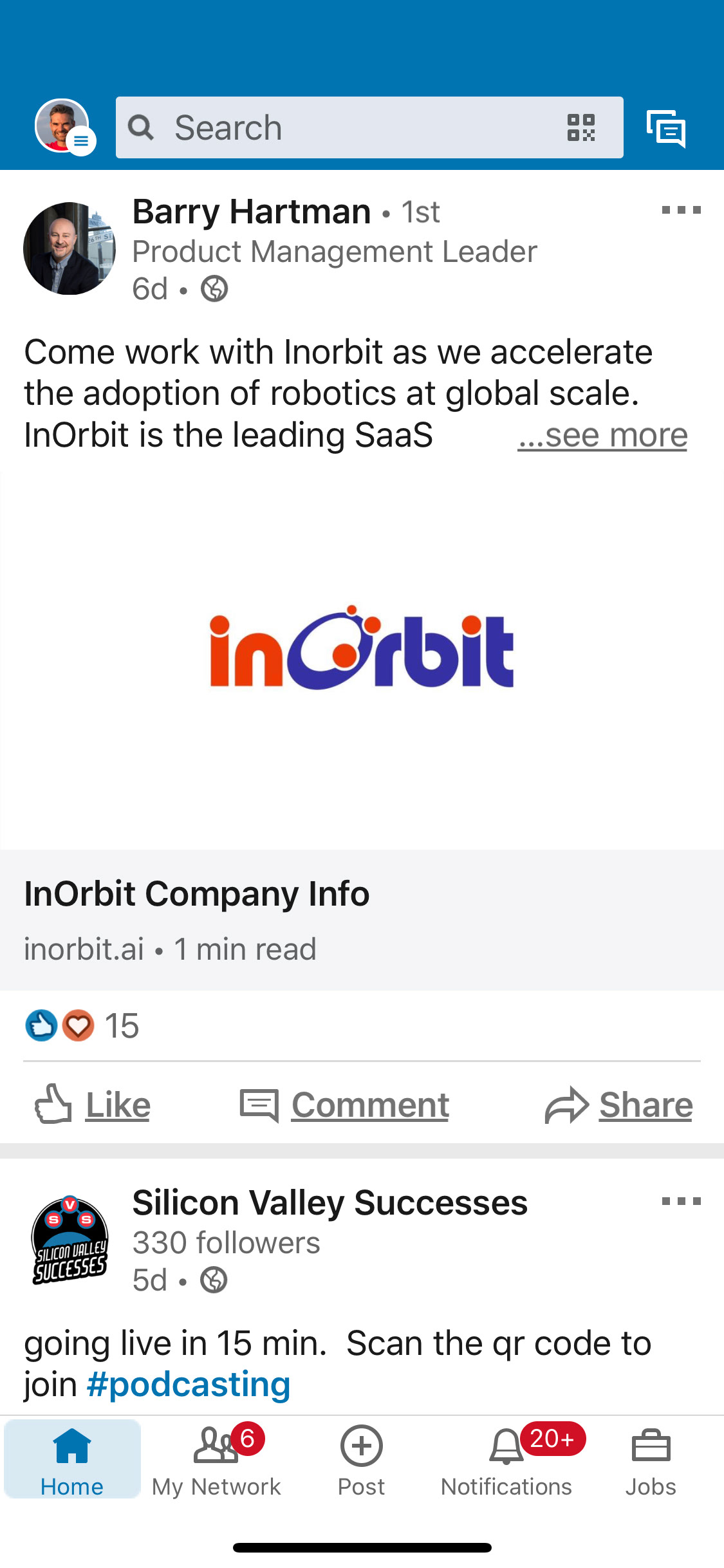
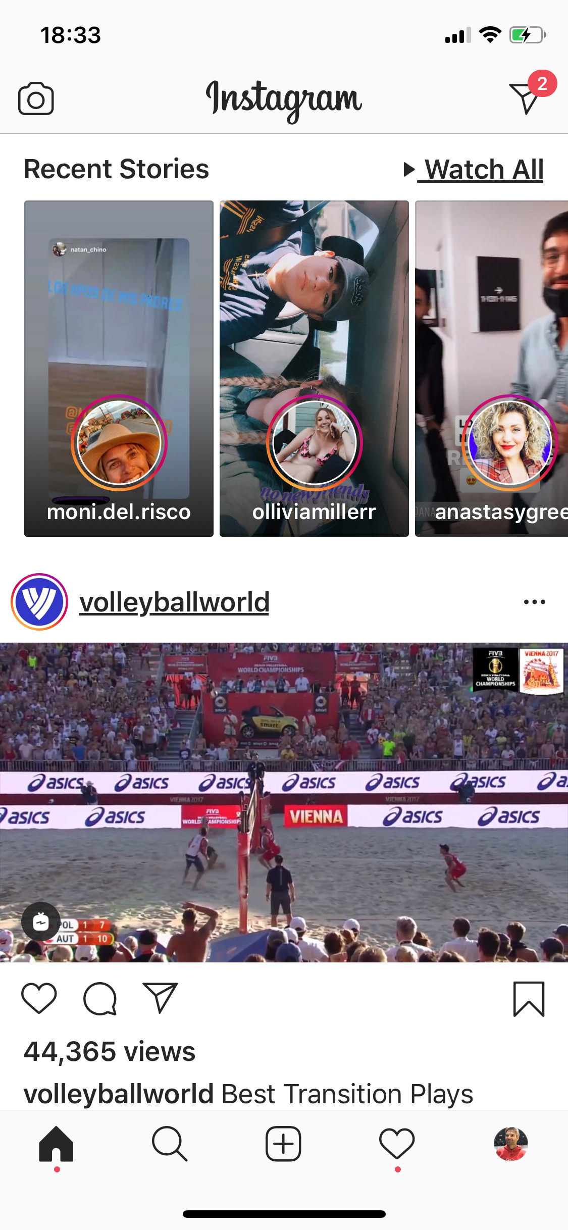
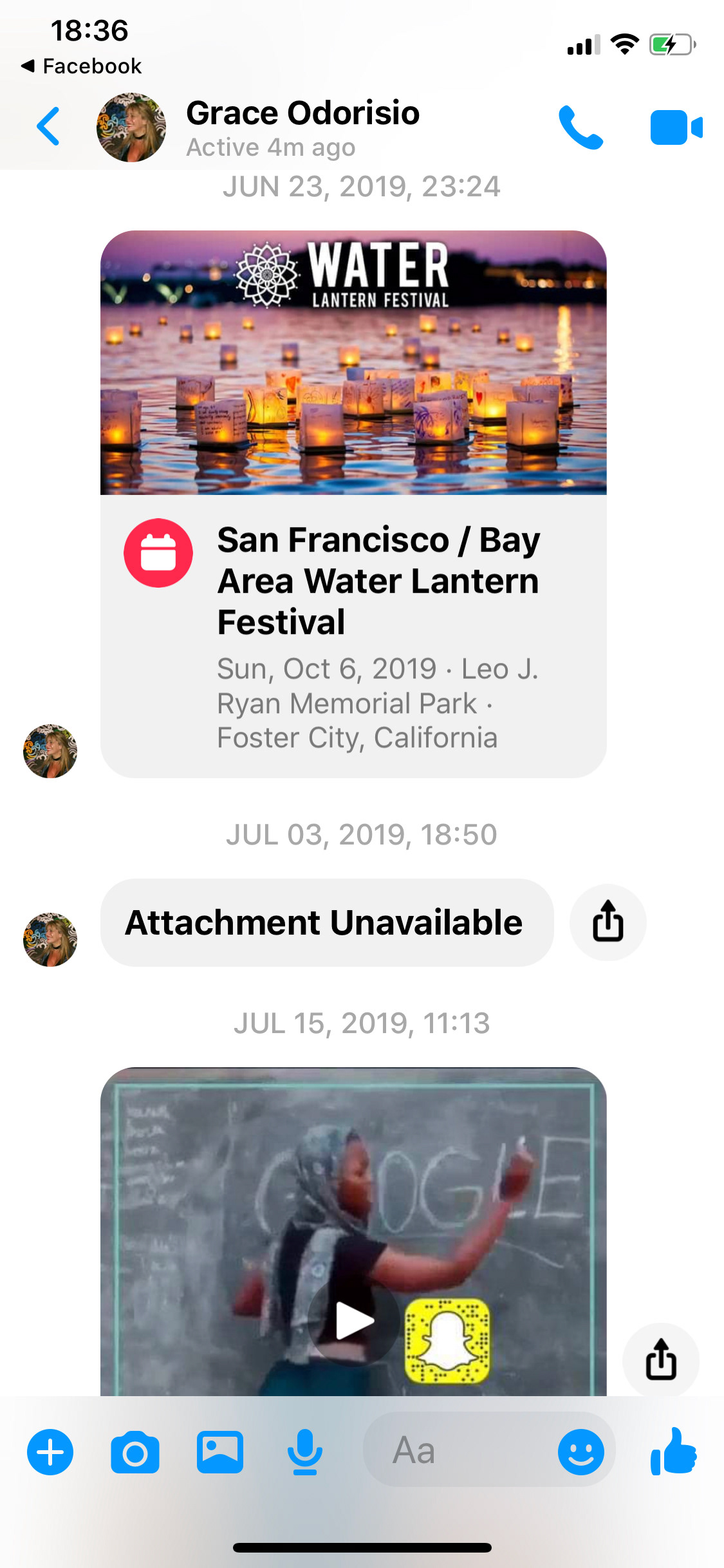
Visual landscape: Facebook, LinkedIn, Instagram, Twitter, TikTok, Snapchat, Messenger, WhatsUp
4_ The Assumptions
Social Media Users utilize these platforms not only to connect with friends and colleagues but also as a source of information. As century 21st newscasts, social media are the most (and sometimes) the only way for many people to be in touch with the news.
On the other hand, the company future business model suggests a way for users to get paid from choosing which advertising they want to see. It's a fantastic opportunity for brands to create bonds with their fans, create new ones by generating a dialog with them.
5_The Concept
By adding Hashtags, users can customize their feed by searching from self-loaded “Group-Days-Group Days Hashtags”. For example, a user can see all the posts related to #BlackLivesMatter available across all his/her Friends and Followed Brands. In this way, a funnel of information is created from multiple sources, generating a unique and personal experience. As Friends and Brands will indistinctively post based on specific topics, a user can unify those at a unique and exclusive feed.
6_The Solution
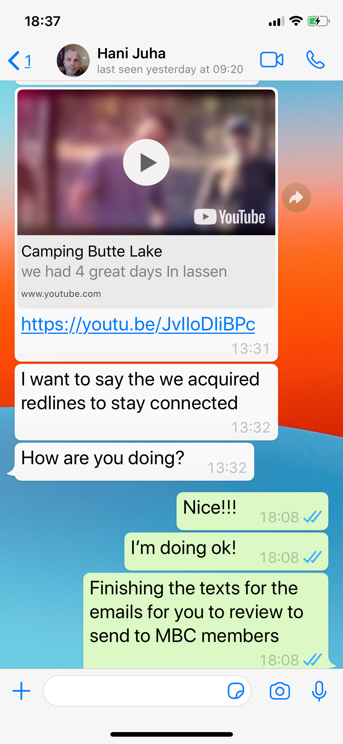
I created a multi-dimensional space with three layers: X, Y, and Z. Basically, a user can search or choose a suggested Hashtag to live-customize his-her feed, scroll down to move from a Group feed to a Hashtag feed, and swipe left to see previous posts and right to see new ones that not have been seen yet by him/her. By tapping on a post, users can dig and expand into it and, by tapping again, even zoom the picture or video to full screen.
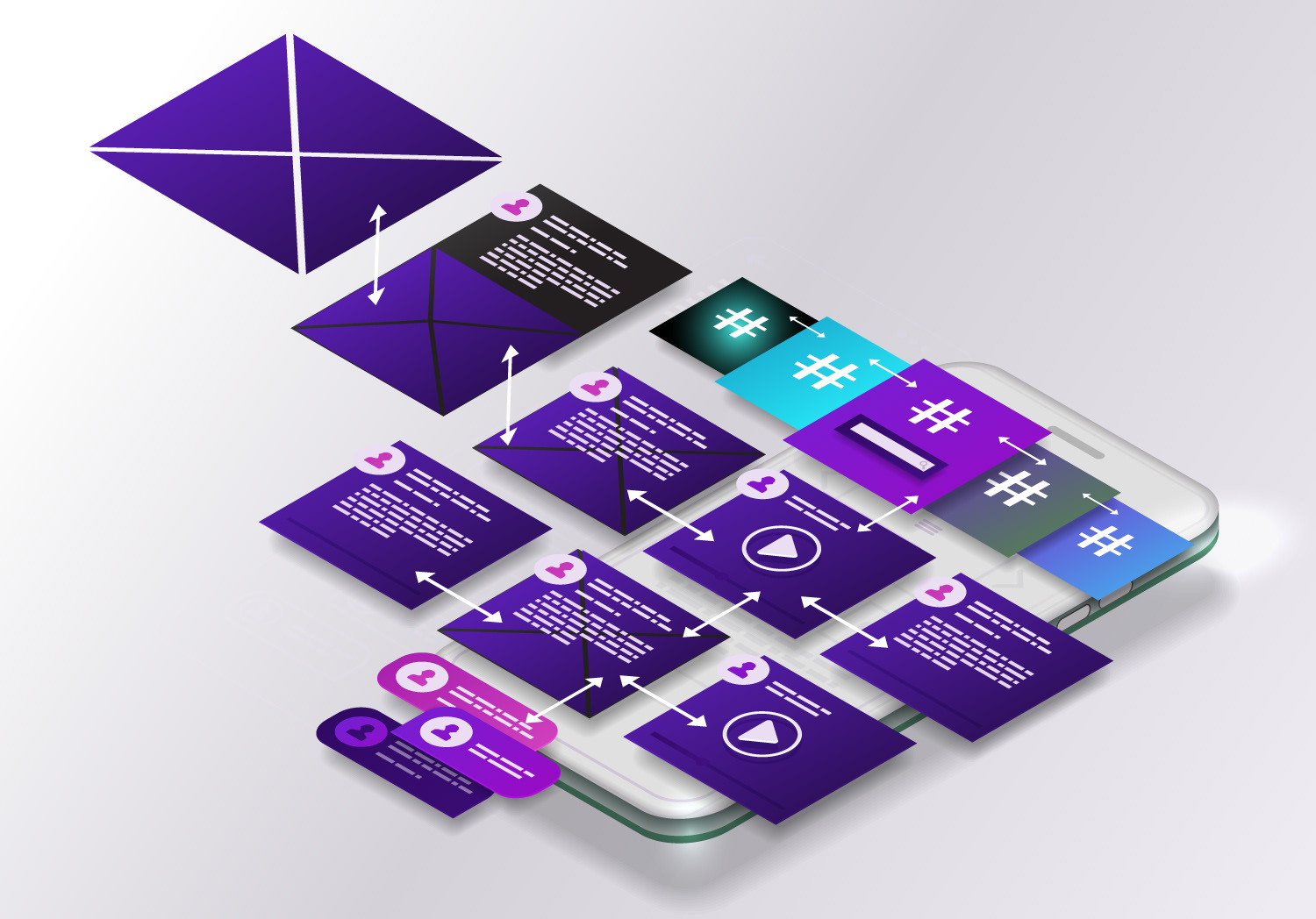
Fig1: Low-fidelity wireframes showcasing the navigation flow
I started from the existing aesthetics principles and generated an updated version keeping a unified visual image based on white spaces, soft shadows, and rounded corners.
To enhance the visual experience, I created an overlapping black bar that will work over the image's post to optimize space grouping more information in fewer pixels.
To enhance the visual experience, I created an overlapping black bar that will work over the image's post to optimize space grouping more information in fewer pixels.
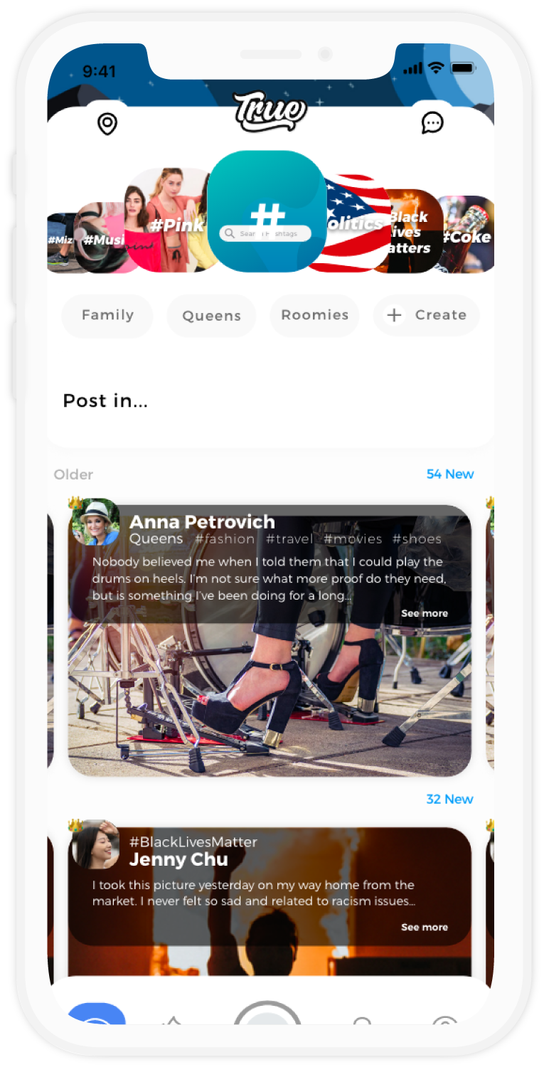
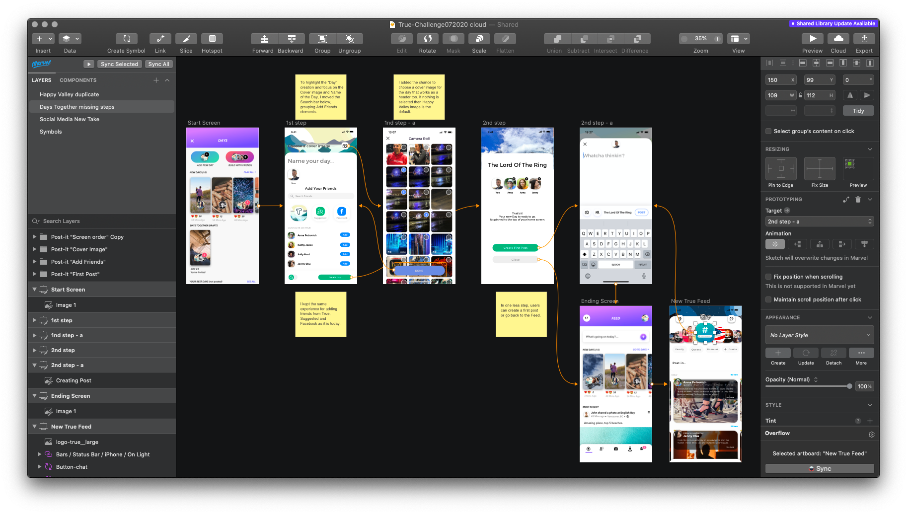
Fig2: The Project was created in Sketch defining Symbols creating a Component System
From an original illustration provided by the company (first from left) I created new versions to highlight events, holidays and special occasions like Unicorn day & Dark Night themes.
Original Background

New version - Unicorn Land

New Version - Nigh Mode

#userexperience #prototyping #lowfidelity #wireframes #highfidelity
#visualdesign #userinterface #businessstrategy #Sketch
#visualdesign #userinterface #businessstrategy #Sketch
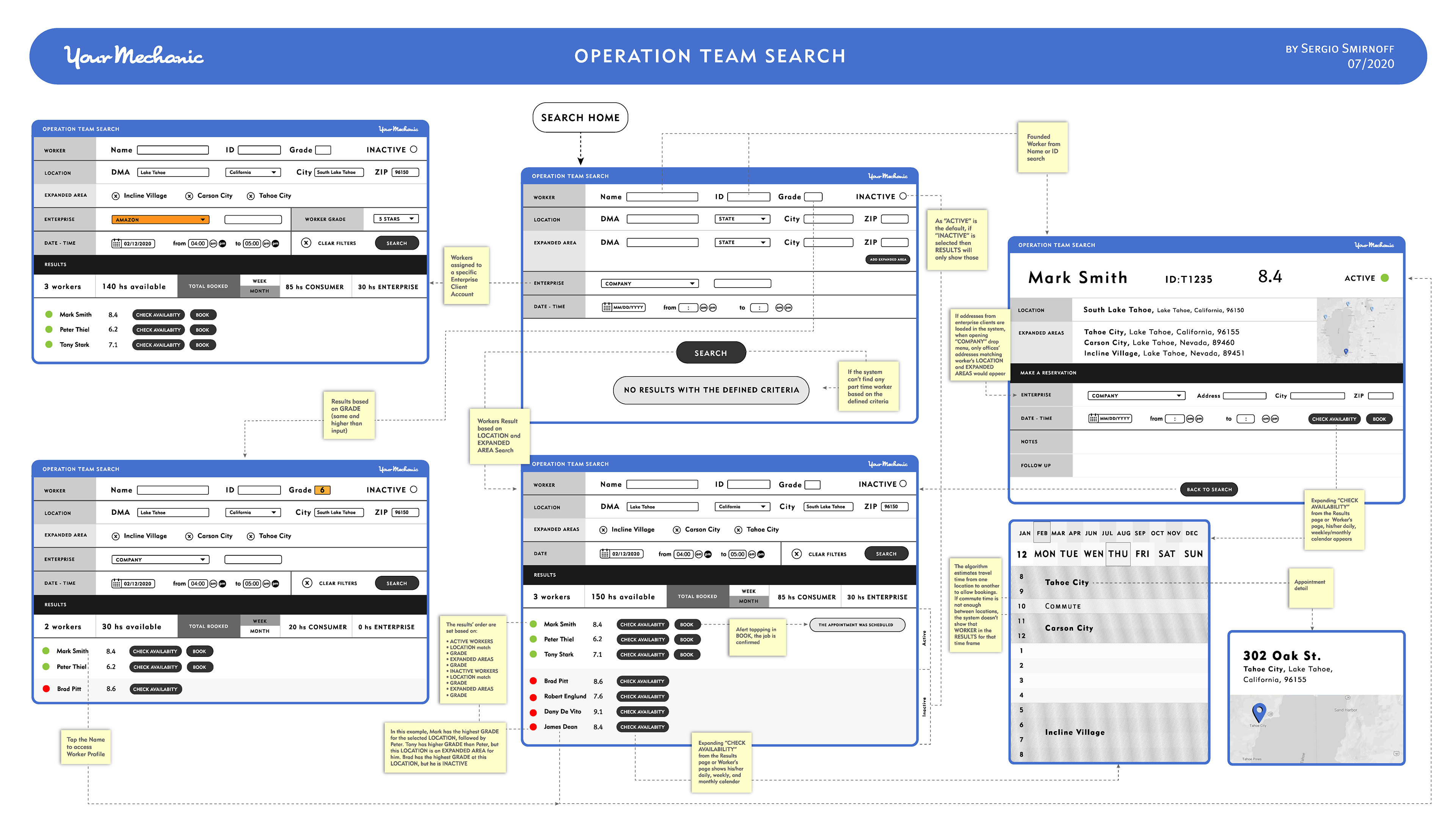
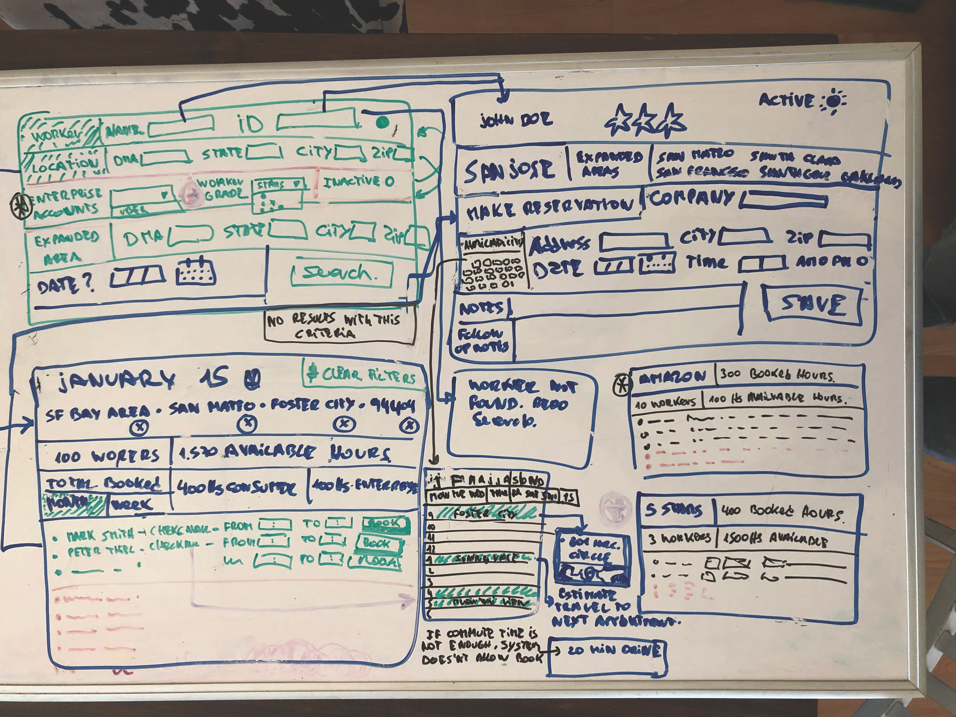
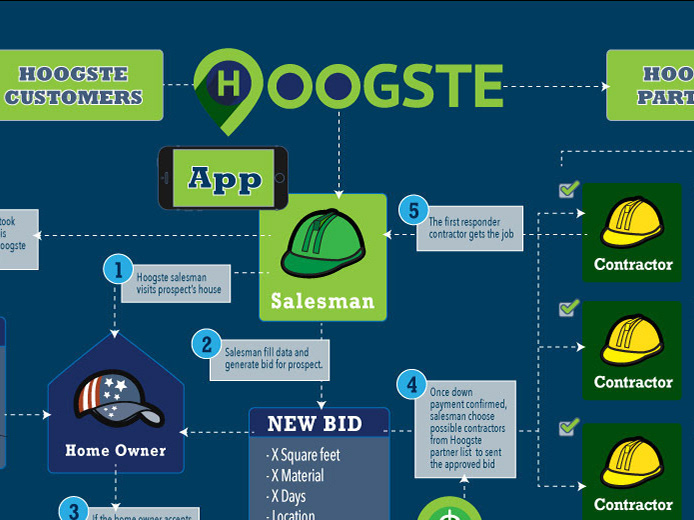
UX for an internal operative team
I created this workflow for a local Silicon Valley company to help operators to assign workers to jobs in certain territories. The challenge is to match the right workers based on zones/availabilities.
#userexperience #prototyping #lowfidelity #wireframes