How I predicted Apple NameDrop 6 years early
App Design
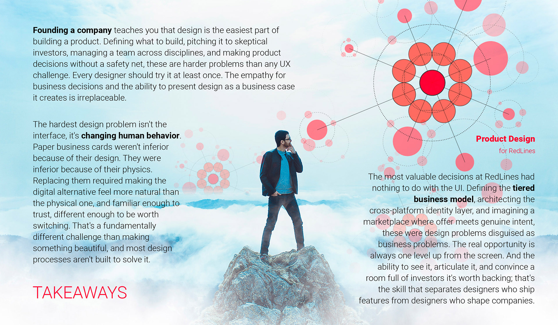
for RedLINES
PROBLEM:
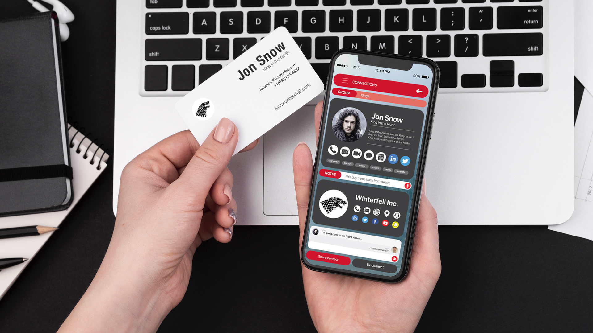
Professional networking still ran on paper business cards in 2017, a friction-heavy, context-dependent, one-directional exchange with no digital follow-through, no AI matching, and no way to keep contact information current.
SOLUTION:
Co-founded and designed RedLines: an AI-powered digital networking platform replacing physical business cards with smart eCards, proximity-based sharing, and AI-driven connection suggestions across multi-social media feeds.
OUTCOME:
Core UX concepts independently validated by LinkedIn (QR profile sharing, 2018) and Apple (NameDrop, 2023) · 0→1 shipped in 10 weeks · 10-person team
METADATA:
Co-Founder · Product Strategy · Lead Designer · 2 years · Mobile & Desktop · B2B2C · Social Networking
In 2017, exchanging contact information between professionals still required a physical object: a paper card that could be lost, forgotten, or never followed up on. LinkedIn existed but had no proximity-based sharing. Smartphones were everywhere, but had no native way to exchange contact details between two people in the same room. The gap between the physical act of networking and the digital tools available to support it was enormous.
I decided to close it. As co-founder of RedLines, I wore every hat simultaneously: product strategy, design lead, brand director, and occasionally sales. The real challenge wasn't the design. It was building something people would actually change their behavior for.
The Process
BUILDING A PRODUCT FROM SCRATCH
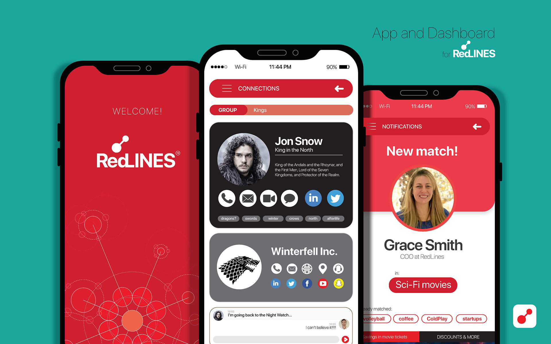
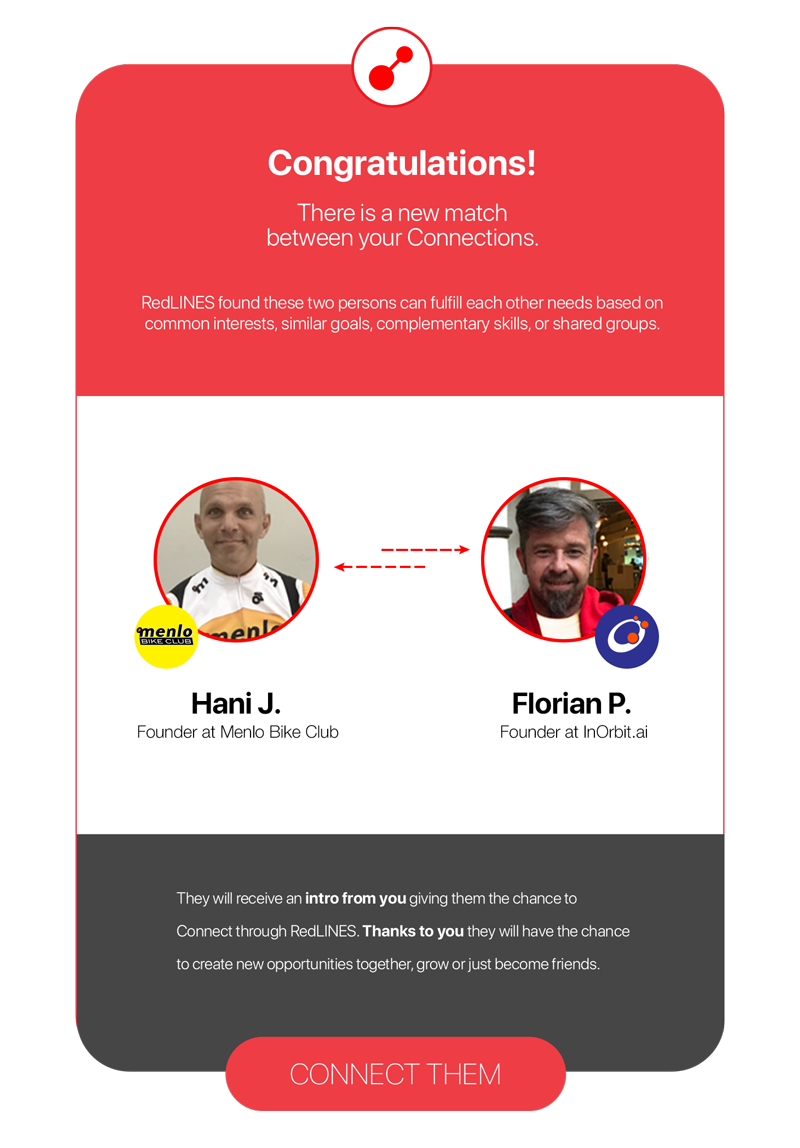
RedLines was an AI-powered professional networking platform with three core capabilities: proximity-based digital business card exchange between smartphones, automatic contact synchronization across social media profiles, and AI-driven connection suggestions based on matched interests, voice notes, and keywords, all without paper, friction, or manual follow-up.
As one of the RedLINES Co-Founders, my value to the team was my experience as a Visual and Product Designer, which I brought to bear across Communication Strategies, Branding, and Product Development. From the idea to the final product, end-to-end.
My job as a Design Lead and Product Manager was to conduct research and user interviews to define the App's architecture, workflow, and User Experience. As I was also in charge of the company's branding and communication strategy, I needed to dig deep into the startup concept to create a highly relevant visual image that could be applied across the UI as a system. I defined the color palette, font styles, and visual elements used for both marketing assets and the User Interface.
CONNECTING THE DOTS
Supported by a millennial legend
As a Graphic Designer by training, I'm very fond of concepts, so after exploring the history of human networks, I found this incredible legend that I brought to the table.
The team felt this is what networking is all about.
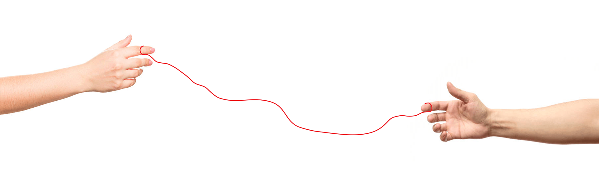
"The Red Strings of Fate is a Far Eastern myth that says everyone's finger is tied to a red string that will lead them to another person with whom they will make history. The cord can stretch, but it can never be cut if you meant to connect with somebody."
Building on this strong foundation was inspiring, as there was always a way to reference this concept, creating a powerful yet poetic message behind every asset we created. That's why the red was, for sure, the primary color, aligned with an immaculate visual aesthetic. Lines and rounded corners support this human and organic connection.
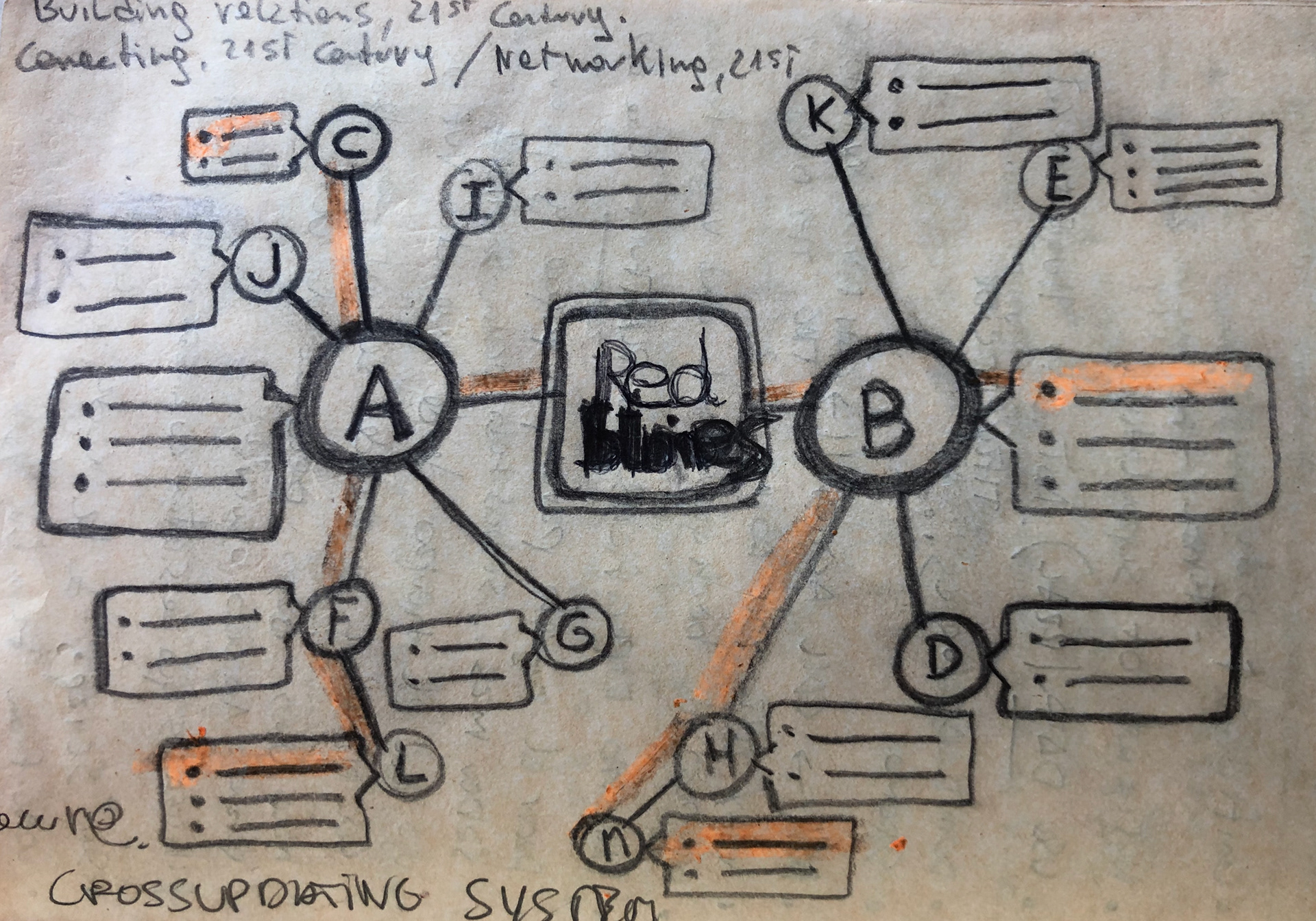
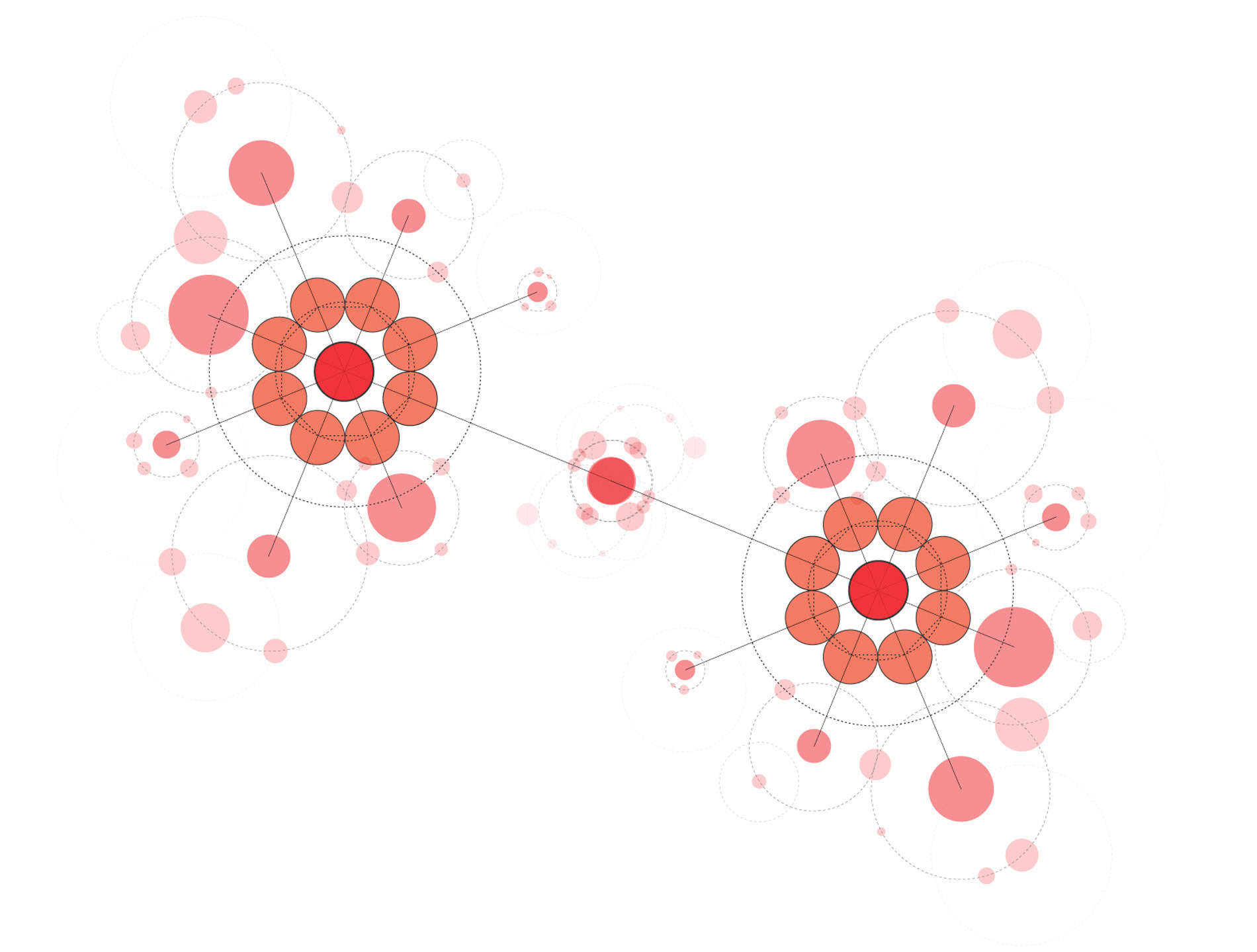
First draft working around the 1st, 2nd, and 3rd degree of Connections in a Network. User A connects with B, so then J can connect with B. Finally, L can connect with B and, eventually, with D through the RedLINES Artificial Intelligence engine.
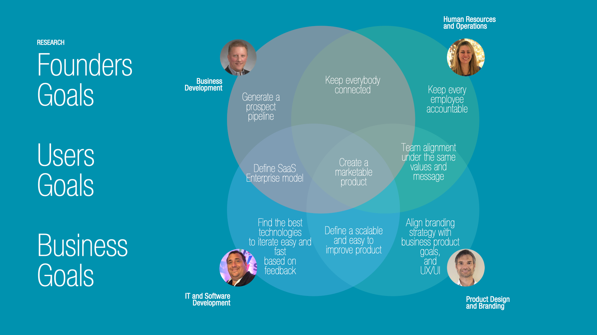
Research
BUSINESS GOALS
My first job was to gather every team member's perspective, point of view, and experience to nourish the product. My business development experience helped me understand the best approach from a market perspective, not to get trapped on just fancy features, but real, strategically oriented goals.
After several brainstorming sessions, the team agreed on the first goals: to spread the App's voice and generate more Sign-ups to achieve critical mass. As a new product in the market, the Founders adopted a test-and-grow approach.
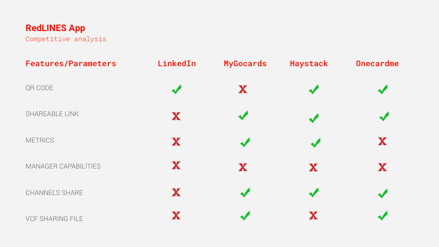
COMPETITIVE ANALYSIS
To better understand the landscape and identify market gaps, I conducted an evaluation of potential competitors.
DESIGN PRINCIPLES
1. To create an easy-to-use flow to help people share contacts in the least possible number of interactions.
2. Align the experience with a real exchange or sharing of contact information using physical printed business cards.
2. Align the experience with a real exchange or sharing of contact information using physical printed business cards.
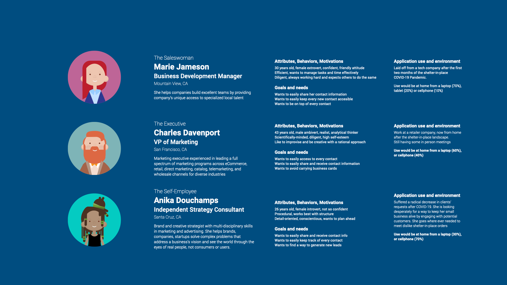
Persona creation
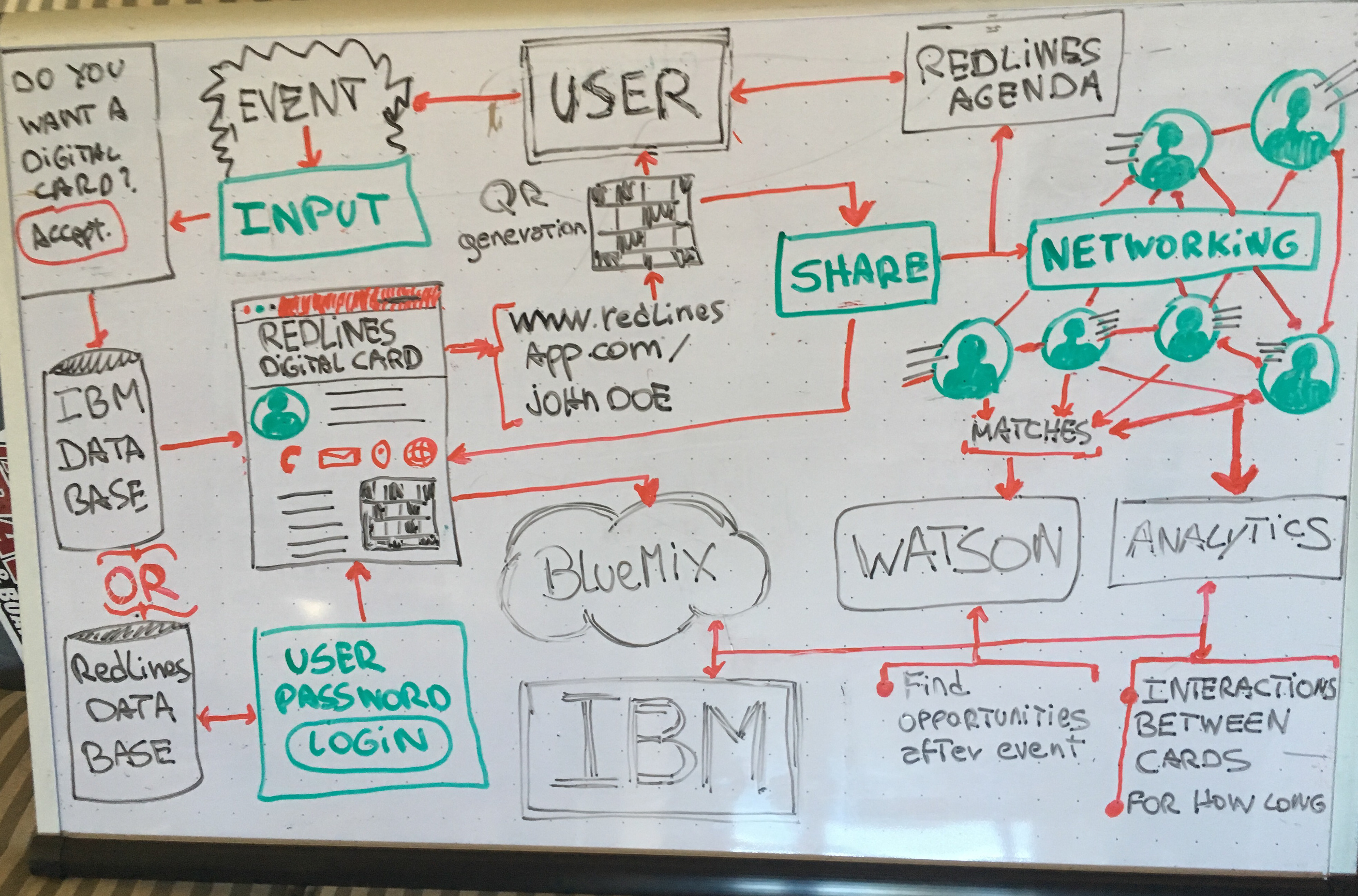
The Information Architecture and Infrastructure
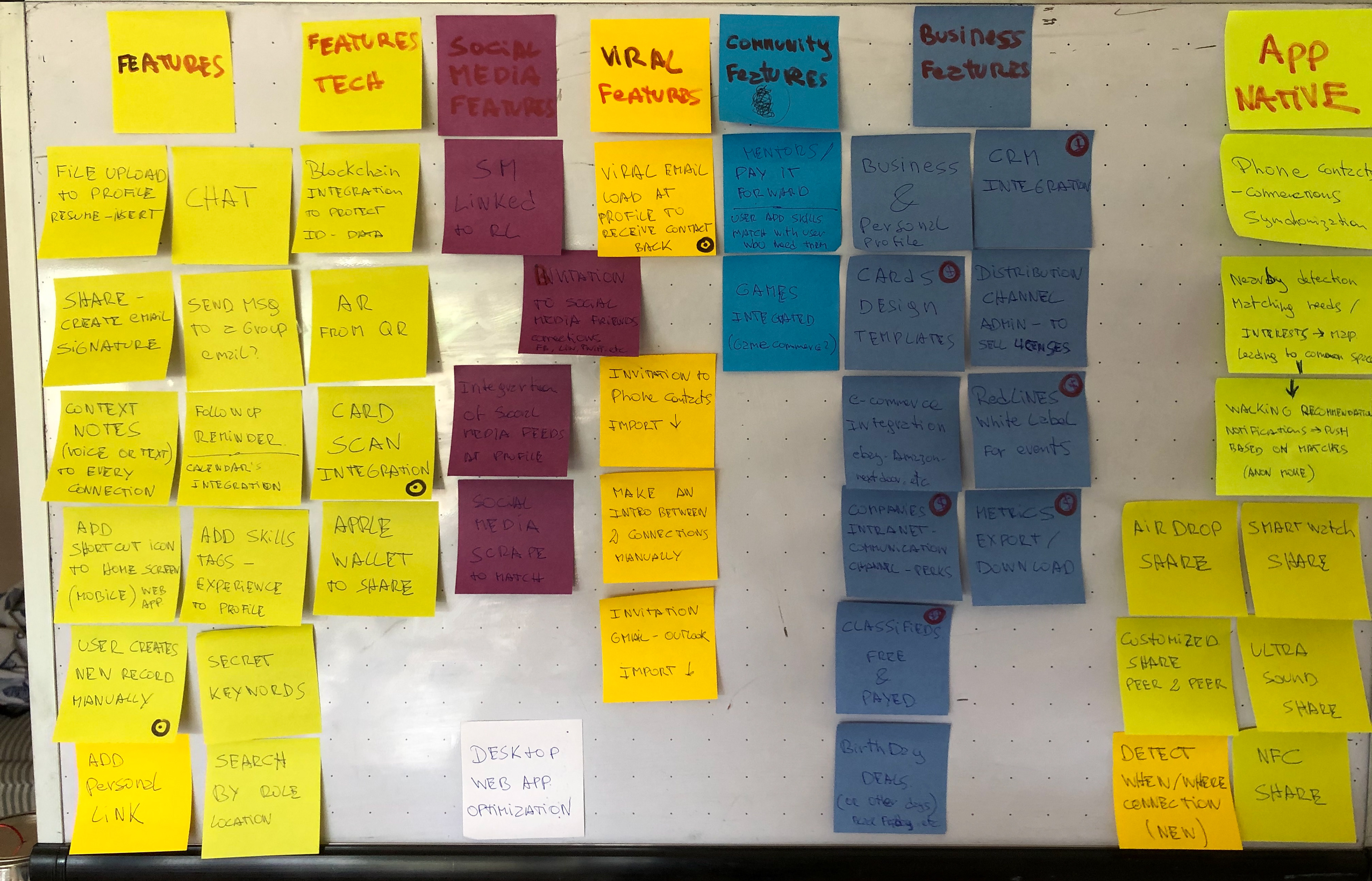
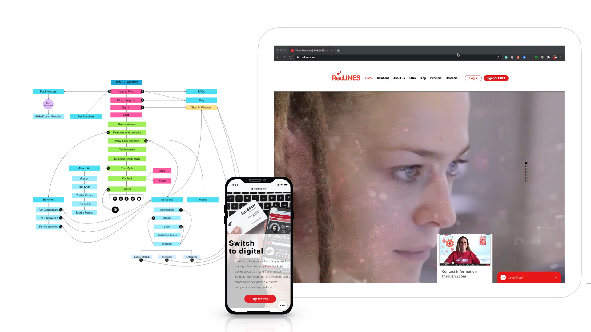
Once the team defined the business goals, I needed to clarify the features and integrations to deploy at different stages, a whiteboard with feature ideas.
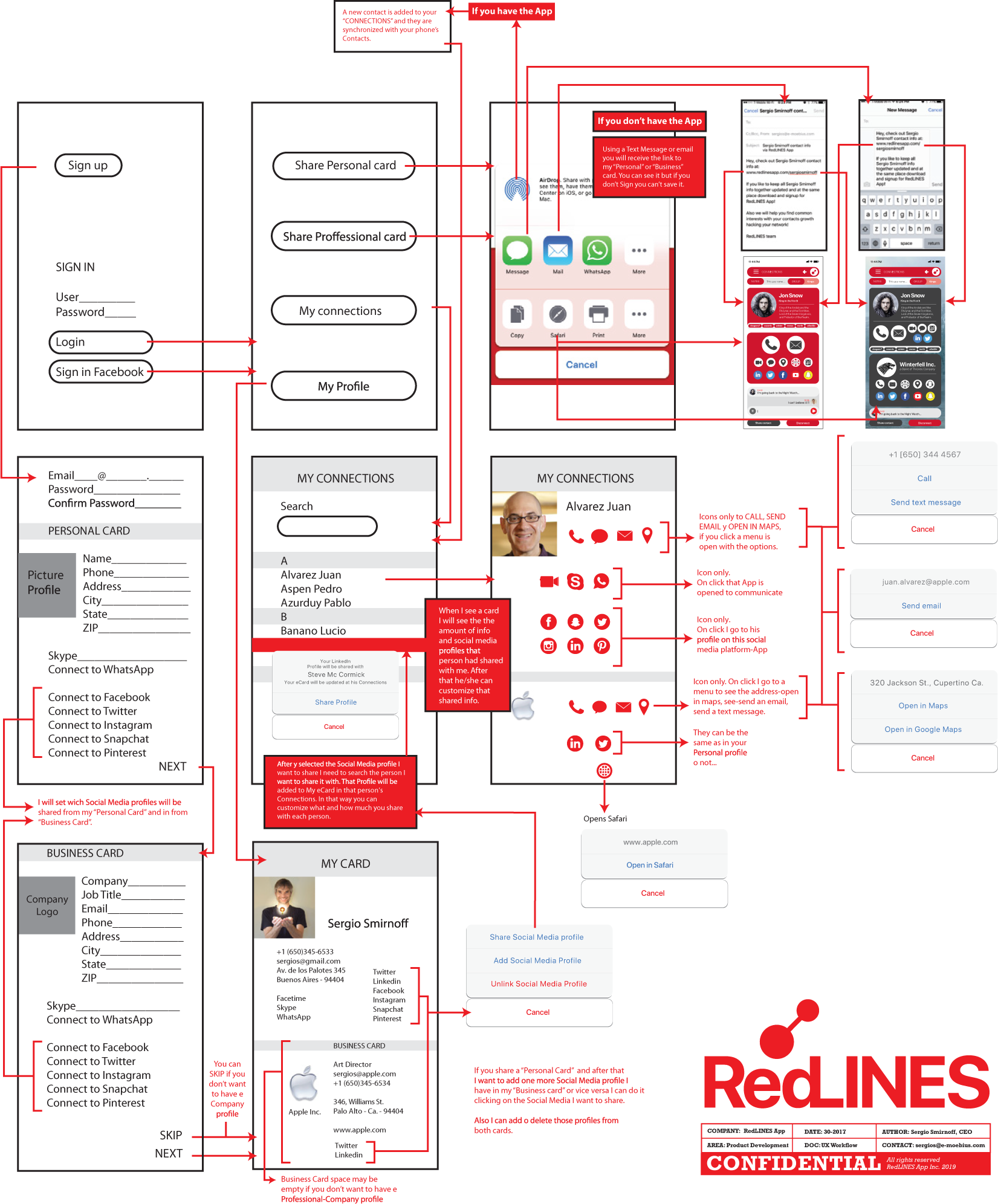
First wireframes, New User, Complete Profile, Share Personal, or Business eCard flow.
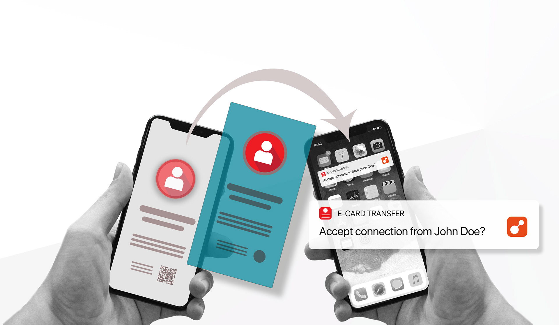
BRIDGING PHYSICAL AND DIGITAL
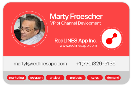
Understanding that changes in human behavior are hard, the main idea was to create a smooth transition from paper business cards to digital ones. As part of this transition, I designed the UI to reference the visual language of a physical business card. So I used specific proportions, levels of information, and shapes from real paper cards to create a “familiar” UI.
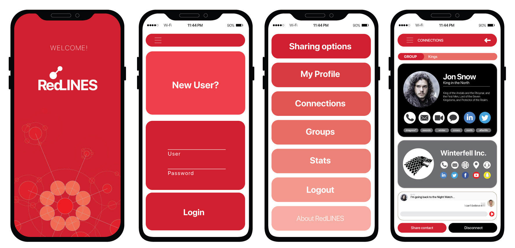
Welcome, Sign-In/Log-In, Menu, and Profile Screens.
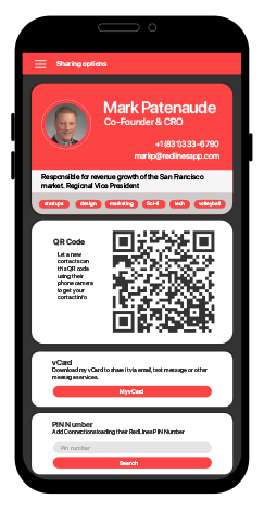
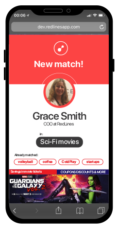

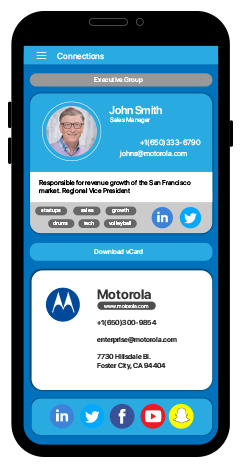
Sharing Contact Information, User Match, and Premium Profile.
LET'S DO SOME BUSINESS
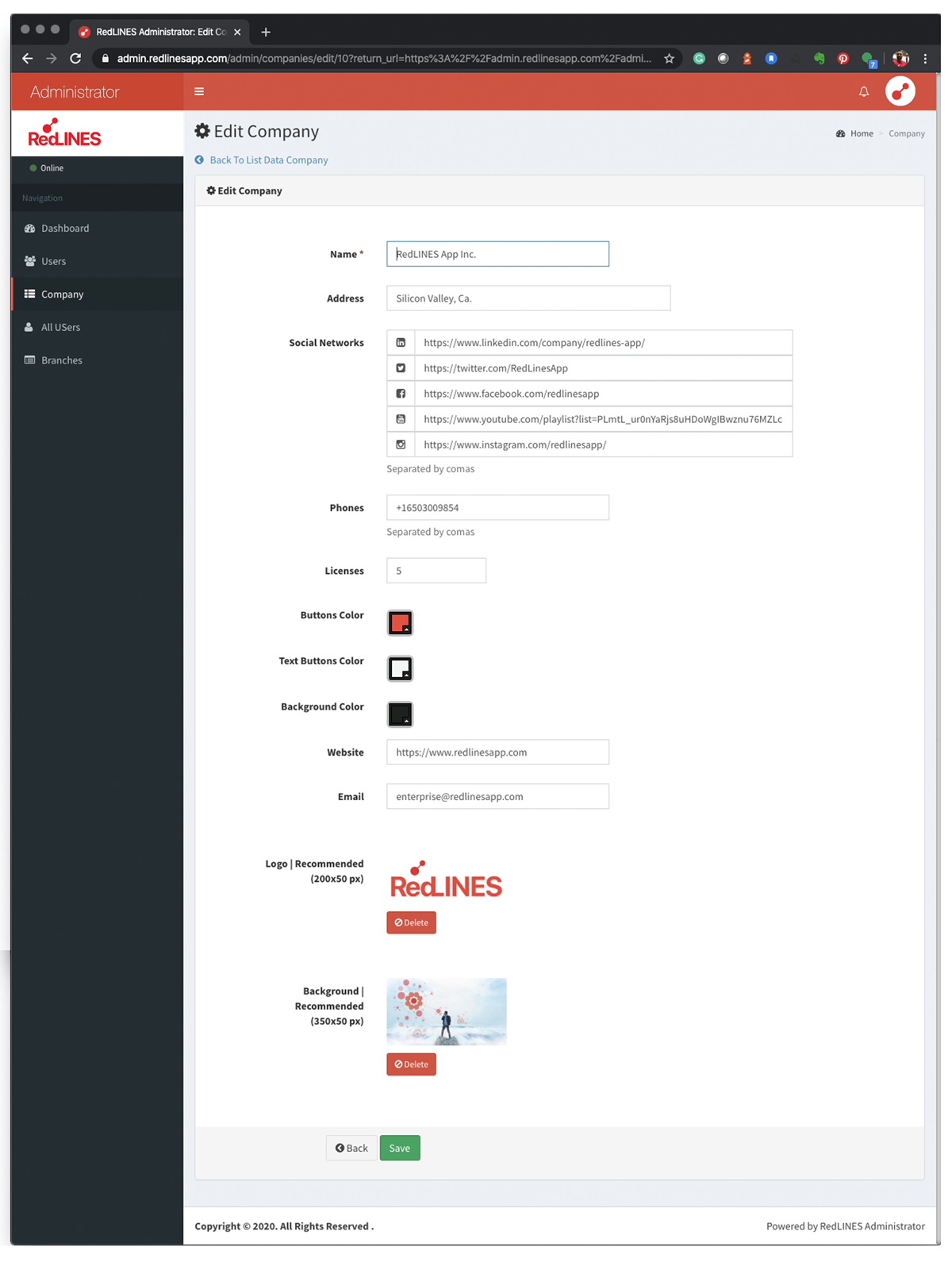
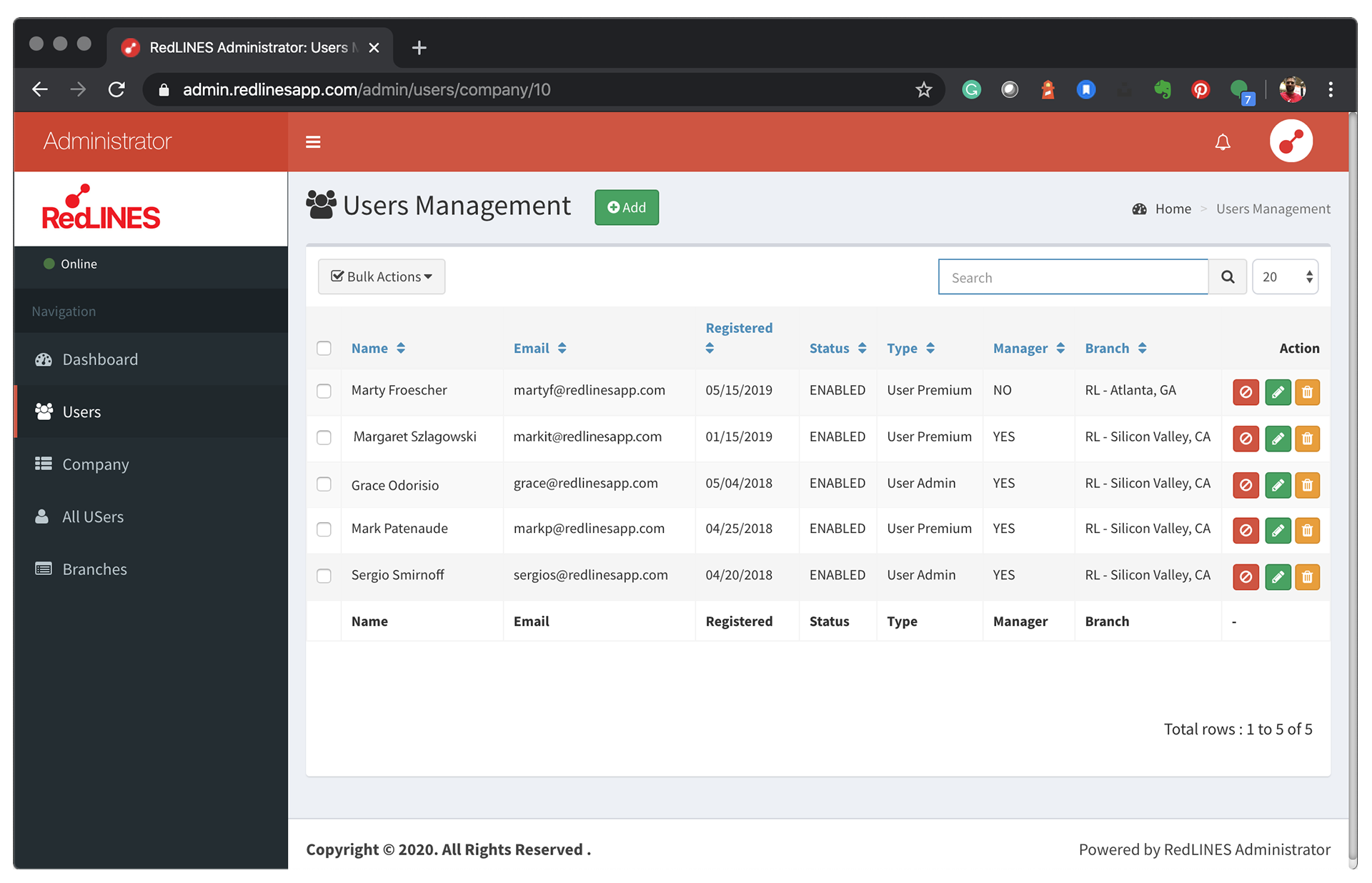
The Enterprise layer
I created an Administration Dashboard that lets managers edit every aspect of their Company and employee profiles. Even though I started from a framework, my job was focused on refining the white space, text hierarchies, and Information Architecture to align it with the rest of the application.
"The consumer version of RedLines, free, frictionless, and designed for individual professionals, was never the business model. It was the distribution strategy."
A critical mass of individual users created the network effect that made the enterprise offering compelling. I defined a B2B SaaS layer targeting sales teams specifically, the professional cohort with the most to gain from knowing what happens after a card is exchanged.
The enterprise model unlocked four premium capabilities:
• Share analytics: tracking how many times a card was shared, viewed, and acted upon, giving sales teams visibility into the top of their pipeline that had never existed before • Engagement metrics: clicks on website links, email addresses, and social media profiles embedded in each card, turning a passive exchange into a measurable sales touchpoint • Brand customization: company logo, brand colors, and consistent visual identity across every employee's card, turning individual exchanges into coordinated brand impressions • Team dashboard: aggregate insights across the entire sales team, allowing managers to identify top performers and optimize outreach strategies
This tiered model, free consumer version driving network growth, paid enterprise version monetizing that network, was the same playbook used by LinkedIn, Slack, and Dropbox. RedLines was applying it to the last analog touchpoint left in professional networking: the business card.
The enterprise strategy transformed RedLines from a consumer utility into a B2B SaaS product with a defensible revenue model, and gave investors a clear path to monetization beyond advertising.
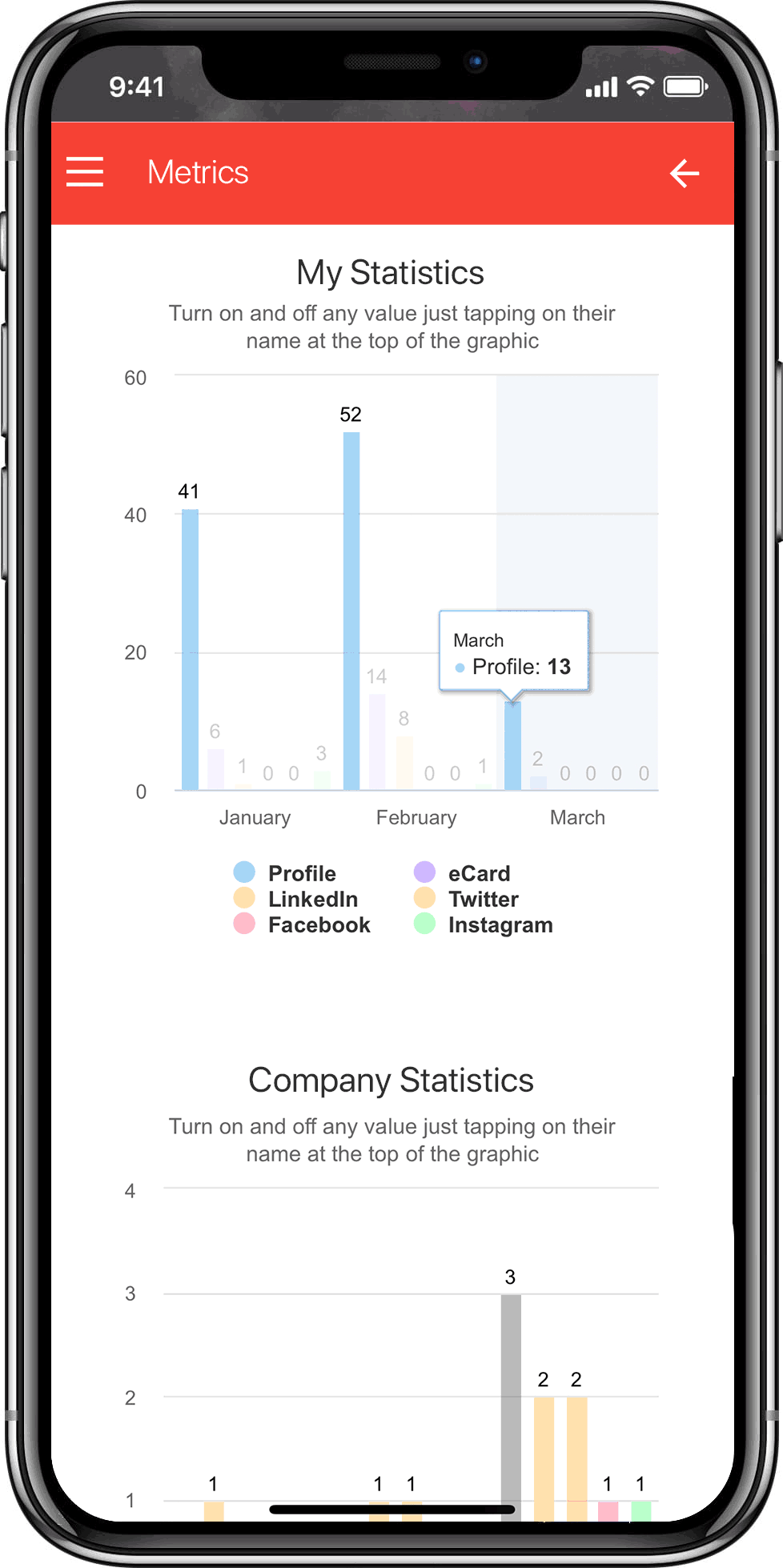
An essential part of the application is the metrics section. It brings a whole new dimension of information and insights for the sales and marketing teams, as never before. My job was to identify the critical markers between the personal and company statistics and make them easy to highlight to differentiate between the two.
I worked side by side with the dev team to make metrics easy to access and navigate on mobile.
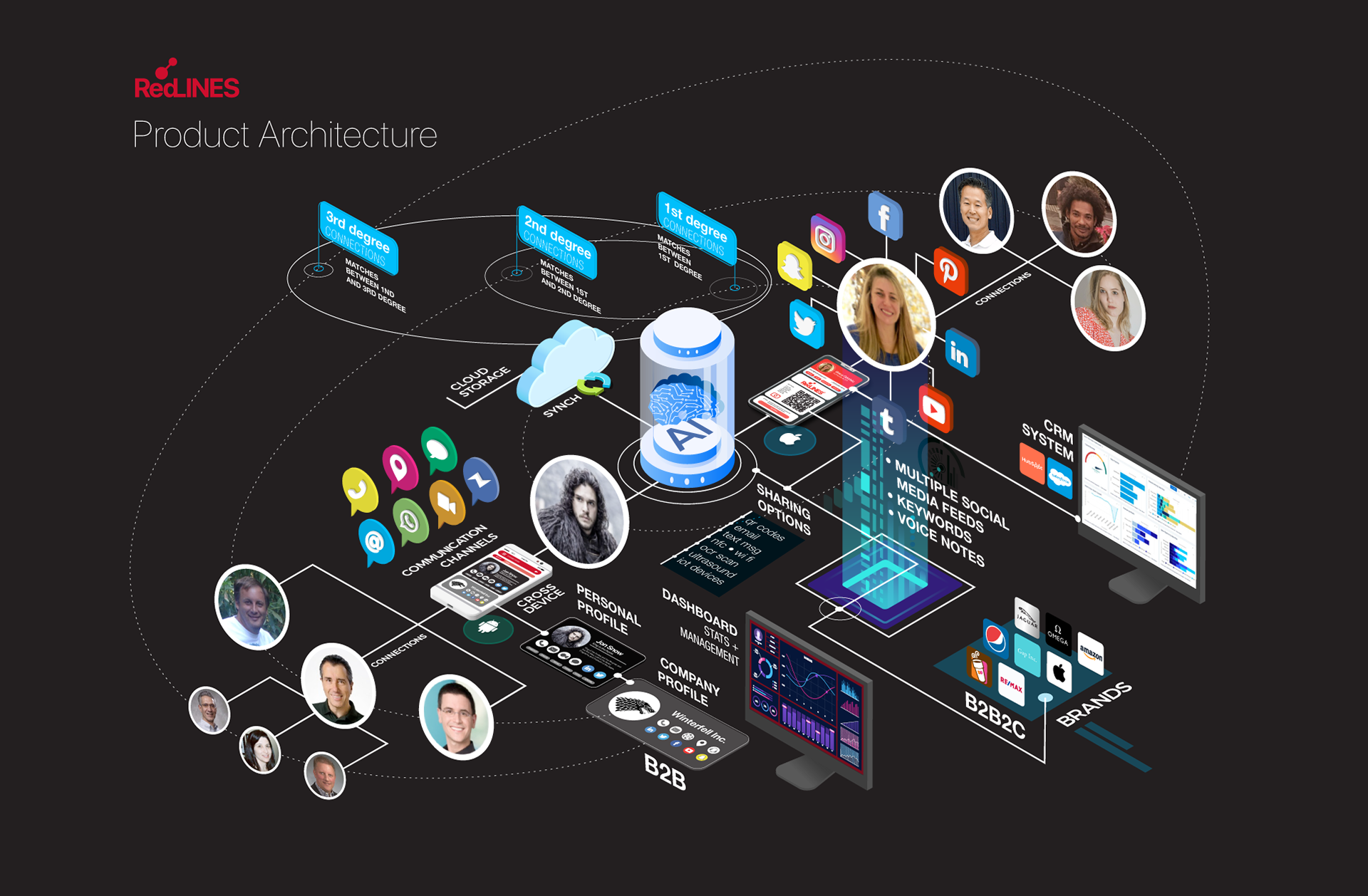
To showcase the Product's architecture, I created infographics-style flows that I also used to generate animations.
BRANDING AND PRODUCT MARKETING
As co-founder, the design responsibility extended well beyond the product UI. RedLines needed a complete visual identity that could work simultaneously as a consumer brand: approachable, human, and culturally resonant, and as a B2B product, credible enough to sell to enterprise sales teams.
The Red Strings of Fate mythology wasn't just a brand story; it became a design system. The primary red, the line motifs, and the rounded organic forms appeared consistently across every touchpoint: the mobile app UI, the marketing website, pitch decks, email campaigns, social media assets, and event materials. The result was a brand that felt intentional at every scale: from a push notification to a conference booth.
The website served a dual purpose: consumer acquisition and investor credibility. For consumers, it needed to explain a behavior change: why a digital card was better than a paper one, in under 10 seconds. For investors, it needed to signal that this was a serious, fundable product with a clear market thesis. Both audiences landed on the same page, so every design decision had to serve both goals simultaneously.
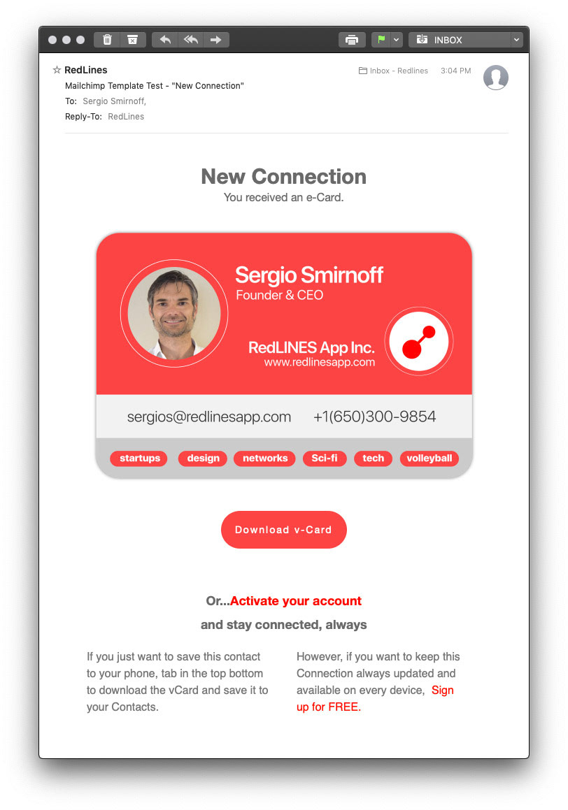
Integrated pieces of the UI into other assets as emails and notifications.
THE ULTIMATE VISION
From Networking Tool to Unified Identity Platform
What would happen if everyone were on everyone else's network...?
Every social media platform knows one version of you.
Facebook knows your birthdays and family moments. Instagram knows where you travel and what you eat. LinkedIn knows your professional ambitions. TikTok knows what makes you laugh at midnight. Pinterest knows what you wish your home looked like. Each platform has a fragment, a single facet of a complete human life, and monetizes it through advertising that only knows that fragment.
RedLines was positioned to know all of them.
Because users built their RedLines card by connecting all their social profiles in one place, we sat at a unique intersection: the only platform with a view of the whole person, not just the slice they showed to any single network. That cross-platform identity (what we called an enriched profile) was the foundation for something far more valuable than a digital business card.
The vision: a marketplace where the gap between advertising and desire collapses entirely.
The difference between spam and a great deal is simple: spam is an offer for something you don't want. A great deal is an offer for something you already wanted that arrives at the right moment. Most advertising fails because platforms only know one version of you. RedLines knew the sum.
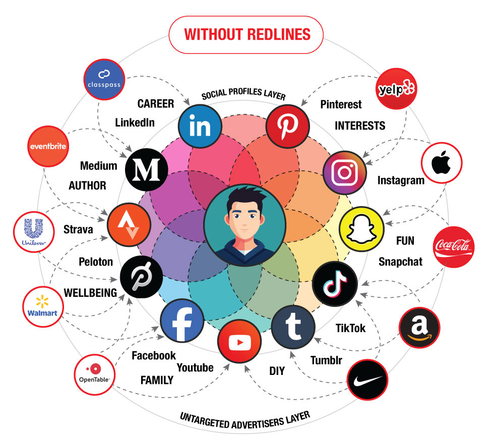
A person's identity is fragmented across dozens of platforms: each one knowing only a single dimension of who they are. Advertisers reach them through guesswork, competing for attention with offers that miss the mark.
RedLines collapses fragmented identity into a unified profile, turning guesswork into precision matching.
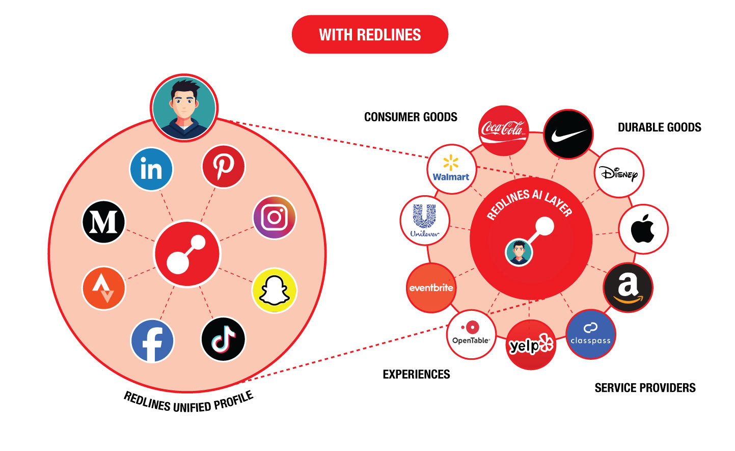
Every social profile collapses into a single unified identity. The RedLines AI layer sits at the center, matching the complete picture of a person's interests, behaviors, and intent with brands and service providers whose offers are genuinely relevant. The result: less noise for users, better conversion for advertisers, and a marketplace where offer meets demand with precision.
By aggregating signals across every connected platform: travel intent from Instagram, career stage from LinkedIn, lifestyle from Facebook, entertainment taste from TikTok, our AI matching engine could identify genuine purchase intent before the user had even articulated it. For advertisers, this meant spending less to reach audiences more likely to convert. For users, it meant replacing intrusive ads with relevant offers that felt like discoveries rather than interruptions.
In a marketplace economy, everyone wants or needs something that a company somewhere is trying to sell. The problem has never been supply or demand; it has always been the match. RedLines was building the infrastructure to make that match precise.
PITCHING THE VISION
From Design Studio to Investment Stage
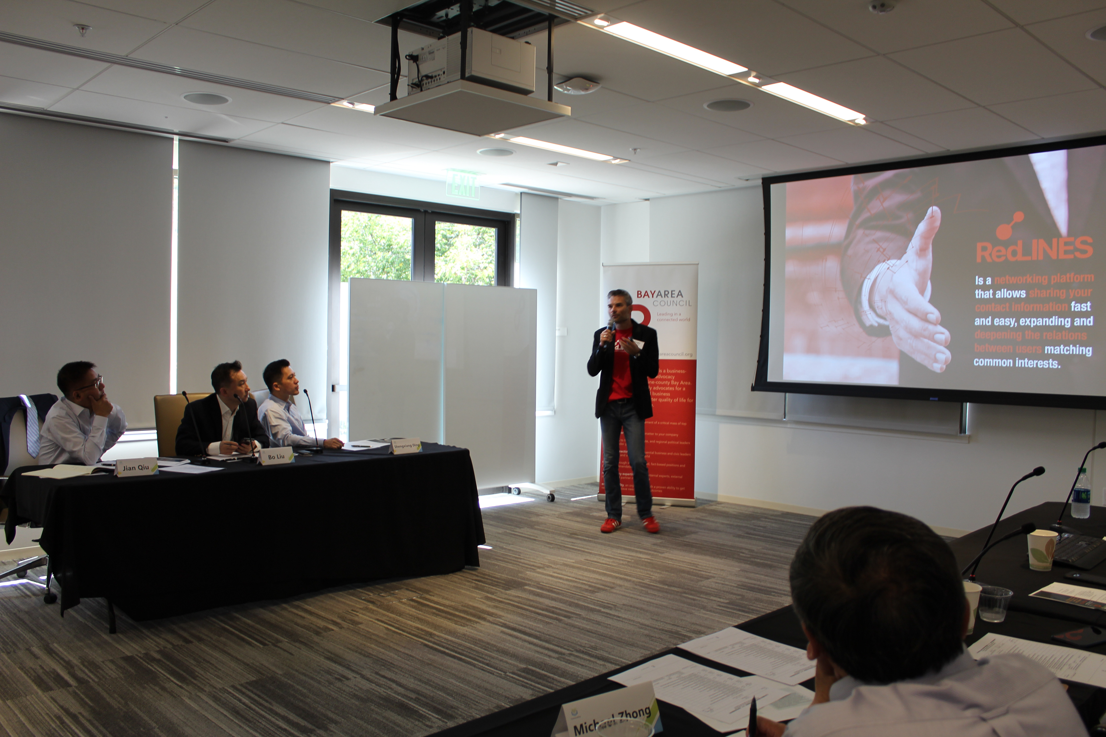
Building RedLines meant wearing one more hat I hadn't planned for: lead storyteller.
As CEO and co-founder, I was the person who stood in front of startup competition panels, angel investors, and private equity evaluators to make the case for why RedLines deserved to exist, and why now. No pitch deck handed to me by someone else. No script written by a marketing team. Every slide designed by me, every narrative arc constructed by me, every answer to a hard question delivered by me.
Pitching to investors is the highest-stakes version of presenting design. The audience is skeptical by default. The time window is brutally short. The questions are designed to find the weakest point in your reasoning. And the cost of a bad presentation isn't a revision cycle; it's a closed door.
What it taught me: the most important design skill isn't knowing how to make something, it's knowing how to make someone else see why it matters. That skill transfers directly to every boardroom, every executive review, and every cross-functional alignment meeting I've been in since. The ability to walk into a room of skeptics and walk out with belief is the same whether you're pitching a startup or a design system.
Startup World Cup - Bay Area, Ca
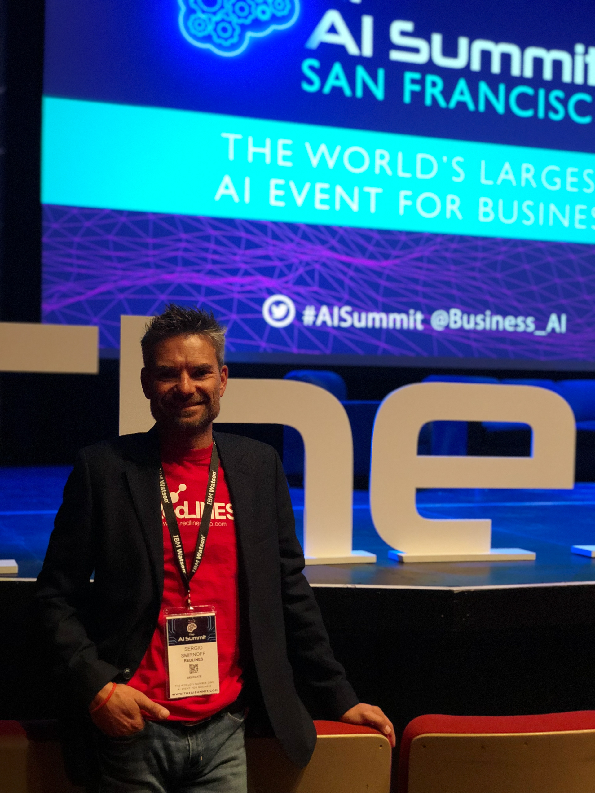
Ai Summit - San Francisco, Ca
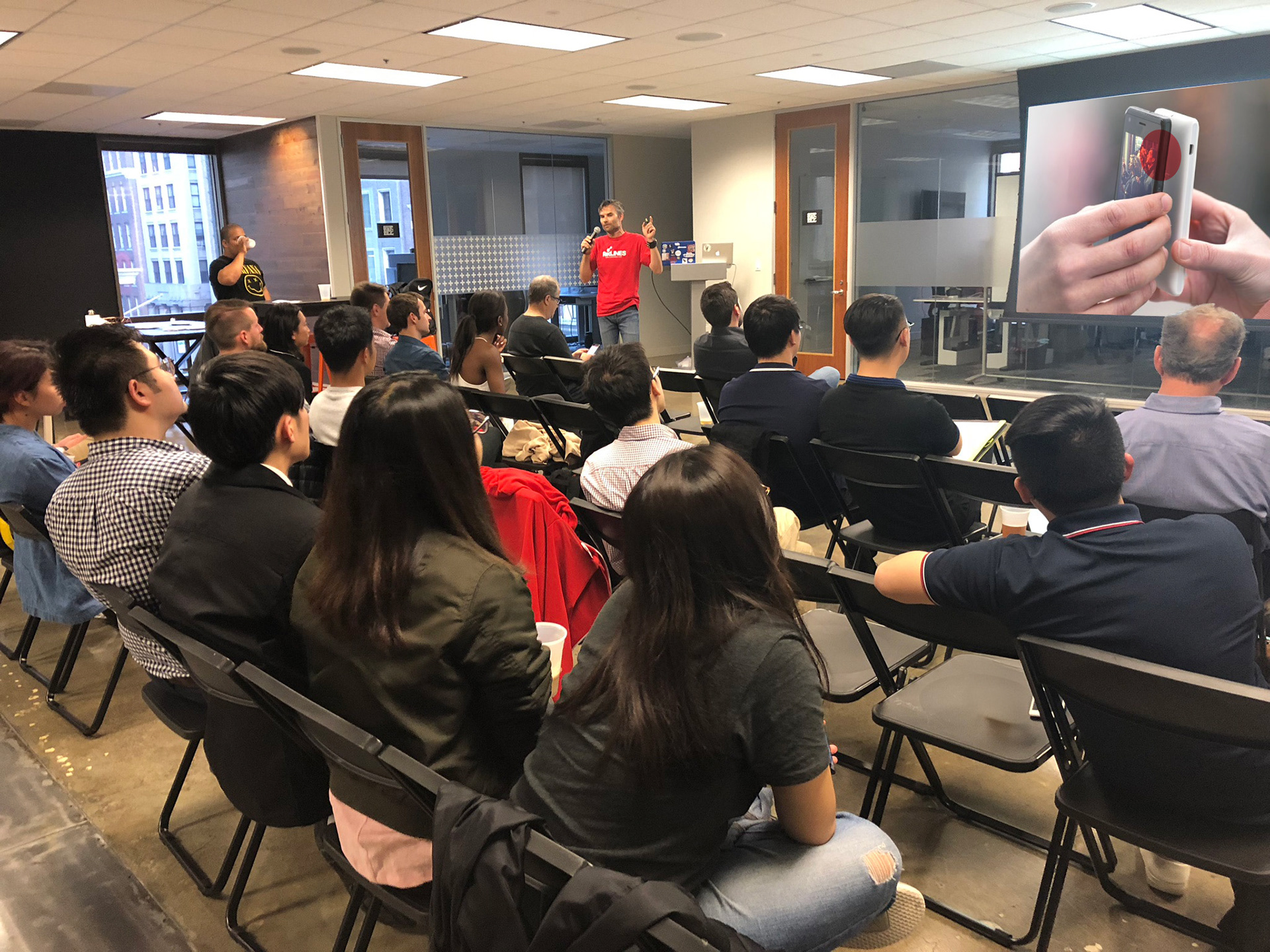
Foreign Startups Pitch Day - San Francisco, Ca
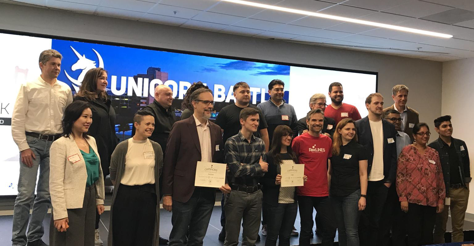
Unicorn Battle - Santa Clara, Ca
CONCLUSION
RedLines didn't survive COVID without external funding, and operations ended in 2020. But the product's story didn't end there.
In 2018 — one year after RedLines launched — LinkedIn introduced QR code-based profile sharing, one of our core interaction patterns. In 2023, Apple launched NameDrop: proximity-based contact sharing between iPhones, the exact UX mechanic that RedLines was built around six years earlier.
Neither company knew about RedLines. They arrived at the same solution independently, which is the strongest possible validation that the problem was real, the timing was early, and the design thinking was right.
The most important lesson: a product can fail commercially and still be correct. Knowing the difference between a business failure and a design failure is what allows you to keep going.
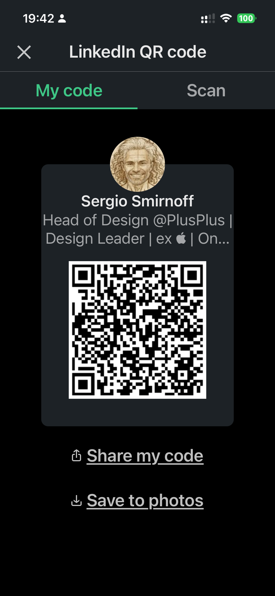
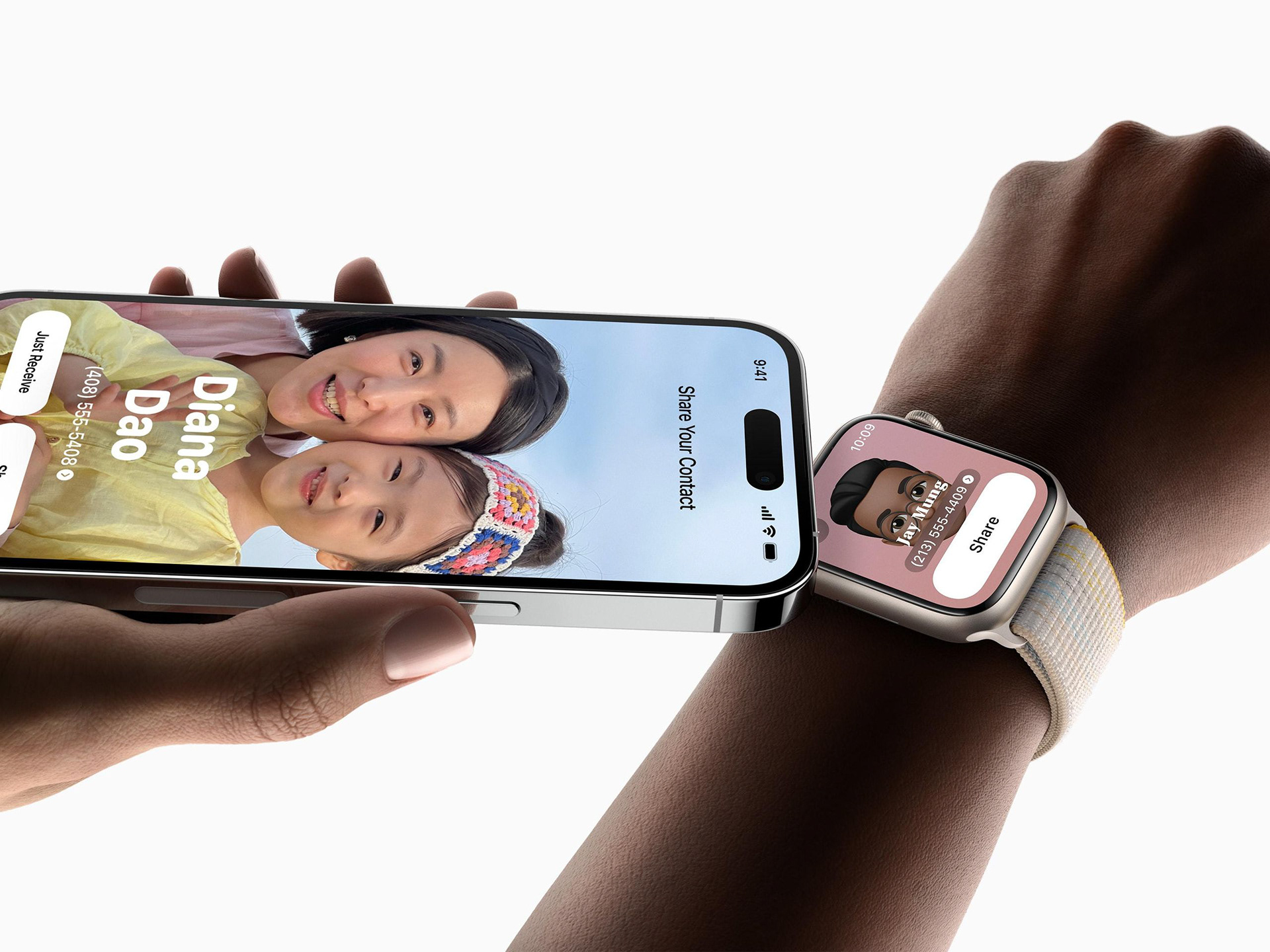
LinkedIn QR code for profile sharing and Apple NameDrop for sharing contact information
RedLines shipped its first version in 10 weeks, a fully functional AI networking platform built by a 10-person team with no external funding, pitched to investor panels and startup competitions across Silicon Valley.
The core UX concepts were adopted by LinkedIn in 2018 and by Apple in 2023. The cross-platform identity vision on which it was built is now the defining challenge of the AI era.
KEY TEAM MEMBERS
Grace Smirnoff
Co-Founder and COO
Co-Founder and COO
Mark Patenaude
Co-Founder and CRO
Co-Founder and CRO