- 2018 -
DASHBOARD DESIGN FOR INORBIT.AI
DASHBOARD DESIGN FOR INORBIT.AI
Mission Control for
Autonomous Robots
Autonomous Robots
InOrbit is a Silicon Valley-based company focused on robot fleet management. Their dashboard brings very specific and valuable insights through data visualization to optimize robot performance avoiding problems and-or blockers to make them more efficient.
ROLE:
Lead Designer
UI/UX
Branding
Lead Designer
UI/UX
Branding
SCOPE:
Six months project
Six months project
PLATFORM:
Desktop
Desktop
TOOLS:
Material Design, Figma
Adobe Photoshop,
Adobe Illustrator
Material Design, Figma
Adobe Photoshop,
Adobe Illustrator
TEAM:
Eight person
Eight person
MARKET-SPACE:
B2B SaaS - Robotics
B2B SaaS - Robotics
The Process
THE PROBLEM
InOrbit hired me to improve and update its platform's UI and branding. The product was done by the founders who have product development experience but without a designer involved in the process.
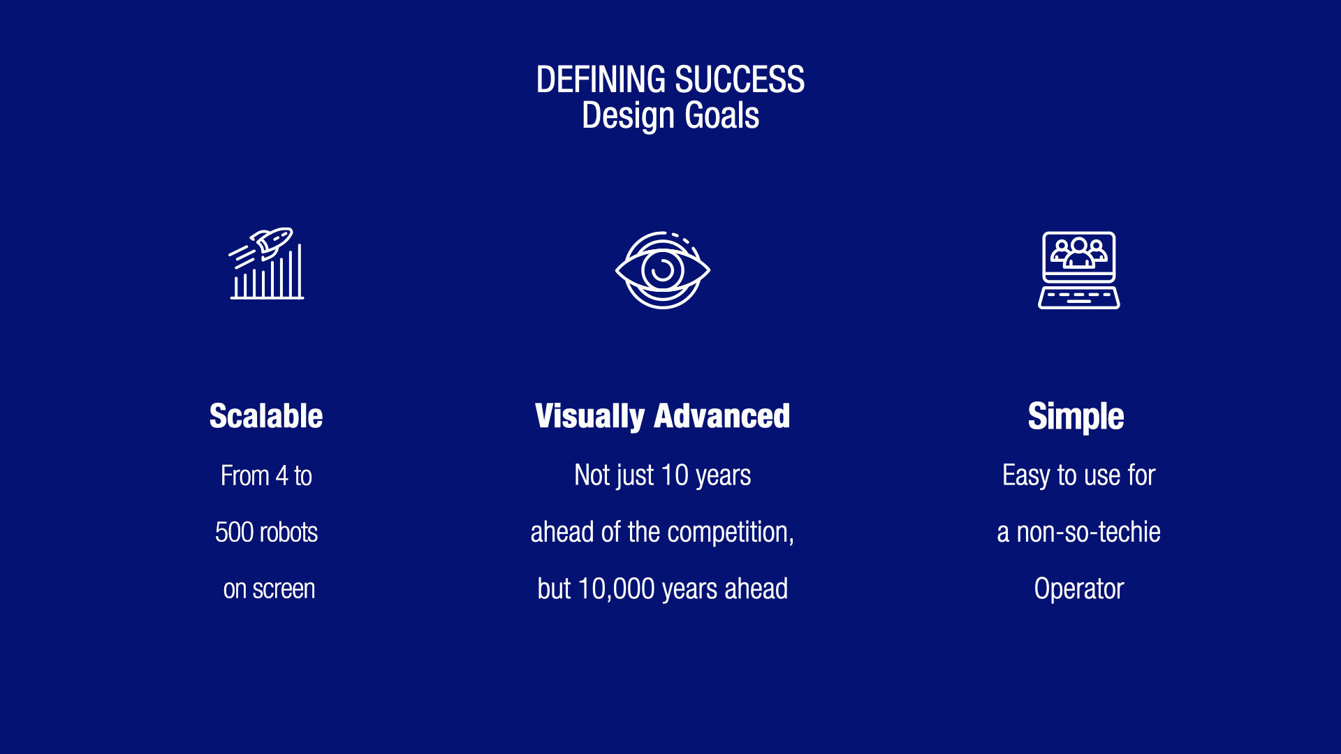
When the company started to scale, they needed a professional approach from the design side to face the enterprise space at a corporate level targeting bigger players in the space and look forward a round of investment in order to accomplish specific goals.
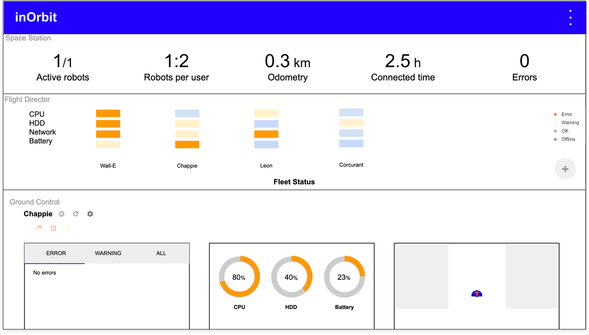
Figure 2. Original dashboard.
The platform's main feature is the capability to handle and preview the activity from a few robots to hundreds. From a UI perspective, this is a challenge as users require to access and visualize specific information at a glance.
RESEARCH
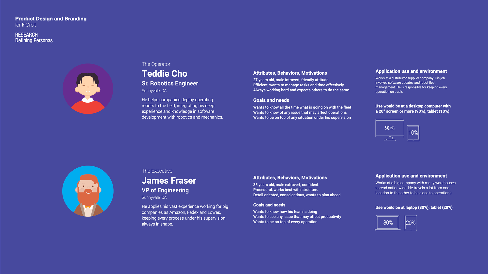
In addition to understanding InOrbit's business goals and their perception of the robot management market, it was essential to hear their clients' feedback. I intended to identify overlaps between client and user needs in order to prioritize platform features and functions. I came up with research strategies to conduct on users, creating and receiving validation on interview questions (shown below) from the InOrbit team.
User's interview
1- Describe the type of company you work at?
2- Which is your role?
3- How active are you at InOrbit? When? Where?
4- What problem does InOrbit solve for you?
5- What is your perception of InOrbit?
6- What led you or your company to use specifically its product for fleet management?
7- Describe your experience with them thus far.
8- How does InOrbit help your job every day?
9- Where do you see InOrbit's strengths and weaknesses from a technical perspective?
10- Where do you see InOrbit's strengths and weaknesses from a business perspective?
11- Is there anything else you think would be valuable?
InOrbit Team interview
1- Which is your role?
2-Describe what inOrbit does in your own words.
3- What is your perception of InOrbit?
4- What problem do you think InOrbit solves?
5- Where do you see InOrbit's strengths and weaknesses from a technical perspective?
6- Where do you see InOrbit's strengths and weaknesses from a business perspective?
7- Which goals should InOrbit's target for the next 12 months? Can you define what success would look like?
8- What upgrades are your customers expecting?
9- Name some companies that you expect to be InOrbit's clients in the future.
10- Is there anything else you think would be valuable?
Fiction vs Reality
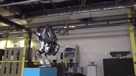
We are all used to fictional robots, but actually which is the real state of robots today? I needed to dig deep into the space to understand the reality of the problems and pain-points in order to work in this project and start thinking in solutions.
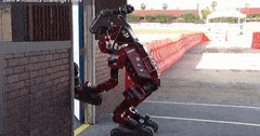
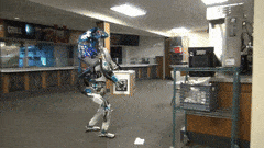
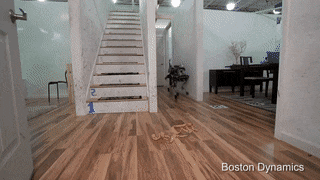
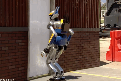
IS THIS SCI-FI?
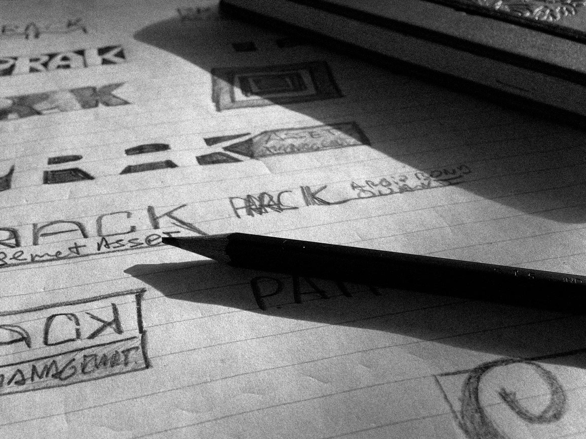
Every time I shared with people some insights about InOrbit, I received an "Uhhh this is so cool!!" mostly from everybody. The fact that they manage fleets of robots sounds like a starting point for a Steven Spielberg script. So I started asking myself that if we have been watching movies from robots and complex systems like Skynet or The Matrix for so many years, and those kinds of technologies are available, so why can't we design interfaces that look futuristic and cool? Can't they seem taken from the future?
The future is happening right now!
That was the starting point for running research of movie artists who design UI for films like Minority Report, Anon, Oblivion... I found astonishing examples that inspired me to introduce that concept to the team.
The future is happening right now!
That was the starting point for running research of movie artists who design UI for films like Minority Report, Anon, Oblivion... I found astonishing examples that inspired me to introduce that concept to the team.
We agreed in starting a process where update after update, we would be able to approximate it to the final goal of bringing the future of UI to the present.
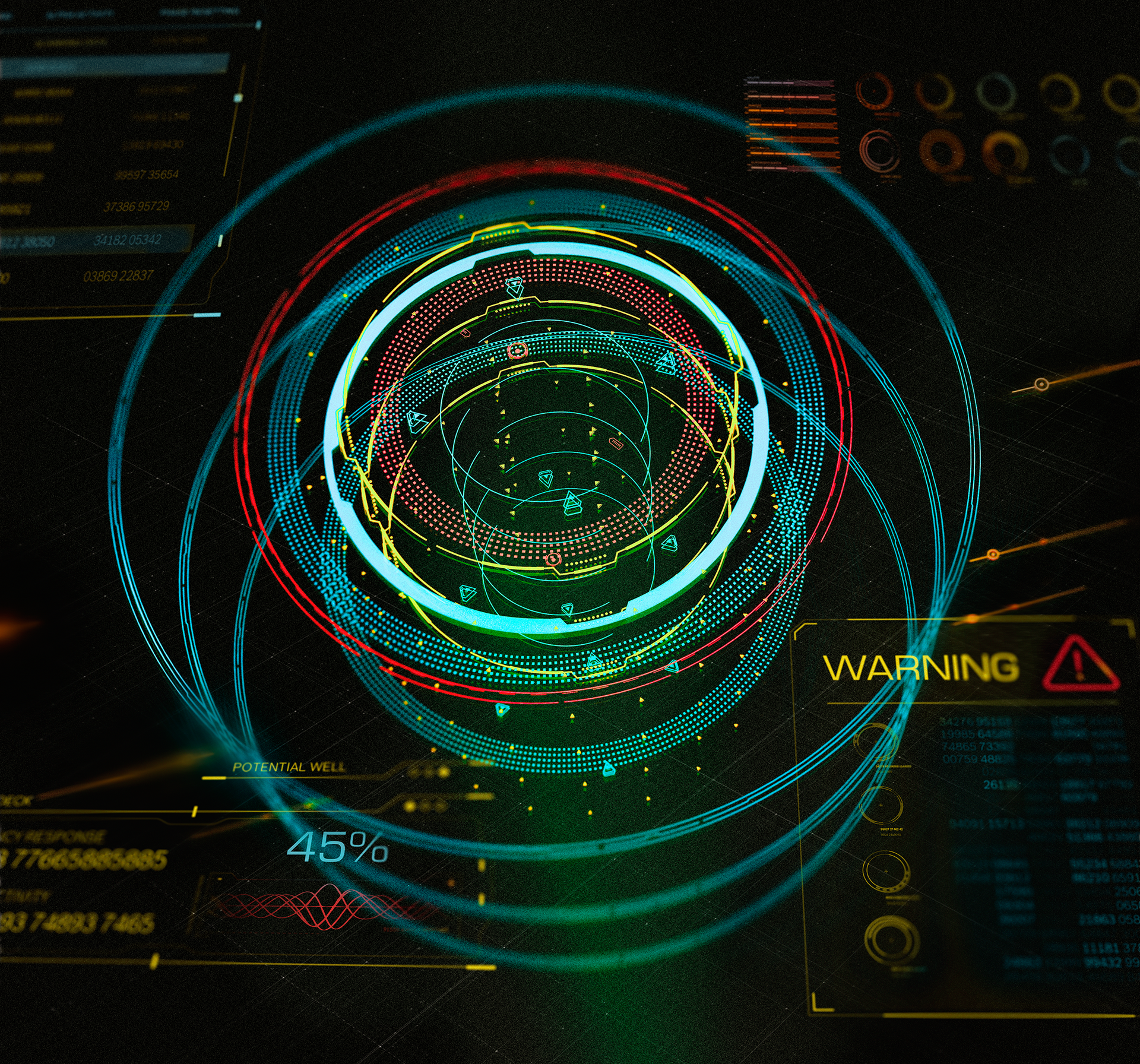
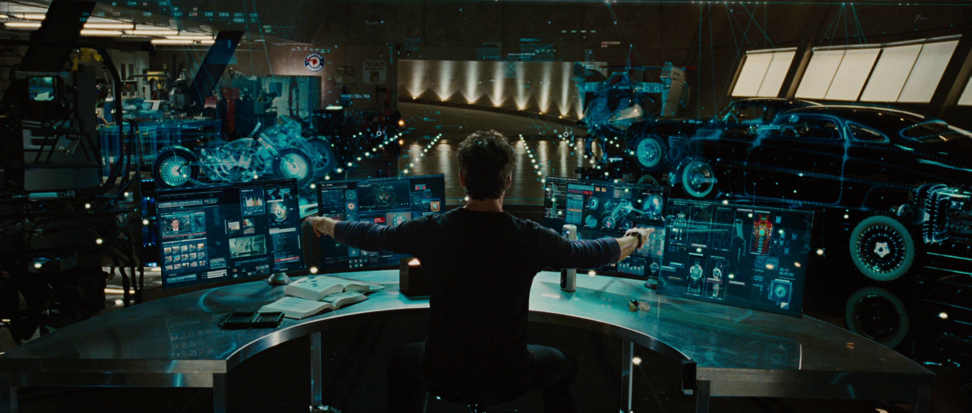
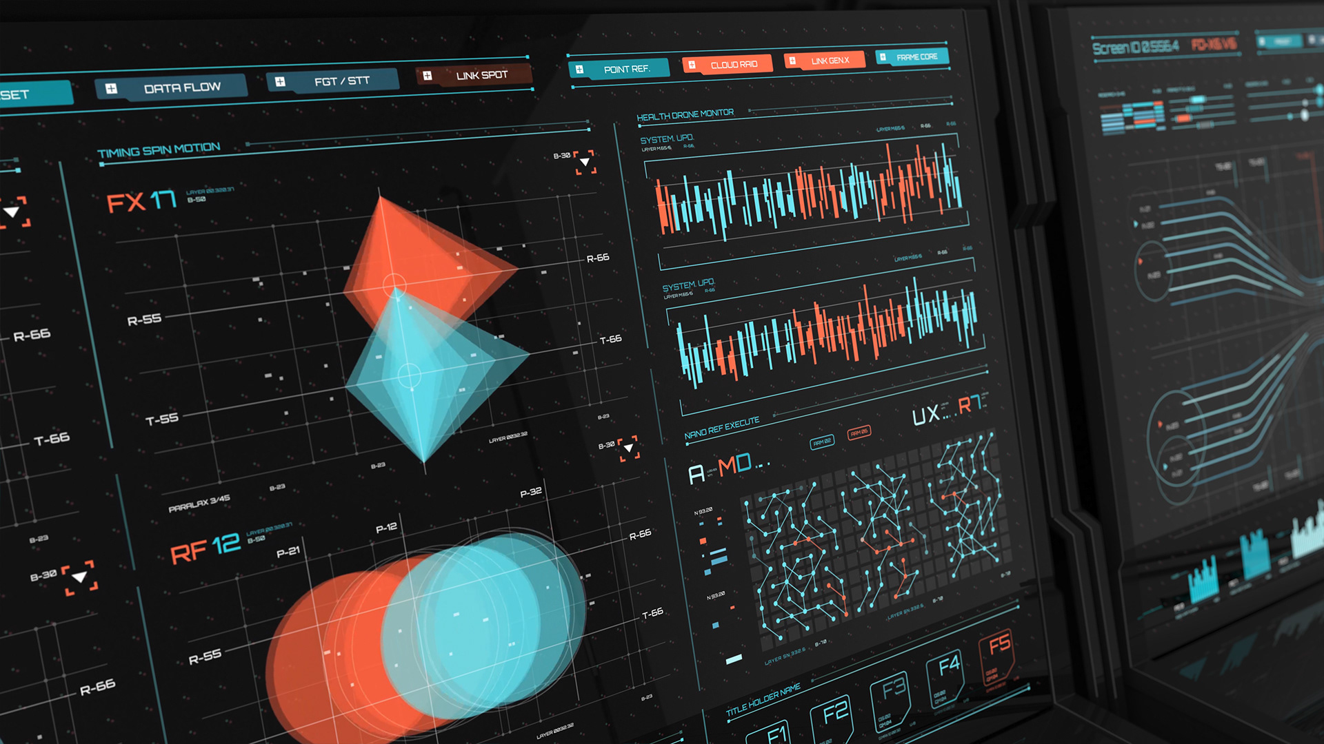
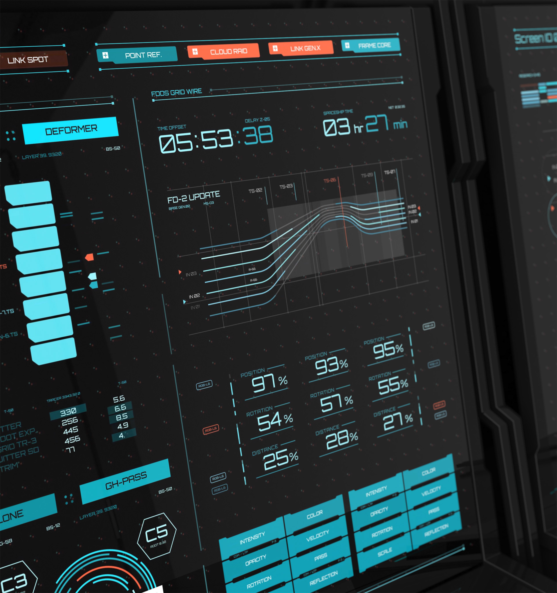
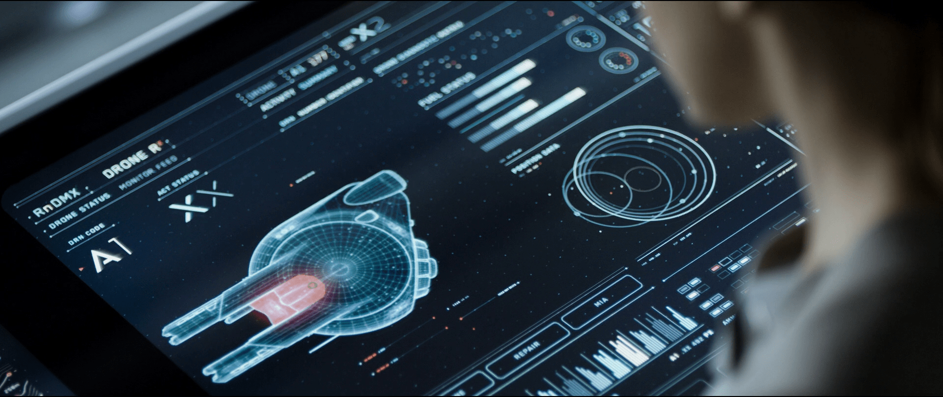
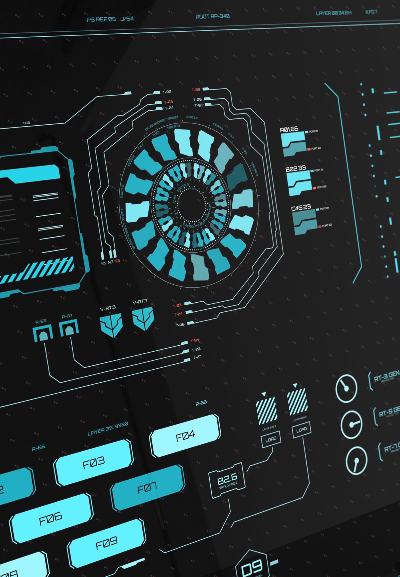
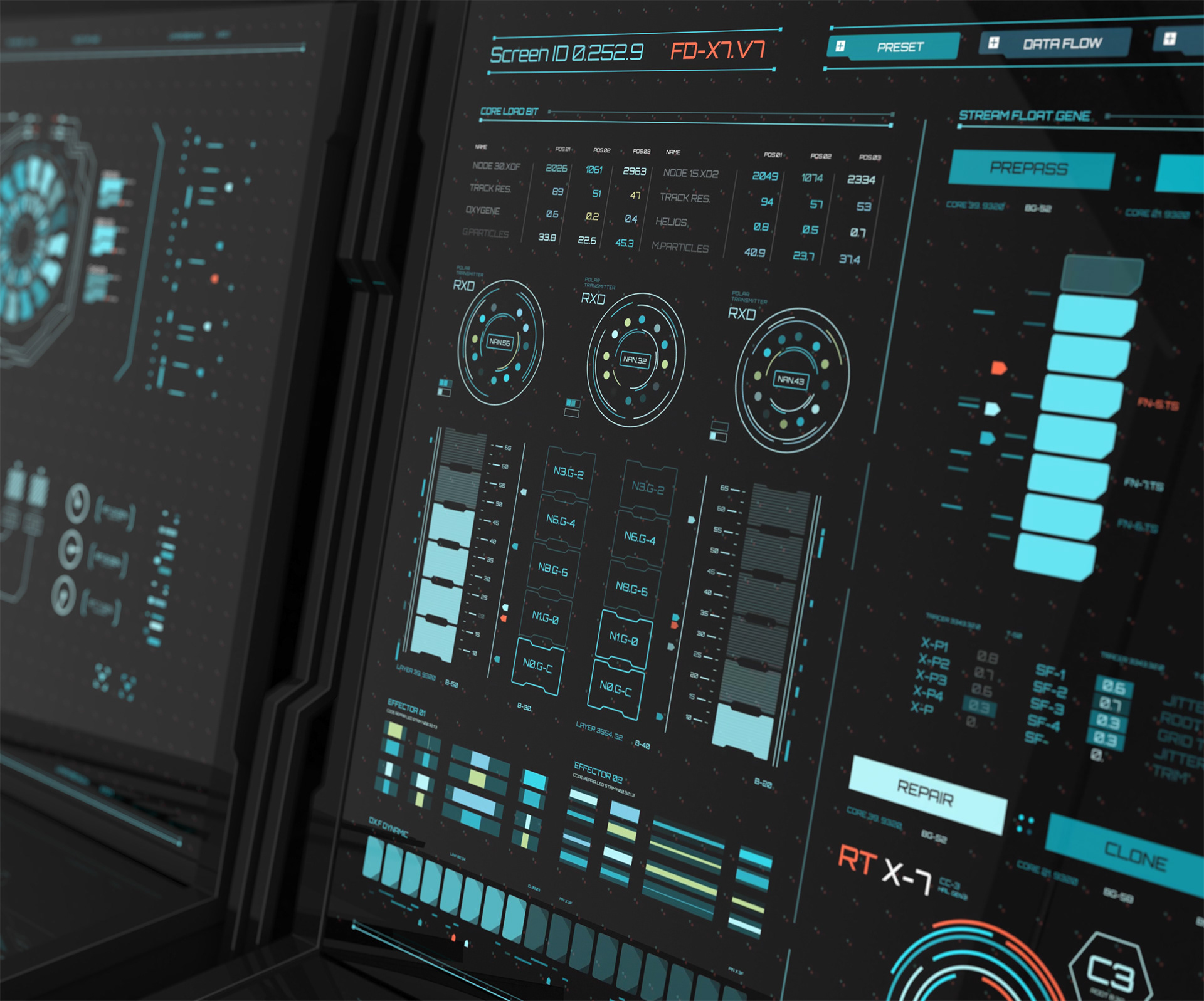
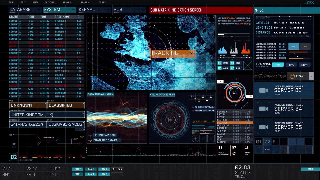
Figure 1. Some User Interfaces I used as a reference to pitch the Sci-Fi idea.
THE SOLUTION
Applying Qualitative research techniques to clearly understand the system and the company goals and users' needs, I defined experience maps, low-fidelity artifacts, and the initial workflow. Understanding the pain-points of the operators was the first step to create a solution where all the information is accessible in "one-tap".
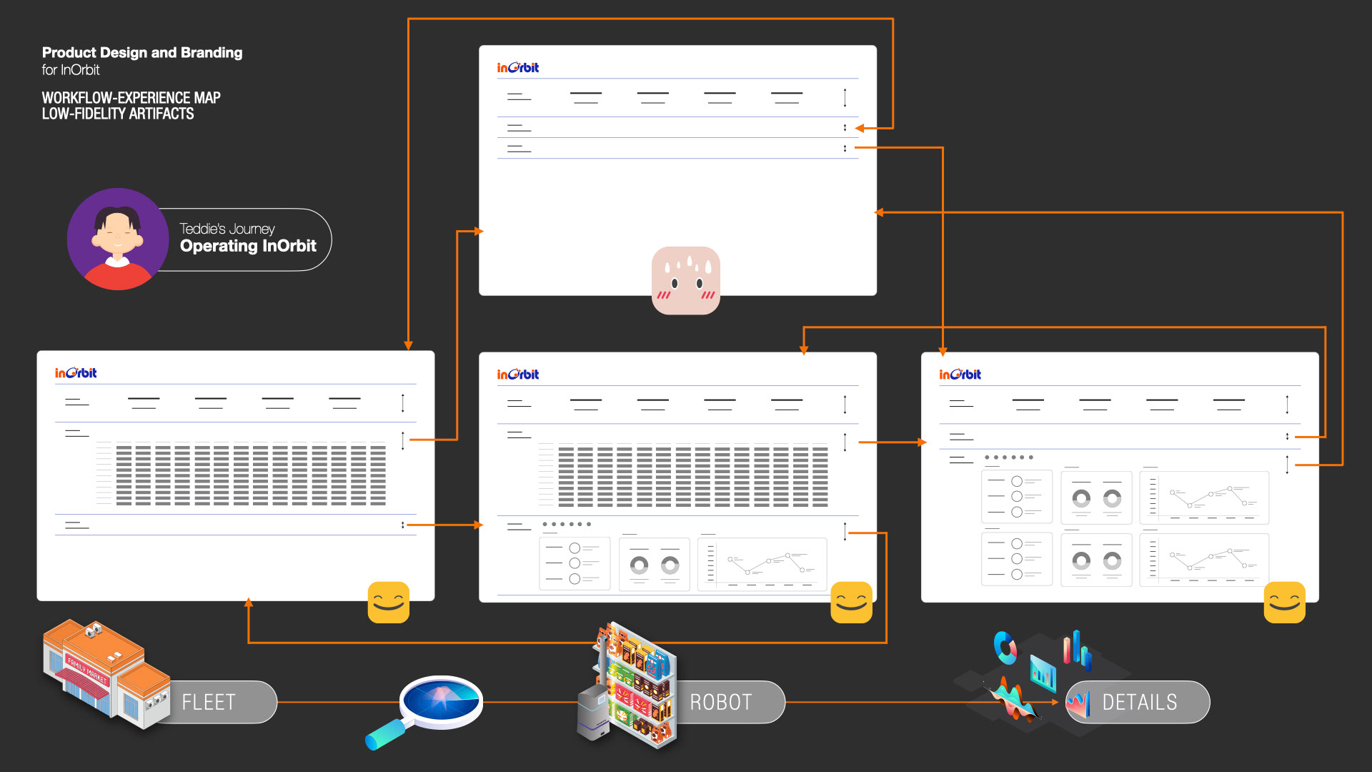
After defining users pain-points and their needs I defined a workflow with low-fidelity artifacts
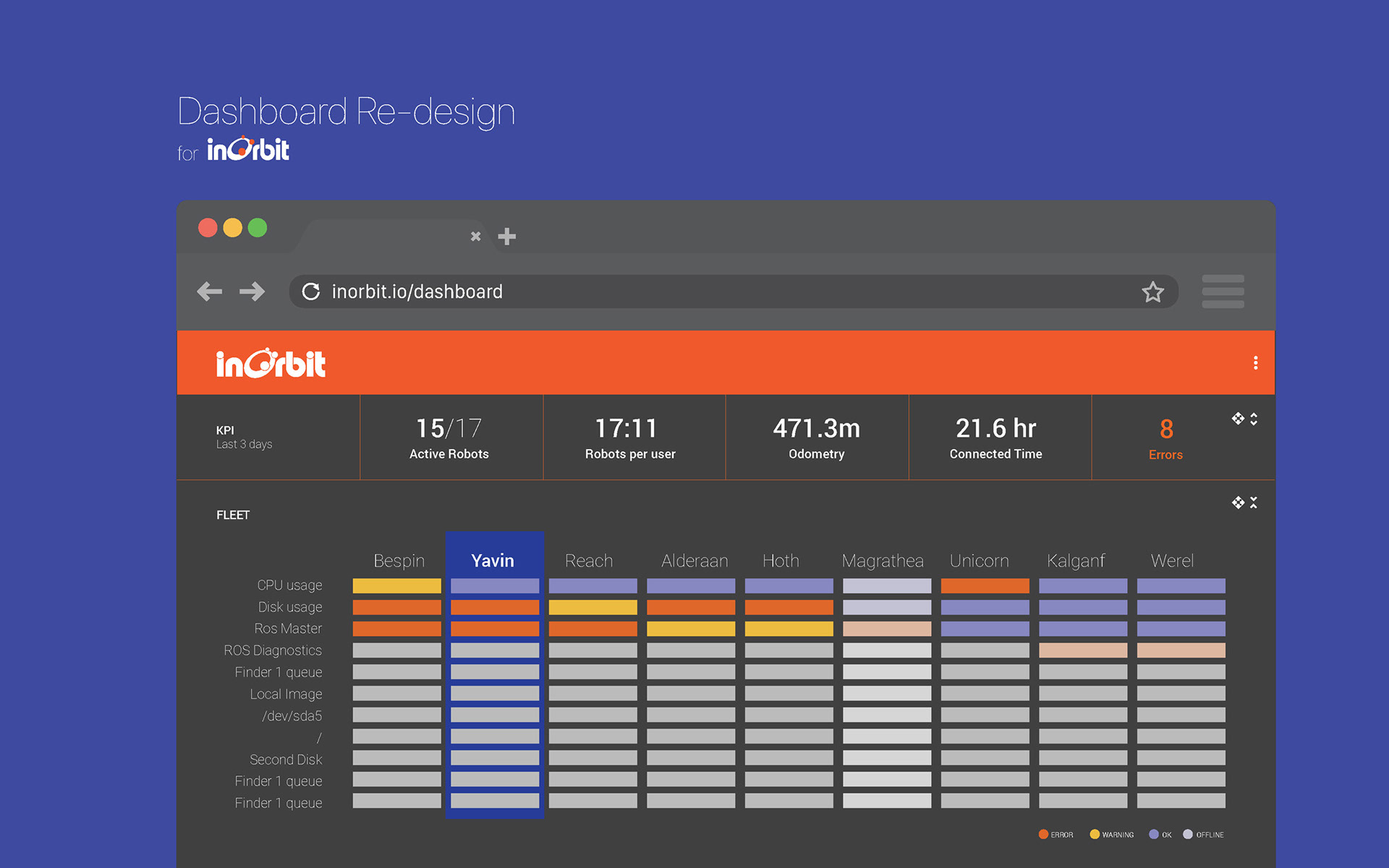
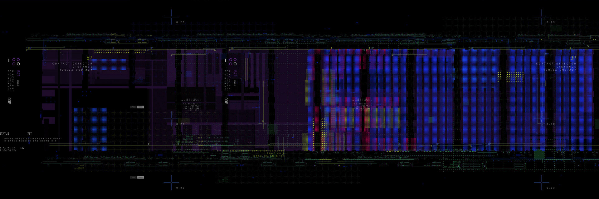
Fig 3. Fleet Status navigation. Robots are set in columns, dimensions are rows. The robots with ERRORS or WARNINGS are moved by the algorithm to the left and the ones with fewer problem or no problems at all are piled on the right and eventually off the screen based on the number of robots in the fleet.
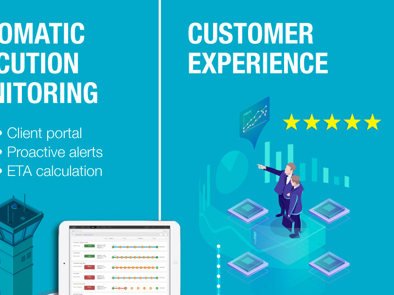
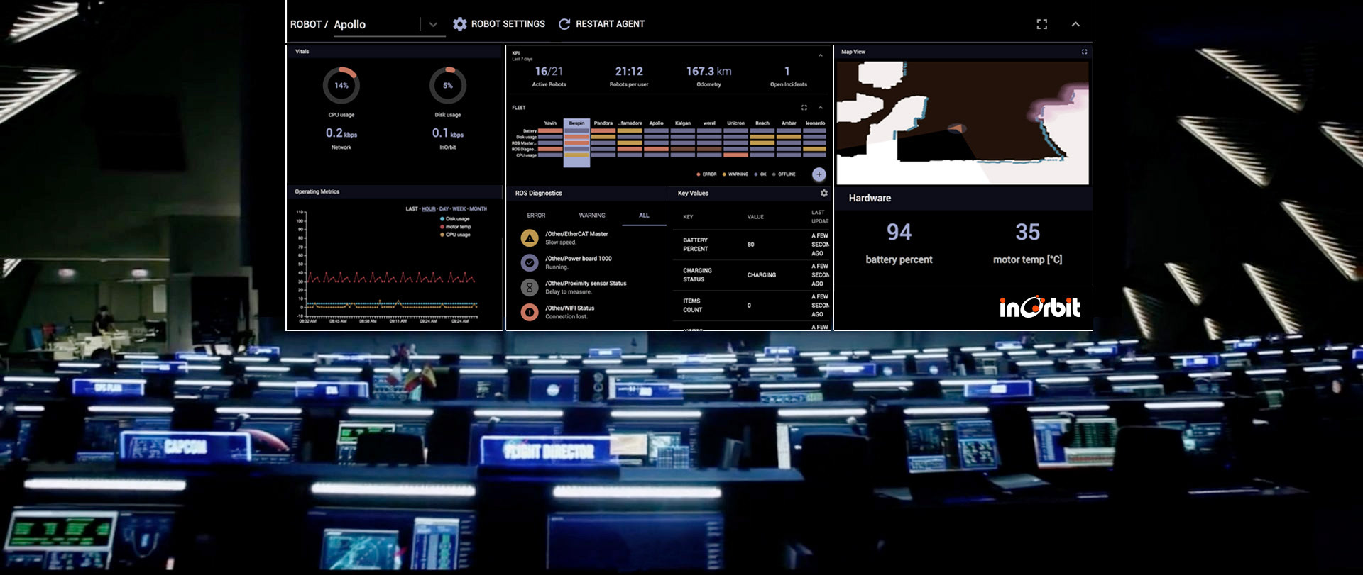
I systematized the dashboard. I standardized colors, proportions, and sizes, creating an easy-to-use scale method that allows showcasing 5 or 100 robots on screen, and the capability to dig deeper on specific metrics, settings, and at different levels of information. The Dark Mode helped to have this futuristic approach.
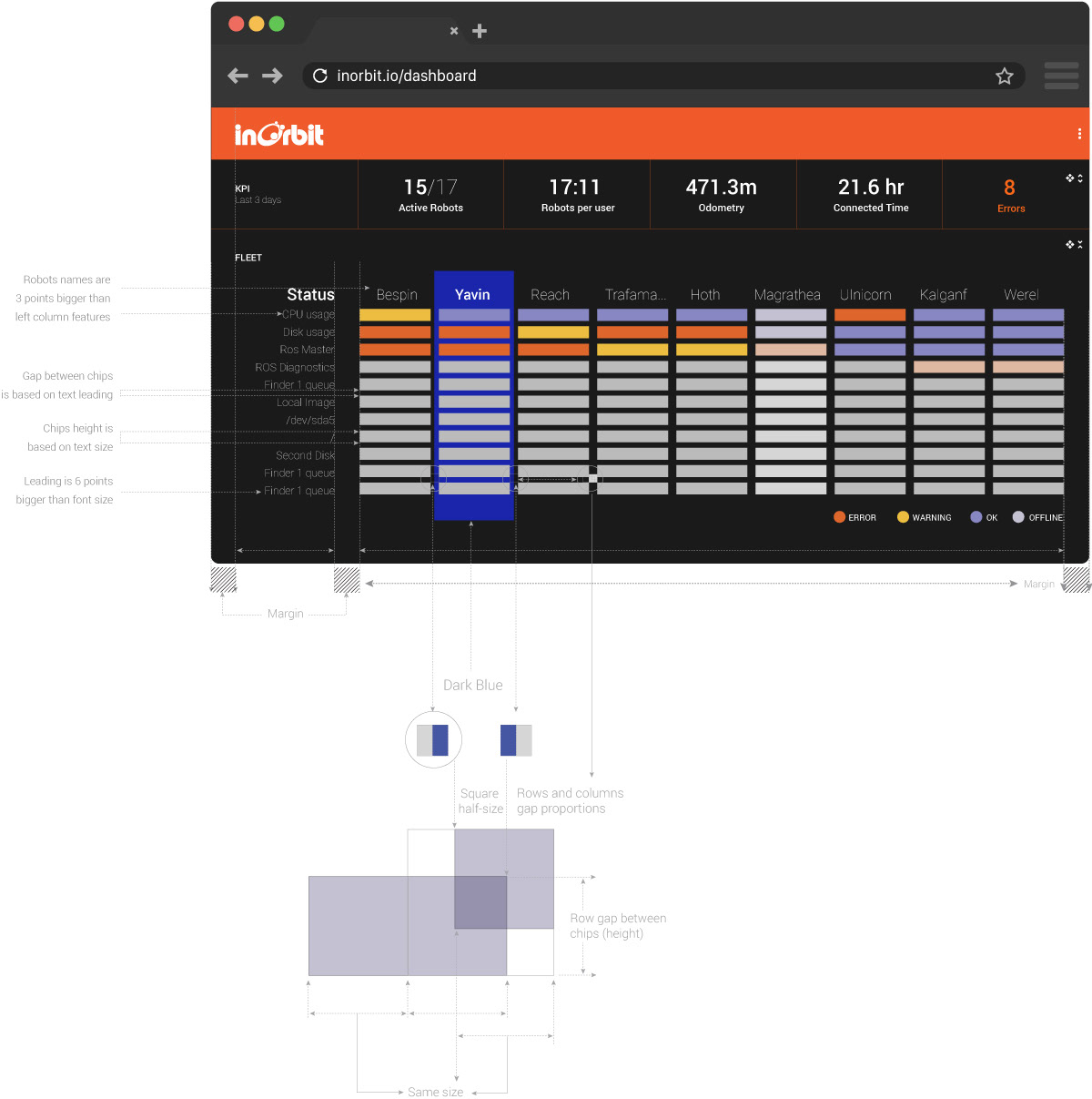
Figure 2. Part of InOrbit’s Dashboard guidelines. Proportions and Modules.
InOrbit's Dashboard has three levels of information:
• General Overview, where the user can have at a glimpse a broad understanding of the fleet and any problem that might be happening.
• Fleet Status, where you can see every robot and its different variables.
• Details, if you need to have a closer look at individual robot variables, camera, connection, map, etc.
I implemented an accordion system that allows the operator to jump from the fleet view to the minimum level of information in two taps. Everything can be Collapsed and Expanded to focus on different pieces of information
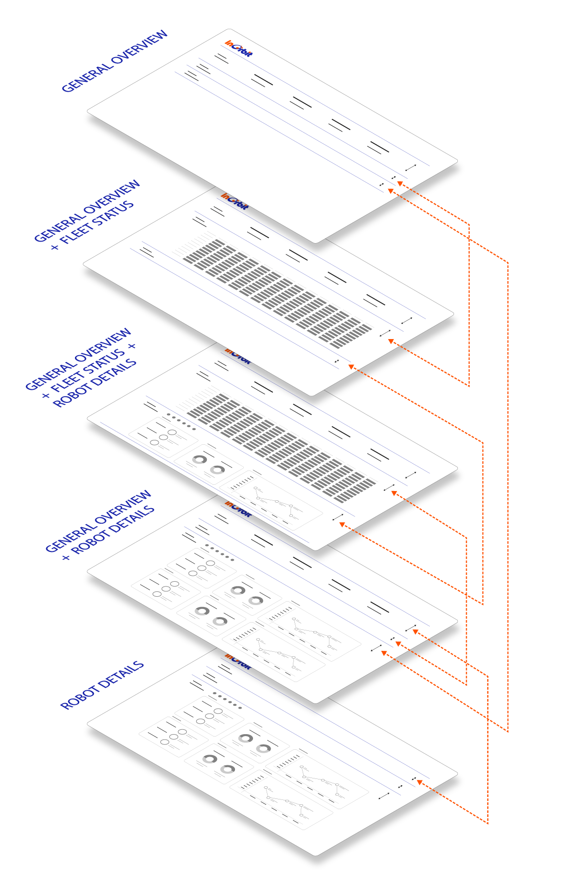
Figure 3. Implementing and Accordion Interaction the operator can have a general overview of the entire fleet. By Collapsing and Expanding the different levels, every data point is at a one-click-distance.
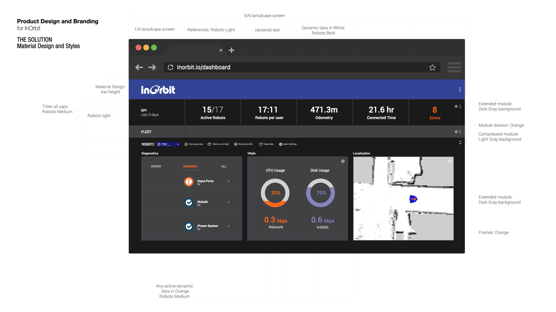
A very significant part of the job was to create a modular responsive structure to support any monitor size. The dashboard is a cloud web-based application so users can access it from any device.
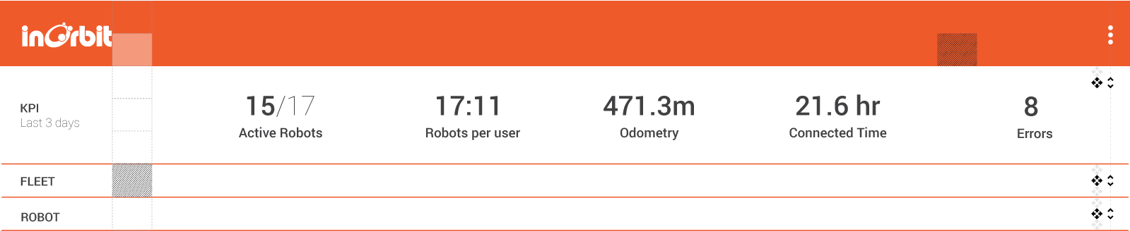
Figure 4. I defined modules to set unified sizes, starting from the standard Material Design Header.
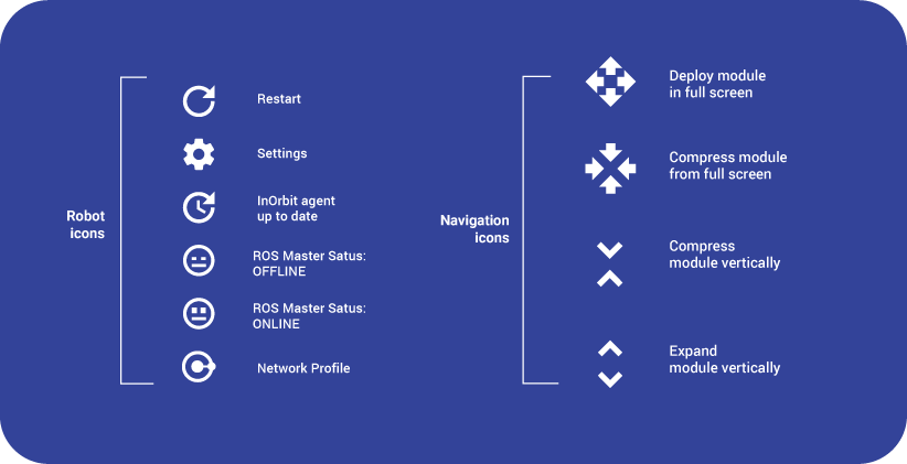
Figure 5. I updated some previous icon versions and created new ones to communicate different instances and situations.
The job included creating a light version.
As a color accent, I used InOrbit's Blue and a Light Blue for strokes and frames.
As a color accent, I used InOrbit's Blue and a Light Blue for strokes and frames.
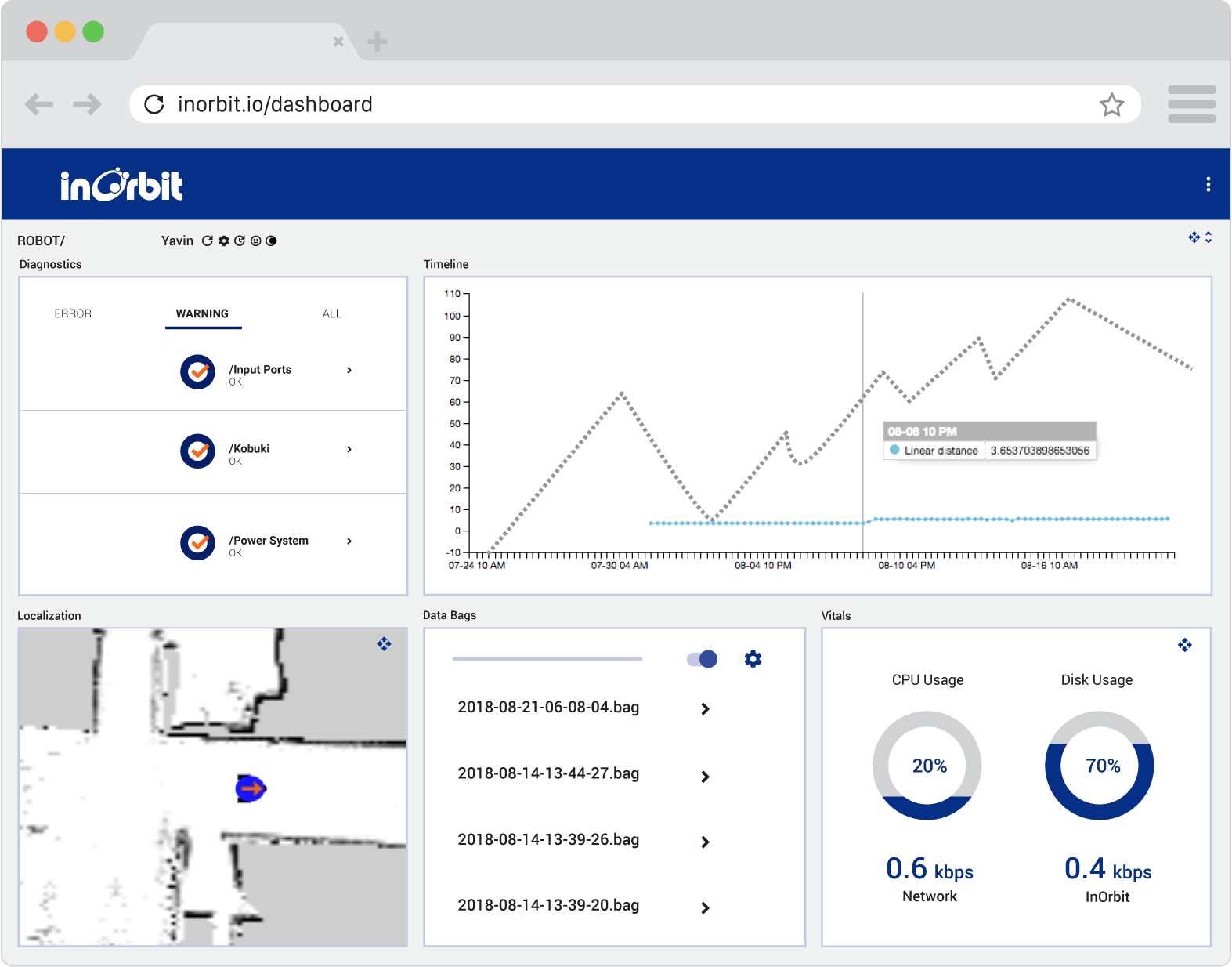
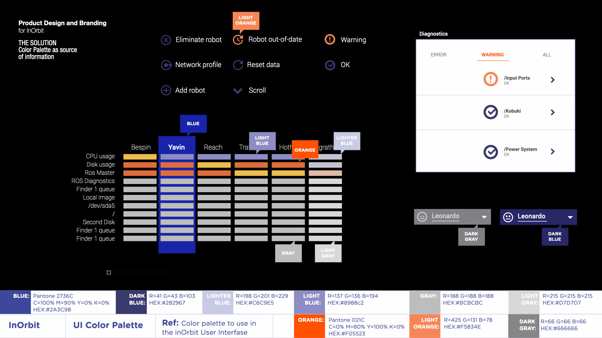
Figure 6. The new color palette was defined accordingly with InOrbit's branding guidelines as part of its full re-branding, but at the same time as a source of information supporting the UI.
The result is a very clear interactive tool,
bringing confidence to its users
when handling a large volume of data.
bringing confidence to its users
when handling a large volume of data.
Team members
Florian Pestoni
Founder and CEO
Product Development
Founder and CEO
Product Development
Julian Cerruti
CO-Founder and CEO
Software Engineer
CO-Founder and CEO
Software Engineer